Both deformation and animation are a way to improve the user experience in the front-end development process. Adding some animation can make the page look less boring.

1. Deformation transform
The transform attribute applies a 2D or 3D transformation to the element. This property allows you to rotate, scale, move, skew, etc. the element.
Deformation is a transformation relative to its own original position, and the original position still occupies a place, which is only a visual change. This point of view is somewhat similar to relative positioning.
1.1 2D deformation
Coordinate system in 2d: x indicates positive direction to the right y indicates positive direction downward
-
translate(x,y) offset , value function, the two parameters are the offset in the x direction and the y direction; if there is only one value, it means the offset to x
translateX (x)Offset in X direction Offset
translateY (y)in Y direction/* 向下偏移100px */ /* transform: translateY(100px); */ /* 向右偏移200px*/ /* transform: translateX(200px); */ /* 同时设置向下偏移100px向右偏移200px */ /* transform: translate(200px,100px) */ transform: translate(100px); -
scale(x,y) scaling , the two parameters are the scaling values in the x direction and the y direction respectively; if there is only one value, it represents the scaling value in both directions of the element
scaleX(x)Scale in X directionscaleY(y)Scale in the Y direction/* x方向缩小一半 */ /* transform: scaleX(0.5); */ /* y方向变大一半 */ /* transform: scaleY(2); */ /* 设置x、y方向的缩放值 */ /* transform: scale(0.9,0.5); */ transform: scale(0.5); -
skew(x deg, y deg); skew , defines a 2D skew transformation along the X and Y axes
skewX()skewY()/* x方向倾斜30deg */ /* transform: skewX(30deg); */ /* y方向倾斜30deg */ /* transform: skewY(60deg); */ transform: skewX(30deg); -
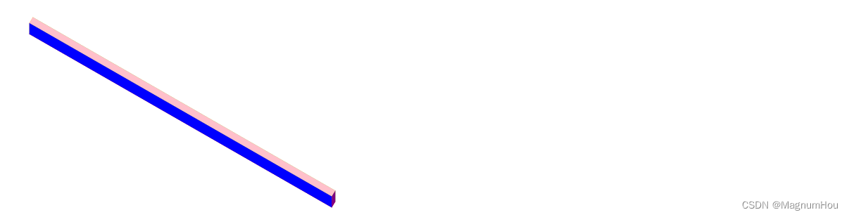
rotate(z deg) Rotate Defines a 2D rotation, specifying the angle in the parameter
rotateX() x轴旋转rotateY() y轴旋转rotateZ() z旋转,平面旋转/* x轴旋转30deg */ /* transform: rotateX(30deg); */ /* y轴旋转30deg */ /* transform: rotateY(60deg); */ transform: rotateZ(60deg)
1.2 Change the deformation center point
The transform-origin attribute allows you to change the position of the transformed element
transform-origin: x-axis y-axis z-axis;
- x-axis defines where on the x-axis the view is placed. Possible values: left center right fixed value percentage
- y-axis defines where on the y-axis the view is placed. Possible values: top center bottom fixed value percentage
- z-axis defines where on the Z axis the view is placed. Possible values: fixed value
Note: 2D transform elements can change the X and Y axis of the element. Transform elements in 3D and also change the element's Z axis.
1.3 Change the deformation type
The transform–style attribute specifies how nested elements are presented in three-dimensional space, 2D deformation and 3D deformation, and the attribute values are as follows
- flat means that all child elements are rendered on a 2D plane
- preserve-3d means that all child elements are rendered in 3D space
1.4 3D deformation related properties and property values
Coordinate system in 3d: x means positive direction to the right y means positive direction down z means vertical to the screen
perspectiveDepth of field, indicating how many pixels away from the screentranslate3d(x,y,z)translateZ(z)The property indicates how many pixels the element has moved along its own Z axisscaleZ(z deg)
Note: 3d deformation needs to be used with the depth of field, and the perspective attribute is added to the parent element
父元素{
	prespective: 101px; // 表示父元素距离屏幕101px的距离,类似于看戏时确定舞台的距离
}
子元素{
	transform: translateZ(100px); // 表示子元素从距离屏幕101px的位置,移动到了距离屏幕1px的位置
}
1.5 Back side not visible
backface-visibility : visible(默认,背面可见) | hidden(背面不可见);
Second, the transition transition
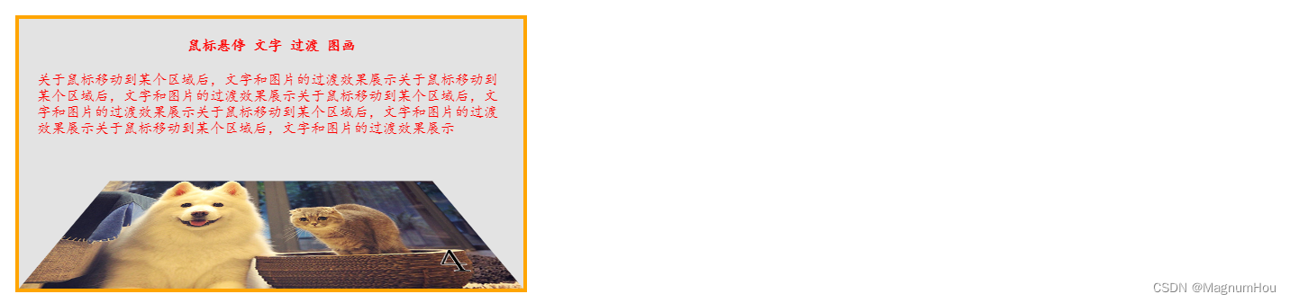
Transition is the evolution from one effect to another, which requires triggering conditions, such as: mouse over to get focus click event, etc.
Two necessary conditions:
Transition property transition-property
Transition time transition-duration
In addition to the above two properties:
Transition action curve transition-timing-function
Transition delay transition-delay
Three, animation animation
The animation also transitions from one effect to another. This does not require any trigger conditions and is played automatically;
Two necessary conditions :
animation-name the name of the animation
animation-duration animation transition time
Other attributes :
animation-delay animation delay playback time
animation-timing-function animation playback rate, the property value is the same as transition-timing-function
animation-iteration-count Set the number of times the animation is played; you can give a number, if it is set to infinity, it means infinite playback
animation-direction Set the direction of animation playback, the property values are as follows:
normal forward playback
reverse play in reverse
alternate Odd number of forward play, even number of reverse play
alternate-reverse even number of forward play, odd number of reverse play
The animation-fill-mode attribute specifies that when the animation is not playing (when the animation is complete, or when the animation has a delay before starting), the style attribute value forwards to be applied to the element retains the effect of the last frame of the animation
Animation set rules :
@keyframes name{
	from{}
	to{}
}
Note: Because there are too few form...to transition effects, generally we will use percentages of 0%, 10%, ..., 90%, 100% to present a more delicate animation process
@keyframes name{
    0%{}
    10%{}
    ...
    90%{}
    100%{}
}
Animation Shorthand Properties
animation:name duration delay timing-function iteration-count direction;
Control the playback state of the animation
animation-play-state: running (默认运动) | paused (停止) ;
Such as: set the mouse to slide over the container to stop the animation playback