Pyecharts is a Python visualization library based on Echarts, which can easily generate various interactive charts and maps in Python language. It supports a variety of chart types, including line charts, histograms, scatter charts, pie charts, maps, etc., and can realize data visualization through simple API calls.
Advantages of Pyecharts include:
1. Easy to use: Pyecharts provides an easy-to-use API that can easily generate various charts and maps.
2. Rich chart types: Pyecharts supports a variety of chart types, including line charts, histograms, scatter charts, pie charts, maps, etc.
3. Interactive visualization: The charts generated by Pyecharts can be interactively operated, including zooming, dragging, data filtering, etc.
4. Support multiple data formats: Pyecharts supports multiple data formats, including CSV, JSON, Excel, etc.
5. Strong scalability: Pyecharts can be integrated with other Python libraries and frameworks, such as Pandas, Flask, Django, etc.
In short, Pyecharts is a powerful, easy-to-use Python visualization library that can help developers quickly generate various interactive charts and maps.
Today we will take a look at the common basic usage of Pyecharts, Lesson 3
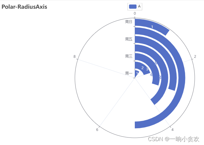
1. Polar coordinate diagram - circular
from pyecharts import options as opts
from pyecharts.charts import Polar
from pyecharts.faker import Faker
c =(
Polar().add_schema(
radiusaxis_opts=opts.RadiusAxisOpts(data=Faker.week, type_="category"),
angleaxis_opts=opts.AngleAxisOpts(is_clockwise=True, max_=10),).add("A",[1,2,3,4,3,5,1], type_="bar").set_global_opts(title_opts=opts.TitleOpts(title="Polar-RadiusAxis")).set_series_opts(label_opts=opts.LabelOpts(is_show=True)).render("polar_radius.html"))
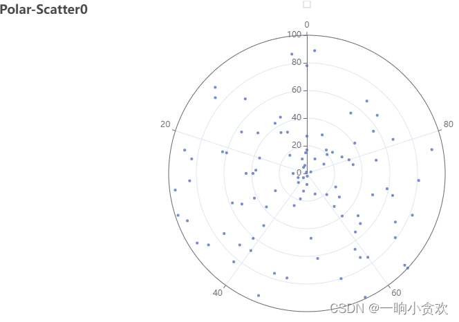
Polar plot - scatter
import random
from pyecharts import options as opts
from pyecharts.charts import Polar
data =[(i, random.randint(1,100))for i inrange(101)]
c =(
Polar().add("", data, type_="scatter", label_opts=opts.LabelOpts(is_show=False)).set_global_opts(title_opts=opts.TitleOpts(title="Polar-Scatter0")).render("polar_scatter_0.html"))
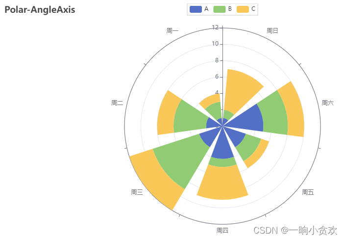
Polar Plot - Angles
from pyecharts import options as opts
from pyecharts.charts import Polar
from pyecharts.faker import Faker
c =(
Polar().add_schema(angleaxis_opts=opts.AngleAxisOpts(data=Faker.week, type_="category")).add("A",[1,2,3,4,3,5,1], type_="bar", stack="stack0").add("B",[2,4,6,1,2,3,1], type_="bar", stack="stack0").add("C",[1,2,3,4,1,2,5], type_="bar", stack="stack0").set_global_opts(title_opts=opts.TitleOpts(title="Polar-AngleAxis")).render("polar_angleaxis.html"))
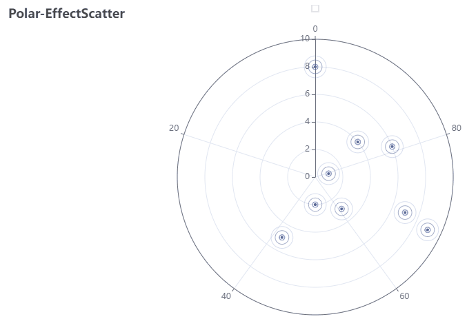
Polar plot - dynamic scatterplot
import random
from pyecharts import options as opts
from pyecharts.charts import Polar
data =[(i, random.randint(1,100))for i inrange(10)]
c =(
Polar().add("",
data,
type_="effectScatter",
effect_opts=opts.EffectOpts(scale=10, period=5),
label_opts=opts.LabelOpts(is_show=False),).set_global_opts(title_opts=opts.TitleOpts(title="Polar-EffectScatter")).render("polar_effectscatter.html"))
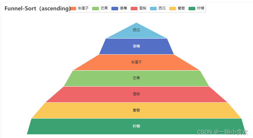
2. Funnel diagram
from pyecharts import options as opts
from pyecharts.charts import Funnel
from pyecharts.faker import Faker
c =(
Funnel().add("商品",[list(z)for z inzip(Faker.choose(), Faker.values())],
sort_="ascending",
label_opts=opts.LabelOpts(position="inside"),).set_global_opts(title_opts=opts.TitleOpts(title="Funnel-Sort(ascending)")).render("funnel_sort_ascending.html"))
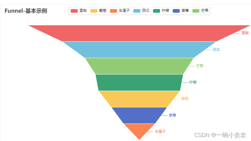
2. Funnel Chart-1
from pyecharts import options as opts
from pyecharts.charts import Funnel
from pyecharts.faker import Faker
c =(
Funnel().add("商品",[list(z)for z inzip(Faker.choose(), Faker.values())]).set_global_opts(title_opts=opts.TitleOpts(title="Funnel-基本示例")).render("funnel_base.html"))
For more knowledge, please inquire on the official website: click me
Hope it helps beginners
A little programmer dedicated to office automation
Hope to get [a free follow] from everyone! grateful