CSS layout is the most important lesson on the front-end. If you learn CSS layout, you can get started. This article summarizes common layout cases, which can be used as learning materials for CSS layout, and can also be used as reference materials for development. It is recommended that you bookmark it first. If it is helpful to you, you can consider giving it a little praise.
center horizontally
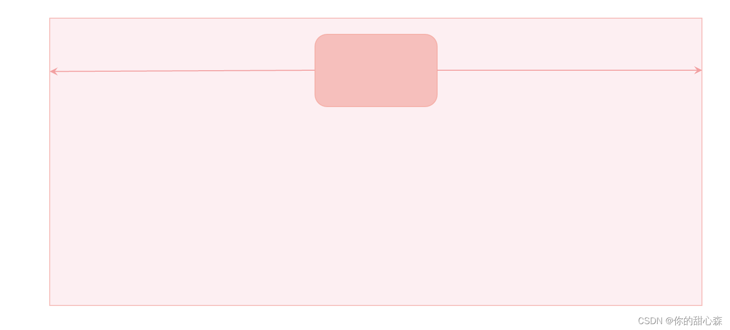
Horizontally centered layout requirements: Assume the width of the container is xxx , the width of the middle content isyyy , then left margin width = right margin width =( x − y ) / 2 (xy)/2(x−y ) /2 , as shown in the figure below:
Method 1, margin: auto;
    <style>
      .box {


        height: 50vh;
        background-color: #fdeff2;
      }

      .content {


        width: 150px;
        height: 100px;
        background-color: #f6bfbc;

        margin: 0 auto; /*居中*/
      }
    </style>

    <div class="box">
      <div class="content"></div>
    </div>
[Interpretation of key points] The meaning of horizontal centering: "Centering" is only meaningful when the width of the container is larger than the content, so the premise of using this method is that the width of the content is smaller than the width of the container.
[Error-prone point] It is used for content that is equal to the width of the container margin:auto;. For example, when the container is a floating box, the out-of-flow positioning container.
[Principle] The auto value of margin is equal to the width of the remaining space, and the written margin-left: auto;content will be pushed to the right. If left and right are set at the same time, margin: 0 auto;the left and right will divide the remaining space equally.
[Tips] margin: 0 auto;It can be abbreviated as: margin: auto;because when margin-top or margin-bottom is auto, the value is 0, unless it is out of the document flow.
Method 2. Flexbox
    <style>
      .box {


        height: 150px;
        background-color: #fdeff2;
        display: flex;
        justify-content: center; /*居中*/
      }

      .content {


        width: 150px;
        height: 100px;
        background-color: #f6bfbc;
      }
    </style>

    <div class="box">
      <div class="content"></div>
    </div>
[Interpretation] The elastic box has a special centering scheme: that is, set the center in the direction of the main axis and the cross axis.
Method 3, text-align: center
When the content is a non-block-level element, the centering effect text-align:center;can :
    <style>
      ul {


        text-align: center;

        /* 其他样式 */
        line-height: 40px;
        list-style: none;
        margin: 0;
        padding: 0;
        background-color: #fdeff2;
      }

      ul li {


        display: inline-block;

        /* 其他样式 */
        background-color: #f6bfbc;
        padding: 8px 16px;
      }
    </style>
    <ul>
      <li>首页</li>
      <li>关于</li>
      <li>产品</li>
    </ul>

[Interpretation of key points] The text-align method is often used when the text is centered, and this attribute is inherited, which is very convenient to use. When used for layout, the links in the common language navigation bar are centered, liset inline-blockand then center.
[Mistakes] Did not distinguish between the container and the content, and set the inline-block to the container element.
[Error-prone point] Used for containers with the same width and content, such as floating containers.
Method 4. Positioning realization
    <style>
      .box {


        height: 200px;
        background-color: #fdeff2;

        position: relative;
      }

      .content {


        width: 150px;
        height: 100px;
        background-color: #f6bfbc;

        /* 定位实现水平居中
        1. left=right
        2. 剩余空间的宽度大于零
        3. 内容宽度已知
        */
        position: absolute;
        left: 0;
        right: 0;
        margin: auto;
      }
    </style>

    <div class="box">
      <div class="content"></div>
    </div>
[Interpretation of key points] Set the left and right distances to be equal, and then setmargin: auto;
[Error-prone point] You need to know the width of the content. If you don't set the width of the content, the container will be filled.
summary
Have you learned so many horizontal centering methods?
[Exercise] Please name several horizontal centering methods, and what are their advantages and disadvantages?
vertical center
Method 1. Line-height realizes vertical centering of text
Idea: Set the line-height to the height of the container to center the text.
<style>
  .box {


    height: 50px;
    background-color: #fdeff2;
  }

  .content {


    line-height: 50px;
    background-color: #f6bfbc;
    color: #b94047;
  }
</style>

<div class="box">
  <div class="content">你猜我居中了没</div>
</div>

Method 2: vertical-align to center the image and text
    <style>
      .box {


        line-height: 50px;
        background-color: #fdeff2;
        color: #b94047;
      }

      .box img {


        height: 30px;
        vertical-align: middle;
      }

      .box span {


        vertical-align: middle;
      }
    </style>

    <div class="box">
      <img src="https://s1.52poke.wiki/wiki/thumb/5/53/054Psyduck.png/300px-054Psyduck.png" alt="图不见了" />
      <span>这可怎么居中呀</span>
    </div>

[Points] This method can only be used for elements with inline properties, and the height of the content is less line-heightthan effective.
Method 3. Flexbox
Flexbox can be vertically centered easily:
    <style>
      .box {


        height: 50px;
        display: flex;
        align-items: center;

        background-color: #fdeff2;
        color: #b94047;
      }

      .box img {


        height: 30px;
      }
    </style>

    <div class="box">
      <img src="https://s1.52poke.wiki/wiki/thumb/5/53/054Psyduck.png/300px-054Psyduck.png" alt="图不见了" />
      <span>这可怎么居中鸭</span>
    </div>

[Interpretation of key points] Use align-items:center;to achieve vertical centering, and use justify-content:center;to achieve horizontal centering. A more accurate statement is: align-items:center;realize the centering of the cross axis direction, justify-content:center;realize the centering of the main axis direction, the main axis direction is flex-directiondeclared , and the default is from left to right.
[Error-prone point] Vertical centering can only be achieved when the height of the container is larger than the content.
Method 4. Positioning to achieve vertical centering
    <style>
      .box {


        height: 100px;
        background-color: #fdeff2;

        position: relative;
      }

      .content {


        width: 20px;
        height: 50px;
        background-color: #f6bfbc;

        /* 定位实现垂直居中
        1. top=bottom, 设置 margin: auto;
        2. 剩余空间的高度大于零
        3. 内容高度已知
        */
        position: absolute;
        right: 20px;
        top: 0;
        bottom: 0;
        margin: auto;
      }
    </style>

    <div class="box">
      <div class="content"></div>
    </div>

[Interpretation of key points] Set the upper and lower distances to be equal, and then set margin: auto;to achieve this. This method is mostly used for the layout of the toolbar on the right.
There is another method for positioning, the translation method:
    <style>
      .box {


        height: 100px;
        background-color: #fdeff2;

        position: relative;
      }

      .content {


        width: 20px;
        height: 50px;
        background-color: #f6bfbc;

        /* 定位实现垂直居中
        1. 先让上边界居中,然后用平移调整
        2. 剩余空间的高度大于零
        3. 内容高度已知
        */
        position: absolute;
        right: 20px;
        top: 50%;
        transform: translateY(-50%);
      }
    </style>

    <div class="box">
      <div class="content"></div>
    </div>
summary
Vertical centering is a common method for web page layout. Vertical centering is a little more troublesome than horizontal centering. But with flexbox, everything becomes easier. After all, flexbox is designed for layout.
【Exercise】Please tell me several methods of vertical centering, and what are the advantages and disadvantages of each?
two column layout
As shown in the figure below, the two-column layout requires:
1) Fixed left width
2) The right side occupies the remaining width
3) The left side does not scroll with the content on the right side

A two-column layout is commonly used in background management systems, with a multi-level navigation menu on the left and system details on the right. It is also commonly used in document systems, with multi-level directories on the left and document content on the right.
Method 1. Use positioning to achieve a two-column layout
    <style>
      body {


        margin: 0;
      }

      .home-side {


        /* 实现固定侧边栏
         * 必须同时设置 top 和 bottom
        */
        position: fixed;
        top: 0;
        bottom: 0;

        /* 设置侧边栏宽度 */
        width: 200px;

        /* 设置内容溢出滚动效果 */
        overflow-y: auto;
      }

      .side-content {


        width: 100%;
        height: 120vh;
        background-color: #e9dfe5;
      }

      .home-main {


        /* 使用左外边距留出侧边栏宽度 */
        margin-left: 200px;

        background-color: #f5b1aa;
        height: 200vh;
      }
    </style>
    <div class="home">
      <aside class="home-side">
        <div class="side-content"></div>
      </aside>
      <main class="home-main"></main>
    </div>
【Key points】
1) Use fixed positioning to make the sidebar fixed on the left side. To make the sidebar scrollable, you must also set the top, bottom and overflow properties at the same time.
2) Use margin or padding to leave the content of the sidebar for the content.
Realize the effect:

If the third condition is abandoned: that is, the sidebar can scroll with the content, then there will be many layout methods:
Method 2, flexible layout
    <style>
      body {


        margin: 0;
      }

      .home {


        display: flex;
      }

      .home-side {


        width: 200px;
        flex-shrink: 0; /*不允许收缩*/
      }

      .home-main {


        flex-grow: 1; /*占据剩余空间*/

        background-color: #f5b1aa;
        height: 200vh;
      }

      .side-content {


        width: 100%;
        height: 120vh;
        background-color: #e9dfe5;
      }
    </style>

    <div class="home">
      <aside class="home-side">
        <div class="side-content"></div>
      </aside>
      <main class="home-main"></main>
    </div>
[Interpretation of main points] The key code is only four lines:
      .home {


        display: flex;
      }

      .home-side {


        width: 200px;
        flex-shrink: 0; /*不允许收缩*/
      }

      .home-main {


        flex-grow: 1; /*占据剩余空间*/
	  }
[Advantages] Simple and easy to understand.
[Disadvantage] The sidebar cannot be fixed.
【Skills】flex:1;Equivalent toflex-grow:1;
Sidebar layout with resizable width
A fixed sidebar with variable width cannot be achieved without JavaScript. Here is a case for reference only:
    <style>
      body {


        margin: 0;
      }

      :root {


        --sidebar-width: 200px;
      }

      .home-side {


        /* 实现固定侧边栏
         * 必须同时设置 top 和 bottom
        */
        position: fixed;
        top: 0;
        bottom: 0;

        box-sizing: border-box;
        /* 设置侧边栏宽度 */
        width: var(--sidebar-width);
      }

      .side-resizer {


        position: absolute;
        right: 0;
        top: 0;
        bottom: 0;

        cursor: ew-resize;
        background-color: transparent;
        width: 5px;
      }

      .side-resizer:hover,
      .side-resizer:active {


        border-right: 1px dashed #43676b;
      }

      .side-scroll-box {


        position: absolute;
        top: 0;
        bottom: 0;
        left: 0;
        right: 0;
        overflow-y: auto;

        /* 火狐浏览器滚动条样式 */
        scrollbar-color: #bfbfbf rgb(239, 239, 239);
        scrollbar-width: thin;
      }

      /*滚动条样式*/
      .side-scroll-box::-webkit-scrollbar {


        width: 5px;
      }

      .side-scroll-box::-webkit-scrollbar-track {


        background: rgb(239, 239, 239);
        border-radius: 2px;
      }

      .side-scroll-box::-webkit-scrollbar-thumb {


        background: #bfbfbf;
        border-radius: 10px;
      }

      /* 拖动的时候禁用选择 */
      .sidebar-resizing {


        -moz-user-select: none;
        -webkit-user-select: none;
        -ms-user-select: none;
        user-select: none;
      }

      .side-content {


        height: 120vh;
        background-color: #e9dfe5;
      }

      .home-main {


        /* 使用左外边距留出侧边栏宽度 */
        margin-left: var(--sidebar-width);

        background-color: #f5b1aa;
        height: 200vh;
      }
    </style>

    <div class="home">
      <aside class="home-side" id="sidebar">
        <div class="side-scroll-box">
          <div class="side-content"></div>
        </div>
        <div class="side-resizer" id="sidebar-resizer"></div>
      </aside>
      <main class="home-main"></main>
    </div>

    <script>
      const html = document.querySelector("html");
      const sidebarResizer = document.getElementById("sidebar-resizer");
      const sidebar = document.getElementById("sidebar");
      sidebarResizer.addEventListener("mousedown", initResize, false);

      function initResize(e) {


        window.addEventListener("mousemove", resize, false);
        window.addEventListener("mouseup", stopResize, false);
        html.classList.add("sidebar-resizing");
      }

      function resize(e) {


        var pos = e.clientX - sidebar.offsetLeft;
        pos = Math.min(pos, window.innerWidth - 100);
        document.documentElement.style.setProperty("--sidebar-width", pos + "px");
      }

      //on mouseup remove windows functions mousemove & mouseup
      function stopResize(e) {


        html.classList.remove("sidebar-resizing");
        window.removeEventListener("mousemove", resize, false);
        window.removeEventListener("mouseup", stopResize, false);
      }
    </script>
[Interpretation of main points] The sidebar with adjustable width looks difficult on the surface, but there are still many technical details involved:
-
Fixed two-column layout
-
CSS variables:
--sidebar-width -
Scroll bar style adjustment
-
Events related to resizing the width.
Three-column layout with sticky positioning
The usage scenario of the three-column layout is generally the details of the article, one side is for operations such as sharing and likes, and the other side is for content such as recommendations, catalogs, and advertisements. In fact, the three-column layout is not difficult: you can implement the two-column layout first, and then implement the three-column layout. In addition to showing you the effect of three-column layout, this case also shows you the effect of sticky layout. You can’t stop using this function at all:
    <style>
      .home {


        display: flex;
        align-items: flex-start;
      }

      .left {


        width: 200px;
        flex-shrink: 0;

        background-color: #b98c46;
        height: 80vh;
        margin-right: 20px;
      }

      .right {


        width: 200px;
        flex-shrink: 0;
      }

      .main {


        flex: 1;
        display: flex;
      }

      .content {


        flex: 1;
        background-color: #8b968d;
        height: 300vh;
      }

      .box1 {


        width: 200px;
        flex-shrink: 0;
        height: 50vh;
        background-color: #aa4c8f;
        margin: 20px 20px;
      }

      .box2 {


        width: 200px;
        flex-shrink: 0;
        height: 30vh;
        background-color: #7a4171;
        margin: 20px 20px;

        position: sticky;
        top: 20px;
      }
    </style>

    <div class="home">
      <div class="left"></div>
      <div class="main">
        <div class="content"></div>
        <div class="right">
          <div class="box1"></div>
          <div class="box2"></div>
        </div>
      </div>
    </div>
Effect:

[Interpretation of main points]
- Structure: long content in the middle, ads (lavender) and catalog (dark purple) on the right
- When the scroll bar slides down, the directory area will stick to the top. The adsorption effect
position: sticky;is implemented , and the current mainstream browsers support it well1 .
waterfall layout
Waterfall layout is often used for image-type websites, for example: heaptang.com. Waterfall layout has a professional English name Masonry Layouts. Waterfall flow, also known as waterfall flow layout, is a popular website page layout method. 2 .
Waterfall layout features:
1. Because the waterfall flow is attractive, the waterfall flow will continuously load you with new information at the bottom of its page, and attract your curiosity by giving incomplete visual pictures, so that you can't stop and want to continue to explore downwards. Products using this solution can often enhance the user's residence time through waterfall flow and increase the user's viscosity.
2. The fast reading mode allows users to scan a large amount of information in a short time, and the lazy loading mode of the waterfall stream avoids the click-turning operation, and can obtain the most content experience at the minimum operating cost , the visual way of waterfall flow makes it easy for people to immerse themselves in it and is not easy to be interrupted.
3. In addition, the main feature of waterfall flow is: fixed width but not fixed height. This kind of page design is different from the traditional matrix image layout mode. It cleverly uses visual hierarchy and arbitrary flow of sight to relieve visual fatigue.
Waterfall flow is more suitable for casual browsing and non-purpose use scenarios, just like shopping, watching while walking, and at the same time being attracted by the dazzling array of goods on the street, so it is more suitable for pictures, novels, and information scenes. Taking the existing successful cases as an example, many UGC-based related websites are hosted by waterfall.

Method 1, JavaScript implementation
At present, there is no perfect pure CSS implementation method, and a mature solution requires JavaScript to participate in the implementation 3 .
<style>
      .waterfall {


        position: relative;
      }
      .waterfall-item {


        position: absolute;
        width: 23%;
        height: 100px;
        background: rgb(236, 146, 10);
        margin-bottom: 10px;
        display: flex;
        justify-content: center;
        align-items: center;
        transition: all 0.1s;
      }

      .num {


        font-size: 18px;
        color: #fff;
        border-radius: 100%;
        width: 25px;
        height: 25px;
        line-height: 25px;
        text-align: center;
        border: 1px solid #fff;
      }
      .btn {


        text-align: center;
        font-size: 15px;
        color: #400eff;
        cursor: pointer;
        position: absolute;
        bottom: 10px;
        left: 50%;
      }
    </style>
    <div id="waterfall" class="waterfall"></div>
    <script>
      class WaterFall {


        constructor(container, options) {


          this.gap = options.gap || 0;
          this.container = container;
          this.items = container.children || [];
          this.heightArr = [];
          this.renderIndex = 0;
          window.addEventListener("resize", () => {


            this.renderIndex = 0;
            this.heightArr = [];
            this.layout();
          });
          this.container.addEventListener("DOMSubtreeModified", () => {


            this.layout();
          });
        }

        layout() {


          if (this.items.length === 0) return;
          const gap = this.gap;
          const pageWidth = this.container.offsetWidth;
          const itemWidth = this.items[0].offsetWidth;
          const columns = Math.floor(pageWidth / (itemWidth + gap)); // 总共有多少列

          while (this.renderIndex < this.items.length) {


            let top, left;
            if (this.renderIndex < columns) {


              // 第一行
              top = 0;
              left = (itemWidth + gap) * this.renderIndex;
              this.heightArr.push(this.items[this.renderIndex].offsetHeight);
            } else {


              const minIndex = this.getMinIndex(this.heightArr);
              top = this.heightArr[minIndex] + gap;
              left = this.items[minIndex].offsetLeft;
              this.heightArr[minIndex] += this.items[this.renderIndex].offsetHeight + gap;
            }
            this.container.style.height = this.getMaxHeight(this.heightArr) + "px";
            this.items[this.renderIndex].style.top = top + "px";
            this.items[this.renderIndex].style.left = left + "px";
            this.renderIndex++;
          }
        }

        getMinIndex(heightArr) {


          let minIndex = 0;
          let min = heightArr[minIndex];
          for (let i = 1; i < heightArr.length; i++) {


            if (heightArr[i] < min) {


              min = heightArr[i];
              minIndex = i;
            }
          }
          return minIndex;
        }

        getMaxHeight(heightArr) {


          let maxHeight = heightArr[0];
          for (let i = 1; i < heightArr.length; i++) {


            if (heightArr[i] > maxHeight) {


              maxHeight = heightArr[i];
            }
          }
          return maxHeight;
        }
      }

      window.onload = function () {


        const waterfall = document.getElementById("waterfall");
        const water = new WaterFall(waterfall, {

       gap: 10 });
        water.layout();
      };
    </script>

    <script>
      var index = 0;
      const waterfall = document.getElementById("waterfall");
      function getData(num = 5) {


        return new Promise((resolve, reject) => {


          setTimeout(() => {


            const fragment = document.createDocumentFragment();
            for (let i = 0; i < num; i++) {


              const div = document.createElement("div");
              const numDiv = document.createElement("div");
              div.className = "waterfall-item";
              numDiv.className = "num";
              numDiv.textContent = index + 1;
              index++;
              div.appendChild(numDiv);
              div.style.height = getRandomHeight(4, 1) + "px";
              fragment.appendChild(div);
            }
            waterfall.appendChild(fragment);
            resolve();
          }, 1000);
        });
      }

      getData(20);

      var loading = false;
      window.onscroll = async function () {


        const scrollTop = document.documentElement.scrollTop; // 滚动条位置
        const clientHeight = document.documentElement.clientHeight;
        const scrollHeight = document.body.scrollHeight; // 完整高度
        if (scrollTop + clientHeight >= scrollHeight && !loading) {


          loading = true;
          await getData();
          loading = false;
        }
      };

      function getRandomHeight(max = 5, min = 1) {


        return (Math.floor(Math.random() * (max - min + 1)) + min) * 100;
      }
    </script>
Method 2, Future Method 4
.container {


  display: grid;
  grid-template-columns: repeat(4, 1fr);
  grid-template-rows: masonry;
}
reference article
♥ I'm a front-end engineer: your sweetheart Sen. Thank you very much for your likes and attention. Everyone is welcome to participate in discussions or collaborations. QQ exchange group: 233589794.
★ This article is open source , using the CC BY-SA 4.0 protocol , please indicate the source for reprinting: Self-cultivation of front-end engineers . GitHub.com@xiayulu.
★ For creative cooperation or recruitment information, please send a private message or email: [email protected], specifying the subject: creative cooperation or recruitment of front-end engineers .
Gulenjing. Analysis of the layout principle and implementation of waterfall flow . Blog Garden. ↩︎
Advanced front-end Xiaobai. Dry goods! Pure js package waterfall flow layout plug-in . Rare earth nuggets. ↩︎
MDN. Masonry layout. ↩︎