Dialog boxes are temporary windows for users to communicate with computers, and are widely used in modern software. In the software design, with the help of dialog boxes, the user's operation needs can be better met, and the user's operation is more convenient and flexible.
1. Types and functions of controls
There are various controls in the dialog box, which can be used to control the interface. Below, we first introduce these controls.
(1) Button (Push Button). The button is the most commonly used control object in the dialog box, and its characteristic is to add a text description on the rectangular box. A button represents an action, so it is sometimes called a command button.
(2) Double button (Toggle Button). Add text on the rectangular frame of the double button to indicate that the button has two states, namely the pressed state and the popped state. Its state will change every time it is clicked.
(3) radio button (Radio Button). A radio button is a circle with a text description. It's an optional button that has a solid black dot in the center of the circle when selected, otherwise the circle is blank.
In a group of radio buttons, usually only one can be selected. If one of them is selected, the original selected one will no longer be selected. This is like the radio can only select one station at a time, so it is called single button. In some literature, it is also called radio button or radio button.
(4) Check box (Check Box). A checkbox is a small box with a text description. Its function is similar to that of a radio button, and it is also a group of options. The selected item has √ \surd in its small box√ . Unlike radio buttons, check boxes can have more than one selection at a time. This is also the reason for the name of the checkbox. It is also called a detection frame in some literature.
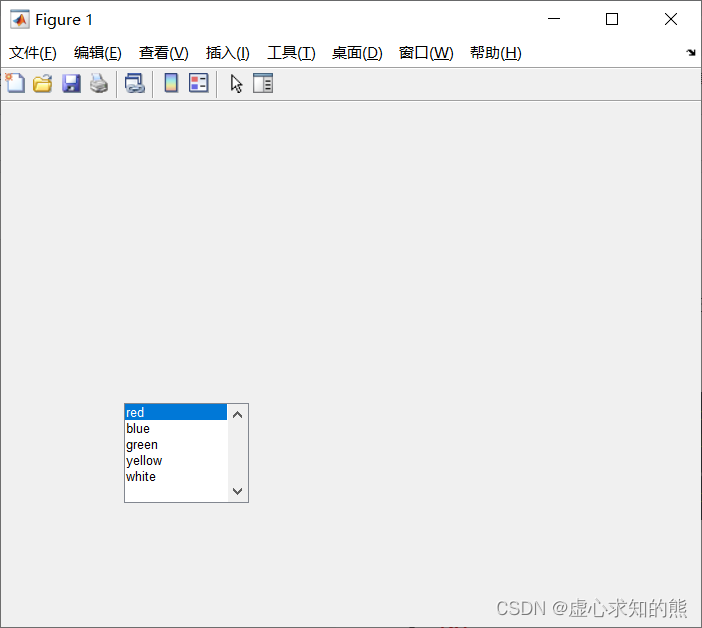
(5) List Box (List Box). The list box lists some options that can be selected. When there are too many options and the list box cannot fit, you can use the scroll bar at the right end of the list box to choose.
(6) Drop-down list box (Popup Menu). The drop-down list box usually only displays the current option, click the down arrow at the right end to pop up a list box, listing all the options. It works like a list box.
(7) Edit Box (Edit Box). Edit boxes are available for users to enter data. A default input value can be provided in the edit box, which can then be modified by the user.
(8) Slider (Slider). The slider bar can be used to input a quantity value within the specified range graphically. The user can move the cursor in the middle of the slider to change its corresponding parameter.
(9) Static Text. Static text is the explanatory text displayed in the dialog box, which is generally used to give the user necessary prompts. Because the user cannot change the text description while the program is running, it is called static text.
(10) Frame. The border is mainly used to decorate the user interface and make the user interface more friendly. You can use a border to enclose an area in the graphics window, and organize certain control objects in this area.
2. Control operation
In MATLAB, to design a dialog box, you must first create a graphics window, and then prevent related user control objects in the graphics window.
2.1 Create a control object
MATLAB provides functions for creating control objects uicontrol, and the calling format is as follows:
句柄变量=uicontrol(图形窗口句柄,属性名1,属性值1,属性名2,属性值2,...)
Among them, various attribute names and their values determine the functions of the control, and we will introduce some commonly used attributes below.
2.2 Basic control properties of control objects
MATLAB's control objects use the same property types, but these properties have different meanings for different types of control objects.
Controls have public properties such as Children, Parent, Tag, Type, UserData, Visible, etc. In addition to public properties, there are some commonly used special properties.
(1) Position attribute: The value of this attribute is a vector composed of 4 elements, and its form is [x, y, w, h]. This vector defines the position and size of the control object on the screen, where x and y are the horizontal and vertical coordinates of the lower left corner of the control object relative to the graphics window, and w and h are the width and height of the control object respectively. Their units are determined by the Units property.
(2) Units attribute: The value of this attribute can be 'pixels' (pixels, the default value), 'normalized' (relative unit), 'inches' (inches), 'centimeters' (centimeters) or 'points' ( pound).
Units other than normalized are absolute units of measure. All units are measured from the lower left corner of the graphics window. In relative units, the lower left corner of the graphics window corresponds to (0, 0), and the upper right corner corresponds to (1.0, 1.0). This attribute will affect all attribute items that define the size, such as the previous Position attribute.
(3) CallBack attribute: the value of this attribute is a string, which can be a script file name or a group of MATLAB commands, allowing the user to establish a response command after the control object is selected.
(4) String attribute: The value of this attribute is a string. It defines the description text of the control object, such as the description text on the button and the description text behind the radio button or check button, etc.
(5) Style attribute: The value of this attribute can be 'push' (button, default value), 'toggle' (double button), 'radio' (radio button), 'check' (check box), 'list' (list box), 'popup' (popup box), 'edit' (edit box), 'text' (static text), 'slider' (slider bar), and 'frame' (border), to define The type of control object.
(6) BackgroundColor attribute: the value of this attribute is a character representing a certain color or an RGB triplet, which defines the background color of the control object area, and the default is light gray.
(7) ForegroundColor attribute: the value of this attribute is the same as that of the BackgroundColor attribute. The ForegroundColor property defines the color of the description text of the control object, and the default is black.
(8) Max attribute and Min attribute: the values of this attribute are all numerical values, and the default values are 1 and 0 respectively. These two attribute values have different meanings for different control object types.
When the radio button is activated, its Value property is the value defined by the Max property. When the radio button is inactive, its Value property is the value defined by the Min property.
When the check box is activated, its Value property is the value defined by the Max property. When the check box is inactive, its Value property is the value defined by the Min property.
For slider objects, the Max property value must be greater than the Min property value, Max defines the maximum value of the slider, and Min defines the minimum value of the slider.
For an edit box, if Max-Min>1, then the corresponding edit box accepts multi-line character input; if Max-Min≤1, then the edit box only accepts single-line character input.
For a list box, if Max-Min>1, multiple selections are allowed in the list box; if Max-Min≤1, only single selection is allowed in the list box.
Also, control objects such as borders, popovers, and static text do not use the Max and Min properties.
(9) Value attribute: The value of this attribute can be a vector value or a numeric value. Its meaning depends on the type of control object.
For radio buttons and check boxes, when they are activated, the Value property value is defined by the Max property value, otherwise defined by the Min property.
For the popup box, the value of the Value attribute is the serial number of the option, so the option of the popup box can be known from the value of Value.
For list boxes, the Value property defines the sequence number of the highlighted option in the list box.
For slider objects, the Value property value is between the Min and Max property values, defined by the value corresponding to the position of the slider's scale.
Other control objects do not use this property value.
(10) FontAngle attribute: The value of this attribute is 'normalized' (default value), 'italic' and 'oblique'. This property value defines the font for control object titles etc. When its value is 'normalized', the system default regular font is selected, and when its value is 'italic' or 'oblique', a square italic font is used.
(11) FontName attribute: The value of this attribute is the name of the font used in the title of the control object, etc., and must be a variety of fonts supported by the system. The default font is the default font of the system.
(12) FontSize attribute: The value of this attribute is a numerical value, which defines the font size of the control object title, etc. The font size units are defined by the value of the FontUnits property. The default is system dependent.
(13) FontUnits attribute: The value of this attribute is 'points' (pound, default value), 'normalized' (relative unit), 'inches' (inches), 'centimeters' (centimeters) or 'pixels' (pixels) , which defines the font size unit. Relative units interpret the FontSize property value as a percentage of the icon height of the control object, and other units are absolute units.
(14) FontWeight attribute: The value of this attribute is 'nomal' (default value), 'light', 'demi' or 'bold', which defines the thickness of characters.
(15) HorizontalAlignment attribute: The value of this attribute is 'left', 'center' (default value) or 'right'. It is used to determine the alignment of the description text of the control object in the horizontal direction, that is, the description text is aligned to the left (left), center (center), and right (right) on the icon of the control object.
2.3 Example of creating a control object
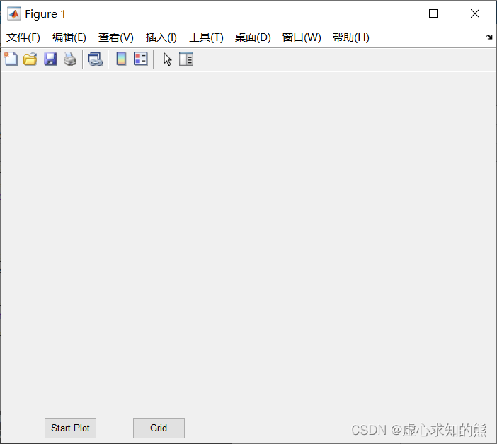
(1) Create buttons and double buttons.
The interface includes a button and a double button. When the button is clicked, a sine curve is drawn, and the double button is used to control whether to add grid lines to the coordinates.
The Style attribute value push indicates that the control object is a button, toggle indicates that the control object is a double button, Position indicates the position and size of the established button object in the current graphics window, the String attribute value is the explanatory text on the object, and CallBack The properties define what should happen when the user clicks the button object.
After the program runs, the interface is shown in the figure below.
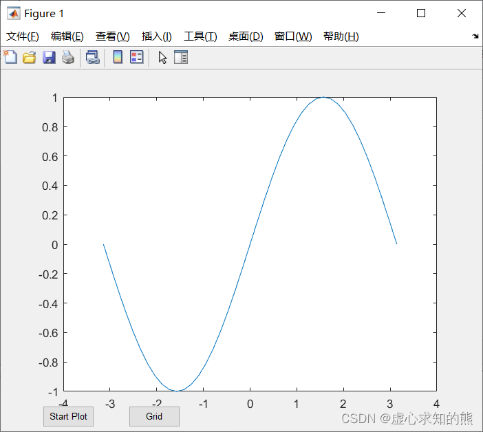
At this point, we click the Start Plot button, and the running results are shown in the figure below.
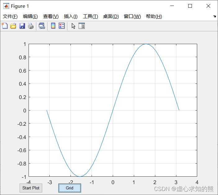
Then, we click the Grid button to generate grid lines, and the program running results are shown in the figure below.
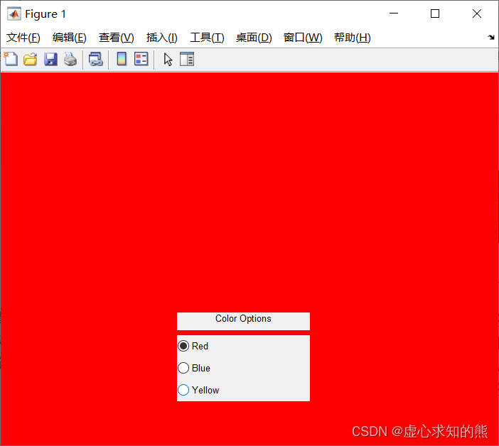
(2) Create radio buttons.
The radio buttons in the interface are used to set the color of the graphics window, and only one color can be selected.
The result of the CallBack execution ensures that only one radio button is on.
Because the Value property of the radio button is defined in this way: if the state of the radio button is on, then the value of the property Value is the property value of another property Max of the radio button, and the default value of the property value is 1; if the state is off, then the value of the attribute Value is the attribute value of another attribute Min of the radio button, and its default value is 0. In this way, by setting different values for the property Value, you can get different states of the radio button. The program running result is shown in the figure below.
When we choose a different color, the background color will change accordingly.
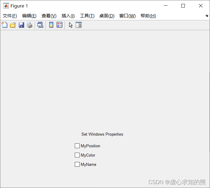
(3) Create a check box.
The check boxes in the interface are used to set certain properties of the graphics window, such as size, color, title, etc.
The procedure is as follows:
htxt=uicontrol(gcf,'Style','text','Position',[200,125,150,25],...'String','Set Windows Properties');
hp=uicontrol(gcf,'Style','checkbox','Position',...[200,100,150,25],'String','MyPosition',...'Callback',['set(gcf,''Position'',[10,10,300,250]);'...'if get (hp,''Value'')==1,'...'set(gcf,''Position'',[10,10, 600,500]),','end']);
hc=uicontrol(gcf,'Style','check','Position',...[200,75,150,25],'String','MyColor',...'CallBack',['set(gcf,''color'',''w'');',...'if get(hc,''Value'')==1,','set (gcf,''color'',''g''),','end']);
hn=uicontrol(gcf,'Style','check','Position',...[200,50,150,25],'String','MyName',...'CallBack',['set(gcf,''Name'',''复选框未选中'');',...'if get(hn,''Value'')==1,',...'set(gcf,''Name'',''复选框被选中''),','end']);
The program running result is shown in the figure below.
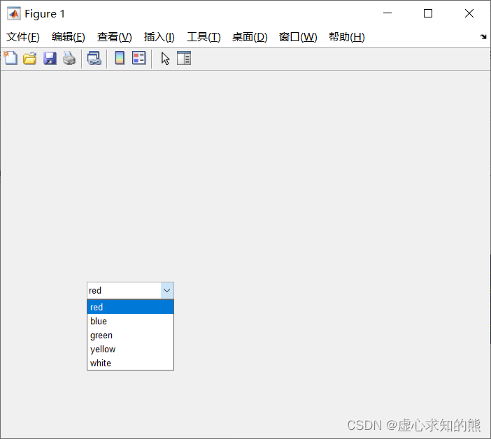
(4) Create a drop-down list box.
The interface contains a set of colors to choose from in the drop-down list. When a color is selected, the background color of the graphics window is set to that color.
The options of the drop-down list box are set in the String property, and each item is separated by a vertical bar character "|", and all options are enclosed in single quotation marks. The value of the Value property is the ordinal number of the option in the drop-down list. For example, if the user selects item 2 in the list, the value of the Value property is 2.
The program running result is shown in the figure below.
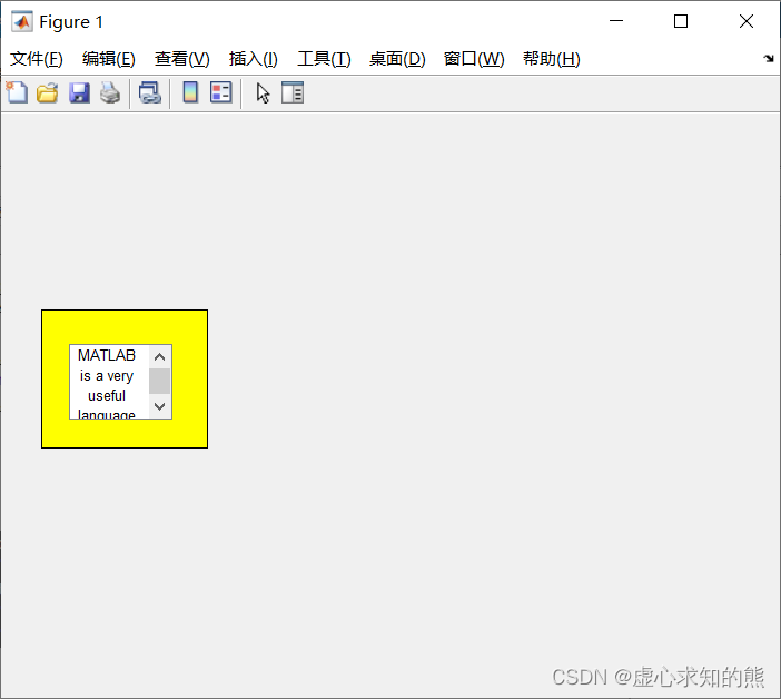
(6) Create edit boxes and borders.
When the control objects need to be organized with borders, the border objects must be created before defining the control objects, or the border objects must cover all the control objects in the group. To allow for the border of the frame, the frame object occupies an area at least larger than the area occupied by all control objects in the group.
The edit box is divided into multi-line edit box and single-line edit box. When the difference between the attribute Max and the attribute Min is less than or equal to 1, it is a single-line edit box, otherwise it is a multi-line edit box.
The procedure is as follows:
ftdir=uicontrol(gcf,'Style','frame',...'back','y','Position',[30,180,120,100]);
edmulti=uicontrol(gcf,'Style','edit',...'String','MATLAB is a very useful language.',...'Position',[50,200,75,55],'Max',2,'back','w');
After the following operations, MATLAB performs the operation defined by the CallBack property of the edit box object.
① Change the input value in the edit box, and move the mouse out of the edit box control object.
② For the single-line edit box, press the Enter key, no matter whether the value in the edit box is changed or not.
③ For single-line and multi-line edit box objects, hold down the Ctrl key and press the Enter key, no matter whether the value in the edit box is changed or not. In the multi-line edit box, press the Enter key to enter the next line of characters.
The program running result is shown in the figure below.
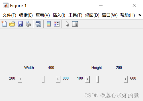
(7) Create a slider.
Create two sliders, which are used to set the width and height of the graphics window, and use static text to describe the object, marking the value range of the slider and its current value.