a brief introduction
1. A Simple Effect
The number on the page starts from 0 and increases by 1 at regular intervals. After reaching 10, the number has a zoom-in and zoom-out animation, as follows:

2. If you don't use styled-components, we can do this:
import React, {

     useEffect, useRef, useState } from 'react';
import styles from './index.module.scss'

const Test2 = () => {


  const [count, setCount] = useState(0)
  const numRef = useRef()

  useEffect(() => {


    const timer=setInterval(()=>{


      if(count<10){


        setCount(count=>count+1)
      }else{


        numRef.current.classList.add(styles.expand)
        clearInterval(timer)
      }
    },90)

    return () => {


      clearInterval(timer)
    }
  },[count]);

  return (
   <>
   <div ref={

    numRef} className={

    styles.num}>
    {

    count}
   </div>
   </>
  );

}

export default Test2;
index.module.scss:
.expand{


  animation: expandAnim 2s 0.5s linear 2;
}

.num{


  display: inline-block;
  padding: 2rem 1rem;
  font-size: 1.2rem;
}

@keyframes expandAnim{


  from {


    transform: scale(2);
  }
  to {


    transform: rscale(1);
  }
}
3. If you use styled-components, the code is as follows:
import React, {

     useEffect, useRef, useState } from 'react';
import styled from 'styled-components';
import styles from './index.module.scss'

const Expand = styled.div`
  display: inline-block;
  padding: 2rem 1rem;
  font-size: 1.2rem;
  &.expandCount{
    animation: expandAnim 2s 0.5s linear 2;
  }
  @keyframes expandAnim{
    from {
      transform: scale(2);
    }
    to {
      transform: rscale(1);
    }
  }
`;

const Test1 = () => {


  const [count, setCount] = useState(0)
  const numRef = useRef()

  useEffect(() => {


    const timer=setInterval(()=>{


      if(count<10){


        setCount(count=>count+1)
      }else{


        numRef.current.classList.add('expandCount')
        clearInterval(timer)
      }
    },90)

    return () => {


      clearInterval(timer)
    }
  },[count]);

  return (
   <>
   <Expand ref={

    numRef}>
    {

    count}
   </Expand>
   </>
  );

}

export default Test1;
Note that here &.expandCount{···}is actually a class defined on the parent element, if you want to use it in jsx, you can do this:
<Expand ref={

    numRef} className='expandCount'>
    {

    count}
</Expand>
In this way, the style is defined in the parent element, and then the style is introduced to make the style take effect when needed.
3. Questions
Since it can be achieved without styled-components, why use this library?
The key is that we can use variables in css through styled-components.
Next, let's look at the example of the big turntable.
two turntables
Let's take the big turntable as an example, different prizes correspond to different rotation angles. Considering that the big turntable is mainly on the app side, the width of the div here is set to 750px.
Generally speaking, the turntable is divided into four parts: the outer decorative circle, the disc, the prize information in the disc, and the pointer.
Step 1: Add the outer decoration and disc first
import React, {

     useEffect, useRef, useState } from 'react';
import styles from './index.module.scss'

const Test3 = () => {


  return (
   <>
    <div className={

    styles.turnable_wrap}>
        {

    /* 转盘外层的装饰层 */}
        <div className={

    styles.turnable_decorate}>
            {

    /* 圆盘里的部分 */}
            <div className={

    styles.turnable_circle}>

            </div>
        </div>


    </div>
   </>
  );

}

export default Test3;
index.module.scss:
.turnable_wrap{


  width:750px;
  height:750px;
  margin: 0 auto;
}

.turnable_decorate{


  background:url('./assets/decorate.png') center center no-repeat;
  background-size: contain;
  width:720px;
  height:720px;
  position:relative;
}

.turnable_circle{


  width:496px;
  height:496px;
  // border: 3px solid #EC833E;
  border: 3px solid #fff;
  border-radius: 50%;
  position:absolute;
  left:50%;
  top:50%;
  margin-top:3px;
  -webkit-transform: translate(-50%, -50%);
  transform: translate(-50%, -50%);
}
The effect is as shown in the figure below: 
Here, in order to highlight the effect of the disc, the border of the disc is first set to white.
Step 2: Divide the disk into 6 pieces
import React, {

     useEffect, useRef, useState } from 'react';
import styles from './index.module.scss'

const Test3 = () => {


    const prizes = [
        {


            name:'奖品1',
        },
        {


            name:'奖品2',
        },
        {


            name:'奖品3',
        },
        {


            name:'奖品4',
        },
        {


            name:'奖品5',
        },
        {


            name:'奖品6',
        },
    ]

    return (
    <>
        <div className={

    styles.turnable_wrap}>
            {

    /* 转盘外层的装饰层 */}
            <div className={

    styles.turnable_decorate}>
                {

    /* 圆盘里的部分 */}
                <div className={

    styles.turnable_circle}>
                    {


                    prizes.map((item,index)=>{


                       return <div key={

    index} className={

    styles.turnable_bg} style={

    {

    transform:`rotate(${

      (-30+60*index)}deg) skewY(-30deg)`}}></div>
                    })
                    }

                </div>
            </div>


        </div>
    </>
    );

}

export default Test3;
css part:
.turnable_wrap{


  width:750px;
  height:750px;
  margin: 0 auto;
}

.turnable_decorate{


  background:url('./assets/decorate.png') center center no-repeat;
  background-size: contain;
  width:720px;
  height:720px;
  position:relative;
}

.turnable_circle{


  width:496px;
  height:496px;
  // border: 3px solid #EC833E;
  border: 3px solid #fff;
  border-radius: 50%;
  position:absolute;
  left:50%;
  top:50%;
  margin-top:3px;
  -webkit-transform: translate(-50%, -50%);
  transform: translate(-50%, -50%);
  overflow: hidden;  //把turnable_bg中多出来的隐藏
}

.turnable_bg{


  width:248px;
  height:248px;
  position:absolute;
  left: 50%;
  margin: 0 auto;
  transform-origin:0 100%;   //重要
  border:3px solid #fff;
}
Let’s take a look at the effect first:

Here are a few points to note:
1. The initial positions of the six regions.
Each region is in a unified left:50%; top:0position, and then the rotation and tilt angles are set uniformly.
2. The rotation and tilt process of the six regions
Look at the picture: 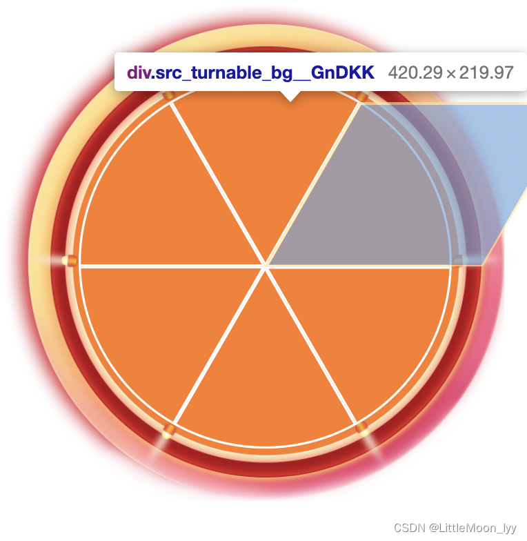
Each area is actually based on the lower left point as the base point of rotation , first rotated and then tilted by -30 degrees.
The first one is rotated -30 degrees first, the second one is rotated 30 degrees, and so on, you can get
style={

    {

    transform:`rotate(${

      (-30+60*index)}deg) skewY(-30deg)`}}`
Step 3: Set the prize content and pointer inside
import React, {

     useEffect, useRef, useState } from 'react';
import styles from './index.module.scss'

const Test3 = () => {


    const prizes = [
        {


            name:'奖品1',
        },
        {


            name:'奖品2',
        },
        {


            name:'奖品3',
        },
        {


            name:'奖品4',
        },
        {


            name:'奖品5',
        },
        {


            name:'奖品6',
        },
    ]

    return (
    <>
        <div className={

    styles.turnable_wrap}>
            {

    /* 转盘外层的装饰层 */}
            <div className={

    styles.turnable_decorate}>
                {

    /* 圆盘里的部分 */}
                <div className={

    styles.turnable_circle}>
                    {


                    prizes.map((item,index)=>{


                       return (
                           <div key={

    index}>
                                <div  className={

    styles.turnable_bg} style={

    {

    transform:`rotate(${

      (-30+60*index)}deg) skewY(-30deg)`}}>
                                </div>
                                <div className={

    styles.turnable_prize} style={

    {

    transform:`rotate(${

      -60+(index+1)*60}deg) translateX(-124px)`}}>
                                    <p>{

    item.name}</p>
                                    <img src={

    require('./assets/car.png')} alt=''/>
                                </div>
                           </div>
                       )
                    })
                    }
                    {

    /* 指针 */}
                    <div className={

    styles.turnable_pointer}>
                        <img src={

    require('./assets/pointer.png')} alt=''/>
                    </div>
                </div>
            </div>

        </div>
    </>
    );

}

export default Test3;
css part:
.turnable_wrap{


  width:750px;
  height:750px;
  margin: 0 auto;
}

.turnable_decorate{


  background:url('./assets/decorate.png') center center no-repeat;
  background-size: contain;
  width:720px;
  height:720px;
  position:relative;
}

.turnable_circle{


  width:496px;
  height:496px;
  // border: 3px solid #EC833E;
  border: 3px solid #fff;
  border-radius: 50%;
  position:absolute;
  left:50%;
  top:50%;
  margin-top:3px;
  -webkit-transform: translate(-50%, -50%);
  transform: translate(-50%, -50%);
  overflow: hidden;  //把turnable_bg中多出来的隐藏
}

.turnable_bg{


  width:248px;
  height:248px;
  position:absolute;
  left: 50%;
  margin: 0 auto;
  transform-origin:0 100%;   //重要
  border:3px solid #fff;
}

.turnable_prize{


  width:248px;
  height:248px;
  position:absolute;
  left: 50%;
  margin: 0 auto;
  transform-origin: left bottom;
  text-align: center;
}

.turnable_pointer{


  position:absolute;
  left: 50%;
  top:50%;
  -webkit-transform: translate(-50%, -50%);
  transform: translate(-50%, -50%);
  width:238px;
  height:238px;
}
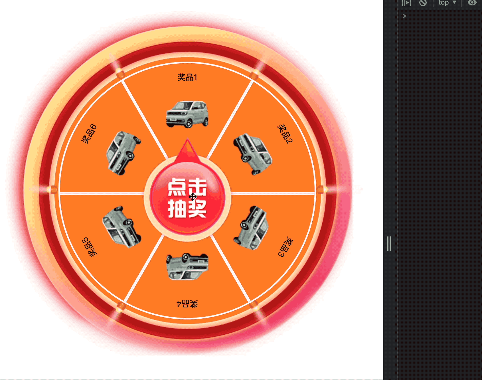
Effect:

Pay attention to the rotation of each prize here, see the picture:

still use the point in the lower left corner as the base point of rotation, first rotate and then translate half the side length along the x-axis.
The first is not rotated, the second is rotated 60 degrees, the third is rotated 120 degrees, and so on, resulting in
style={

    {

    transform:`rotate(${

      -60+(index+1)*60}deg) translateX(-124px)`}}
The next step is the pointer. Here we use a picture and fix it at the center.
Put the code on it together, and look at the final effect:

Step 4: Control the rotation angle of the large turntable
Let's take a look at the effect first:
import React, {

     useEffect, useRef, useState } from 'react';
import styles from './index.module.scss'
import styled, {

     keyframes } from 'styled-components'

// 这里的keyframes不能拿到props,失败的尝试
// const rotateProcess = keyframes`
//     0%{


//         transform: rotate(0deg);
//     }
//     100%{


//         transform: rotate(${props=>(props.num*60+1800)+'deg'});
//     }
// `;

const Rotate = styled.div`
  width:496px;
  height:496px;
  @keyframes rotateWheel {
    0%{
        transform: rotate(0deg);
    }
    100%{
        transform: rotate(${

      props=>(1800-props.num*60)+'deg'});
    }
  }
  &.rotateAnim{
    animation: rotateWheel 3s ease-out;
  }
  &.afterRotate {
    transform: rotate(${

      props=>-props.num*60+'deg'});
  }
`;


const Test3 = () => {


    const prizes = [
        {


            name:'奖品1',
        },
        {


            name:'奖品2',
        },
        {


            name:'奖品3',
        },
        {


            name:'奖品4',
        },
        {


            name:'奖品5',
        },
        {


            name:'奖品6',
        },
    ]

    const [prizeNum, setPrizeNum] = useState(3)
    const [isClicked, setIsClicked] = useState(false)

    const rotatePart = useRef()

    const rotateTurnable = () => {


        const randomNum = parseInt(Math.random() * 6)
        console.log('randomNum: '+ randomNum);
        // rotatePart.current.classList.add('rotateAnim')
        setPrizeNum(randomNum)
        setIsClicked(true)
        setTimeout(()=>{


            // rotatePart.current.classList.remove('rotateAnim')
            // rotatePart.current.classList.add('afterRotate')
            setIsClicked(false)
        },3000)
    }

    return (
    <>
        <div className={

    styles.turnable_wrap}>
            {

    /* 转盘外层的装饰层 */}
            <div className={

    styles.turnable_decorate}>
                {

    /* 圆盘里的部分 */}
                <div className={

    styles.turnable_circle}>
                    <Rotate num={

    prizeNum} ref={

    rotatePart} className={

    isClicked? 'rotateAnim': 'afterRotate'}>
                        {


                            prizes.map((item,index)=>{


                                return (
                                    <div key={

    index}>
                                            <div  className={

    styles.turnable_bg} style={

    {

    transform:`rotate(${

      (-30+60*index)}deg) skewY(-30deg)`}}>
                                            </div>
                                            <div className={

    styles.turnable_prize} style={

    {

    transform:`rotate(${

      -60+(index+1)*60}deg) translateX(-124px)`}}>
                                                <p>{

    item.name}</p>
                                                <img src={

    require('./assets/car.png')} alt=''/>
                                            </div>
                                    </div>
                                )
                            })
                        }
                    </Rotate>
                </div>
                {

    /* 指针 */}
                <div className={

    styles.turnable_pointer} onClick={

    rotateTurnable}>
                    <img src={

    require('./assets/pointer.png')} alt=''/>
                </div>
            </div>

        </div>
    </>
    );

}

export default Test3;
Here are a few points to note: 1. I wrap
the rotating area with a label, and the corresponding css needs to set width and height, and the rotation center point is center center 2. I originally planned to use the current.classList of useRef to manually add and delete styles. But here is a problem: if you add or subtract styles in the current of useRef, the entire page will not be refreshed. You must combine useEffect and useState, but this is more troublesome. So I added a new variable isClicked to control the change of the style. After doing this, the entire ref here can be omitted, and this code is reserved for recording the problem. In 3. , use prizeNum to specify the prize for each winning prize, and className is used to specify the style. There is a point to note here: I set the className to , and after the rotation, I plan to manually specify the style of the last big turntable, but in fact isClicked After it is false, the className is '', even if the style is manually specified, it will be cleared at the end, so we must pay attention here. 4. keyframes are provided in styled-components, and keyframes are directly used to specify animations in rotateProcess, but there is a problem that parameters cannot be added in it.<Rotate></Rotate>
<Rotate num={prizeNum} ref={rotatePart} className={isClicked? 'rotateAnim': 'afterRotate'}>className={isClicked? 'rotateAnim': ''}rotatePart.current.classList.add('afterRotate')
Final code:
import React, {

     useEffect, useRef, useState } from 'react';
import styles from './index.module.scss'
import styled from 'styled-components'

const Rotate = styled.div`
  width:496px;
  height:496px;
  @keyframes rotateWheel {
    0%{
        transform: rotate(0deg);
    }
    100%{
        transform: rotate(${

      props=>(1800-props.num*60)+'deg'});
    }
  }
  &.rotateAnim{
    animation: rotateWheel 3s ease-out;
  }
  &.afterRotate {
    transform: rotate(${

      props=>-props.num*60+'deg'});
  }
`;


const Test3 = () => {


    const prizes = [
        {


            name:'奖品1',
        },
        {


            name:'奖品2',
        },
        {


            name:'奖品3',
        },
        {


            name:'奖品4',
        },
        {


            name:'奖品5',
        },
        {


            name:'奖品6',
        },
    ]

    const [prizeNum, setPrizeNum] = useState(0)
    const [isClicked, setIsClicked] = useState(false)

    const rotateTurnable = () => {


        const randomNum = parseInt(Math.random() * 6)
        console.log('randomNum: '+ randomNum);
        setPrizeNum(randomNum)
        setIsClicked(true)
        setTimeout(()=>{


            setIsClicked(false)
        },3000)
    }

    return (
    <>
        <div className={

    styles.turnable_wrap}>
            {

    /* 转盘外层的装饰层 */}
            <div className={

    styles.turnable_decorate}>
                {

    /* 圆盘里的部分 */}
                <div className={

    styles.turnable_circle}>
                    <Rotate num={

    prizeNum} className={

    isClicked? 'rotateAnim': 'afterRotate'}>
                        {


                            prizes.map((item,index)=>{


                                return (
                                    <div key={

    index}>
                                            <div  className={

    styles.turnable_bg} style={

    {

    transform:`rotate(${

      (-30+60*index)}deg) skewY(-30deg)`}}>
                                            </div>
                                            <div className={

    styles.turnable_prize} style={

    {

    transform:`rotate(${

      -60+(index+1)*60}deg) translateX(-124px)`}}>
                                                <p>{

    item.name}</p>
                                                <img src={

    require('./assets/car.png')} alt=''/>
                                            </div>
                                    </div>
                                )
                            })
                        }
                    </Rotate>
                </div>
                {

    /* 指针 */}
                <div className={

    styles.turnable_pointer} onClick={

    rotateTurnable}>
                    <img src={

    require('./assets/pointer.png')} alt=''/>
                </div>
            </div>

        </div>
    </>
    );

}

export default Test3;