With experience in the development of macOS, iPadOS, watchOS, iOS and other systems, Apple also has an inherent advantage in the design of the XR operating system. Compared with other companies building the XR system interface from scratch, Apple can directly learn from the proven design aesthetics.
At the same time, judging from a series of developer tutorials published on WWDC 2023, the company also has deep thinking on the design of VST perspective mode UI. The background of this mixed reality form is based on the surrounding dynamic environment, rather than being set in a controllable virtual scene like VR, so the interface design needs to be reconsidered. In addition, coupled with the eyeball and gesture input functions of Vision Pro, the visual interaction experience of visionOS is quite unique, which may inspire other XR system designs.

Here are some features of visionOS UI:
- The interface design elements of visionOS maintain some iOS design styles, such as sidebars, tab options, search bars and other familiar elements;
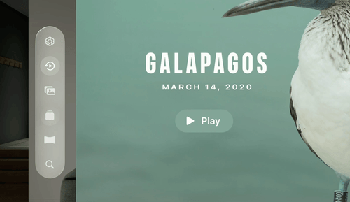
- The size of the menu interface (translucent window) can be adjusted according to the actual use, display content and space, which is more user-friendly than the fixed-size interface of other VR platforms. In addition, you can also open interfaces of different sizes at the same time to improve the efficiency of multitasking;
- The interface is positioned at the height of the user's line of sight and the center of the field of view by default (taking into account the user's actual height and posture);
- On the Quest platform, you can click the Oculus button on the handle to reset the menu position. Although the Vision Pro does not have an official handle, you can still redirect it by clicking the digital knob on the headset body;
- In order to help users accurately fix the AR window in a specific physical space, visionOS adopts subtle changes when the window moves. For example, the window is translucent when moving, allowing the user to recognize the environment behind the window. After fixing, the window becomes highly saturated again. degree image;
- In the AR viewing mode, the visionOS system will automatically reduce the transparency of the VST perspective, making the viewing experience more immersive and focused;
- visionOS attaches great importance to the integration of virtual and reality, such as rendering the light projected by the window on the surrounding environment and the shadow on the ground, which looks solid, like a screen placed in space. Or when displaying photos and other content, blur the edges of photos;
- Fully combine weak depth change information to highlight specific interface elements, such as placing interfaces that require user attention closer to the user, while other interfaces are later.
01. Interaction Design
In the visionOS spatial computing platform, you only need to look at a button, and then tap it with gestures to input. Vision Pro is equipped with a camera at the bottom of the headset, so you can track gestures without raising your arms. In addition, compared with the cursor projection control method used in the previous VR system, the gaze point can be more natural aiming options and quickly cooperate with micro-gestures.
Vision Pro is not equipped with a native handle, but there are still many options for input methods. The gaze point is the main aiming method. No matter how far the UI is from the user, it can effortlessly aim at any part according to the gaze point information. Then, you can use micro-gestures to confirm the selection, or directly interact with UI elements with your hands, in addition to voice input, or connect a Bluetooth keyboard, magic trackpad, or gamepad.
In order to ensure the accuracy of gaze point aiming, Apple not only optimized the sensor design of the Vision Pro headset, but also took many considerations in UI design, such as:
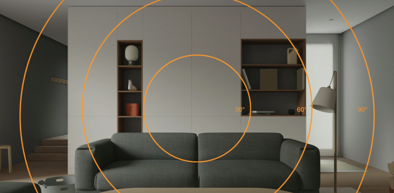
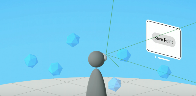
1) The main content of the application should be located in the center of the field of view: even though spatial computing has infinite room to play, the user can only see the picture within the field of view, and only the most central part of the field of view has the most comfortable viewing experience (30 degrees in the picture below within the range);
2) The secondary content or operating mechanism of the application can be placed on the edge of the field of view;
3) The application layout should also consider the comfort of the shoulder and neck;
4) The human eye can only focus on one depth at a time, and changing the focal length frequently will cause visual fatigue, so the interactive content should be kept at the same depth to ensure that users can switch UI without effort;
5) Subtle depth changes can be used to convey the hierarchy of the UI;
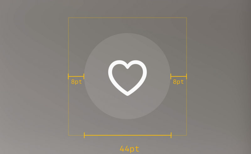
6) The minimum area suitable for gaze point selection should be at least 60pt in size. Developers can design icons and other elements (about 44pt in size) within this range, and ensure that the distance between the element and the edge of the selected area is wide enough to allow gaze point selection more accurate and faster;
7) The UI can be dynamically scaled (nearly small, far away). If the developer chooses to fix the UI ratio, then if the interface is placed in the distance, the vision will look smaller and it will be difficult to control with the eyes;
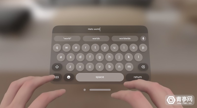
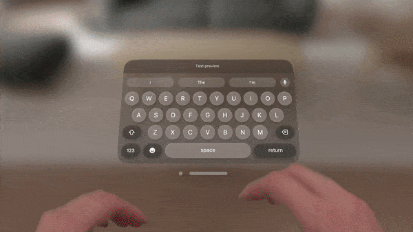
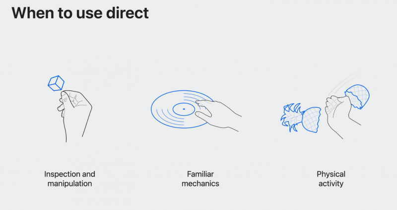
8) The original intention of the visionOS interactive system is to allow users to comfortably interact with the UI at a distance; it also supports direct input at close range, such as typing with fingers on a virtual keyboard;
9) Use hover highlighting/highlighting to represent the movement of the gaze point, in order to respond to the rapid movement of the human eye in a timely manner, this effect is more natural and subtle;
10) The gaze point hovers over a position for a long time, which represents the user's interest and intention;
11) If you stare at a location for a long time, the visionOS interface will display additional information and functions, such as tooltips, expand the tab bar, trigger voice search, etc. When the attention is diverted from the UI, the UI will restore a clean and simple interface;
12) In the Vision Pro head-mounted display, it can be operated with eyes and voice; long-term gaze can even replace gestures to confirm input, which means that the UI can be controlled only with eyes;
13) Eyeball + gesture positioning is the main interaction method of the visionOS system. It claims to provide accurate and user-friendly interaction, and realize some intelligent combined actions. For example, when zooming in and out of an image, it will first zoom in or out from the user's gaze point ; Or, you can also use the gaze point to control the drawing cursor to achieve a more efficient creative experience;
14) The gesture interaction design of the Vision Pro headset is close to the familiar touch screen operation of mobile phones. For example, the action of pinching fingers is equivalent to clicking on the screen of the mobile phone, while the gesture of dragging and pinching can browse the interface and zoom with both hands;
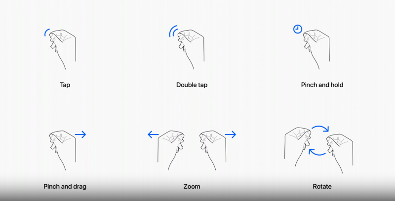
15) The logic of gesture interaction is similar to the logic of multi-touch gestures, so it is easy to use. Users can realize click, double-click, grab, drag and drop, zoom in, rotate and other operations through the kneading action of one hand or both hands;
16) In addition to system standard gestures, developers can also customize gestures;
17) The virtual keyboard uses a dynamic highlight effect to prompt the distance and guide the finger to aim at the key;
18) Since raising the arm for a long time is likely to cause fatigue, close-range touch gestures should be used appropriately and only used in the core gameplay of the experience; avoid repeated gestures that make the user feel tired, or use gestures that are easy to make mistakes;
19) On the spatial computing platform, software applications are no longer limited to windows, but can occupy the physical space where the user is located and respond to the user's body movements;
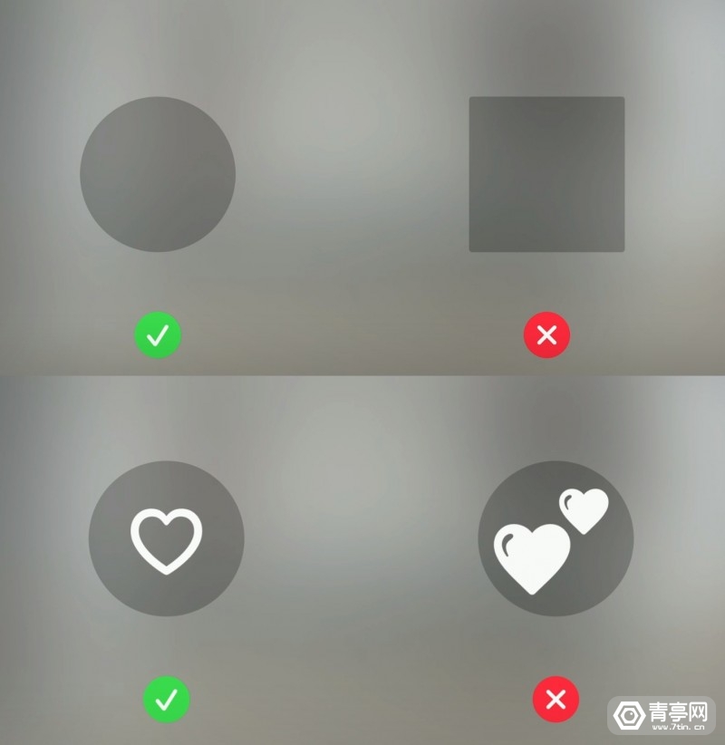
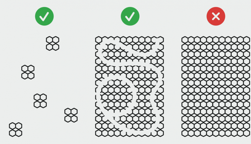
20) In order to ensure the accuracy of gaze point input, the visionOS interface mainly uses some graphics with rounded edges, because if squares and other sharp-edged shapes are used, the gaze point may go outside, thereby reducing the accuracy of recognition; in addition, graphics should avoid Use thick outlines to avoid drawing attention to the outside of the figure.
02. Spatial UI design
In order to help developers adapt to the spatial computing platform more quickly, Apple has built a familiar visual language, which is characterized by consistency with existing platforms such as iOS, and some elements have been optimized for the spatial platform.
◎ Foundation and Design Principles
1. App icon
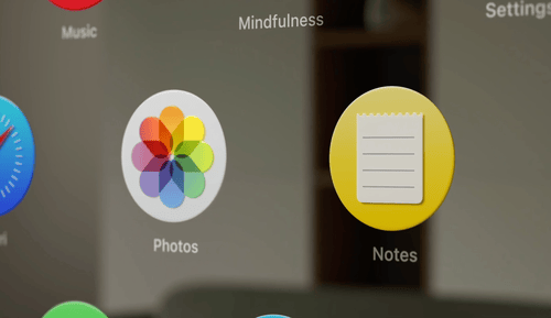
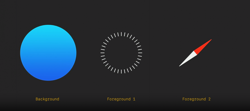
The app icon of visionOS adopts a style close to that of iOS. The biggest difference is that the shape has changed from a rounded rectangle to a circle. One of the reasons for this design change is to make the gaze point more accurate. In addition, the app logo of visionOS is three-dimensional, the raised surface can be seen from the side, and it can dynamically interact with the gaze point. When you stare at a logo, the logo will expand and show highlights and shadows to deepen the subtlety. visual hierarchy.
To put it simply, the app logo of visionOS is usually composed of 3 flat layers (1 background layer, 2 surface layers) in order to present depth, in order to present the binocular parallax effect. Additionally, a "glass layer" effect is superimposed to render depth, highlights and shadows.
2. Background material
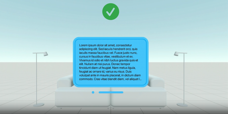
It is worth noting that the application logo of visionOS is not directly superimposed on the physical perspective background, but fixed on a translucent interface like frosted glass. Apple points out that the benefits of this design are a sense of lightness, a sense of physical space, and adaptability to a variety of different usage scenarios, such as small spaces, at night, or in bright daylight. In addition, the semi-transparent feature means that the physical space will not be completely blocked, but the effect of dynamic penetration of ambient light can be simulated.
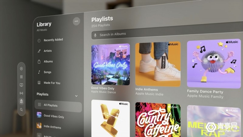
In order to allow users to perceive the environment well in the spatial experience, Apple does not recommend that developers use solid-color menu backgrounds.
3. Text typesetting
In order to improve the legibility of the text and the contrast with the background, the font of visionOS is bolded and emphasized on the basis of the iOS font. However, some small explanatory text is still difficult to read even when the window is enlarged, so it is recommended to increase the weight and boldness of the font as much as possible.
Notably, Apple has also introduced two new font styles for visionOS, featuring a wider edit-style layout.
4. Vibrancy mode
The principle is to highlight the light and color of the text (contrast with the background). When turned on, the text looks brighter and more readable. Considering that the window background of the visionOS menu changes appearance according to the surrounding environment, the vitality mode of the text will also adjust the brightness in real time to ensure that the text is clearly visible.
Not only that, but Vitality Mode has three brightness levels to reveal the hierarchy between different characters.
5. Color
Apple recommends that developers set the text color to the system default white, because Apple has calibrated the legibility of white text and can dynamically adapt to the tone and contrast of the background window.
6. Other suggestions:
- Considering the range of motion of the user's neck, most people are more accustomed to turning their heads left and right rather than up and down, so the UI interface should not be placed too high or too low. It is best to choose a horizontal layout instead of a vertical layout for a large-scale interface ;
- The hover effect is a visual focus feedback, which can well confirm the position of the user's gaze point and let the user know which elements can be interacted with;
- Apple requires careful UI design, as well as the shape of the corners of interactive elements. The corners of the upper and lower layers need to be part of concentric circles to ensure that the UI looks uniform;
- All system components of visionOS support different input methods, including eyeballs, gestures, Bluetooth keyboards/touchpads, and more.
03. Visual experience design
Compared with the 2D interface, the spatial computing platform has more unique gameplay, such as depth and 360° field of view. In addition, developers need to consider the limitations of the human body, otherwise it may affect the XR application experience. In other words, design decisions for XR content have a significant impact on users' visual comfort.
◎ Visual depth cues
XR content needs to provide the correct visual depth cues (matching what the human eye actually focuses on). How to do it? Use color, blur, relative size, soft motion, background, light and shadow, occlusion, texture density and other signals to visually imply the position and depth of the target. For example, in a sparse scene, if a lemon slice is displayed in green, the human brain will automatically match the lemon in real life, and analyze the depth of the lemon based on its visual size.
It is worth noting that developers should avoid misleading visual cues such as repeating patterns, otherwise if the left and right eyes focus on different objects, the perceived focal length may not match the actual focal length of the object, resulting in ghosting.
◎ Application scenario optimization
For different application scenarios, the visual parameters of XR content need to be optimized to improve visual comfort and reduce eye pressure. For example, in applications such as XR reading that require long-term gaze, it is best to place the e-book at a distance of one arm. At the same time, give users the ability to adjust the depth/distance of the interface. In contrast, ephemeral visual effects or directly interactive content (supporting direct gesture input) can be displayed close to the human eye.
In addition, high contrast should be used when displaying text, and for virtual signals that divert attention, it can be set to lower contrast, transparency, or add blur effects. When the XR interface switches from dark to bright colors, also make sure to slow down the switching process to allow the human eye to comfortably adapt to the transition.

The position of the image in space is also particular. For example, the human eye is most comfortable looking down, left, and right, while looking up and diagonally scanning requires more eye movements. Developers should consider these when designing XR applications features to enhance the visual experience. If the XR content requires extreme eye movement, it is recommended to design it as a short interaction, or try to prevent it from being in the center of the field of view to reduce eye movement.
In order for human eyes to have pauses, developers should incorporate natural pauses into XR interactive experiences.
When reading text, you can enlarge the text, adjust the size and depth of the window to enhance the visual clarity of the text, and prevent users from turning their heads frequently to read.
04. Motion-aware design
Being prone to dizziness is what many people think of XR. Due to the characteristics and limitations of the human sensory system, moving in XR content may affect the comfort of the experience. Apple pointed out that the human visual system is responsible for receiving light and sensing the dynamic content around it, including the movement of the person itself. At the same time, the vestibular system in the inner ear also perceives human movements.
Under normal circumstances, the visual information and the motion perceived by the vestibular system are always consistent, but when the visual motion information is missing or conflicts with the vestibular information, people will feel uncomfortable, causing dizziness or nausea.
In the XR scene, the human body is usually fixed in one position, but visually, the body moves around in the virtual control, which obviously causes conflicts in motion perception. To this end, Apple hopes to optimize user comfort by carefully designing content to make the brain think that the XR scene is relatively static. For example, setting moving objects in XR to be translucent and ensuring that the VST scene is clearly visible ensures that the human brain recognizes the static state of the body.
Apple recommends that developers try not to let the UI interface follow the movement of the user's head. If it is necessary to design in this way, try to reduce the size of the interface and place it at a far distance, or use a delayed follow method to slowly follow the movement of the user's head.
The motion design in the UI interface also needs to be paid attention to. For example, the horizon in the window should be aligned with the horizon of the real scene, and the center direction of content movement should be within the field of view of the human eye, and fast turning or pure rotation movement can be avoided (you can use fast fade out to render instantaneous steering).

At the same time, in order to optimize visual comfort, XR sports elements should avoid using large-scale objects, and use low-brightness contrast solid-color textures to reduce the human eye's recognition of sports.
In short, the developer course explained the design logic of visionOS very well, from which we can see Apple's design ideas for AR and VR. It can be said that Apple has integrated most of the first-party applications and services into visionOS.
I believe that more developers are also looking forward to the visionOS SDK that will be launched at the end of the month. Whether they are trying to migrate iOS applications or develop for visionOS, developers will be able to conduct a more complete exploration by then. After all, it is more convincing to try it yourself.
Reference: Apple