Compose provides us with a Material Design-style homepage component ( Scaffold), which we can directly apply to complete the homepage interface of an APP
Since Scaffold also contains other components, explain Scaffold first to explain some front components
TopAppBar
First of all, it is TopAppBar, which is essentially the common Toolbar native to Android, but it is well packaged and can be built quickly. The following is its parameter list
TopAppBar(
    title: @Composable () -> Unit,
    modifier: Modifier = Modifier,
    navigationIcon: @Composable (() -> Unit)? = null,
    actions: @Composable RowScope.() -> Unit = {},
    backgroundColor: Color = MaterialTheme.colors.primarySurface,
    contentColor: Color = contentColorFor(backgroundColor),
    elevation: Dp = AppBarDefaults.TopAppBarElevation
)
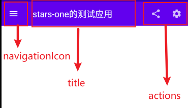
titleTitle, receive Compose component, you can pass a Text text into itmodifiermodifier, see the previous chapter for detailsnavigationIconnavigation iconactionsaction componentbackgroundColorbackground colorcontentColorcontent colorelevationshadow
It may be so clear, let's directly upload the code and renderings, and everyone will be clear
TopAppBar(
    navigationIcon = {
        IconButton(
            onClick = {}
        ) {
            Icon(Icons.Filled.Menu, null)
        }
    },
    title = {
        Text("stars-one的测试应用")
    },actions = {
        IconButton(
            onClick = {}
        ) {
            Icon(Icons.Filled.Share, null)
        }
        IconButton(
            onClick = {}
        ) {
            Icon(Icons.Filled.Settings, null)
        }
    }
)
The renderings are as follows
FloatingActionButton
The more common floating buttons are generally a simple button inside, and the parameters are the same as the previous Button
FloatingActionButton(
    onClick: () -> Unit,
    modifier: Modifier = Modifier,
    interactionSource: MutableInteractionSource = remember { MutableInteractionSource() },
    shape: Shape = MaterialTheme.shapes.small.copy(CornerSize(percent = 50)),
    backgroundColor: Color = MaterialTheme.colors.secondary,
    contentColor: Color = contentColorFor(backgroundColor),
    elevation: FloatingActionButtonElevation = FloatingActionButtonDefaults.elevation(),
    content: @Composable () -> Unit
)
use:
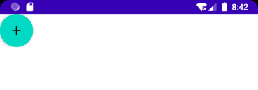
FloatingActionButton(onClick = { /*TODO*/ }) {
    Icon(imageVector = Icons.Default.Add, contentDescription = null)
}
PS: Generally, this is
Scaffoldused in conjunction with Scaffold to control the position of FloatingActionButton
In addition, there is another one ExtendedFloatingActionButton, which can have icons and text, as shown below
ExtendedFloatingActionButton(
    icon = { Icon(Icons.Filled.Favorite, contentDescription = null) },
    text = { Text("ADD TO BASKET") },
    onClick = { /*do something*/ }
)
ExtendedFloatingActionButtonThe FloatingActionButtondifference is that ExtendedFloatingActionButtonit is mainly text, the icon is optional, and FloatingActionButtononly the icon is displayed
BottomAppBar
This is different from the previous TopAppBar parameter. From the name, we know that it is actually a Toolbar placed at the bottom, but it does not have a position control , and it must be used in conjunction with Scaffold. If it is used alone, the effect will be the same as that of TopAppBar. at the top of the page
BottomAppBar(
    modifier: Modifier = Modifier,
    backgroundColor: Color = MaterialTheme.colors.primarySurface,
    contentColor: Color = contentColorFor(backgroundColor),
    cutoutShape: Shape? = null,
    elevation: Dp = AppBarDefaults.BottomAppBarElevation,
    contentPadding: PaddingValues = AppBarDefaults.ContentPadding,
    content: @Composable RowScope.() -> Unit
)
You can think of this layout as a Row layout. The parameters in it can be seen from the name, setting the background color or setting the padding margin, so I won’t go into details here
The only thing worth noting is cutoutShapethe attribute. If there are sums in Scaffoldthe middle, the following effects can be achievedBottomAppBarFloatingActionButton
BottomNavigation
BottomNavigationThere will be N in it BottomNavigationItem, it depends on how many menu items you are going to define
BottomNavigation(
    modifier: Modifier = Modifier,
    backgroundColor: Color = MaterialTheme.colors.primarySurface,
    contentColor: Color = contentColorFor(backgroundColor),
    elevation: Dp = BottomNavigationDefaults.Elevation,
    content: @Composable RowScope.() -> Unit
)
BottomNavigationSome of the parameters provided are to change the color or shadow, the focus is onBottomNavigationItem
BottomNavigationItem(
    selected: Boolean,
    onClick: () -> Unit,
    icon: @Composable () -> Unit,
    modifier: Modifier = Modifier,
    enabled: Boolean = true,
    label: @Composable (() -> Unit)? = null,
    alwaysShowLabel: Boolean = true,
    interactionSource: MutableInteractionSource = remember { MutableInteractionSource() },
    selectedContentColor: Color = LocalContentColor.current,
    unselectedContentColor: Color = selectedContentColor.copy(alpha = ContentAlpha.medium)
)
BottomNavigationItemThere is a selectedparameter indicating whether to select
iconIt is the setting of the icon, labeland it is the text, both of which need to receive a component
selectedContentColorselected colorunselectedContentColorunchecked color
Here's an example directly to explain
var selectIndex by remember {
    mutableStateOf(0)
}
val navList = listOf("首页","发现","我的")
BottomNavigation() {
    navList.forEachIndexed { index, str ->
        BottomNavigationItem(
            selected = index == selectIndex, onClick = { selectIndex = index },
            icon = {
                Icon(imageVector = Icons.Default.Favorite, contentDescription =null )
            },label = {Text(str)}
        )
    }
}

Text(text = "这是${navList[selectIndex]}")
The effect is as follows

PS: If appbar or bootomBar is used, the content in the content will be blocked. At this time, it is necessary to
PaddingValueset the inner margin, such as
Scaffold(){
     Surface(modifier = Modifier.padding(bottom = it.calculateBottomPadding())) {

     }
}
Scaffold
Scaffold(
    modifier: Modifier = Modifier,
    scaffoldState: ScaffoldState = rememberScaffoldState(),
    topBar: @Composable () -> Unit = {},
    bottomBar: @Composable () -> Unit = {},
    snackbarHost: @Composable (SnackbarHostState) -> Unit = { SnackbarHost(it) },
    floatingActionButton: @Composable () -> Unit = {},
    floatingActionButtonPosition: FabPosition = FabPosition.End,
    isFloatingActionButtonDocked: Boolean = false,
    drawerContent: @Composable (ColumnScope.() -> Unit)? = null,
    drawerGesturesEnabled: Boolean = true,
    drawerShape: Shape = MaterialTheme.shapes.large,
    drawerElevation: Dp = DrawerDefaults.Elevation,
    drawerBackgroundColor: Color = MaterialTheme.colors.surface,
    drawerContentColor: Color = contentColorFor(drawerBackgroundColor),
    drawerScrimColor: Color = DrawerDefaults.scrimColor,
    backgroundColor: Color = MaterialTheme.colors.background,
    contentColor: Color = contentColorFor(backgroundColor),
    content: @Composable (PaddingValues) -> Unit
)
property description
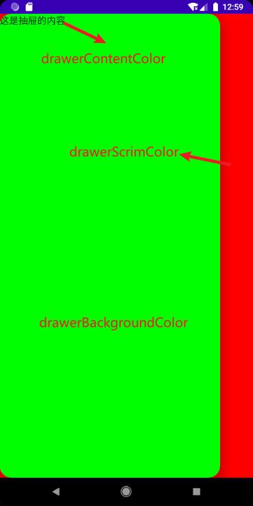
topBartop layoutbottomBarbottom layoutfloatingActionButtonFloating button layoutfloatingActionButtonPositionFloating button position, yesFabPosition.End(default) andFabPosition.CenteroptionalisFloatingActionButtonDockedUsed in conjunction with BottomAppBar, the cropping effect of the bottom navigation bar can be realized. The effect can be seen in the figure belowdrawerGesturesEnabledWhether to enable the side drawer gesture (the drawer can be opened by sliding sideways after opening)drawerShapethe shape of the drawerdrawerContentThe content of the side drawer is a Column layout, which can be arranged by yourselfdrawerElevationside drawer shadowdrawerBackgroundColorThe background color of the side drawerdrawerContentColorThe color of the side drawer content (it seems to override the font color)drawerScrimColorSide drawers cover bottom color
basic use
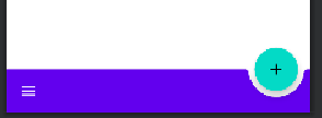
Use 5 attributes topBar bottomBar floatingActionButton floatingActionButtonPosition isFloatingActionButtonDockedto achieve a simple architecture effect
Scaffold(
    topBar = {
        TopAppBar(
            navigationIcon = {
                IconButton(
                    onClick = {}
                ) {
                    Icon(Icons.Filled.Menu, null)
                }
            },
            title = {
                Text("stars-one的测试应用")
            },actions = {
                IconButton(
                    onClick = {}
                ) {
                    Icon(Icons.Filled.Share, null)
                }
                IconButton(
                    onClick = {}
                ) {
                    Icon(Icons.Filled.Settings, null)
                }
            }
        )
    },
    floatingActionButton = {
        FloatingActionButton(onClick = { /*TODO*/ }) {
            Icon(imageVector = Icons.Default.Favorite, contentDescription = null)
        }
    },
    bottomBar = {

        BottomAppBar(cutoutShape = CircleShape) {

        }
    },
    //注意此参数,可以实现图中那种被裁剪的效果,前提是上面的cutoutShape也有设置
    isFloatingActionButtonDocked = true,
    floatingActionButtonPosition = FabPosition.End

) {
    //这里是主界面
    Text("我是要展示的内容")
}
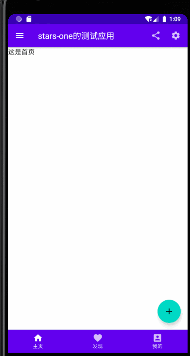
Results as shown below

bottom navigation bar
We can change the above basis (mainly the bottomAppBar parameter), the code is as follows
//当前选择的NavItem
var selectIndex by remember { mutableStateOf(0) }
val navTextList = listOf("主页", "发现", "我的")
//图标
val iconList = listOf(Icons.Default.Home,Icons.Default.Favorite,Icons.Default.AccountBox)
Scaffold(
    topBar = {
        TopAppBar(
            navigationIcon = {
                IconButton(
                    onClick = {}
                ) {
                    Icon(Icons.Filled.Menu, null)
                }
            },
            title = {
                Text("stars-one的测试应用")
            },actions = {
                IconButton(
                    onClick = {}
                ) {
                    Icon(Icons.Filled.Share, null)
                }
                IconButton(
                    onClick = {}
                ) {
                    Icon(Icons.Filled.Settings, null)
                }
            }
        )
    },
    floatingActionButton = {
        FloatingActionButton(onClick = { /*TODO*/ }) {
            Icon(imageVector = Icons.Default.Add, contentDescription = null)
        }
    },
    bottomBar = {

        BottomNavigation() {
            navTextList.forEachIndexed { index, str ->
                BottomNavigationItem(label = {Text(str)},selected = index==selectIndex , onClick = {selectIndex = index },icon = {
                    Icon(imageVector = iconList[index], contentDescription = null)
                })
            }
        }
    },
    //注意此参数,可以实现图中那种被裁剪的效果,前提是上面的cutoutShape也有设置
    floatingActionButtonPosition = FabPosition.End

) {
    //这里是主界面
    //根据底部导航选中的下标改变展示的页面
    when(selectIndex){
        0 -> Text("这是首页")
        1 -> Text("这是发现")
        2 -> Text("这是我的")
    }

}
Results as shown below

with side drawers
It should be noted here that popping up the side drawer is a suspend operation (suspend) , so you need to use the coroutine in Kotlin, but it is not too deep, we just know how to use it first, and I will add the coroutine later when I have time usage of
This is mainly to test the parameters starting with drawer, and click the menu button in the upper left corner to pop up the side drawer function (that is, the corresponding click event)
//状态
val scaffoldState = rememberScaffoldState()
//协程的作用域
val scope = rememberCoroutineScope()
//当前选择的NavItem
var selectIndex by remember { mutableStateOf(0) }
val navTextList = listOf("主页", "发现", "我的")
//图标
val iconList =
    listOf(Icons.Default.Home, Icons.Default.Favorite, Icons.Default.AccountBox)
Scaffold(
    scaffoldState = scaffoldState,
    topBar = {
        TopAppBar(
            navigationIcon = {
                IconButton(
                    onClick = {
                        //使用协程
                        scope.launch {
                            //改变状态,显示drawer抽屉
                            scaffoldState.drawerState.open()
                        }
                    }
                ) {
                    Icon(Icons.Filled.Menu, null)
                }
            },
            title = {
                Text("stars-one的测试应用")
            }, actions = {
                IconButton(
                    onClick = {}
                ) {
                    Icon(Icons.Filled.Share, null)
                }
                IconButton(
                    onClick = {}
                ) {
                    Icon(Icons.Filled.Settings, null)
                }
            }
        )
    },
    floatingActionButton = {
        FloatingActionButton(onClick = { /*TODO*/ }) {
            Icon(imageVector = Icons.Default.Add, contentDescription = null)
        }
    },
    bottomBar = {

        BottomNavigation() {
            navTextList.forEachIndexed { index, str ->
                BottomNavigationItem(
                    label = { Text(str) },
                    selected = index == selectIndex,
                    onClick = { selectIndex = index },
                    icon = {
                        Icon(
                            imageVector = iconList[index],
                            contentDescription = null
                        )
                    })
            }
        }
    },
    //注意此参数,可以实现图中那种被裁剪的效果,前提是上面的cutoutShape也有设置
    floatingActionButtonPosition = FabPosition.End,
    drawerContent = {
        Text("这是抽屉的内容")
    },

    drawerContentColor = Color.Black,
    drawerBackgroundColor = Color.Green,
    drawerGesturesEnabled = true,
    drawerScrimColor = Color.Red,
    drawerShape = RoundedCornerShape(20.dp)

) {
    //这里是主界面
    //根据底部导航选中的下标改变展示的页面
    when (selectIndex) {
        0 -> Text("这是首页")
        1 -> Text("这是发现")
        2 -> Text("这是我的")
    }

}