written in front
[How to draw this picture] The series of pictures are all from VIP群the students' questions. The tweet is only a reproduction of the picture, and does not mean that the author agrees with the form of the picture. Students are welcome to analyze interesting pictures in the group.
Pictures of this issue
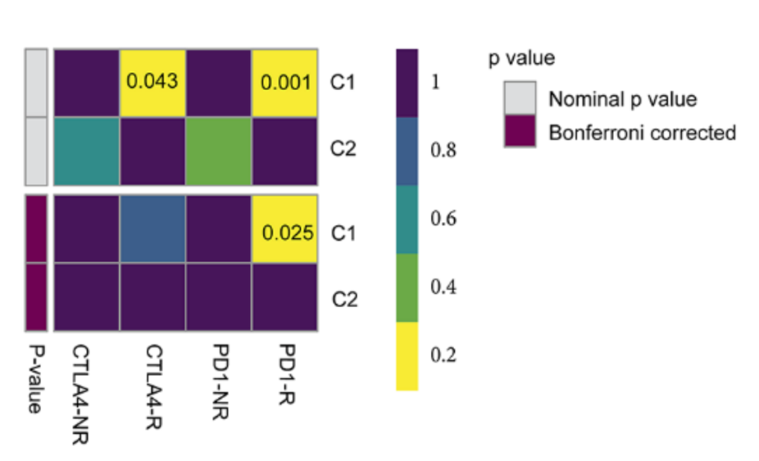
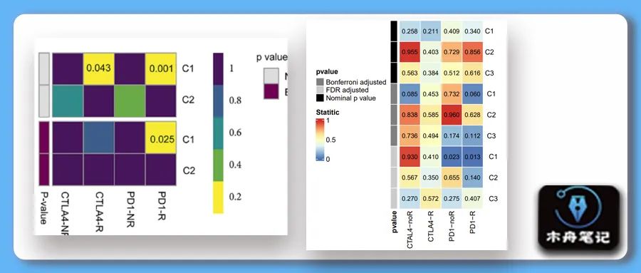
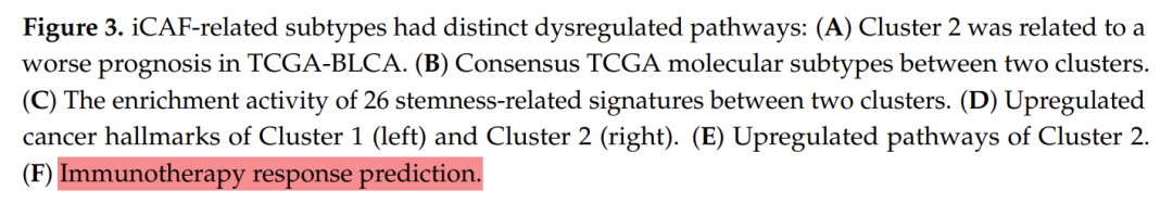
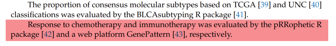
❝Chen, Hualin et al. “Integrated Analysis Revealed an Inflammatory Cancer-Associated Fibroblast-Based Subtypes with Promising Implications in Predicting the Prognosis and Immunotherapeutic Response of Bladder Cancer Patients.” International journal of molecular sciences vol. 23,24 15970. 15 Dec. 2022
❞
method
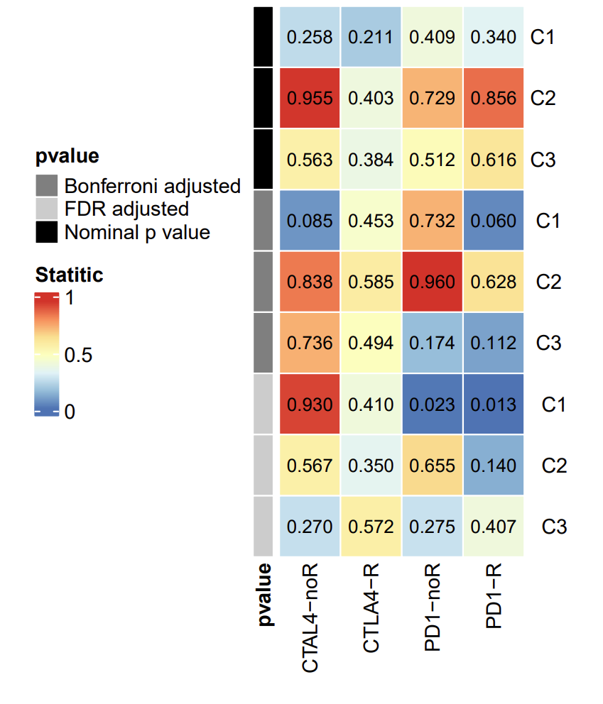
The picture shows the prediction results of different subtypes for response to immunotherapy. The data processing in the early stage is cumbersome, so here we start directly from the drawing.
Reproduce results
Sample data and code collection
点赞, 在看This article, share it in the circle of friends 集赞30个and 保留30分钟send the screenshot to WeChat mzbj0002to receive it.
Canoe notes permanent VIP plan
"rights and interests:"
"All tweet sample data and codes of Muzhou Notes ( updated in real time in the VIP group" ).
data+code Muzhou Notes "Scientific Research Exchange Group" .
"TOLL:"
"169¥/person" . You can add WeChat: mzbj0002transfer, or directly reward at the end of the article. Muzhou Note "2022VIP" can directly pay "70¥" to upgrade.

drawing
rm(list = ls())
library(ComplexHeatmap)
# submap heatmap
dt <- matrix(runif(3*4*3,0,1),
              nrow = 9,byrow = T,
              dimnames = list(c("C1","C2","C3",
                                " C1"," C2"," C3",
                                "  C1","  C2","  C3"),
                              c("CTAL4-noR","CTLA4-R","PD1-noR","PD1-R")))

hm <- pheatmap(dt,
               border_color = "white",
               number_format = "%.3f",
               cellwidth = 30, cellheight = 30,
               cluster_rows = F,cluster_cols = F,
               display_numbers = T,
               number_color = "black",
               fontsize_number = 9,
               name = "Statitic",
               annotation_row = data.frame(pvalue=c("Nominal p value","Nominal p value","Nominal p value",
                                                    "Bonferroni adjusted","Bonferroni adjusted","Bonferroni adjusted",
                                                    "FDR adjusted","FDR adjusted","FDR adjusted"),
                                           row.names = rownames(dt)),
               annotation_colors = list(pvalue=c("Nominal p value"="black","Bonferroni adjusted"="grey50","FDR adjusted" = "grey80")))
pdf("predicted response to immunotherapy.pdf",width = 5,height = 8)
draw(hm, heatmap_legend_side = "left",annotation_legend_side = "right")
invisible(dev.off())
previous content
How to draw this picture | Correlation Analysis Lollipop Chart
(Free tutorial + code collection) | Follow Cell to learn drawing series collection
R actual combat | Lasso regression model establishment and variable screening
Follow NC to map | Advanced interaction network diagram (protein + enrichment pathway) (Cytoscape)
R actual combat | Add a circle to the clustering (ggunchull)