introduction
In daily front-end development, background or background image processing is often required. But most front-end ers don't really know the correct way to use the background. After studying this chapter, I believe you can solve 99% of background processing problems.
One: easy to use
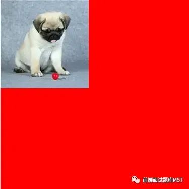
Background color and background image can appear together
div {
    width: 300px;
    height: 300px;
    background-color: red;
    background-image: url(./imgs/1.jpg);
    background-repeat: no-repeat;
   }
复制代码
page display
One: background-repeat
background-repeat determines how the background image is tiled
attribute value
background-repeat:repeat (默认值)
background-repeat:no-repeat (不平铺)
background-repeat:repeat-x (水平方向平铺)
background-repeat:repeat-y (垂直方向平铺)

复制代码
1. repeat
By default, if the background image cannot cover the entire box, the system will tile it horizontally and vertically until it covers the entire box
div {
  width: 300px;
  height: 300px;
  background-color: red;
  background-image: url(./imgs/1.jpg);
  background-repeat: repeat;
 }
复制代码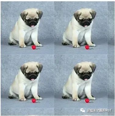
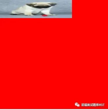
2.repeat-x
If the background image cannot cover the horizontal direction of the box, it will be tiled in the horizontal direction until the horizontal direction of the box is covered.
div {
  width: 300px;
  height: 300px;
  background-color: red;
  background-image: url(./imgs/1.jpg);
  background-repeat: repeat-x;
 }
复制代码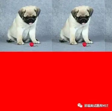
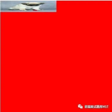
3.repeat-y
If the background image cannot cover the vertical direction of the box, it will be tiled in the vertical direction until the vertical direction of the box is covered.
div {
  width: 300px;
  height: 300px;
  background-color: red;
  background-image: url(./imgs/1.jpg);
  background-repeat: repeat-y;
 }
复制代码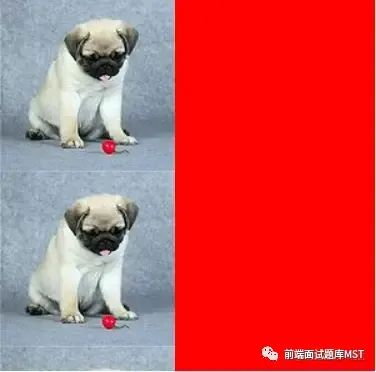
Two: background-position
background-positiont determines the position of the background image in the box area. Its orientation is determined by horizontal and vertical
1.px settings
px determines how much the background image is offset by the specified px in the horizontal and vertical directions of the box.
div {
  width: 300px;
  height: 300px;
  background-color: red;
  background-image: url(./imgs/1.jpg);
  background-repeat: no-repeat;
  background-position: 100px 100px;
 }
复制代码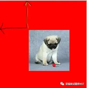
2. Location words
Horizontal direction: left, center, right
Vertical direction: top, center, bottom
Center the background image
div {
  width: 300px;
  height: 300px;
  background-color: red;
  background-image: url(./imgs/1.jpg);
  background-repeat: no-repeat;
  background-position: center center;
 }

复制代码
3. Proportion
Horizontal direction = |box width - picture width| * scale
vertical direction = |box height - image height| * scale
The proportional offset position in the horizontal and vertical directions is calculated according to the above formula.
The following is the setting method for the centered display of the background image
div {
  width: 300px;
  height: 300px;
  background-color: red;
  background-image: url(./imgs/1.jpg);
  background-repeat: no-repeat;
  background-position: 50% 50%;
 }

复制代码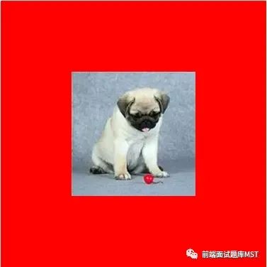
Three: background abbreviation
Background has various styles such as background color, background image, tiled or not, etc. In order to simplify the css style, the system provides a shorthand for the background
background:color url repeat postion
复制代码
The abbreviation of the background can arbitrarily omit several of these attributes
Three: background-size
background-size determines the specific size of the background image displayed in the box, and the attribute value needs to set the width and height of the background image at the same time.
1. Specific px
Directly specify the width and height of the background image
There is a background image distortion problem when setting width and height: We all know that each picture has its own original pixels. If we directly specify its width and height every time, the width and height of the picture will be directly compressed to the specified pixels, and the picture will be deformed problem, which greatly affects the user experience.
div {
    width: 300px;
    height: 300px;
    background-color: red;
    background-image: url(./imgs/1.jpg);
    background-repeat: no-repeat;
    background-size: 200px 50px;
   }
复制代码
2. Percentage
Percentages are relative to the width and height of the box
The percentage also has the problem of background image deformation
div {
    width: 300px;
    height: 300px;
    background-color: red;
    background-image: url(./imgs/1.jpg);
    background-repeat: no-repeat;
    background-size: 50% 10%;
   }
复制代码
3.auto
If the width is a specific value and the height is set to auto, the height of the background image will be proportionally stretched according to the width value
If the height is a specific value and the width is set to auto, the width of the background image will be proportionally stretched according to the height value
If both width and height are set to auto, use the width and height of the original background image directly
As shown in the figure below, the height of the image is stretched proportionally with the width, and there is no image deformation problem.
div {
      width: 300px;
      height: 300px;
      background-color: red;
      background-image: url(./imgs/1.jpg);
      background-repeat: no-repeat;
      background-size: 200px auto;
     }


复制代码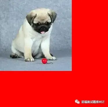
4.cover
cover means covering in English, so its meaning is to require the background image to cover the entire box.
rule
Select the smaller width and height of the background image
Select the smaller side of the background image as a reference, and zoom in or out the background image until the smaller side of the background image just fills the box, and the larger side of the background image will also fill the box.
features
The ratio of width and height is stretched or reduced to fill the entire box, and the width and height must fill the box at the same time
The picture is not deformed
div {
    width: 300px;
    height: 300px;
    background-color: red;
    background-image: url(./imgs/1.jpg);
    background-repeat: no-repeat;
    background-size:cover;
   }
复制代码
5.contain
contain, the width and height of the background image must meet one of the covering boxes. When the width and height of the image are smaller than the box, the image will be stretched proportionally. If the width or height of the image is greater than or equal to the width or height of the box, the stretching will stop.
rule
Select the larger width and height of the background image
Select the larger side of the background image as a reference, and zoom in or out of the background image until the larger side of the background image just fills the box. Ignore whether the smaller side of the background image is filled.
features
The ratio of width and height is stretched or shrunk, and the width or height should be the same as the width and height of the box.
The picture is not deformed
div {
    width: 300px;
    height: 300px;
    background-color: red;
    background-image: url(./imgs/1.jpg);
    background-repeat: no-repeat;
    background-size: contain;
   }

复制代码
四:background-origin
background-origin determines where the background image starts to render from the box
1. background-origin: padding-box (default value)
Starting from the padding position of the box
.box{
  margin: 20px auto;
  width: 300px;
  height: 300px;
  padding: 50px;
  border: 50px solid gold;
  background-color: red;
  background-image: url(./imgs/1.jpg);
  background-repeat: no-repeat;
  background-origin: padding-box;
}


复制代码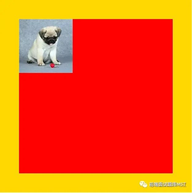
2.background-origin: content-box
Start at the content area position of the box
.box{
  margin: 20px auto;
  width: 300px;
  height: 300px;
  padding: 50px;
  border: 50px solid gold;
  background-color: red;
  background-image: url(./imgs/1.jpg);
  background-repeat: no-repeat;
  background-origin: content-box;
}


复制代码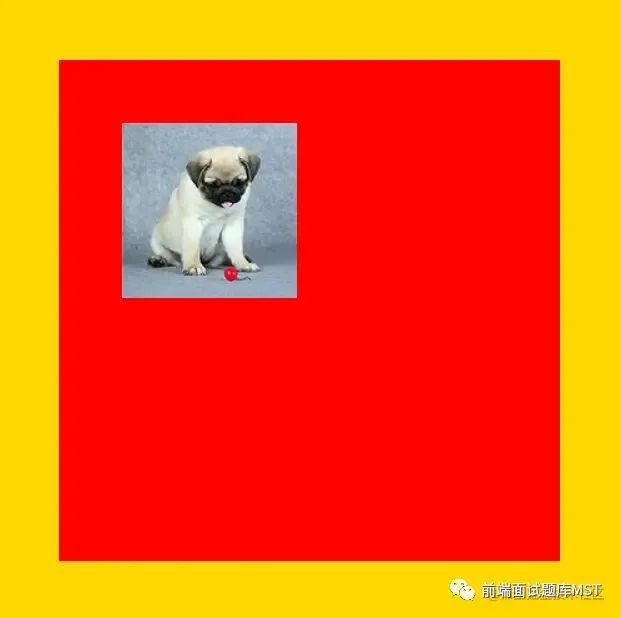
3.background-origin: border-box
Start at the border area position of the box
Five: background-clip
background-clip determines where the background color starts to render from the box
background-clip: border-box (from box margin)
background-clip: content-box (starting from box content)
background-clip: padding-box (default, start from box padding)