In the web page, the style of the drop-down box is the most difficult to beautify, and the default style is ugly. Fortunately, there are various frameworks that have realized the style of the drop-down box. The main idea is to make the drop-down box elements easier to set the style through JS code div to replace, and then associate the corresponding options and events.
A recent project needs to modify a page that was long ago, and the user needs to beautify the style of the drop-down box, and cannot introduce a third-party framework, so I have to write a JS plug-in by myself to realize the beautification of the style of the drop-down box.
1. Plug-in effect
The page contains two drop-down boxes, one with 3 options and one with multiple options. One option is shorter and the other is longer. The page code is as follows:
    <form>
        <div class="div-form">
            <div class="div-form-row">
                <span class="form-title">selected: </span>
                <div class="form-input">
                    <select name="s1" onchange="selectChange('1','2')">
                        <option value="1">1111</option>
                        <option value="2" selected>2222</option>
                        <option value="3">3333</option>
                    </select>
                </div>
            </div>

            <div class="div-form-row">
                <span class="form-title">select time zone: </span>
                <div class="form-input">
                    <select name="s2">
                        <option value="1">(GMT-12:00) International Date Line West</option>
                        <option value="2">(GMT-11:00) Midway Island, Samoa</option>
                        <option value="3">(GMT-10:00) Hawaii</option>
                        <option value="4">(GMT-09:00) Alaska</option>
                        <option value="5">(GMT-08:00) Pacific Time, Tijuana</option>
                        <option value="6">(GMT-07:00) Arizona, Mazatlan</option>
                        <option value="7">(GMT-07:00-1) Chihuahua, La Paz</option>
                        <option value="8">(GMT-07:00-2) Mountain Time</option>
                        <option value="9">(GMT-06:00) Central America</option>
                        <option value="10">(GMT-06:00-1) Central Time</option>
                        <option value="11" selected>(GMT-06:00-2) Guadalajara, Mexico City, Monterrey</option>
                        <option value="12">(GMT-06:00-3) Saskatchewan</option>
                        <option value="13">(GMT-05:00) Bogota, Lima, Quito</option>
                        <option value="14">(GMT-05:00-1) Eastern Time</option>
                        <option value="15">(GMT-05:00-2) Indiana</option>
                        <option value="16">(GMT-04:00) Atlantic Time</option>
                        <option value="17">(GMT-04:00-1) Caracas, La Paz</option>
                        <option value="18">(GMT-04:00-2) Santiago</option>
                        <option value="19">(GMT-03:30) Newfoundland</option>
                    </select>
                </div>
            </div>
        </div>
    </form>
When the plug-in is not introduced, the page effect is as shown in the figure below:
Introduce plugin js and styles:
<script src="select.js"></script>
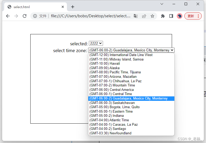
<link rel="stylesheet" href="select.css">After the plug-in is introduced, the page effect is as follows:
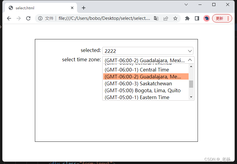
The main change is that the entire drop-down box is wrapped with a border, the direction of the arrow on the right side of the drop-down box is changed when the drop-down box is expanded and collapsed, the option list is set to a maximum height, a scroll bar appears when the height exceeds the height, and the selected option is displayed with a custom background color.
2. Implementation steps
First, add a method in the page loading event processing method to perform the rendering action of the drop-down box:
    win.addListener(win, 'load', function () {
        renderSelects();
    });
Let's look at the renderSelects() method again:
    win.renderSelects = function (className) {
        var selectList;
        if (typeof className != "string" || className.trim().length == 0) {
            selectList = document.querySelectorAll('select');
        } else {
            selectList = document.getElementsByClassName(className);
        }
        for (var i = 0; i < selectList.length; i++) {
            renderOneSelect(selectList[i]);
        }
    }
This method mainly selects the drop-down box in the page through the selector, and then calls a single rendering method for rendering. This method can pass in the style class name of the drop-down box, and only the drop-down box whose selector matches will be rendered with a custom style after passing in. If no parameters are passed in, all the drop-down boxes in the page will be rendered.
Look at the rendering of a single drop-down box renderOneSelect(el), where el is a single drop-down box element. First add a temporary paragraph element pTemp, and then use this paragraph element to replace the drop-down box to occupy the original position of the drop-down box, and then replace pTemp after the structure of the drop-down box constructed by div is spliced:
 renderOneSelect(el){
     var pTemp = document.createElement("p");
     el.replaceWith(pTemp);

     var divSelect = document.createElement("div"); //div构造的下拉框结构
     // ... 一系列构造过程

     pTemp.replaceWith(divSelect); //用构造好的div替换掉 pTemp
 }
The actual element structure of the drop-down box constructed with div is shown in the figure below:
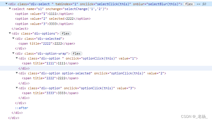
The entire drop-down box is wrapped with div.div-select. The select element of the original drop-down box is placed in div.div-select, and then div.div-options is added. Div.div-options contains two divs inside, the first div.div-selected, used to display the currently selected option in the drop-down box, the second one is used to display all the drop-down box options, a single option is displayed with div.div-option, the currently selected option is added with option-selected style, and other The options are displayed differently. The content of the option is wrapped and displayed with a span element to control the length. If the length is exceeded, an ellipsis appears, and a title is added to display the complete content of the option when the mouse hovers over it.
After the div element is constructed, event processing is added to each element.
div.div-select adds click event processing, and expands and collapses the option list when clicked:
   selectClick = function (el) {
        if (el.hasClass("select-open")) {
            el.removeClass("select-open")
        } else {
            el.addClass("select-open");
        }
    }
div.div-select adds blur event handling, and collapses the option list when the focus is lost:
    selectBlur = function (el) {
        if (el.hasClass("select-open")) {
            el.removeClass("select-open")
        }
    }
div.div-option adds click event processing, selects the option when clicked, synchronously sets the selected state of the original select option, sets the selectIndex of the original select, and calls the onchange method of the original select:
 optionClick = function (el) {
        var _value = el.get("value");
        var select = el.parentElement.parentElement.parentElement.children[0];
        var originIndex = select.selectedIndex;
        var optionLength = select.children.length;
        for (var i = 0; i < optionLength; i++) {
            if (select.children[i].get("value") == _value) {
                select.children[i].set("selected", "");
            } else {
                select.children[i].remove("selected");
            }
        }
        var selected = el.parentElement.parentElement.children[0];
        selected.innerHTML = el.innerHTML;
        var newIndex = 0;
        for (var i = 0; i < el.parentElement.children.length; i++) {
            var tempEl = el.parentElement.children[i];
            tempEl.removeClass("option-selected");
            if (tempEl.get("value") == _value && tempEl.innerHTML == el.innerHTML) {
                newIndex = i;
            }
        }
        el.addClass("option-selected");

        //设置下拉框 selectedIndex 并触发onchange事件
        if (originIndex != newIndex) {
            select.selectedIndex = newIndex;
            eval(select.get("onchange"));
        }
3. Other issues
In actual projects, the selected state of individual selects on individual pages is specified by setting selectedIndex in js. The rendering code cannot obtain the selected state through the selected parameter of the option, and the selected state cannot be rendered correctly. At this time, after the drop-down box is rendered, call A method to render the selected state according to selectedIndex:
   HTMLElement.prototype.renderSelected = function () {
        var ele = this;
        if (this.nodeName == "SELECT") {
            var index = ele.selectedIndex;
            var divOptions = ele.parentElement.children[1];
            if (!!divOptions && divOptions.nodeName == "DIV" && divOptions.hasClass("div-options") && index >= 0) {
                divOptions.children[0].innerHTML = divOptions.children[1].children[index].innerHTML;
                divOptions.children[1].children[index].addClass("option-selected");
            }
        }
    };
In other pages, the option list of the drop-down box is dynamically obtained through an asynchronous method. When the page is rendered in the onload method, the option list is still empty. The option list may be obtained after the rendering is completed. In this case, it can only be done manually. The render method is called after the async method completes.
Code download: https://download.csdn.net/download/evanyanglibo/87490754