Data visualization is a data presentation technology that converts complex and abstract data into intuitive and easy-to-understand graphics. It can help us quickly grasp the distribution and laws of data, and understand and explore information more easily. In today's era of information explosion, data visualization is getting more and more attention.
1. Matplotlib module
Matplotlib is the most commonly used and most famous data visualization module in Python. The submodule pyplot of this module contains a large number of functions for drawing various charts.
1. Draw basic charts
The most basic charts in daily work include column charts, bar charts, line charts, pie charts, etc. The Matplotlib module provides corresponding drawing functions for these charts. The data used to draw the chart can directly use the provided code, or can be imported from an Excel workbook through the read_excel() function of the pandas module.
1. Draw a histogram
Code file: draw column chart.py
Column charts are usually used to visually compare data and are frequently used in practical work. A column chart can be drawn using the bar() function in the Matplotlib module.
The demo code is as follows:
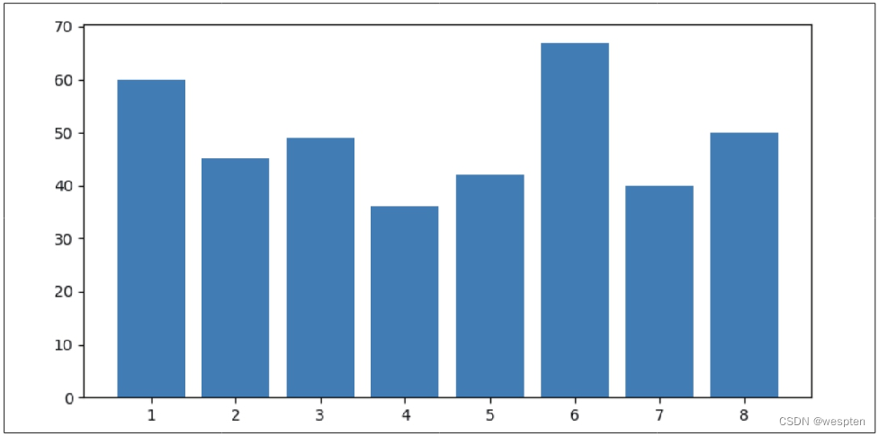
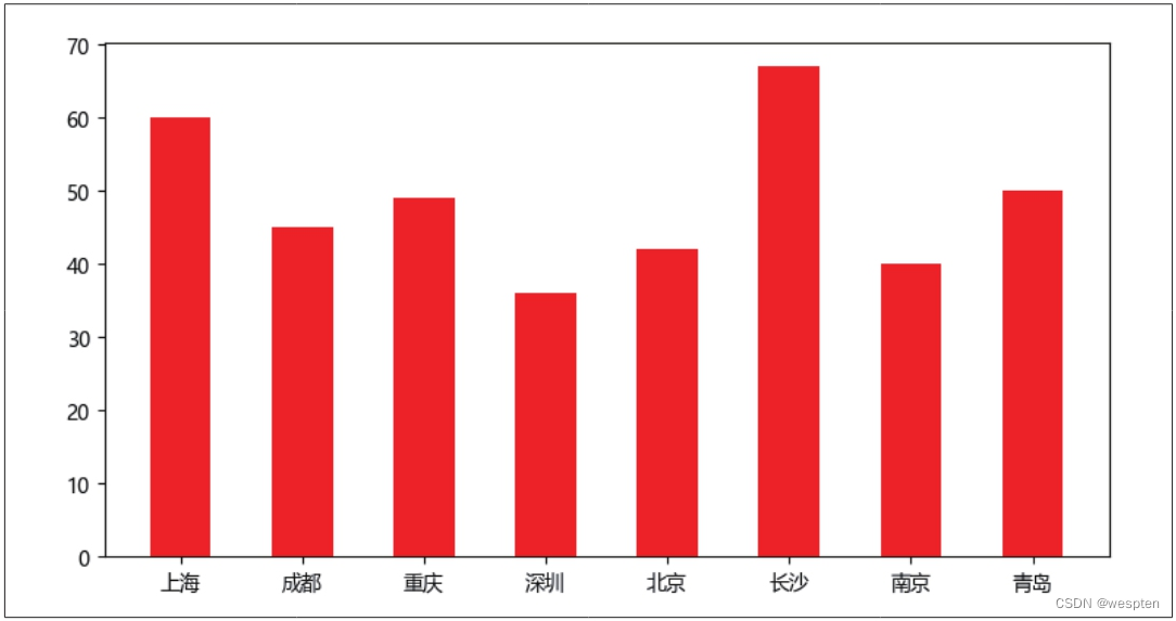
1   import matplotlib.pyplot as plt
2   x = [1, 2, 3, 4, 5, 6, 7, 8]
3   y = [60, 45, 49, 36, 42, 67, 40, 50]
4   plt.bar(x, y)
5   plt.show()
The first line of code imports the submodule pyplot of the Matplotlib module. The second and third lines of code give the values of the x-axis and y-axis of the chart respectively. The fourth line of code uses the bar() function to draw a column chart, and the fifth line The code uses the show() function to display the plotted chart.
The result of running the code is shown in the figure below:
If you want to change the width and color of each column in the bar chart, you can do it by setting the parameters width and color of the bar() function.
The demo code is as follows:
1 plt.bar(x, y, width=0.5, color='r')The parameter width is used to set the width of the column. Its value does not represent a specific size, but represents the proportion of the width of the column in the chart. The default value is 0.8. If set to 1, the columns will be closely connected; if set to a number greater than 1, the columns will overlap each other.
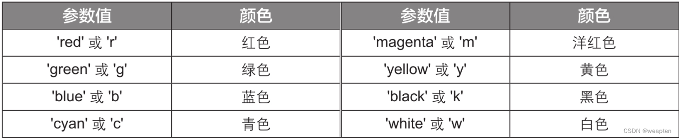
The parameter color is used to set the filling color of the column. "r" in the above code is short for "red", which means that the filling color of the column is set to red. The Matplotlib module supports colors defined in multiple formats, and the commonly used formats are as follows:
- The 8 basic colors defined by the English word of the color name or its abbreviation, see the table below for details;
- A color defined by a floating-point tuple of RGB values. RGB values are usually represented by decimal integers from 0 to 255, such as (51, 255, 0). Divide each element by 255 to get (0.2, 1.0, 0.0 ), which is the RGB color that the Matplotlib module can recognize;
- A color defined by a hexadecimal string of RGB values, such as '#33FF00', which is the same RGB color as (51, 255, 0), can be obtained by searching for "hexadecimal color code conversion tool" by yourself more colors.
In the above code, the values of x-axis and y-axis are numbers, if there are Chinese characters in the value, you must add two lines of code before drawing the chart.
The demo code is as follows:
1   import matplotlib.pyplot as plt
2   plt.rcParams['font.sans-serif'] = ['Microsoft YaHei']
3   plt.rcParams['axes.unicode_minus'] = False
4   x = ['上海', '成都', '重庆', '深圳', '北京', '长沙', '南京', '青岛']
5   y = [60, 45, 49, 36, 42, 67, 40, 50]
6   plt.bar(x, y, width=0.5, color='r')
7   plt.show()
The value of the x-axis given by the fourth line of code is a Chinese character string, and the Matplotlib module does not support displaying Chinese by default when drawing a chart, so the second and third lines of code must be added. Among them, the second line of code displays Chinese content normally by setting the font to Microsoft Yahei, and the third line of code is used to solve the problem that the negative sign is displayed as a square.
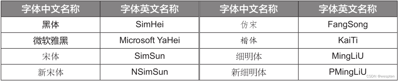
"Microsoft YaHei" in the second line of code is the English name of Microsoft YaHei font. If you want to use other Chinese fonts, you can refer to the Chinese-English comparison table of font names below.
The result of running the code is shown in the figure below:
2. Draw a bar chart
Code file: draw bar chart.py
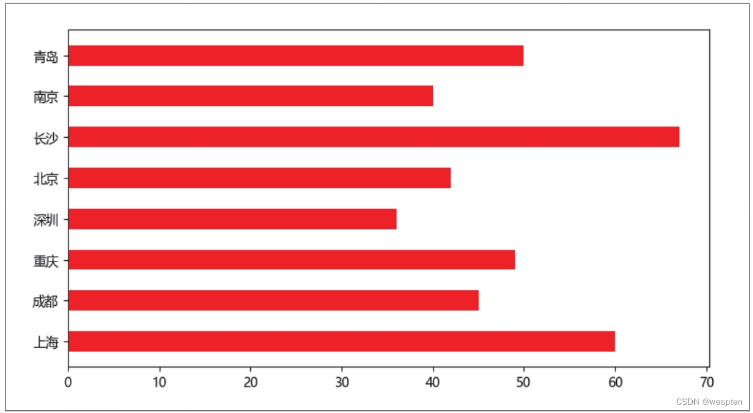
Bar charts are also commonly used to compare data, which can be seen as the result of swapping the x-axis and y-axis of the column chart. Bar graphs can be drawn using the barh() function in the Matplotlib module.
The demo code is as follows:
1   import matplotlib.pyplot as plt
2   plt.rcParams['font.sans-serif'] = ['Microsoft YaHei']
3   plt.rcParams['axes.unicode_minus'] = False
4   x = ['上海', '成都', '重庆', '深圳', '北京', '长沙', '南京', '青岛']
5   y = [60, 45, 49, 36, 42, 67, 40, 50]
6   plt.barh(x, y, height=0.5, color='r')  # 参数height用于设置条形的高度
7   plt.show()
The result of running the code is shown in the figure below:
3. Draw a line chart
Code file: draw line chart.py
Line charts are often used to show data trends over time. Line graphs can be drawn using the plot() function in the Matplotlib module.
The demo code is as follows:
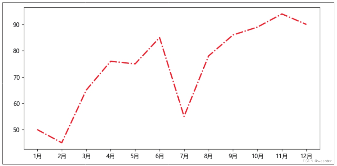
1 import matplotlib.pyplot as plt
2 plt.rcParams['font.sans-serif'] = ['Microsoft YaHei']
3 plt.rcParams['axes.unicode_minus'] = False
4 x = ['1月', '2月', '3月', '4月', '5月', '6月', '7月', '8月', '9月', '10月', '11月', '12月']
5 y = [50, 45, 65, 76, 75, 85, 55, 78, 86, 89, 94, 90]
6 plt.plot(x, y, color='r', linewidth=2, linestyle='dashdot')
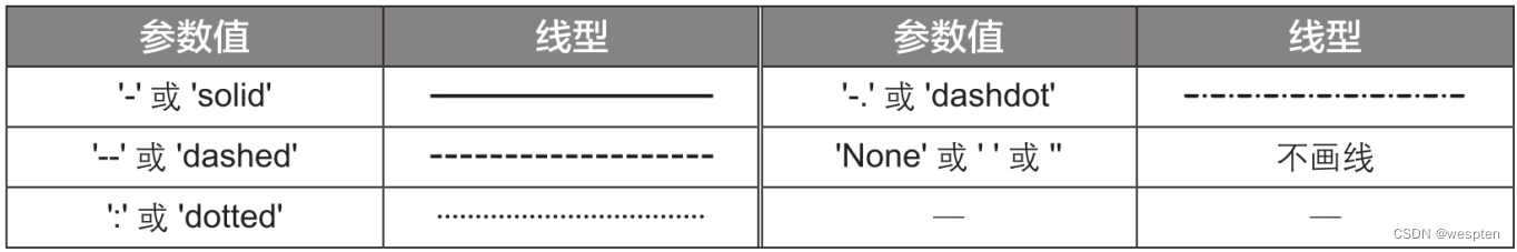
7 plt.show()In the sixth line of code, the parameter color is used to set the color of the polyline; the parameter linewidth is used to set the thickness of the polyline (the unit is "points"); the parameter linestyle is used to set the line style of the polyline, and the possible values are shown in the table below.
The result of running the code is shown in the figure below:
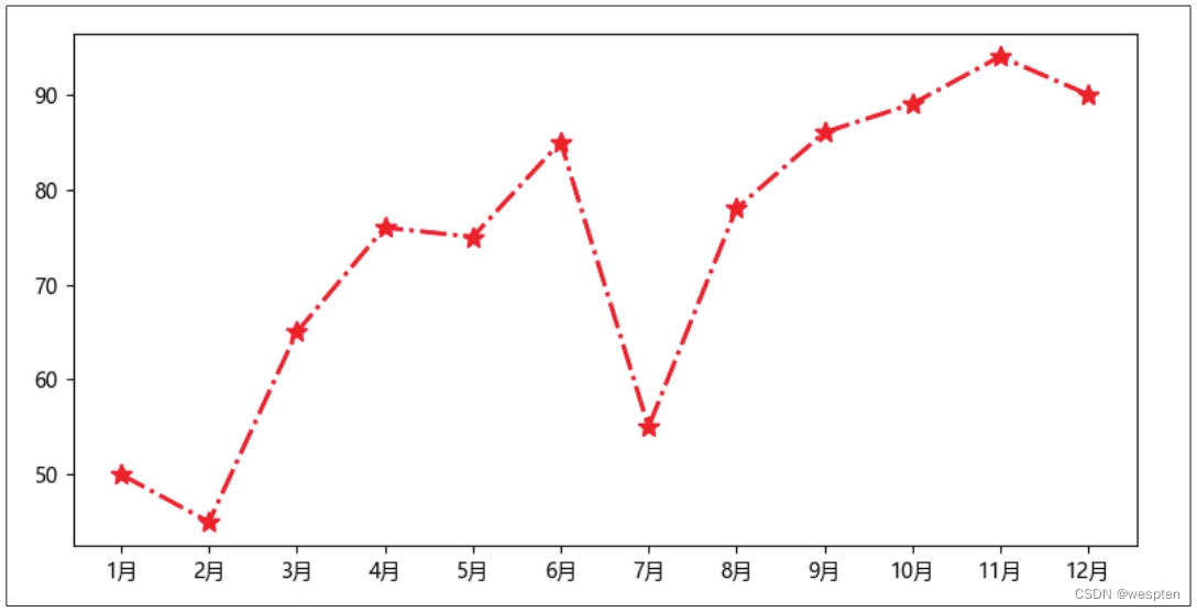
A line chart with data markers can be drawn by setting the parameters marker and markersize.
The demo code is as follows:
1 plt.plot(x, y, color='r', linestyle='dashdot', linewidth=2, marker='*', markersize=10) The marker='*' in the code indicates that the style of the data marker is set to a five-pointed star, and markersize=10 indicates that the size of the data marker is set to 10 points.
The commonly used values of the parameter marker are shown in the following table:
The result of running the code is shown in the figure below:
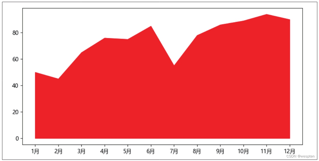
4. Draw an area chart
Code file: draw area chart.py
The area chart is actually another form of line chart, which uses the graph surrounded by the line and the coordinate axis to express the trend of data changes over time. Area charts can be drawn using the stackplot() function in the Matplotlib module.
The demo code is as follows:
1   import matplotlib.pyplot as plt
2   plt.rcParams['font.sans-serif'] = ['Microsoft YaHei']
3   plt.rcParams['axes.unicode_minus'] = False
4   x = ['1月', '2月', '3月', '4月', '5月', '6月', '7月', '8月', '9月', '10月', '11月', '12月']
5   y = [50, 45, 65, 76, 75, 85, 55, 78, 86, 89, 94, 90]
6   plt.stackplot(x, y, color='r')
7   plt.show()
The result of running the code is shown in the figure below:
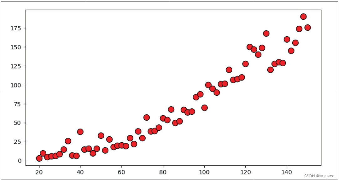
5. Draw a scatterplot
Code file: draw scatterplot.py
Scatterplots are often used to discover relationships between variables. Use the scatter() function in the Matplotlib module to draw scatter plots. The demo code is as follows:
1   import pandas as pd
2   import matplotlib.pyplot as plt
3   data = pd.read_excel('汽车速度和刹车距离表.xlsx')
4   x = data['汽车速度(km/h)']
5   y = data['刹车距离(m)']
6   plt.scatter(x, y, s=100, marker='o', color='r', edgecolor='k')
7   plt.show()
The third line of code uses the read_excel() function to import the data in the workbook "Car Speed and Braking Distance Table.xlsx", and the fourth line specifies that the x-axis value is the data in the "Car Speed (km/h)" column in the workbook , the fifth line of code specifies that the value of the y-axis is the data in the "braking distance (m)" column in the workbook.
In the sixth line of code, the parameter s is used to set the area of each point; the parameter marker is used to set the style of each point, and the value is the same as the parameter marker of the plot() function; the parameters color and edgecolor are used to set each The fill and outline colors of the points.
The result of running the code is shown in the figure below:
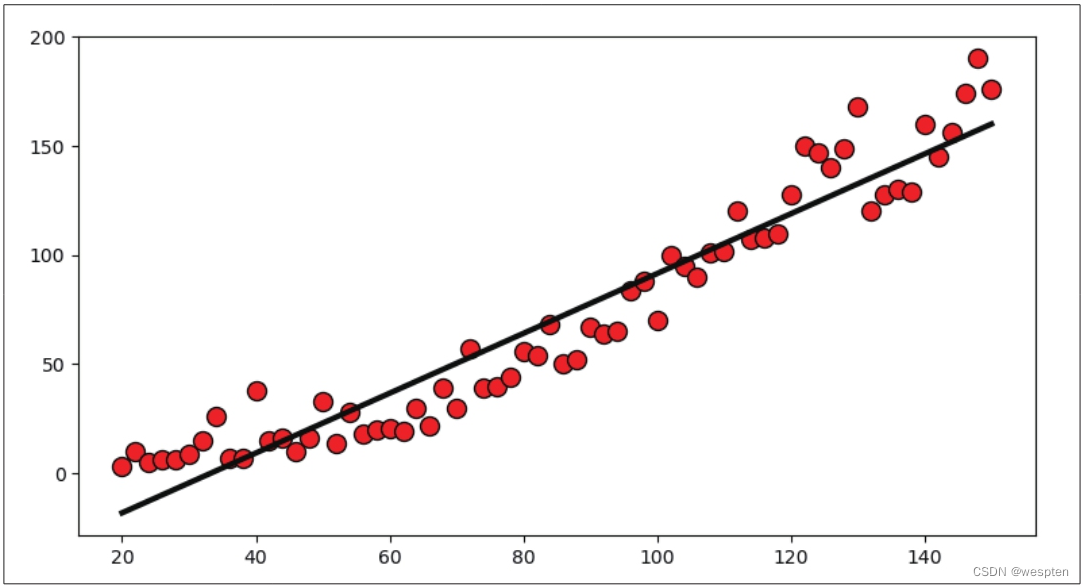
To facilitate the inference of correlations between variables, a linear trendline can be added to the scatterplot.
The demo code is as follows:
1   import pandas as pd
2   import matplotlib.pyplot as plt
3   from sklearn import linear_model
4   data = pd.read_excel('汽车速度和刹车距离表.xlsx')
5   x = data['汽车速度(km/h)']
6   y = data['刹车距离(m)']
7   plt.scatter(x, y, s=100, marker='o', color='r', edgecolor='k')
8   model = linear_model.LinearRegression().fit(x.values.reshape(-1, 1), y)
9   pred = model.predict(x.values.reshape(-1, 1))
10   plt.plot(x, pred, color='k', linewidth=3, linestyle='solid')
11   plt.show()
The third line of code imports the Scikit-Learn module; the eighth and ninth lines of code use the functions in the Scikit-Learn module to create a linear regression algorithm model, which is used to predict the corresponding braking distance according to the speed of the car; the tenth line of code according to The forecast results draw a linear trendline using the plot() function.
The result of running the code is shown in the figure below:
6. Drawing Pie and Donut Charts
Code file: draw pie chart and donut chart.py
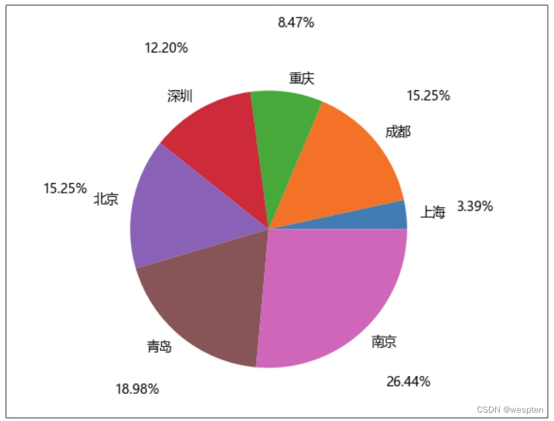
Pie charts are often used to show the proportion of each category of data. Pie charts can be drawn using the pie() function in the Matplotlib module. The demo code is as follows:
1   import matplotlib.pyplot as plt
2   plt.rcParams['font.sans-serif'] = ['Microsoft YaHei']
3   plt.rcParams['axes.unicode_minus'] = False
4   x = ['上海', '成都', '重庆', '深圳', '北京', '青岛', '南京']
5   y = [10, 45, 25, 36, 45, 56, 78]
6   plt.pie(y, labels=x, labeldistance=1.1, autopct='%.2f%%', pctdistance=1.5)
7   plt.show()
In the sixth line of code, the parameter labels is used to set the label of each pie chart block, the parameter labeldistance is used to set the distance between the label of each pie chart block and the center, the parameter autopct is used to set the format of the percentage value, and the parameter pctdistance is used to Sets the distance of the percentage value from the center.
The result of running the code is shown in the figure below:
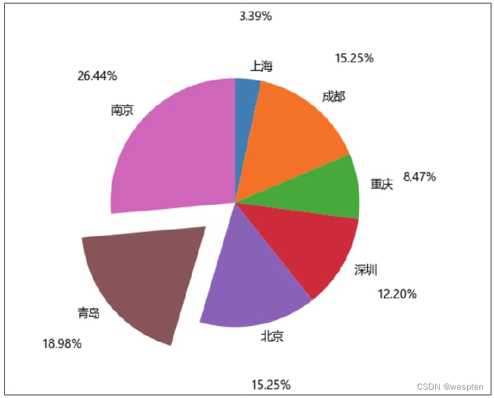
Appropriately setting the value of the parameter explode can separate the pie chart pieces to highlight the data.
The demo code is as follows:
1 plt.pie(y, labels=x, labeldistance=1.1, autopct='%.2f%%', pctdistance=1.5, explode=[0, 0, 0, 0, 0, 0.3, 0], startangle=90, counterclock=False) The parameter explode in the code is used to set the distance between each pie chart block and the center of the circle. Its value is usually a list, and the number of elements in the list is the same as the number of pie chart blocks. Here it is set to [0, 0, 0, 0, 0, 0.3, 0], the sixth element is 0.3, and the other elements are all 0, which means that the sixth pie chart block (Qingdao) is separated, and the other pie chart blocks The position is unchanged.
The parameter startangle is used to set the initial angle of the first pie chart block, which is set to 90° here.
The parameter counterclock is used to set whether each pie chart block is arranged counterclockwise or clockwise. When it is False, it means clockwise arrangement, and when it is True, it means counterclockwise arrangement.
The result of running the code is shown in the figure below:
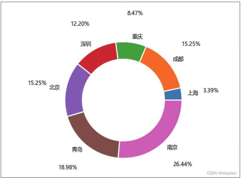
Properly setting the value of the parameter wedgeprops can also draw a donut chart.
The demo code is as follows:
1 plt.pie(y, labels=x, labeldistance=1.1, autopct='%.2f%%', pctdistance=1.5, wedgeprops={'width': 0.3, 'linewidth': 2, 'edgecolor': 'white'}) The parameter wedgeprops is used to set the properties of the pie chart block, its value is a dictionary, and the elements in the dictionary are the key-value pairs of the name and value of each property of the pie chart block. wedgeprops={'width': 0.3, 'linewidth': 2, 'edgecolor': 'white'} in the above code means to set the ring width of the pie chart block (the outer circle radius of the circle minus the inner circle radius) The scale of the outer circle radius is 0.3, the border thickness is 2, and the border color is white. Set the ring width ratio of the pie chart block to a number less than 1 (here, 0.3), and the effect of the ring chart can be drawn.
The result of running the code is shown in the figure below:
2. Chart drawing and beautification skills
It mainly introduces drawing and beautifying skills of some charts, including drawing multiple charts in one canvas, and adding chart titles, legends, grid lines and other elements to the charts to make the charts more beautiful and easier to understand, and setting the elements' Format, such as the line style and thickness of the grid lines, the scale range of the coordinate axes, etc.
1. Draw multiple charts in one canvas
Code file: draw multiple charts in one canvas.py
When the Matplotlib module draws a chart, it first creates a canvas by default, and then displays the drawn chart in the canvas. If you want to draw multiple charts in one canvas, you can use the subplot() function to divide the canvas into several areas, and then draw different charts in each area.
The parameters of the subplot() function are 3 integer numbers: the first number represents how many rows the entire canvas is divided into; the second number represents how many columns the entire canvas is divided into; Charts are drawn in each area, and the numbering rules of the areas are from left to right and from top to bottom, starting from 1.
The demo code is as follows:
1 import matplotlib.pyplot as plt
2 plt.rcParams['font.sans-serif'] = ['Microsoft YaHei']
3 plt.rcParams['axes.unicode_minus'] = False
4 x = ['1月', '2月', '3月', '4月', '5月', '6月', '7月', '8月', '9月', '10月', '11月', '12月']
5 y = [50, 45, 65, 76, 75, 85, 55, 78, 86, 89, 94, 90]
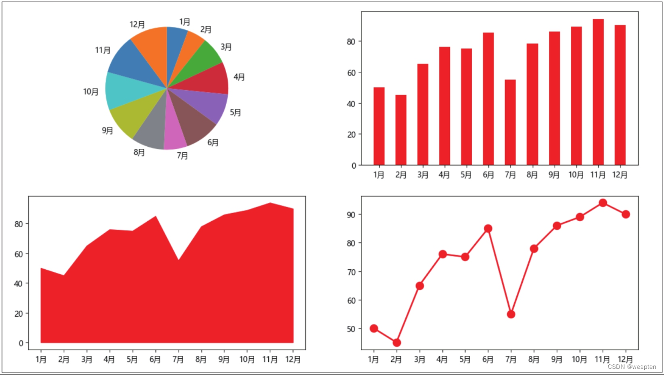
6 plt.subplot(2, 2, 1)
7 plt.pie(y, labels=x, labeldistance=1.1, startangle=90, counterclock=False)
8 plt.subplot(2, 2, 2)
9 plt.bar(x, y, width=0.5, color='r')
10 plt.subplot(2, 2, 3)
11 plt.stackplot(x, y, color='r')
12 plt.subplot(2, 2, 4)
13 plt.plot(x, y, color='r', linestyle='solid', linewidth=2, marker='o', markersize=10)
14 plt.show()The sixth line of code divides the entire canvas into 2 rows and 2 columns, and specifies that the chart should be drawn in the first area. Then use the 7th line of code to draw the pie chart.
The eighth line of code divides the entire canvas into 2 rows and 2 columns, and specifies that the chart should be drawn in the second area. Then use the 9th line of code to draw the histogram.
The 10th line of code divides the entire canvas into 2 rows and 2 columns, and specifies that the chart should be drawn in the third area. Then use the 11th line of code to draw the area chart.
The 12th line of code divides the entire canvas into 2 rows and 2 columns, and specifies that the chart should be drawn in the fourth area. Then use the 13th line of code to draw a line chart.
The parameter of the subplot() function can also be written as a 3-digit integer number, such as 223. When using parameters of this form, the number of rows or columns dividing the canvas cannot exceed 10.
The result of running the code is shown in the figure below:
2. Add chart elements
Code file: add chart elements.py
Let's explain how to add chart elements such as chart titles, axis titles, legends, and data labels to charts.
The demo code is as follows:
1 import matplotlib.pyplot as plt
2 plt.rcParams['font.sans-serif'] = ['Microsoft YaHei']
3 plt.rcParams['axes.unicode_minus'] = False
4 x = ['1月', '2月', '3月', '4月', '5月', '6月', '7月', '8月', '9月', '10月', '11月', '12月']
5 y = [50, 45, 65, 76, 75, 85, 55, 78, 86, 89, 94, 90]
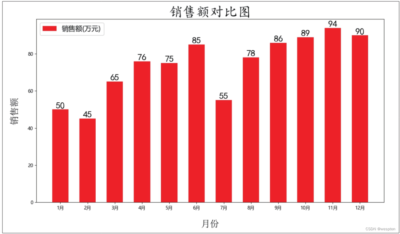
6 plt.bar(x, y, width=0.6, color='r', label='销售额(万元)')
7 plt.title(label='销售额对比图', fontdict={'family': 'KaiTi', 'color': 'k', 'size': 30}, loc='center')
8 plt.xlabel('月份', fontdict={'family': 'SimSun', 'color': 'k', 'size': 20}, labelpad=20)
9 plt.ylabel('销售额', fontdict={'family': 'SimSun', 'color': 'k', 'size': 20}, labelpad=20)
10 plt.legend(loc='upper left', fontsize=15)
11 for a, b in zip(x, y):
12 plt.text(x=a, y=b, s=b, ha='center', va='bottom', fontdict={'family': 'KaiTi', 'color': 'k', 'size': 20})
13 plt.show()The title() function in line 7 is used to add the chart title. The parameter fontdict is used to set the text format of the chart title, such as font, color, font size, etc.; the parameter loc is used to set the position of the chart title, and the possible values are shown in the following table.

The xlabel() function on line 8 is used to add the x-axis title, and the ylabel() function on line 9 is used to add the y-axis title. The first parameter of these two functions is the text content of the title, the parameter fontdict is used to set the text format of the title, and the parameter labelpad is used to set the distance between the title and the coordinate axis.
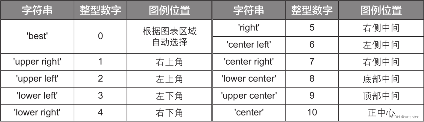
The legend() function in the 10th line of code is used to add a legend, and the content of the legend is determined by the corresponding drawing function. For example, the code on line 6 uses the bar() function to draw a column chart, the legend graphic added by the legend() function is a rectangular color block, and the text of the legend label is the value of the parameter label of the bar() function. The parameter loc of the legend() function is used to set the position of the legend, and the value can be a string or an integer number, as shown in the following table.
It should be noted that the meaning of 'right' is actually the same as that of 'center right', this value was established for compatibility with older versions of the Matplotlib module.
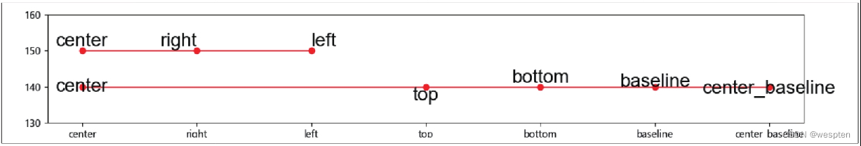
The function of the text() function in the 12th line of code is to add text at the specified position in the chart coordinate system. The parameters x and y represent the x-coordinate and y-coordinate of the text respectively; the parameter s represents the content of the text; the parameter ha is the abbreviation of horizontal alignment, which indicates the display position of the text in the horizontal direction, including 'center', 'right', and 'left' Three values are optional; the parameter va is the abbreviation of vertical alignment, which indicates the display position of the text in the vertical direction, and there are five optional values of 'center', 'top', 'bottom', 'baseline', and 'center_baseline'.
The drawing effect when the parameters ha and va take different values is shown in the figure below (the upper part is the effect of the parameter ha, and the lower part is the effect of the parameter va), due to space limitations, no explanation is given here, and everyone can simply understand it.
The text() function can only add one text at a time. To add data labels to all data points in the chart, you need to use a loop. The 11th line of code uses the for statement to construct a loop, where the zip() function is used to pack the elements of the list x and y into tuples one by one, that is, similar to ('January', 50), ('2 month', 45), ('March', 65)..., and then take out the elements of each tuple through the loop variables a and b, and pass them to the text() function in the 12th code for adding data label.
The result of running the code is shown in the figure below:
3. Add and set grid lines
Code file: add and set grid lines.py
Gridlines can be added to a plot using the grid() function in the Matplotlib module.
The demo code is as follows:
1 import matplotlib.pyplot as plt
2 plt.rcParams['font.sans-serif'] = ['Microsoft YaHei']
3 plt.rcParams['axes.unicode_minus'] = False
4 x = ['1月', '2月', '3月', '4月', '5月', '6月', '7月', '8月', '9月', '10月', '11月', '12月']
5 y = [50, 45, 65, 76, 75, 85, 55, 78, 86, 89, 94, 90]
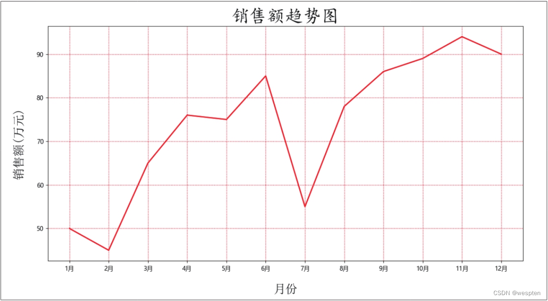
6 plt.plot(x, y, color='r', linestyle='solid', linewidth=2)
7 plt.title(label='销售额趋势图', fontdict={'family': 'KaiTi', 'color': 'k', 'size': 30}, loc='center')
8 plt.xlabel('月份', fontdict={'family': 'SimSun', 'color': 'k', 'size': 20}, labelpad= 20)
9 plt.ylabel('销售额(万元)', fontdict={'family': 'SimSun', 'color': 'k', 'size': 20}, labelpad=20)
10 plt.grid(b=True, color='r', linestyle='dotted', linewidth=1)
11 plt.show()In the 10th line of code, the parameter b of the grid() function is set to True, indicating that the grid lines are displayed (by default, the grid lines of the x-axis and y-axis are displayed at the same time), and the parameters linestyle and linewidth are used to set the lines of the grid lines respectively shape and thickness.
The result of running the code is shown in the figure below:
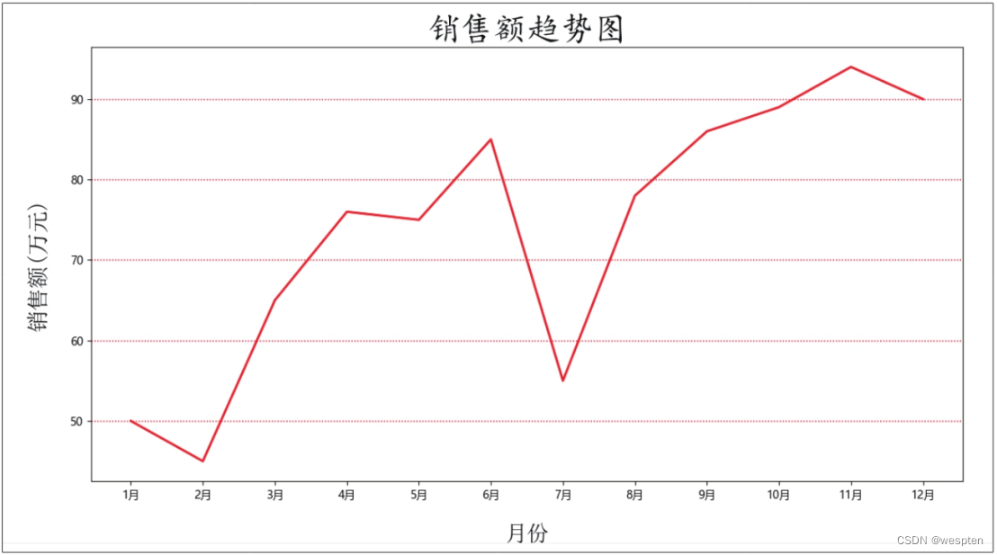
If you only want to display the grid lines of the x-axis or y-axis, you can set the parameter axis of the grid() function. The default value of this parameter is 'both', which means that the grid lines of the x-axis and y-axis are set at the same time. When the value is 'x' or 'y', it means that only the grid lines of the x-axis or y-axis are set respectively.
The demo code is as follows:
1 plt.grid(b=True, axis='y', color='r', linestyle='dotted', linewidth=1)The result of running the code is shown in the figure below:
4. Adjust the scale range of the coordinate axis
Code file: adjust the scale range of the coordinate axis.py
Use the xlim() and ylim() functions in the Matplotlib module to adjust the scale range of the x-axis and y-axis, respectively.
The demo code is as follows:
1 import matplotlib.pyplot as plt
2 plt.rcParams['font.sans-serif'] = ['Microsoft YaHei']
3 plt.rcParams['axes.unicode_minus'] = False
4 x = ['1月', '2月', '3月', '4月', '5月', '6月', '7月', '8月', '9月', '10月', '11月', '12月']
5 y = [50, 45, 65, 76, 75, 85, 55, 78, 86, 89, 94, 90]
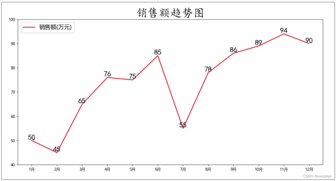
6 plt.plot(x, y, color='r', linestyle='solid', linewidth=2, label='销售额(万元)')
7 plt.title(label='销售额趋势图', fontdict={'family': 'KaiTi', 'color': 'k', 'size': 30}, loc='center')
8 plt.legend(loc='upper left', fontsize=15)
9 for a,b in zip(x, y):
10 plt.text(a, b, b, ha='center', va='bottom', fontdict={'family': 'KaiTi', 'color': 'k', 'size': 20})
11 plt.ylim(40, 100)
12 plt.show()In the 11th line of code, the ylim() function is used to set the value range of the y-axis scale from 40 to 100. If you want to adjust the scale range of the x-axis, use the xlim() function.
The result of running the code is shown in the figure below:
Tip: Toggle the display and hiding of the coordinate axes.
Use the axis() function to toggle the display and hiding of the coordinate axes.
The demo code is as follows:
1   plt.axis('on')  # 显示坐标轴
2   plt.axis('off')  # 隐藏坐标轴
3. Draw advanced charts
Previously, I learned how to draw common charts, as well as adding and formatting chart elements. Next, we will draw more advanced and professional charts, such as bubble charts, radar charts, box charts, etc.
1. Draw a bubble chart
Code file: draw bubble chart.py
The bubble chart is a chart showing the relationship between three variables. It is actually upgraded on the basis of the scatter chart. On the basis of the original two variables of x coordinate and y coordinate, a third one is introduced. variable and represented by the size of the bubble. Therefore, the function used to draw the bubble chart is the scatter() function for drawing the scatter chart, but there are some differences in the parameter settings.
The demo code is as follows:
1 import matplotlib.pyplot as plt
2 import pandas as pd
3 plt.rcParams['font.sans-serif'] = ['Microsoft YaHei']
4 plt.rcParams['axes.unicode_minus'] = False
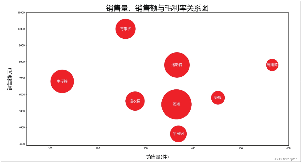
5 data = pd.read_excel('产品销售统计.xlsx')
6 n = data['产品名称']
7 x = data['销售量(件)']
8 y = data['销售额(元)']
9 z = data['毛利率(%)']
10 plt.scatter(x, y, s=z * 300, color='r', marker='o')
11 plt.xlabel('销售量(件)', fontdict={'family': 'Microsoft YaHei', 'color': 'k', 'size': 20}, labelpad=20)
12 plt.ylabel('销售额(元)', fontdict={'family': 'Microsoft YaHei', 'color': 'k', 'size': 20}, labelpad=20)
13 plt.title('销售量、销售额与毛利率关系图', fontdict={'family': 'Microsoft YaHei', 'color': 'k', 'size': 30}, loc='center')
14 for a, b, c in zip(x, y, n):
15 plt.text(x=a, y=b, s=c, ha='center', va='center', fontsize=15, color='w')
16 plt.xlim(50, 600)
17 plt.ylim(2900, 11000)
18 plt.show()The key to drawing a bubble chart is to set the value of the parameter s of the scatter() function, which represents the area of each point. When this parameter is a single value, it means that the area of all points is the same, so that a scatter diagram can be drawn; when this parameter is a value of a sequence type, different areas can be set for each point, so that a bubble diagram can be drawn .
In the 10th line of code, the parameter s is set to the variable z of the sequence type, and each value in the sequence is enlarged by 300 times. This is because the value of the gross profit rate is small. If it is not enlarged, the bubble will be too small, causing the chart to be blurred beautiful. Lines 16 and 17 set the scale ranges of the x-axis and y-axis appropriately so that the bubbles can be displayed completely.
The result of running the code is shown in the figure below:
2. Draw a combination diagram
Code file: draw combination diagram.py
Combination chart refers to drawing multiple charts in one coordinate system, and its implementation is also very simple, just set multiple sets of y coordinate values when drawing charts using the functions in the Matplotlib module.
The demo code is as follows:
1   import pandas as pd
2   import matplotlib.pyplot as plt
3   plt.rcParams['font.sans-serif'] = ['Microsoft YaHei']
4   plt.rcParams['axes.unicode_minus'] = False
5   data = pd.read_excel('销售业绩表.xlsx')
6   x = data['月份']
7   y1 = data['销售额(万元)']
8   y2 = data['同比增长率']
9   plt.bar(x, y1, color='c', label='销售额(万元)')
10   plt.plot(x, y2, color='r', linewidth=3, label='同比增长率')
11   plt.legend(loc='upper left', fontsize=15)
12   plt.show()
The 7th and 8th lines of code set two sets of y-coordinate values respectively, the 9th line of code draws a column chart with the 1st set of y-coordinate values, and the 10th line of code draws a polyline with the 2nd set of y-coordinate values picture.
The result of running the code is shown in the figure below:
As can be seen from the figure above, because the order of magnitude difference between the two groups of y-coordinate values is relatively large, the line chart representing the year-on-year growth in the drawn combination chart is almost a straight line, which is not helpful for analyzing the data at all. At this time, you need to use the twinx() function to set the secondary axis for the chart.
The demo code is as follows (lines 1 to 8 are the same as before, omitted):
9   plt.bar(x, y1, color='c', label='销售额(万元)')
10   plt.legend(loc='upper left', fontsize=15)
11   plt.twinx()
12   plt.plot(x, y2, color='r', linewidth=3, label='同比增长率')
13   plt.legend(loc='upper right', fontsize=15)
14   plt.show()
The 9th line of code draws a column chart, the 10th line of code adds a legend to the column chart in the upper left corner of the chart; the 11th line of code uses the twinx() function to add a secondary axis to the chart; the 12th line of code in the secondary axis A line chart is drawn in , and the code on line 13 adds a legend to the line chart in the upper right corner of the chart.
The result of running the code is shown in the figure below:
3. Draw a histogram
Code file: draw histogram.py
The histogram is used to display the distribution of the data, and the hist() function in the Matplotlib module can be used to draw the histogram. The demo code is as follows:
1   import pandas as pd
2   import matplotlib.pyplot as plt
3   plt.rcParams['font.sans-serif'] = ['Microsoft YaHei']
4   plt.rcParams['axes.unicode_minus'] = False
5   data = pd.read_excel('客户年龄统计表.xlsx')
6   x = data['年龄']
7   plt.hist(x, bins=9)
8   plt.xlim(15, 60)
9   plt.ylim(0, 40)
10   plt.title('年龄分布直方图', fontsize=20)
11   plt.xlabel('年龄')
12   plt.ylabel('人数')
13   plt.grid(b=True, linestyle='dotted', linewidth=1)
14   plt.show()
In the seventh line of code, the parameter bins of the hist() function is used to set the number of data groups in the histogram, that is, the number of columns.
The result of running the code is shown in the figure below:
4. Draw a radar chart
Code file: draw radar chart.py
Radar charts can compare and analyze multiple metrics simultaneously. The chart can be viewed as one or more closed polylines, therefore, radar charts can also be drawn using the plot() function that draws line charts.
The demo code is as follows:
1   import pandas as pd
2   import numpy as np
3   import matplotlib.pyplot as plt
4   plt.rcParams['font.sans-serif'] = ['SimHei']
5   plt.rcParams['axes.unicode_minus'] = False
6   data = pd.read_excel('汽车性能指标分值统计表.xlsx')
7   data = data.set_index('性能评价指标')
8   data = data.T
9   data.index.name = '品牌'
10   def plot_radar(data, feature):
11       columns = ['动力性', '燃油经济性', '制动性', '操控稳定性', '行驶平顺性', '通过性', '安全性', '环保性', '方便性', '舒适性', '经济性', '容量性']
12       colors = ['r', 'g', 'y']
13       angles = np.linspace(0.1 * np.pi, 2.1 * np.pi, len(columns), endpoint=False)
14       angles = np.concatenate((angles, [angles[0]]))
15       figure = plt.figure(figsize=(6, 6))
16       ax = figure.add_subplot(1, 1, 1, projection='polar')
17       for i, c in enumerate(feature):
18           stats = data.loc[c]
19           stats = np.concatenate((stats, [stats[0]]))
20           ax.plot(angles, stats, '-', linewidth=2, c=colors[i], label=str(c))
21           ax.fill(angles, stats, color=colors[i], alpha=0.75)
22       ax.legend(loc=4, bbox_to_anchor=(1.15, -0.07))
23       ax.set_yticklabels([2, 4, 6, 8, 10])
24       ax.set_thetagrids(angles * 180 / np.pi, columns, fontsize=12)
25       plt.show()
26       return figure
27   figure = plot_radar(data, ['A品牌', 'B品牌', 'C品牌'])
Lines 10 to 26 define a function plot_radar(), which has two parameters, where data is the data used to draw the chart, and feature is one or more brands to be displayed.
The 11th line of code sets the performance evaluation indicators to be displayed in the chart. Line 12 is used to set the legend color of each brand in the chart. Line 13 divides the circle equally according to the number of indicators to be displayed. Line 14 of the code is used to concatenate the tick mark data. Line 15 uses the figure() function to create a canvas with a height and width of 6 inches. The 16th line of code uses the add_subplot() function to divide the entire canvas into 1 row and 1 column, and draw in the first area. Lines 17 to 21 use the for statement and the plot() function to draw radar charts for the specified brands.
loc=4 in the 22nd line of code indicates that the legend is displayed in the lower right corner, and the parameter bbox_to_anchor is used to determine the position of the legend in the direction of the coordinate axis. The 23rd line of code is used to set the tick mark data value to be displayed. Line 24 is used to add data labels to the chart.
The result of running the code is shown in the figure below:
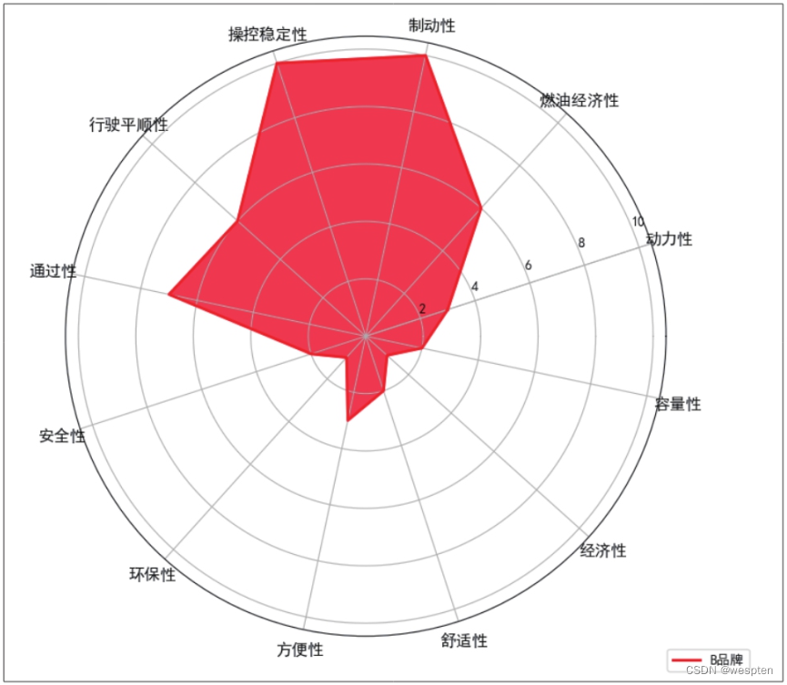
If you only want to display the indicators of a single brand, change the code on line 27 to the following code.
1 figure = plot_radar(data, ['B品牌'])The result of running the code is shown in the figure below:
5. Draw a dendrogram
Code file: Draw a dendrogram.py
The dendrogram visually displays the data ratio relationship of multiple items through the area, arrangement and color of the rectangles. To draw this chart, you need to use the Matplotlib module in combination with the squarify module.
The demo code is as follows:
1 import squarify as sf
2 import matplotlib.pyplot as plt
3 plt.rcParams['font.sans-serif'] = ['Microsoft YaHei']
4 plt.rcParams['axes.unicode_minus'] = False
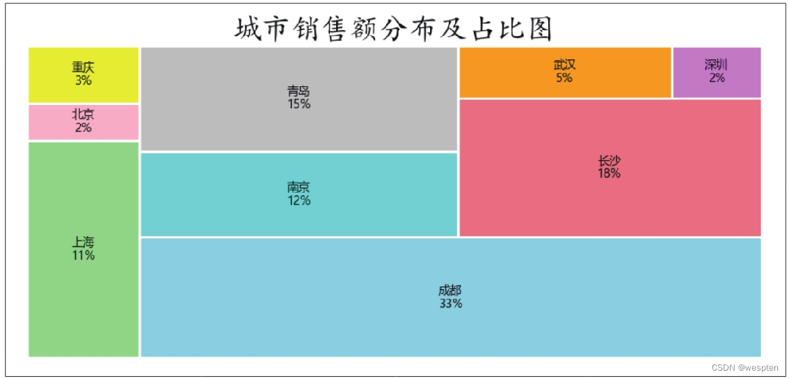
5 x = ['上海', '北京', '重庆', '成都', '南京', '青岛', '长沙', '武汉', '深圳']
6 y = [260, 45, 69, 800, 290, 360, 450, 120, 50]
7 colors = ['lightgreen', 'pink', 'yellow', 'skyblue', 'cyan', 'silver', 'lightcoral', 'orange', 'violet']
8 percent = ['11%', '2%', '3%', '33%', '12%', '15%', '18%', '5%', '2%']
9 chart = sf.plot(sizes=y, label=x, color=colors, value=percent, edgecolor='white', linewidth=2)
10 plt.title(label='城市销售额分布及占比图', fontdict={'family': 'KaiTi', 'color': 'k', 'size': 25})
11 plt.axis('off')
12 plt.show()Lines 1 and 2 import the squarify module and the Matplotlib module respectively. Line 5 specifies the text label for each rectangle in the chart. Line 6 specifies the size of each rectangle. Line 7 specifies the fill color for each rectangle. Line 8 specifies the numerical labels for each rectangle. Line 9 uses the plot() function in the squarify module to draw a dendrogram.
The result of running the code is shown in the figure below:
6. Draw a box plot
Code file: draw box plot.py
A box plot is a statistical graph used to show the distribution of data, named for its shape like a box. Boxplots can be drawn using the boxplot() function in the Matplotlib module.
The demo code is as follows:
1   import pandas as pd
2   import matplotlib.pyplot as plt
3   plt.rcParams['font.sans-serif'] = ['Microsoft YaHei']
4   plt.rcParams['axes.unicode_minus'] = False
5   data = pd.read_excel('1月销售统计表.xlsx')
6   x1 = data['成都']
7   x2 = data['上海']
8   x3 = data['北京']
9   x4 = data['重庆']
10   x5 = data['南京']
11   x = [x1, x2, x3, x4, x5]
12   labels = ['成都', '上海', '北京', '重庆', '南京']
13   plt.boxplot(x, vert=True, widths=0.5, labels=labels, showmeans=True)
14   plt.title('各地区1月销售额箱形图', fontsize=20)
15   plt.ylabel('销售额(万元)')
16   plt.show()
Lines 6-11 give the data used to draw the boxplot. Line 12 of the code gives the x coordinate value. The parameter vert in the 13th line of code is used to set the direction of the box plot, True means vertical display, False means horizontal display; parameter showmeans is used to set whether to display the mean value, True means display the mean value, False means not display the mean value.
The result of running the code is shown in the figure below:
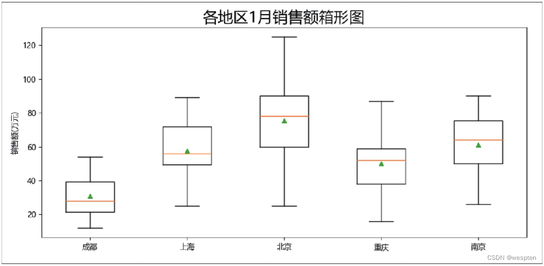
The meanings represented by the 5 horizontal lines and 1 point in the box plot are as follows:
- Lower limit: refers to the minimum value among all data;
- Lower quartile: also known as "first quartile", refers to the 25% value after all the data are arranged from small to large;
- Median: Also known as the "second quartile", it refers to the 50% value after all the data are arranged from small to large;
- Upper quartile: Also known as "third quartile", it refers to the 75th percentile value after all data are arranged from small to large;
- Upper limit: refers to the maximum value of all data;
- Point: Refers to the average of all data.
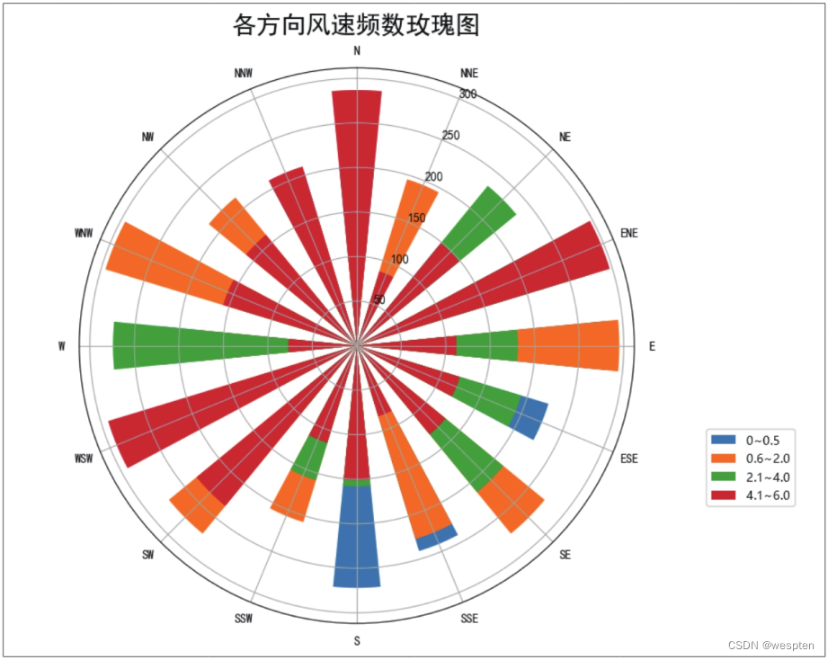
7. Draw a rose diagram
Code file: draw rose diagram.py
The rose chart can reflect data in multiple dimensions. It converts a column chart into a pie chart. When the central angle is the same, the size of the indicator is displayed by the length of the sector. To draw a rose chart, the bar() function for drawing a column chart is also used.
The demo code is as follows:
1   import numpy as np
2   import pandas as pd
3   import matplotlib.pyplot as plt
4   plt.rcParams['font.sans-serif'] = ['SimHei']
5   plt.rcParams['axes.unicode_minus'] = False
6   index = ['0~0.5', '0.6~2.0', '2.1~4.0', '4.1~6.0']
7   columns = ['N', 'NNE', 'NE', 'ENE', 'E', 'ESE', 'SE', 'SSE', 'S', 'SSW', 'SW', 'WSW', 'W', 'WNW', 'NW', 'NNW']
8   np.random.seed(0)
9   data = pd.DataFrame(np.random.randint(30, 300, (4, 16)), index=index, columns=columns)
10   N = 16
11   theta = np.linspace(0, 2 * np.pi, N, endpoint=False)
12   width = np.pi / N
13   labels = list(data.columns)
14   plt.figure(figsize=(6, 6))
15   ax = plt.subplot(1, 1, 1, projection='polar')
16   for i in data.index:
17       radius = data.loc[i]
18       ax.bar(theta, radius, width=width, bottom=0.0, label=i, tick_label=labels)
19   ax.set_theta_zero_location('N')
20   ax.set_theta_direction(-1)
21   plt.title('各方向风速频数玫瑰图', fontsize=20)
22   plt.legend(loc=4, bbox_to_anchor=(1.3, 0.2))
23   plt.show()
The sixth line of code sets the distribution of wind speed to 4 intervals. Line 7 sets 16 directions. The seed() function in line 8 is used to generate the same random number. The ninth line of code creates a DataFrame with 4 rows and 16 columns. The data in it is a random number in the range of 30 to 300. The row label is the wind speed distribution interval set by the sixth line of code, and the column label is the direction set by the seventh line of code.
Line 10 of the code specifies that the number of directions of the wind speed is 16. The 11th line of code is used to generate angle values in 16 directions. The 12th line of code is used to calculate the width of the fan. The 13th line of code is used to define the axis label as the name of 16 directions.
Line 14 uses the figure() function to create a canvas with a height and width of 6 inches. The 15th line of code uses the subplot() function to divide the entire canvas into 1 row and 1 column, and draw in the first area.
Line 18 of the code uses the bar() function to draw 16 columns in the rose diagram, that is, the fan. The parameter bottom is used to set the position of the bottom of each column. Here, it is set to 0.0, which means drawing from the center of the circle.
The 19th line of code is used to set the direction of 0° to "N", which is north. The 20th line of code is used to arrange the columns in a counterclockwise direction.
The result of running the code is shown in the figure below:
Two, pyecharts module
pyecharts is a Python third-party module developed based on the ECharts chart library. ECharts is a pure JavaScript commercial-grade charting library, compatible with most of the current browsers, capable of creating rich types, exquisite and vivid, interactive, and highly customizable data visualization effects. pyecharts builds a bridge between Python and ECharts, so that Python users can also use the powerful functions of ECharts.
1. Chart configuration items
Code file: chart configuration item.py
The pyecharts module can be installed using the command "pip install pyecharts". Before using this module to draw charts, you must first import the module. The import statement is usually written as "from pyecharts.charts import chart type keywords". After importing the module, given the data used to draw the chart, the chart can be drawn.
The following takes drawing a column chart as an example to explain the basic usage of the pyecharts module.
The demo code is as follows:
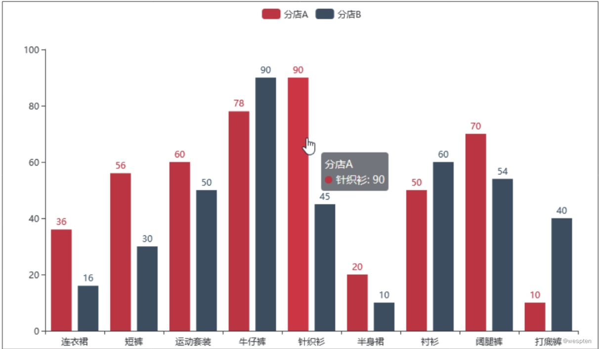
1   from pyecharts.charts import Bar
2   x = ['连衣裙', '短裤', '运动套装', '牛仔裤', '针织衫', '半身裙', '衬衫', '阔腿裤', '打底裤']
3   y1 = [36, 56, 60, 78, 90, 20, 50, 70, 10]
4   y2 = [16, 30, 50, 90, 45, 10, 60, 54, 40]
5   chart = Bar()
6   chart.add_xaxis(x)
7   chart.add_yaxis('分店A', y1)
8   chart.add_yaxis('分店B', y2)
9   chart.render('图表配置项.html')
The first line of code imports the Bar() function in the pyecharts module, which is used to draw a column chart. If you want to draw other types of charts, just import the corresponding chart functions here.
Lines 2 to 4 give the values of the x-coordinate and y-coordinate of the chart, where the y-coordinate value has two data series.
The add_xaxis() function in line 6 of the code is used to add the x coordinate value. The add_yaxis() function in the 7th and 8th line of code is used to add the y-coordinate values of the two series in sequence. The first parameter of this function is used to set the series name, and the second parameter is used to set the series data.
The render() function in the ninth line of code is used to save the drawn chart as a web page file, which is saved here as the "chart configuration item.html" file under the folder where the code file is located. The save path and file name can be determined according to the actual Requirements change.
After running the above code, a web page file named "chart configuration item.html" will be generated under the folder where the code file is located. Double-click the file to see the column chart shown in the figure below in the default browser.
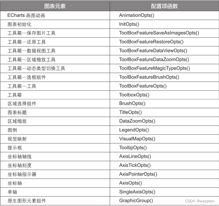
The column chart is static and has no chart title, axis title, etc. elements. If you want to draw a personalized dynamic chart, you can configure the chart elements. In the pyecharts module, all elements of the chart can be configured, and the options for configuring chart elements are called configuration items. Configuration items are divided into two types: global configuration items and series configuration items. Here we mainly introduce the global configuration items.
Global configuration items can be set through the set_global_opts() function in the pyecharts module. When using this function to set global configuration items, you must first import the options submodule of the pyecharts module.
There are many global configuration items, and each configuration item corresponds to a function in the options submodule.
The configuration item functions corresponding to common chart elements are shown in the following table:
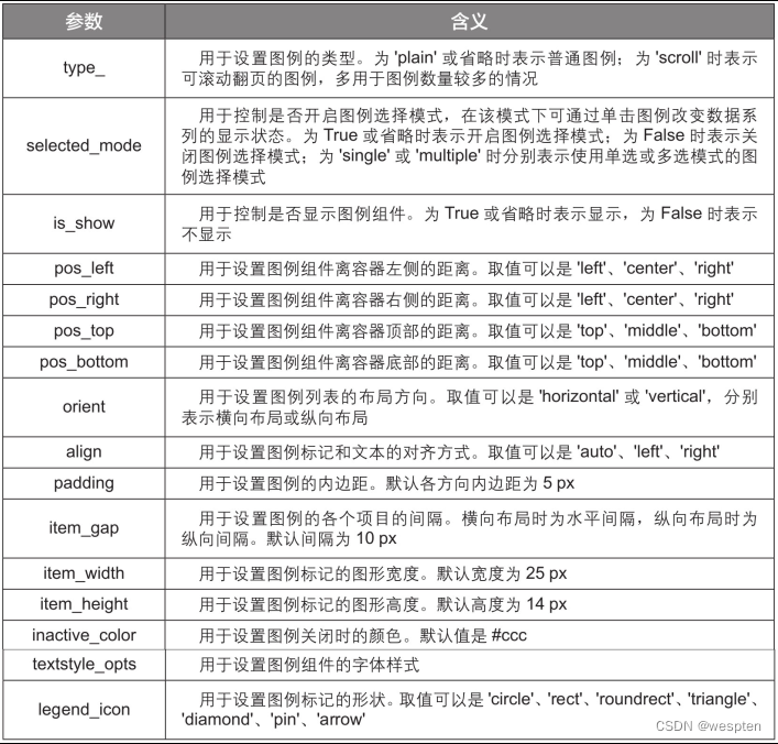
The function corresponding to each configuration item has many parameters. The LegendOpts() function corresponding to the configuration item in the legend is used as an example to briefly introduce the parameters of the configuration item function. See the table below for details.
If you want to know more about configuration items, you can refer to the official documentation of the pyecharts module at https://pyecharts.org/#/zh-cn/global_options.
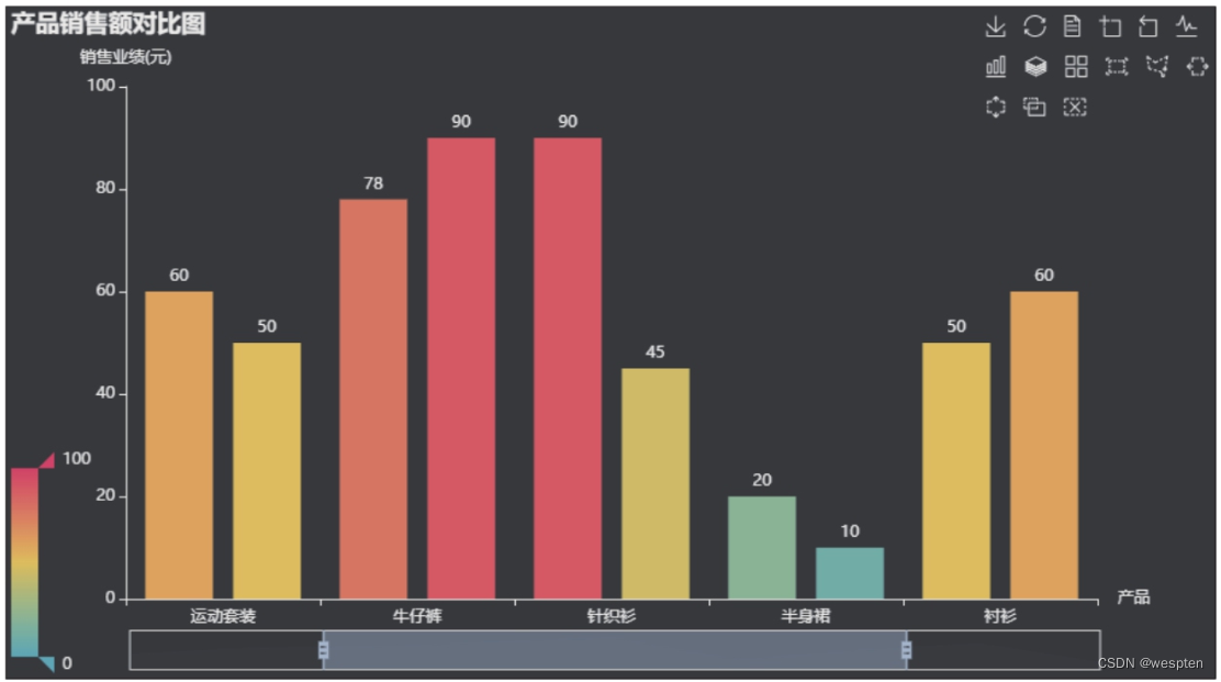
Next, by setting global configuration items, add elements such as chart title, zoom slider, and coordinate axis title to the previously drawn column chart.
The demo code is as follows:
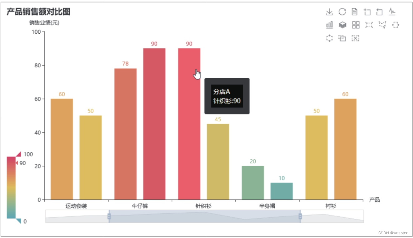
1   from pyecharts import options as opts
2   chart.set_global_opts(title_opts=opts.TitleOpts(title='产品销售额对比图', pos_left='left'),
3       yaxis_opts=opts.AxisOpts(name='销售业绩(元)', name_location='end'),
4       xaxis_opts=opts.AxisOpts(name='产品', name_location='end'),
5       tooltip_opts=opts.TooltipOpts(is_show=True, formatter='{a}<br/>{b}:{c}', background_color='black', border_width=15),
6       legend_opts=opts.LegendOpts(is_show=False),
7       toolbox_opts=opts.ToolboxOpts(is_show=True, orient='horizontal'),
8       visualmap_opts=opts.VisualMapOpts(is_show=True, type_='color', min_=0, max_=100, orient='vertical'),
9       datazoom_opts=opts.DataZoomOpts(is_show=True, type_='slider'))
In the above code, the configuration item TitleOpts() function adds a chart title to the chart and sets the chart title to the left.
The configuration item AxisOpts() function adds the y-axis title "Sales Performance (yuan)" and the x-axis title "Product" to the chart, and sets the coordinate axis title at the end of the axis.
The configuration item TooltipOpts() function sets the prompt box of the chart, that is, the prompt message that pops up when the mouse pointer is placed on the data series of the chart.
The configuration item LegendOpts() function is set not to display the legend.
The configuration item ToolboxOpts() function sets the toolbox to be displayed in the chart in a horizontal layout.
The configuration item VisualMapOpts() function sets to enable the visual map, and sets the color, minimum value, maximum value and layout of the visual map.
The configuration item DataZoomOpts() function sets the area zoom function to be enabled, and sets its type to slider.
After running the code, open the generated web page file, and you can see the column chart as shown in the figure below. Drag the zoom slider below to dynamically display the sales comparison of some products.
The pyecharts module also has a variety of styles of chart themes built in, allowing users to more easily set the appearance of the chart. The method of use is to first import the ThemeType object in the pyecharts module, and then use the InitOpts() function in the function of the chart to set the initialization configuration item.
The demo code is as follows:
1   from pyecharts.globals import ThemeType
2   chart = Bar(init_opts=opts.InitOpts(theme=ThemeType.DARK))
The second line of code uses the InitOpts() function in the Bar() function to set the theme style of the chart to "DARK", and can also be set to "LIGHT", "CHALK", "ESSOS", etc.
The chart effect after setting the theme is shown in the following figure:
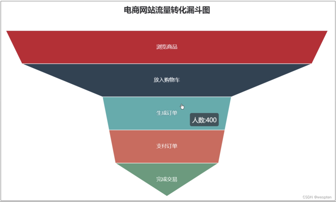
2. Draw a funnel diagram
Code file: draw funnel chart.py
The funnel chart is used to present the data of several stages from top to bottom, and the data of each stage gradually becomes smaller. Use the Funnel() function in the pyecharts module to quickly draw a funnel chart. Next, use this function to draw a funnel diagram to show the changes in the number of people in each stage from browsing products to completing transactions on the e-commerce website.
The demo code is as follows:
1   import pyecharts.options as opts
2   from pyecharts.charts import Funnel
3   x = ['浏览商品', '放入购物车', '生成订单', '支付订单', '完成交易']
4   y = [1000, 900, 400, 360, 320]
5   data = [i for i in zip(x, y)]
6   chart = Funnel()
7   chart.add(series_name='人数', data_pair=data, label_opts=opts.LabelOpts(is_show=True, position='inside'), tooltip_opts=opts.TooltipOpts(trigger='item', formatter='{a}:{c}'))
8   chart.set_global_opts(title_opts=opts.TitleOpts(title='电商网站流量转化漏斗图', pos_left='center'), legend_opts=opts.LegendOpts(is_show=False))
9   chart.render('漏斗图.html')
The fifth line of code first uses the zip() function to pack the corresponding elements in the lists x and y into tuples, and then forms these tuples into a list. This operation is necessary because the Funnel() function requires that the data format of the chart must be a list of tuples, that is, the format of [(key1, value1), (key2, value2), (…)].
Tip: List comprehensions.
The syntax format used to generate lists in line 5 is called a list comprehension, which is equivalent to the following code:
1   data = []
2   for i in zip(x, y)
3       data.append(i)
The list comprehension can make the code concise and concise, and it is also suitable for iterable data structures such as dictionaries and collections.
In the seventh line of code, the functions of the parameters of the add() function are as follows:
- The parameter series_name is used to specify the series name.
- The parameter data_pair is used to specify the series data value.
- The parameter label_opts is used to set the label, and the configuration item of the label has multiple parameters: the parameter is_show is used to control whether to display the label, when it is True, it means display, and when it is False, it means it does not display; the parameter position is used to set the position of the label, set here It is 'inside', indicating that the label is displayed inside the chart, and the value of this parameter can also be 'top', 'left', 'right', etc.
- The parameter tooltip_opts is used to set the prompt box, and the configuration item of the prompt box has multiple parameters: the parameter trigger is used to set the trigger type of the prompt box, and its value is generally set to 'item', which means that when the mouse pointer is placed on the data series, the Display the prompt box; the parameter formatter is used to set the display content of the prompt box, where {a} represents the series name, and {c} represents the data value.
After running the code, the obtained chart effect is as shown in the figure below:
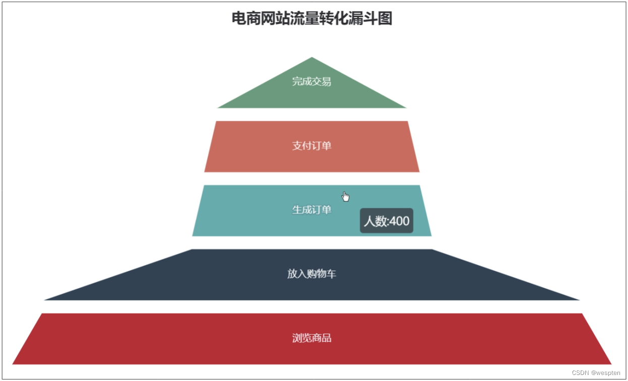
If you want to make the funnel graph inverted, you can use the parameter sort_ in the add() function to adjust the arrangement direction of the data graph. In addition, you can also use the parameter gap in the add() function to set the spacing of the data graphics.
The demo code is as follows:
1 chart.add(series_name='人数', data_pair=data, sort_='ascending', gap=15, label_opts=opts.LabelOpts(is_show=True, position='inside'), tooltip_opts=opts.TooltipOpts(trigger='item', formatter='{a}:{c}'))After running the code, the resulting chart effect is shown in the figure below.
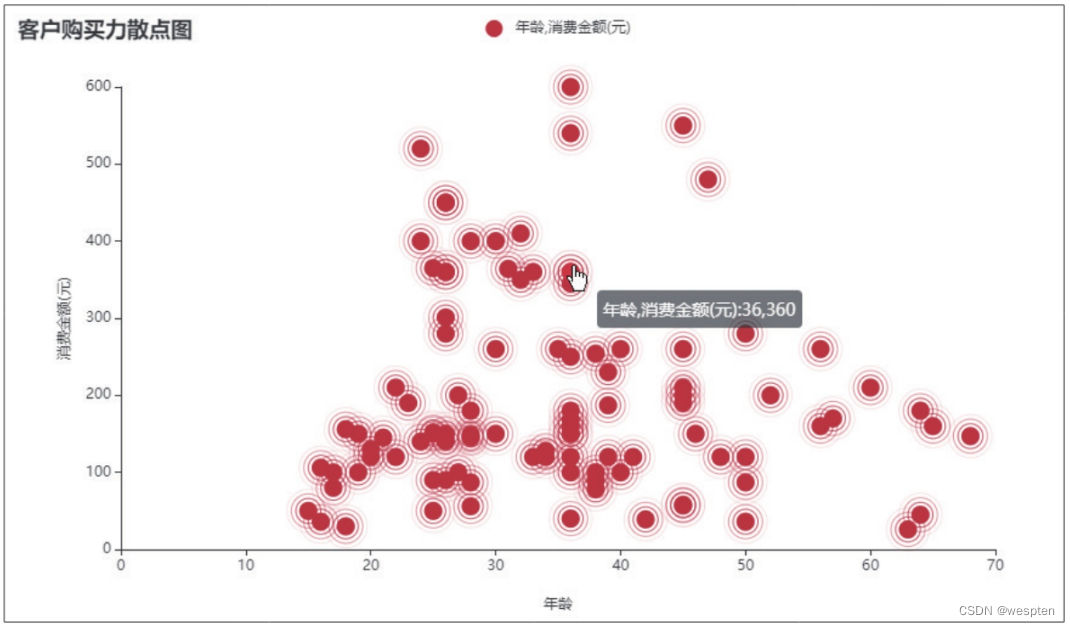
3. Draw a ripple special effect scatter diagram
Code file: draw ripple effect scatter plot.py
The method of drawing a scatter plot using the plot() function in the Matplotlib module has been introduced earlier. The scatter plot drawn by this method is static. Use the EffectScatter() function in the pyecharts module to draw a scatter chart with ripple effects.
The demo code is as follows:
1   import pandas as pd
2   import pyecharts.options as opts
3   from pyecharts.charts import EffectScatter
4   data = pd.read_excel('客户购买力统计表.xlsx')
5   x = data['年龄'].tolist()
6   y = data['消费金额(元)'].tolist()
7   chart = EffectScatter()
8   chart.add_xaxis(x)
9   chart.add_yaxis(series_name='年龄,消费金额(元)', y_axis=y, label_opts=opts.LabelOpts(is_show=False), symbol_size=15)
10   chart.set_global_opts(title_opts=opts.TitleOpts(title='客户购买力散点图'), yaxis_opts=opts.AxisOpts(type_='value', name='消费金额(元)', name_location='middle', name_gap=40), xaxis_opts=opts.AxisOpts(type_='value', name='年龄', name_location='middle', name_gap=40), tooltip_opts=opts.TooltipOpts(trigger='item', formatter='{a}:{c}'))
11   chart.render('涟漪特效散点图.html')
After the codes in lines 5 and 6 select data from the DataFrame, use the tolist() function to convert the selected data into a list format. This is because the pyecharts module only supports Python's native data types, including int, float, str, bool , dict, list.
In the ninth line of code, the parameter label_opts of the add_yaxis() function has the same meaning as the parameter of the same name of the add() function, and the parameter symbol_size is used to set the size of the label.
In the 10th line of code, the parameter title_opts is used to set the chart title; the parameters yaxis_opts and xaxis_opts are used to set the y-axis and x-axis respectively, and the parameter type_ of the corresponding configuration item function AxisOpts() is used to set the type of the coordinate axis [ Here it is set to 'value' (value axis), it can also be set to 'category' (category axis), 'time' (time axis), 'log' (logarithmic axis)], the parameter name is used to set the axis title, The parameter name_location is used to set the position of the coordinate axis title relative to the axis line (here it is set to be displayed in the center), and the parameter name_gap is used to set the distance between the coordinate axis title and the axis line (here it is set to 40 px).
After running the code, the obtained chart effect is as shown in the figure below:
4. Draw a water polo diagram
Code file: draw water polo diagram.py
The water polo chart is suitable for displaying individual percentages. Use the Liquid() function in the pyecharts module to draw a water polo diagram, and you can get a cool display effect through a very simple configuration.
The demo code is as follows:
1 import pyecharts.options as opts
2 from pyecharts.charts import Liquid
3 a = 68
4 t = 100
5 chart = Liquid()
6 chart.add(series_name='商品A', data=[a / t])
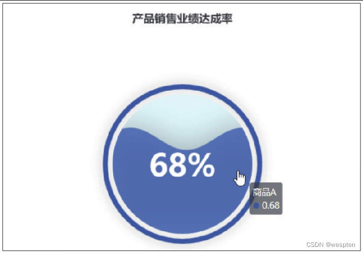
7 chart.set_global_opts(title_opts=opts.TitleOpts(title='产品销售业绩达成率', pos_left='center'))
8 chart.render('水球图.html')The third line and the fourth line of code give the actual sales performance and target sales performance of the product respectively. In the sixth line of code, the parameter data of the add() function is used to specify the series of data. In this case, to show the achievement rate of sales performance, divide the actual sales performance by the target sales performance. It should be noted that the format of the parameter data must be a list.
After running the code, the obtained chart effect is as shown in the figure below:
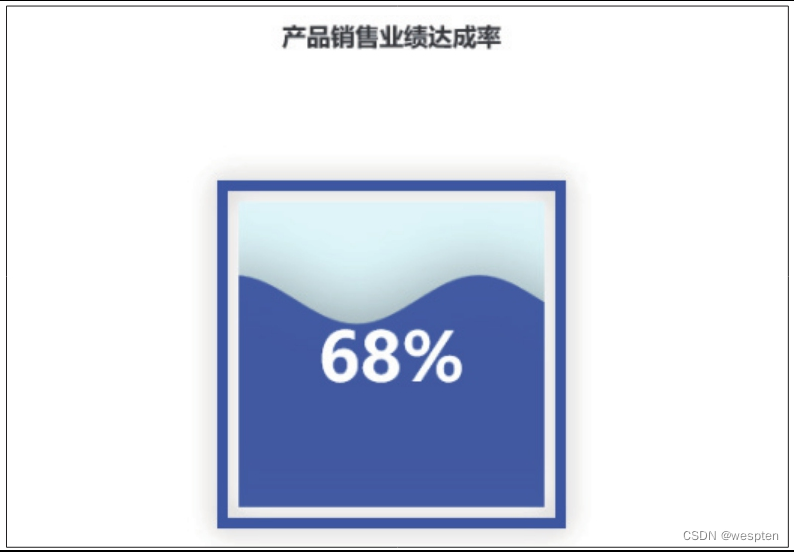
The default shape of the water polo diagram drawn by the Liquid() function is a circle, and the shape of the water polo diagram can be changed by setting the value of the parameter shape. The value of this parameter can be 'circle', 'rect', 'roundRect', 'triangle', 'diamond', 'pin', 'arrow', and the corresponding shapes are circle, rectangle, rounded rectangle, triangle, Rhombus, map pin, arrow.
The demo code is as follows:
1 chart.add(series_name='商品A', data=[a / t], shape='rect') After running the code, the obtained chart effect is as shown in the figure below:
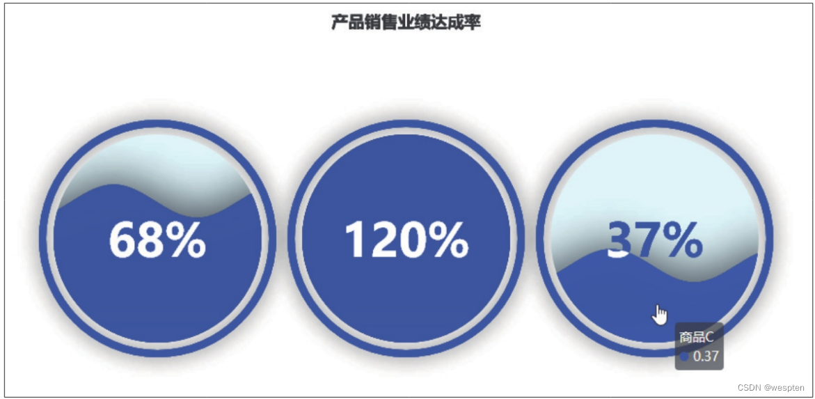
If you want to draw multiple water polo in a water polo diagram, you can achieve it by setting the parameter center of the add() function.
The demo code is as follows:
1   import pyecharts.options as opts
2   from pyecharts.charts import Liquid
3   a1 = 68
4   a2 = 120
5   a3 = 37
6   t = 100
7   chart = Liquid()
8   chart.set_global_opts(title_opts=opts.TitleOpts(title='产品销售业绩达成率', pos_left='center'))
9   chart.add(series_name='商品A', data=[a1 / t], center=['20%', '50%'])
10   chart.add(series_name='商品B', data=[a2 / t], center=['50%', '50%'])
11   chart.add(series_name='商品C', data=[a3 / t], center=['80%', '50%'])
12   chart.render('水球图.html')
Lines 3 to 6 specify the actual sales performance and the same target sales performance of the three products respectively.
Line 7 creates a water polo plot. Line 8 adds a centered chart title to the water polo chart.
Lines 9-11 use the add() function to draw 3 water polo in the water polo diagram in sequence. The parameter center of the function is used to specify the position of the center point of the water polo in the chart.
After running the code, the obtained chart effect is as shown in the figure below:
5. Draw the dashboard
Code file: draw dashboard.py
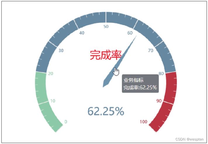
Dashboards, like water polo charts, are also suitable for displaying individual percentages. Dashboards can be drawn using the Gauge() function in the pyecharts module.
The demo code is as follows:
1   import pyecharts.options as opts
2   from pyecharts.charts import Gauge
3   chart = Gauge()
4   chart.add(series_name='业务指标', data_pair=[('完成率', '62.25')], split_number=10, radius='80%', title_label_opts=opts.LabelOpts(font_size=30, color='red', font_family='Microsoft YaHei'))
5   chart.set_global_opts(legend_opts=opts.LegendOpts(is_show=False), tooltip_opts=opts.TooltipOpts(is_show=True, formatter='{a}<br/>{b}:{c}%'))
6   chart.render('仪表盘.html')
The parameter split_number in the fourth line of code is used to specify the average number of segments of the dashboard, here it is set to 10 segments; the parameter radius is used to set the radius of the dashboard, and its value can be a percentage or a numeric value; the parameter title_label_opts is used to set the dashboard Configuration item for title text label.
After running the code, the obtained chart effect is as shown in the figure below:
6. Draw a word cloud map
Code file: draw word cloud map.py
The word cloud map is a chart used to display high-frequency keywords. It produces a very impactful visual effect through the combination of text, color, and graphics. Use the WordCloud() function in the pyecharts module to draw a word cloud map.
The demo code is as follows:
1   import pandas as pd
2   import pyecharts.options as opts
3   from pyecharts.charts import WordCloud
4   data = pd.read_excel('电影票房统计.xlsx')
5   name = data['电影名称']
6   value = data['总票房(亿元)']
7   data1 = [z for z in zip(name, value)]
8   chart = WordCloud()
9   chart.add('总票房(亿元)', data_pair=data1, word_size_range=[6, 66])
10   chart.set_global_opts(title_opts=opts.TitleOpts(title='电影票房分析', title_textstyle_opts=opts.TextStyleOpts(font_size=30)), tooltip_opts=opts.TooltipOpts(is_show=True))
11   chart.render('词云图.html')
In the ninth line of code, the parameter word_size_range of the add() function is used to set the font size range of each word in the word cloud graph. After running the code, the resulting chart effect is shown in the figure below.

Similar to the water polo graph, the outline of the word cloud graph can be changed by setting the value of the parameter shape. Possible values are 'circle', 'cardioid', 'diamond', 'triangle-forward', 'triangle', 'pentagon', ' star'.
The demo code is as follows:
1 chart.add('总票房(亿元)', data_pair=data1, shape='star', word_size_range=[6, 66])After running the code, the obtained chart effect is as shown in the figure below:

Interested friends can use natural language processing methods to segment a batch of texts and count the word frequency, and then use the word frequency data to draw a word cloud map.
7. Draw a candlestick chart
Code file: draw candlestick chart.py
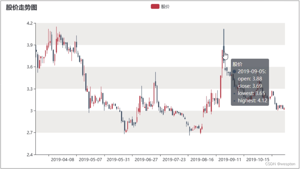
K-line charts are used to reflect stock price information, also known as candlestick charts and stock price charts. All K-line charts revolve around the four data of opening price, closing price, lowest price and highest price. Kline charts can be drawn using the Kline() function in the pyecharts module.
Use the Tushare module to obtain stock price data. Here is an example of obtaining daily K-line stock price data from January 1, 2010 to January 1, 2020 for a stock with a stock code of 000005.
The demo code is as follows:
1   import tushare as ts
2   data = ts.get_k_data('000005', start='2010-01-01', end='2020-01-01')
3   print(data.head())
The result of the code operation is as follows (date is the transaction date, open is the opening price, close is the closing price, high is the highest price, low is the lowest price, volume is the trading volume, and code is the stock code):
1            date  open  close  high   low     volume    code
2   0  2010-01-04  6.01   5.99  6.05  5.91  223582.22  000005
3   1  2010-01-05  5.95   6.20  6.32  5.83  644252.42  000005
4   2  2010-01-06  6.13   6.08  6.28  6.06  494034.08  000005
5   3  2010-01-07  6.03   5.83  6.07  5.82  314417.23  000005
6   4  2010-01-08  5.80   5.89  5.93  5.74  167892.49  000005
Write the acquired stock price data into an Excel workbook.
The demo code is as follows:
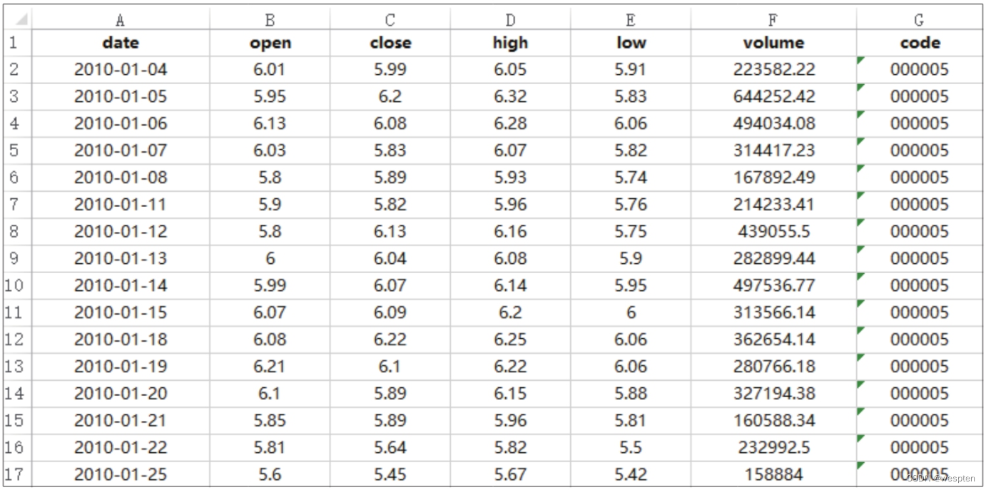
1 data.to_excel('股价数据.xlsx', index=False)After running the code, an Excel workbook named "stock price data.xlsx" will be generated in the folder where the code file is located. Open the workbook, and you can see the acquired stock price data, as shown in the figure below.
After completing the acquisition of stock price data, you can use the Kline() function to draw a K-line chart.
The demo code is as follows:
1   import pandas as pd
2   from pyecharts import options as opts
3   from pyecharts.charts import Kline
4   data = pd.read_excel('股价数据.xlsx')
5   x = data['date'].tolist()
6   open = data['open']
7   close = data['close']
8   lowest = data['low']
9   highest = data['high']
10   y = [z for z in zip(open, close, lowest, highest)]
11   chart = Kline()
12   chart.add_xaxis(x)
13   chart.add_yaxis('股价', y)
14   chart.set_global_opts(xaxis_opts=opts.AxisOpts(is_scale=True), yaxis_opts=opts.AxisOpts(is_scale=True, splitarea_opts=opts.SplitAreaOpts(is_show=True, areastyle_opts=opts.AreaStyleOpts(opacity=1))), datazoom_opts=[opts.DataZoomOpts(type_='inside')], title_opts=opts.TitleOpts(title='股价走势图'))
15   chart.render('K线图.html')
Lines 6 to 9 of the code respectively specify the opening price, closing price, lowest price, and highest price data used to draw the candlestick chart. Line 10 packs this data into a list of tuples as the y-coordinate values. It should be noted that the value of the y coordinate must be arranged in the order of opening price, closing price, lowest price, and highest price.
The SplitAreaOpts() in the 14th line of code is the split area configuration item in the series configuration item, which is used to set whether to display the split effect of color interlaced filling in the background area of the chart data series. The parameter opacity is used to set the opacity, the value The range is 0 to 1, when it is 0, it is completely transparent, and when it is 1, it is completely opaque.
After running the code, the obtained chart effect is as shown in the figure below:
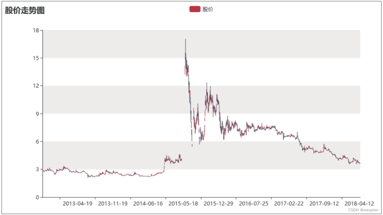
The 14th line of code also uses the configuration item DataZoomOpts() function to add an area zoom slider to the chart. The DataZoomOpts() function was used to add a slider displayed at the bottom of the chart to the column chart, and the slider added here is hidden in the chart. Drag the chart left and right with the mouse to see the data of different periods; place the mouse pointer in the chart, and then slide the mouse wheel, you can see that the chart will zoom as the wheel slides.
In addition, placing the mouse pointer over the data series will display detailed stock price data for the day the mouse pointer points to, as shown in the following figure.