Blue sky and white clouds effect realized by pure CSS3
Today I used CSS3 new properties border-radius , linear-gradient , scale (scaling) and some layout tricks to achieve the effect of blue sky and white clouds. Its HTML structure is as follows:
<div class="container">
    <div class="blueSky">
        <div class="cloud1"></div>
        <div class="cloud2"></div>
        <div class="cloud3"></div>
        <div class="cloud4"></div>
        <div class="cloud5"></div>
    </div>
    <div class="grassLand"></div>
</div>
Implement CSS styles for blue sky :
.blueSky{
    width: 100%;
    height: 240px;
    background-image: -webkit-linear-gradient(top,rgb(196,228,253),rgb(255,255,255));
    position: relative;
}
Implement the CSS style of the grassland :
.grassLand{
    width: 100%;
    height: 160px;
    background-image: -webkit-linear-gradient(top,rgb(255,255,255),rgb(148, 190, 89));
}
Implement the CSS style of the cloud :
.cloud1{
width: 103px;
height: 30px;
background-color: #fff;
border: 1px solid #fff;
border-radius: 50%;
position: absolute;
left: 40%;
top:10%;
}
.cloud1:after{
content: "";
height: 29px;
width: 46px;
background-color: #fff;
border: 1px solid #fff;
border-radius: 50%;
display: block;
position: absolute;
top: -8px;
left: 48px;
}
.cloud1:before{
content: "";
height: 36px;
width: 46px;
background-color: #fff;
border: 1px solid #fff;
border-radius: 50%;
display: block;
position: absolute;
top: -5px;
left: 13px;
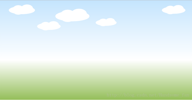
}The result of running the program is as follows:
how about it? Isn't CSS3 very interesting, let's try it now.