In general, there are two categories:
1. transition: the transition process from one style to another
width: the time required for the transition
linear: uniform transition transition: 2s linear; uniform transition, and the duration is 2s
ease: start slowly, then speed up, then end slowly
ease-in: slow start
ease-out: slow end
ease-in-out: slow start and end
example:
.div1{width: 100px; transition: 1s linear;} .div1:hover{width:500px;}
The properties of the transition can be width and height, font color, background color, etc.
2. transform: from one position to another, usually used in conjunction with transition
①Rotate
rotate(30deg) positive value is clockwise
rotateX(30deg)
rotateY(30deg)
② move
translate(x,y) positive values are right, down
translate3d(x,y,z)
translateX
translateY
translateZ
③ Zoom
scale(x,y) x,y is a multiple and can be negative
scaleX
scaleY
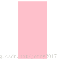
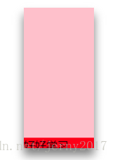
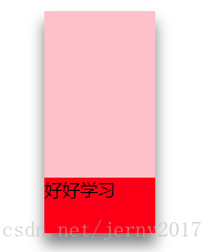
Example: When the mouse moves in, the element does not slowly slide in from the bottom
.div1{
    width:100px;height:200px;background:pink;
    position:relative;
    overflow: hidden;
    transition:1s;
}
.div1 p{
    margin:0;
    height:50px;position:absolute;
    bottom:-50px;left:0;right:0;
    background:red;
    transition:1s;
}
.div1:hover{
    transform: translateY(10px);
    box-shadow:0 10px 20px gray; /* right, bottom, blur radius, shadow color */
}
.div1:hover p{ /* Move the mouse over div1 to write style for the inner p*/
    transform: translateY(-50px);
}
<div class="div1">
    <p>Study hard and make progress every day</p>
</div>