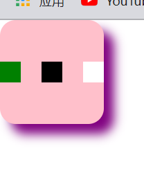
Case 1:
- Draw 3 squares with a variable length of 20px, the colors are
greenblackwhite - Outermost box gives shadow
颜色purple,XY轴各偏移10px,模糊度10px
<!DOCTYPE html>
<html lang="en">

<head>
    <meta charset="UTF-8">
    <meta http-equiv="X-UA-Compatible" content="IE=edge">
    <meta name="viewport" content="width=device-width, initial-scale=1.0">
    <title>Document</title>
</head>
<style>
    .box {


        width: 100px;
        height: 100px;
        border-radius: 15px;
        background-color: pink;
        box-shadow: purple 10px 10px 10px;
    }

    .square1 {


        width: 20px;
        height: 20px;
        background-color: green;
    }

    .square2 {


        width: 20px;
        height: 20px;
        background-color: black;
    }

    .square3 {


        width: 20px;
        height: 20px;
        background-color: white;
    }
</style>

<body>
    <div class="box">
        <div class="square1"></div>
        <div class="square2"></div>
        <div class="square3"></div>
    </div>
</body>

</html>
Knowledge points:
- box shadow
box-shadow: X轴偏移度 Y轴偏移度 模糊度 模糊范围 - Understand that
divis a block element and cannot be arranged on the same line under normal circumstances
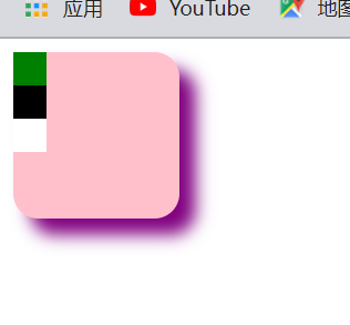
Case 2:
- Use wildcards to remove page preset styles
- Arrange three squares in the same row
- Centered horizontally and vertically

<!DOCTYPE html>
<html lang="en">

<head>
    <meta charset="UTF-8">
    <meta http-equiv="X-UA-Compatible" content="IE=edge">
    <meta name="viewport" content="width=device-width, initial-scale=1.0">
    <title>Document</title>
</head>
<style>
    /* 通配符 */
    * {


        margin: 0;
    }

    .box {


        width: 100px;
        height: 100px;
        border-radius: 15px;
        background-color: pink;
        box-shadow: purple 10px 10px 10px;
    }

    .squareBox {


        /* 专有名词叫弹性布局,是最常用的布局之一 */
        display: flex;
        flex-direction: row;
        /* 下面两行代码实现水平垂直居中 */
        justify-content: center;
        align-items: center;
    }

    .square1 {


        width: 20px;
        height: 20px;
        background-color: green;
    }

    .square2 {


        width: 20px;
        height: 20px;
        background-color: black;
    }

    .square3 {


        width: 20px;
        height: 20px;
        background-color: white;
    }
</style>

<body>
    <div class="box">
        <div class="squareBox">
            <div class="square1"></div>
            <div class="square2"></div>
            <div class="square3"></div>
        </div>
    </div>
</body>

</html>
Knowledge points:
- wildcard
- Flexible layout
display: flex - Code formula for horizontal and vertical centering
.父盒子{
	display: flex;
	justify-content: center;
	align-items: center;
}
think:
- How can I center the three squares horizontally in the box?
- How to make the three boxes spaced properly in the same column?
hint:
- Go to MDN, rookie tutorial Soso
- The second
justify-contentproblem is related to a property value of
The final effect: