On the second day, I learned the knowledge of CSS selectors. There are many CSS selectors. In some style control later, we actually use CSS selectors. This knowledge should be used frequently and reviewed frequently. What I learned today is Text control in CSS and the very important box model
One, text control
1.1 Text basis
font-family设置字体
In CSS, we generally set multiple fonts, because there are different browsers under different users, and the font may not be available on the user’s browser, so generally set multiple fonts for backup
You can also use @font-facethe url of the font format to import external fonts. Here are some commonly used font formats
@font-face {
    font-family: 'Courier New', Courier, monospace;;
    src: url("SourceHanSansSC-Light.otf") format("opentype"),	/*指定字体格式*/
}
| Font | format |
|---|---|
| .otf | opentype |
| .woff | woff |
| .ttf | truetype |
| .eot | Embedded-opentype |
font-weight字重
Word weight refers to the definition of word thickness. Value range normal | bold | bolder | lighter | 100 ~900. 400 corresponds normalto 700 bold, usually bold or normal is used more often.
font-size文本字号
The font size is used to control the display size of the characters, including xx-small | x-small | small | meidum | large | x-large | xx-large, the percentage that can be used is the size of the child element relative to the parent element. For example, the parent element is 20px, and the child element is set to 200%, which is twice the size of your element.
You can also use em as a unit, the em unit is equivalent to a percentage unit
color文本颜色
You can use string settings, hexadecimal settings, rgb settings, rgba to set the transparent color
line-hright行高
font-style字体倾斜风格
组合设置
span {
	/* 加粗 斜体 20号 1.5倍行高 字体*/
	font: bold italic 20px/1.5 'Courier New', Courier, monospace;
}
- Must have font rules
- Must have character size rules
1.2 Text style
大小转换
| CSS style | Instance | effect |
|---|---|---|
| font-variant | font-variant: small-caps; | Small capital letters |
| text-transform | text-transform: capitalize; | Lowercase first letter |
text-decoration文本线条
text-shadow阴影控制
span {
	text-shadow: rgba(13, 6, 89, 0.8) 3px 3px 5px;
}
white-space空白显示
| Options | Description |
|---|---|
| pre | Keep all whitespace in the text, similar to using the pre tag |
| nowrap | Prohibit text wrapping |
| pre-wrap | Keep blank, keep line breaks |
| pre-line | Blank merge, keep line breaks |
1.3 Text overflow handling
Place text in a div, sometimes exceeding the size of the div, then you can use text overflow at this time
单行文本溢出
After a single line of text overflows, you can use line breaks to handle it
div{
    border: solid 1px blue;
    width: 100px;
    overflow-wrap: break-word;
}
溢出内容后面添加...
<!DOCTYPE html>
<html lang="en">
<head>
<meta charset="UTF-8">
<meta name="viewport" content="width=device-width, initial-scale=1.0">
<title>Document</title>
<style>
div{
border: solid 1px blue;
width:300px;
white-space: nowrap; /*禁止换行*/
overflow: hidden;
text-overflow: ellipsis;
}
</style>
</head>
<body>
<div>
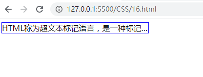
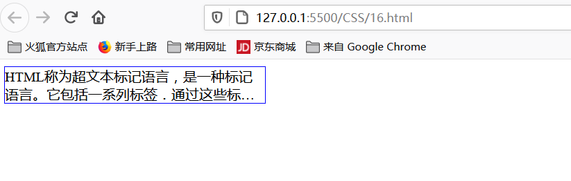
HTML称为超文本标记语言,是一种标记语言。它包括一系列标签.通过这些标签可以将网络上的文档格式统一,使分散的Internet资源连接为一个逻辑整体。HTML文本是由HTML命令组成的描述性文本,HTML命令可以说明文字,图形、动画、声音、表格、链接等。 [1]
超文本是一种组织信息的方式,它通过超级链接方法将文本中的文字、图表与其他信息媒体相关联。这些相互关联的信息媒体可能在同一文本中,也可能是其他文件,或是地理位置相距遥远的某台计算机上的文件。这种组织信息方式将分布在不同位置的信息资源用随机方式进行连接,为人们查找,检索信息提供方便。
</div>
</body>
</html>
控制多行文本溢出时添加…
<style>
    div{


        border: solid 1px blue;
        width:300px;
        overflow: hidden;
        display:-webkit-box;
        -moz-box-orient: vertical;
        -webkit-line-clamp: 2;
    }
</style>
控制表格文本溢出
Table text overflow control needs to define the table-layout: fixed;css style for the table tag , which means that the column width is defined by the table and cell width.
<style>
  table {


    table-layout: fixed;
  }

  table tbody tr td {


    white-space: nowrap;
    overflow: hidden;
    text-overflow: ellipsis;
  }
</style>
溢出后产生滚动条
<style>
    div{


        width: 100px;
        height: 300px;
        border: solid red 1px;
        overflow:scroll;
    }
</style>
1.4 Paragraph control
text-indent文本缩进
text-align文本对齐Using left|right|centerthe text alignment operation
vertical-alignUsed to define the vertical alignment style of the content, including middle | baseline | sub | superetc.
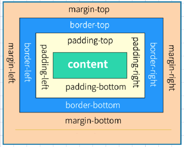
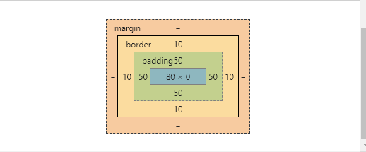
Second, the box model
Open the debugging tool of the browser, you can see the box model diagram below
Basic usage examples:
<!DOCTYPE html>
<html lang="en">

<head>
    <meta charset="UTF-8">
    <meta name="viewport" content="width=device-width, initial-scale=1.0">
    <title>Document</title>
    <style>
        a {


            display: inline-block;
            border: solid 2px #dddddd;
            text-align: center;
            padding: 10px 20px;
            margin-top: 30px;
        }
    </style>
</head>
<body>
    <a href="">MYSQL</a>
    <a href="">LINUX</a>
    <a href="">PHP</a>
</body>
</html>
The margins are defined as top, right, bottom, and left, set to auto to dynamically adjust with the page
2.1 Margin merge
The vertical margins of adjacent elements will be merged, for example
<!DOCTYPE html>
<html lang="en">
<head>
    <meta charset="UTF-8">
    <meta name="viewport" content="width=device-width, initial-scale=1.0">
    <title>Document</title>
    <style>
        main article li{


            border: solid 1px red;
            margin-top: 20px;
            margin-bottom: 20px;
        }
        main article div{


            height: 40px;
            background-color: red;
            margin-left: 40px;
        }
    </style>
</head>
<body>
    <main>
        <article>
            <ul>
                <li>html</li>
                <li>css</li>
                <li>java</li>
            </ul>
            <div>

            </div>
        </article>
    </main>
</body>
</html>
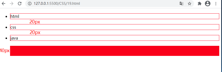
Obviously, the li tag sets the top and bottom margins. It should be 40px between two adjacent li, but because the margins are merged, it is only 20px.
2.2 BOX-SIZING
After setting BOX-SIZING, the width and height include padding and border. The width and height of the previous settings do not include the padding and borders, which can be checked by debugging, for example
<style>
    div {


        border: solid 10px #ddd;
        height: 60px;
        width: 200px;
        padding: 50px;
        box-sizing: border-box;
    }
</style>
2.3 Border design
The frame design can only involve the frame in one direction, for example:
| rule | Description |
|---|---|
| border-top-style | Top side |
| border-right-style | right |
| border-bottom-style | below |
| border-left-style | left |
| border-style | four sides |
border-style边框样式
| Types of | description |
|---|---|
| none | Define no border. |
| dotted | Define a dotted border. It is rendered as a solid line in most browsers. |
| dashed | Define the dashed line. It is rendered as a solid line in most browsers. |
| solid | Define the solid line. |
| double | Define two lines. The width of the double line is equal to the value of border-width. |
| groove | Define the 3D groove border. The effect depends on the value of border-color. |
| ridge | Define a 3D ridge border. The effect depends on the value of border-color. |
| inset | Define the border of the 3D inset. The effect depends on the value of border-color. |
| outset | Define the 3D outset border. The effect depends on the value of border-color. |
The order of styles is top, right, left, bottom
border-width边框高度
border-color边框颜色
border-radius圆角边框Use border-radiusrule setting fillet may be used px | %and other units. It also supports four sides to be set separately.
| Options | Description |
|---|---|
| border-top-left-radius | Top left |
| border-top-right-radius | Upper right |
| border-bottom-left-radius | Bottom left |
| border-bottom-right-radius | Lower right |
Draw a garden by the border
div{
    width: 100px;
    height: 100px;
    border: solid 3px red;
    border-radius: 50%;
}
2.4 Contour
The element is generated when the focus is acquired, and the contour line does not take up space. Pseudo-classes can :focusdefine styles.
- The outline is displayed outside the border
- Contour lines do not affect page layout
Form items have contour lines by default, which can be set or cancelled
outline-style轮廓线样式
| value | description |
|---|---|
| none | default. Define no contour. |
| dotted | Define a point-like outline. |
| dashed | Define the dashed outline. |
| solid | Define the solid outline. |
| double | Define the double-line profile. The width of the double line is equal to the value of outline-width. |
| groove | Define the 3D groove profile. This effect depends on the outline-color value. |
| ridge | Define the 3D convex groove profile. This effect depends on the outline-color value. |
| inset | Define the 3D concave edge profile. This effect depends on the outline-color value. |
| outset | Define the 3D convex edge profile. This effect depends on the outline-color value. |
outline-width宽度
outline-color线条颜色
Can also be defined in combination
<!DOCTYPE html>
<html lang="en">
<head>
    <meta charset="UTF-8">
    <meta name="viewport" content="width=device-width, initial-scale=1.0">
    <title>Document</title>
    <style>
        input:focus{


            outline:double 10px red;
        }
    </style>
</head>
<body>
    <input type="text">
</body>
</html>
2.5 display与visibility
Display and hide the display control element
| Options | Description |
|---|---|
| none | Hidden element |
| block | Show as block element |
| inline | Displayed as a row element, width/height cannot be set |
| inline-block | Row-level block element, allowing setting of width/height f |
Visibility is also the hiding of control elements, and the space is retained after hiding
<!DOCTYPE html>
<html lang="en">
<head>
    <meta charset="UTF-8">
    <meta name="viewport" content="width=device-width, initial-scale=1.0">
    <title>Document</title>
    <style>
        article div:nth-of-type(1){


            height: 200px;
            width: 200px;
            background-color: red;
            visibility: hidden;
        }
        article div:nth-child(2){


            height: 200px;
            width: 200px;
            background-color: green;
        }
    </style>
</head>
<body>
    <article>
        <div></div>
        <div></div>
    </article>
</body>
</html>
2.6 Size definition
There are many ways to set the width and height dimensions of an element.
| Options | Description |
|---|---|
| width | width |
| height | height |
| min-width | Minimum width |
| min-height | Minimum height |
| max-width | Maximum width |
| max-height | maximum height |
| fill-available | Fill up the available space |
ticle>
```
2.6 Size definition
There are many ways to set the width and height dimensions of an element.
| Options | Description |
|---|---|
| width | width |
| height | height |
| min-width | Minimum width |
| min-height | Minimum height |
| max-width | Maximum width |
| max-height | maximum height |
| fill-available | Fill up the available space |
| fit-content | Adapt to the size according to the content |