A jquery plug-in every day-make picture reflections
Make a picture reflection
Shigeon Ryo Mathematics, Mathematics, !!! ∑ (゚ Д ゚ ノ) ノ
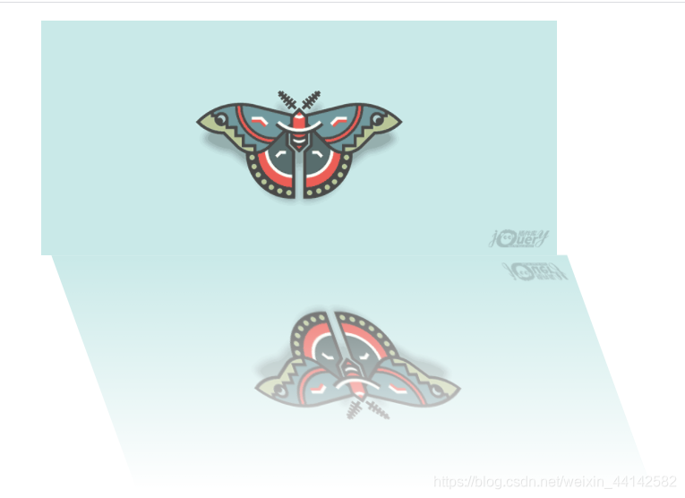
The effect is as follows
Code part
*{


	margin: 0px;
	padding: 0px;
}
.rel{


	position: relative;
}
.clo{


	position: absolute;
	transform: rotateX(180deg);
	background-size: 100% 100%;
	background-repeat: no-repeat;
	background-position: center center;
	transform: skewX(20deg)rotateX(180deg);
}
<!DOCTYPE html>
<html>
	<head>
		<meta charset="utf-8">
		<title>做图片倒影</title>
		<script src="js/jquery-3.4.1.min.js"></script>
		<script src="js/ztpdy.js"></script>
		<link href="css/ztpdy.css" rel="stylesheet" type="text/css" />
		<style>
			#img{


				width:60%;
				display: block;
				margin:20px auto;
			}
		</style>
	</head>
	<body>
		<img id="img" src="img/1.png" />
	</body>
</html>
<script>
	ztpdy("img");
</script>
var ztpdy = function(id){


	var $id = $("#"+id);
	$id.parent().addClass("rel");
	var $clone  =$("<div class='clo'></div>");
	$clone.appendTo($id.parent())
	var y  = $id[0].offsetTop+$id.height()
	var x  =$id[0].offsetLeft
	//这里缺个数学计算,额,就是skew变形之后,会不对称,所以还得让定位往右走一点,具体走多少可以算出来
	//这是个标准的直角三角形,已知高和三个角,其中一个偏了20度,求值,qwq
	//c=b/tant
	var temp =  $id.height()/2/Math.tan(20);
	//但是算出来还是有点问题,不管了,碎觉
	$clone.css({


		"top":y,
		"left":x+temp,
		"width":$id.width(),
		"height":$id.height(),
		"background-image":"linear-gradient(to top, rgba(255, 255, 255, 0), rgba(255, 255, 255, 1)),url("+$id.attr("src")+")"
	})
}
What i wanna do
- I just want to try this image deformation, the function of the transform attribute, I have studied for a long time, thinking that I can make a reflection effect, like the feeling of a lake reflecting everything on the shore, but mine is a bit exploded
- The complete idea is to designate the container, put the contents of the container on the canvas to make a picture and then make a reflection, so try to use the picture first
- There is not much code, that is, the use of the css part, and the gradient of the picture only looks for the linear gradient of the background image, so there is no way to only earn the things in the image path into the background image after specifying the image, using background-image The properties inside set the background image to a linear gradient, which is similar to the mask used in it, oh, then I will give a deformation effect
- Deformation made my brain hurt. After setting the starting point of deformation, many things were not clear, so I didn’t set the starting point of deformation. Then I just calculated the trigonometric function and the needle didn’t rub.
- There are comments in the code, laugh
- Finished, broken sleep