table of Contents
One, common usage of Matplotlib
4. Get to know figure (canvas)
7.2 ls stands for linestyle (line style)
2. Advanced usage of Matplotlib
3. Import images (California housing prices)
Matplotlib is a Python plotting library based on NumPy. It is a tool for data visualization in machine learning.
Matplotlib has strong tool properties, which means that it is only for my use, we don't need to spend too much energy to refine it.
We only need to know what it can do, what graphics can be drawn, and an impression is enough.
Whatever we use in actual use, we will be proficient when we use it.
One, common usage of Matplotlib
1. Draw a simple image
Let's take the most common activation function in machine learning as an sigmoidexample, let's draw it.
import matplotlib.pyplot as plt
import numpy as np
x = np.linspace(-10,10,1000)
y = 1 / (1 + np.exp(-x))
plt.plot(x,y)
plt.show()
The formula of sigmoid is: The
plot() method displays the trend between variables, and the show() method displays the image.
We get the image as shown:

2. Add common elements
We add some reference elements, and the explanation of each function is detailed in the code.
x = np.linspace(-10,10,1000)

#写入公式
y = 1 / (1 + np.exp(-x))

#x轴范围限制
plt.xlim(-5,5)

#y轴范围限制
plt.ylim(-0.2,1.2)

#x轴添加标签
plt.xlabel("X axis")

#y轴添加标签
plt.ylabel("Y axis")

#标题
plt.title("sigmoid function")

#设置网格,途中红色虚线
plt.grid(linestyle=":", color ="red")

#设置水平参考线
plt.axhline(y=0.5, color="green", linestyle="--", linewidth=2)

#设置垂直参考线
plt.axvline(x=0.0, color="green", linestyle="--", linewidth=2)

#绘制曲线
plt.plot(x,y)

#保存图像
plt.savefig("./sigmoid.png",format='png', dpi=300)
The above code includes content such as limiting the range of the X and Y axes, adding titles and labels, setting the grid, adding reference lines, saving images and so on.
The drawing image is as follows:

3. Draw multiple curves
#生成均匀分布的1000个数值
x = np.linspace(-10,10,1000)

#写入sigmoid公式
y = 1 / (1 + np.exp(-x))
z = x**2
plt.xlim(-2,2)
plt.ylim(0,1)

#绘制sigmoid
plt.plot(x,y,color='#E0BF1D',linestyle='-', label ="sigmoid")

#绘制y=x*x
plt.plot(x,z,color='purple',linestyle='-.', label = "y=x*x")

#绘制legend,即下图角落的图例
plt.legend(loc="upper left")

#展示
plt.show()
To draw multiple images, call multiple plot() directly.
Note: If the legend() method is not called, the legend (legend ) in the upper left corner will not be drawn . The colorparameter supports hex representation.

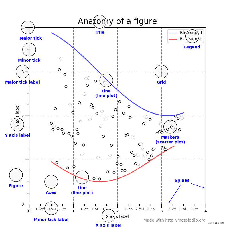
4. Get to know figure (canvas)
First of all, we know figure (canvas), such as legend, which we mentioned above, is the display of line labels.
The dotted line enclosed by the grid is the grid reference line. Text labels such as Title/x axislabel. This picture helps us have an intuitive understanding of figure.
5. Draw multiple images
One figure can correspond to multiple plots . Now we try to draw multiple images on one figure.
x = np.linspace(-2*np.pi, 2*np.pi, 400)
y = np.sin(x**2)
z = 1 / (1 + np.exp(-x))
a = np.random.randint(0,100,400)
b = np.maximum(x,0.1*x)

#创建两行两列的子图像
fig, ax_list = plt.subplots(nrows=2, ncols=2)

# 'r-'其中r表示color=red,-表示linestyle='-'
ax_list[0][0].plot(x,y,'r-')
ax_list[0][0].title.set_text('sin')

ax_list[0][1].scatter(x,a,s=1)
ax_list[0][1].title.set_text('scatter')

ax_list[1][0].plot(x,b,'b-.')
ax_list[1][0].title.set_text('leaky relu')

ax_list[1][1].plot(x,z,'g')
ax_list[1][1].title.set_text('sigmoid')

#调整子图像的布局
fig.subplots_adjust(wspace=0.9,hspace=0.5)
fig.suptitle("Figure graphs",fontsize=16)
plt.show()
Among them, the most critical is the subplotsmethod, which generates sub-images with 2 rows and 2 columns, and then we call each drawing method in ax_list.
Among them 'r-', the 'b-.'parameter is the abbreviation of drawing, and the following paragraphs of parameter abbreviation will be explained separately in this article.

6. Draw common diagrams
We often use graphs to represent the relationship between data. Common graphs include histograms, histograms, pie charts, scatter plots, and so on.
# import matplotlib.pyplot as plt
# import numpy as np
# x = np.linspace(-10,10,100)
# y = 1 / (1+np.exp(-x))
# plt.plot(x,y);
# plt.show()

#添加一些参考元素
# import numpy as np
# import matplotlib.pyplot as plt
# x = np.linspace(-10,10,1000)
# y = 1/ (1+np.exp(-x))
# #x轴范围限制
# plt.xlim(-5,5)
# #y轴范围限制
# plt.ylim(-0.2,1.2)
# # x轴添加标签
# plt.xlabel("X axis")
# #y轴添加标签
# plt.ylabel("Y axis")
# #标题
# plt.title("Sigmoid function")
#
# # 设置网格,途中红色虚线
# plt.grid(linestyle = ":",color = "red")
#
# # 设置水平参考线
# plt.axhline(y=0.5,color="green",linestyle="--",linewidth=2)
# #设置垂直参考线
# plt.axvline(x =0.0,color="green",linestyle="--",linewidth=2)
# #绘制曲线
# plt.plot(x,y)
# plt.show()
# #保存图像
# # plt.savefig("./sigmod.png",format="png",dpi=300)
#

#绘制多曲线
# import numpy as np
# import matplotlib.pyplot as plt
# #生成均匀分布的1000个数值
# x = np.linspace(-10,10,1000)
# y = 1/(1+np.exp(-x))
# z = x**2;
# plt.xlim(-2,2)
# plt.ylim(0,1)
# #绘制sigmod
# plt.plot(x,y,color="red",linestyle="-",label="sigmod")
# #绘制y = x**2
# plt.plot(x,z,color="purple",linestyle="-.",label="y=x**2")
# plt.legend(loc="upper left") #左上方角落的图例。
# plt.show()


# 绘制多图像
#一个figure是可以对应多个plot的
# import numpy as np
# import matplotlib.pyplot as plt
# x = np.linspace(-2*np.pi,2*np.pi,400)
# y = np.sin(x**2)
# z = 1/(1+np.exp(-x))
# a = np.random.randint(0,100,400)
# b = np.maximum(x,0.1*x)
# #创建两行两列的子对象
# fig ,ax_list = plt.subplots(nrows =2,ncols =2)
# # r-中r表示color = red. - 表示linestyle ='-'
# ax_list[0][0].plot(x,y,"r-")
# ax_list[0][0].title.set_text("scatter")
#
# ax_list[0][1].scatter(x,a,s=1)
# ax_list[0][1].title.set_text('scatter')
#
# ax_list[1][0].plot(x,b,'b-.')
# ax_list[1][0].title.set_text('leaky relu')
#
# ax_list[1][1].plot(x,z,'g')
# ax_list[1][1].title.set_text('sigmoid')
#
# fig.subplots_adjust(wspace=0.9,hspace=0.5)
# fig.suptitle("Figure graphs",fontsize = 16)
# fig.show()
# plt.show()
#
#

# 绘制常用图
#直方图,柱状图,饼图,散点图等
# 使绘图支持中文
import numpy as np
import matplotlib.pyplot as plt

plt.rcParams['font.sans-serif'] = ['Arial Unicode MS']

#plt.rcParams["font.sans_serif"]=["Microsoft YaHei"]
#创建两行两列的子对象
fig,[[ax1,ax2],[ax3,ax4],[ax5,ax6]]=plt.subplots(nrows=3,ncols=2,figsize=(8,8))
#绘制柱状图
value = (2,3,4,1,2)
index = np.arange(5)
ax1.bar(index,value,alpha = 0.4,color="b")
ax1.set_xlabel("Group")
ax1.set_ylabel("Scores")
ax1.set_title("柱状图")

#绘制直方图
h = 100 + 15*np.random.randn(437)
ax2.hist(h,bins=50)
ax2.title.set_text("直方图")

#绘制饼图pie
labels = "Frogs","CAT","yongji","Logs"
sizes =[15,30,45,10]
explode =(0,0.1,0,0)
ax3.pie(sizes,explode = explode,labels=labels,autopct='%1.1f%%',
        shadow = True,startangle = 90)
ax3.axis("equal")
ax3.title.set_text("饼图")

# 绘制棉棒图
x = np.linspace(0.5,2*np.pi,20)
y = np.random.randn(20)
ax4.stem(x,y,linefmt="-",markerfmt ="o",basefmt='-')
ax4.title.set_text("棉棒图")
#绘制气泡图scatter
a = np.random.randn(100)
b = np.random.randn(100)
ax5.scatter(a,b,s=np.power(2*a+4*b,2),c = np.random.rand(100),cmap=plt.cm.RdYlBu,marker='o')

#绘制极线图polar
fig.delaxes(ax6)
ax6 = fig.add_subplot(236,projection='polar')
r = np.arange(0,2,0.01)
theta = 2*np.pi*r
ax6.plot(theta,r)
ax6.set_rmax(2)
ax6.set_rticks([0.5,1,1.5,2])
ax6.set_rlabel_position(-22.5)
ax6.grid(True)
#调整子图像的布局
fig.subplots_adjust(wspace=1,hspace=1.2)
fig.suptitle("图形绘制", fontsize=16)
plt.show()
The drawing image is as follows:

7. Parameter shorthand
Because matplotlib supports abbreviations for parameters, I think it is necessary to talk about the abbreviations of each parameter separately.
x = np.linspace(-10,10,20)
y = 1 / (1 + np.exp(-x))
plt.plot(x,y,c='k',ls='-',lw=5, label ="sigmoid", marker="o", ms=15, mfc='r')
plt.legend()
plt.show()
The drawing image is as follows:

7.1 c stands for color
| character | colour |
|---|---|
| ‘b’ | blue |
| ‘g’ | green |
| ‘r’ | red |
| ‘c’ | cyan |
| ‘m’ | magenta |
| 'Y' | yellow |
| ‘k’ | black |
| ‘w’ | white |
7.2 ls stands for linestyle (line style)
| character | description |
|---|---|
| '-' | solid line style |
| '--' | dashed line style |
| '-.' | dash-dot line style |
| ':' | dotted line style |
| '.' | point marker |
| ',' | pixel marker |
| 'The' | circle marker |
| 'v' | triangle_down marker |
| '^' | triangle_up marker |
| '<' | triangle_left marker |
| '>' | triangle_right marker |
| '1' | tri_down marker |
| '2' | tri_up marker |
| '3' | tri_left marker |
| '4' | tri_right marker |
| 's' | square marker |
| 'p' | pentagon marker |
| '*' | star marker |
| 'h' | hexagon1 marker |
| 'H' | hexagon2 marker |
| '+' | plus marker |
| 'x' | x marker |
| 'D' | diamond marker |
| 'd' | thin_diamond marker |
| '|' | vline marker |
| '_' | hline marker |
7.3 marker (mark style)
The mark style is shown as follows: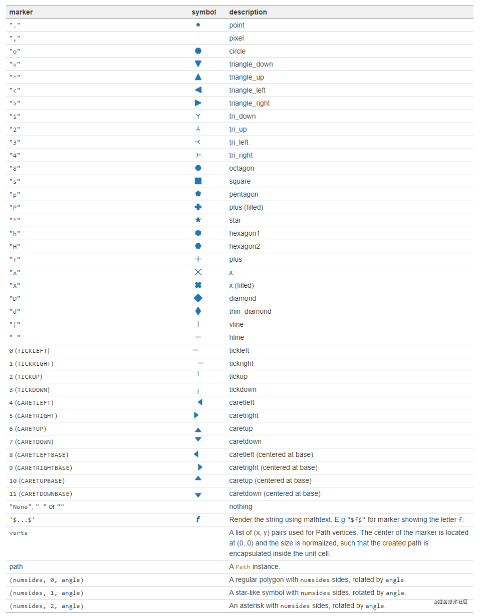
7.4 Other abbreviations
-
lwRepresents linewidth (line width) , such as: lw=2.5 -
msRepresents the markersize (mark size), such as: ms=5 -
mfcRepresents markerfacecolor (marker color), such as: mfc='red'
2. Advanced usage of Matplotlib
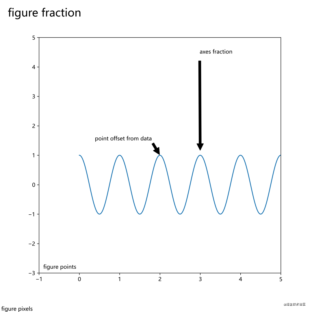
1. Add text notes
We can add text, arrows and other annotations on the canvas (figure) to make the image presentation more clear and accurate.
We draw annotations by calling annotatemethods .
fig, ax = plt.subplots(figsize=(8, 8))

t = np.arange(0.0, 5.0, 0.01)
s = np.cos(2*np.pi*t)

# 绘制一条曲线
line, = ax.plot(t, s)

#添加注释
ax.annotate('figure pixels',
            xy=(10, 10), xycoords='figure pixels')
ax.annotate('figure points',
            xy=(80, 80), xycoords='figure points')
ax.annotate('figure fraction',
            xy=(.025, .975), xycoords='figure fraction',
            horizontalalignment='left', verticalalignment='top',
            fontsize=20)

#第一个箭头
ax.annotate('point offset from data',
            xy=(2, 1), xycoords='data',
            xytext=(-15, 25), textcoords='offset points',
            arrowprops=dict(facecolor='black', shrink=0.05),
            horizontalalignment='right', verticalalignment='bottom')

#第二个箭头
ax.annotate('axes fraction',
            xy=(3, 1), xycoords='data',
            xytext=(0.8, 0.95), textcoords='axes fraction',
            arrowprops=dict(facecolor='black', shrink=0.05),
            horizontalalignment='right', verticalalignment='top')

ax.set(xlim=(-1, 5), ylim=(-3, 5))
The drawing image is as follows:
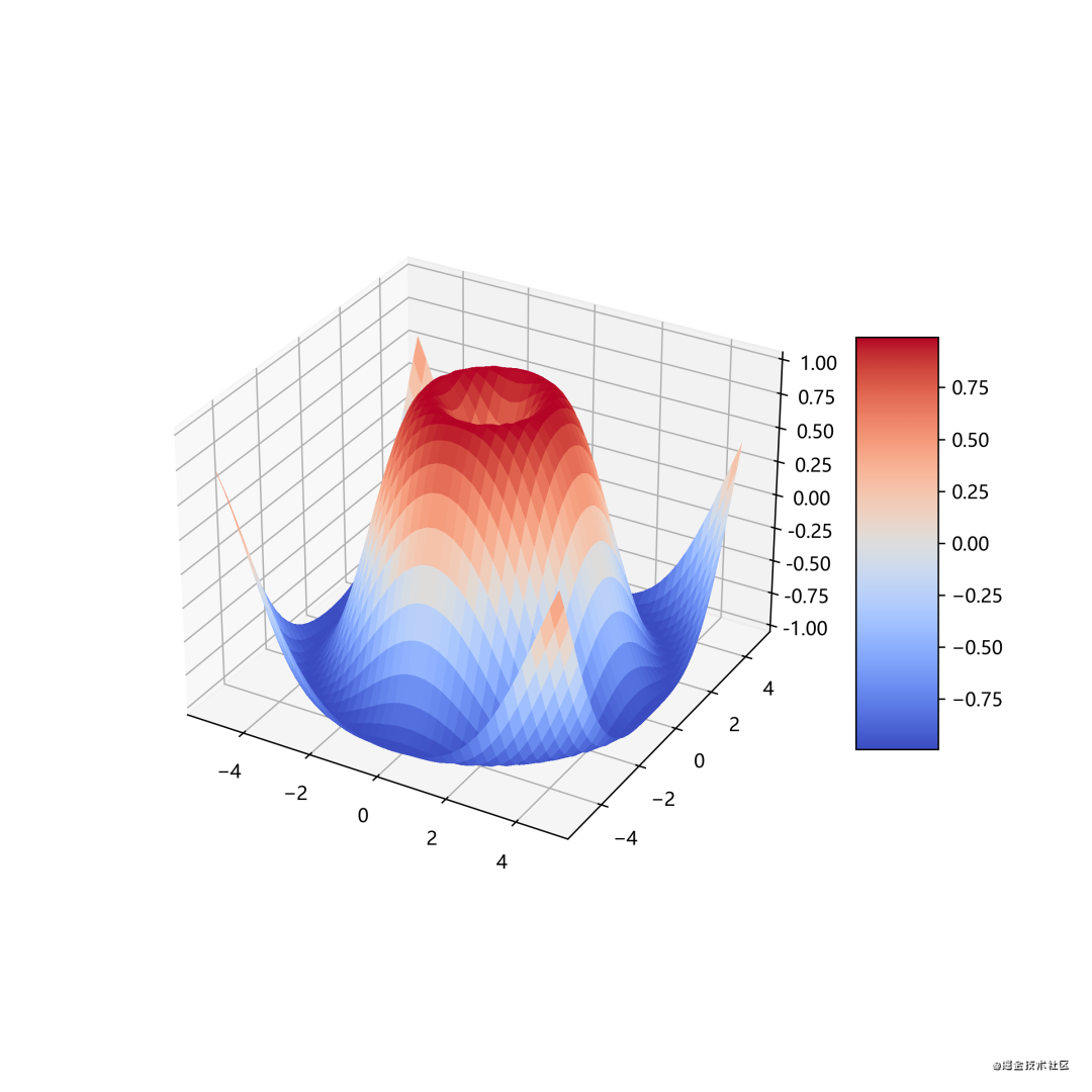
2. Drawing 3D images
To draw a 3D image, you need to import the Axes3Dlibrary.
from mpl_toolkits.mplot3d import Axes3D
import matplotlib.pyplot as plt
from matplotlib import cm
from matplotlib.ticker import LinearLocator, FormatStrFormatter
import numpy as np


fig = plt.figure(figsize=(15,15))
ax = fig.gca(projection='3d')

# Make data.
X = np.arange(-5, 5, 0.25)
Y = np.arange(-5, 5, 0.25)
X, Y = np.meshgrid(X, Y)
R = np.sqrt(X**2 + Y**2)
Z = np.sin(R)

# Plot the surface.
surf = ax.plot_surface(X, Y, Z, cmap=cm.coolwarm,
                       linewidth=0, antialiased=False)

# Customize the z axis.
ax.set_zlim(-1.01, 1.01)
ax.zaxis.set_major_locator(LinearLocator(10))
ax.zaxis.set_major_formatter(FormatStrFormatter('%.02f'))

# Add a color bar which maps values to colors.
fig.colorbar(surf, shrink=0.5, aspect=5)
Which cmapmeans colormap, used to draw color distribution, gradient color, etc. cmapUsually colorbarused in conjunction to draw the color bar of the image.
3. Import images (California housing prices)
Introducing mpimgthe library, to import images.
Let's take California housing price data as an example, import California housing price data to draw a scatter plot, and import California map pictures to view the housing price data corresponding to the latitude and longitude of the map. Use the color bar at the same time to draw the thermal image.
code show as below:
import os
import urllib
import numpy as np
import pandas as pd
import matplotlib.pyplot as plt
import matplotlib.image as mpimg

#加州房价数据(大家不用在意域名)
housing = pd.read_csv("http://blog.caiyongji.com/assets/housing.csv")
#加州地图
url = "http://blog.caiyongji.com/assets/california.png"
urllib.request.urlretrieve("http://blog.caiyongji.com/assets/california.png", os.path.join("./", "california.png"))
california_img=mpimg.imread(os.path.join("./", "california.png"))

#根据经纬度绘制房价散点图
ax = housing.plot(kind="scatter", x="longitude", y="latitude", figsize=(10,7),
                       s=housing['population']/100, label="Population",
                       c="median_house_value", cmap=plt.get_cmap("jet"),
                       colorbar=False, alpha=0.4,
                      )
plt.imshow(california_img, extent=[-124.55, -113.80, 32.45, 42.05], alpha=0.5,
           cmap=plt.get_cmap("jet"))
plt.ylabel("Latitude", fontsize=14)
plt.xlabel("Longitude", fontsize=14)

prices = housing["median_house_value"]
tick_values = np.linspace(prices.min(), prices.max(), 11)

#颜色栏,热度地图
cbar = plt.colorbar(ticks=tick_values/prices.max())
cbar.ax.set_yticklabels(["$%dk"%(round(v/1000)) for v in tick_values], fontsize=14)
cbar.set_label('Median House Value', fontsize=16)
v
plt.legend(fontsize=16)
The drawing image is as follows:
red is expensive, blue is cheap, the size of the circle indicates the population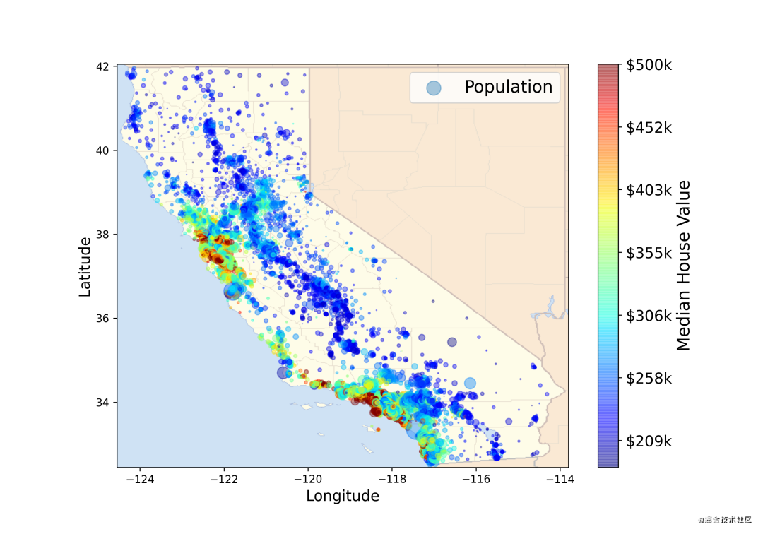
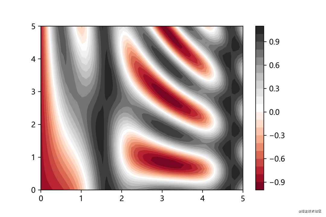
4. Draw contour lines
Contour lines are useful for drawing three-dimensional images in two-dimensional space.
def f(x, y):
    return np.sin(x) ** 10 + np.cos(10 + y * x) * np.cos(x)

x = np.linspace(0, 5, 50)
y = np.linspace(0, 5, 40)

X, Y = np.meshgrid(x, y)
Z = f(X, Y)
plt.contourf(X, Y, Z, 20, cmap='RdGy')
plt.colorbar()
The drawing image is as follows:
black places are peaks, red places are valleys.
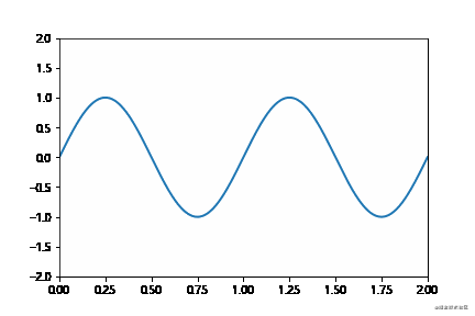
Draw animation
The drawing animation needs to be imported into the animationlibrary, and the FuncAnimationdrawing animation is realized by calling the method.
import numpy as np
from matplotlib import pyplot as plt
from matplotlib import animation

fig = plt.figure()
ax = plt.axes(xlim=(0, 2), ylim=(-2, 2))
line, = ax.plot([], [], lw=2)

# 初始化方法
def init():
    line.set_data([], [])
    return line,

# 数据更新方法,周期性调用
def animate(i):
    x = np.linspace(0, 2, 1000)
    y = np.sin(2 * np.pi * (x - 0.01 * i))
    line.set_data(x, y)
    return line,

#绘制动画,frames帧数,interval周期行调用animate方法
anim = animation.FuncAnimation(fig, animate, init_func=init,
                               frames=200, interval=20, blit=True)
anim.save('ccccc.gif', fps=30)

plt.show()
The anim.save()method in the above code supports saving mp4 format files.
The animated picture is drawn as follows: