Table of contents
- foreword
- Prepare
- 1. pyplot basic function
-
- (1) Back-end resource management
- (2) Basic drawing functions provided by matplotlib.pyplot
-
- 1.plt.title(str, fontsize, fontweight, fontstyle, verticalalignment, horizontalalignment, rotation, alpha, backgroundcolor, bbox)
- 2.plt.xlim(xmin, xmax),plt.ylim()
- 3.plt.xlabel(str, fontsize, fontweight, fontstyle, verticalalignment, horizontalalignment, rotation, alpha, backgroundcolor, bbox),plt.ylabel()
- 4.plt.grid(ls, color)
- 5.plt.axhline(y, xmin, xmax, c, ls, lw, label),plt.axhline(x, ymin, ymax, c, ls, lw, label)
- 6.plt.axhspan(ymin, ymax ,facecolor, alpha),plt.axvspan(xmin, xmax ,facecolor, alpha)
- 7.plt.xticks(),plt.yticks()
- 8.plt.annotate()
- 9.plt.bbox()
- 10.plt.text() / axes.text()
- 11.plt.legend()
- 12.plt.table()
- 2. Figure, Axes and Axis
-
- diagram
- (one)
- (2) Add axes to the figure
-
- 1.函数matplotlib.pyplot.subplot(*args, **kwargs) / matplotlib.pyplot.subplot(nrows, ncols, index, **kwargs)
- 2.函数matplotlib.pyplot.subplots(nrows, ncols, sharex, sharey, squeeze, subplot_kw, gridspec_kw=None, **fig_kw)
- 3. Method matplotlib.pyplot.figure().add_subplot(nrows, ncols, index, **kwargs)
- 4,方法matplotlib.pyplot.figure().add_axes(rect, projection, polar, sharex, sharey, **kwargs)
- 5.函数matplotlib.pyplot.subplot2grid(shape, loc, rowspan, colspan, fig, **kwargs)
- (3) Method of function figure
- (4) AxesSubplot method
- 3. Types of painting
-
- (1) Basics
-
- 1. Line graph matplotlib.pyplot.plot(*args,**kwargs,label) / AxesSubplot.plot()
- 2. Scatter plot matplotlib.pyplot.scatter(x, y, s, c, marker, cmap, norm, vmin, vmax, alpha, linewidths, edgecolors, **kwargs) / AxesSubplot.scatter()
- 3. Histogram matplotlib.pyplot.bar() / AxesSubplot.bar()
- 4. Horizontal histogram matplotlib.pyplot.barh() / AxesSubplot.barh()
- 4. Stem graph (match map) matplotlib.pyplot.stem(x, y, linefmt, markerfmt, basefmt,bottom, label, orientation) / AxesSubplot.stem()
- 5. Ladder chart (step chart) (segmented line chart) matplotlib.pyplot.step() / AxesSubplot.step()
- 6. Filling map matplotlib.pyplot.fill_between() / AxesSubplot.fill_between()
- 7. Stacked graph matplotlib.pyplot.stackplot() / AxesSubplot.stackplot()
- 8. Polar coordinates matplotlib.pyplot.polar() / AxesSubplot.polar()
- (2) Drawing of arrays and fields
-
- 1. Display image matplotlib.pyplot.imshow(X,cmap,interpolation) / AxesSubplot.imshow()
- 2.matplotlib.pyplot.pcolormesh() / AxesSubplot.pcolormesh()
- 3. Contour line (contour line) matplotlib.pyplot.contour(X, Y, Z, levels, cmap, **kwargs) / AxesSubplot.contour()
- 4. Fill contour matplotlib.pyplot.contourf(X, Y, Z, levels, cmap, **kwargs) \ AxesSubplot.contourf()
- 5. Barb plot matplotlib.pyplot.barbs() \ AxesSubplot.barbs()
- 6.箭图matplotlib.pyplot.quiver() \ AxesSubplot.quiver()
- 7. Streamline diagram matplotlib.pyplot.streamplot() \ AxesSubplot.streamplot()
- 8. Draw the correlation between X and Y matplotlib.pyplot.cohere() \ AxesSubplot.cohere()
- 9. Power spectral density map matplotlib.pyplot.psd() \ AxesSubplot.psd()
- 10. Spectrum matplotlib.pyplot.specgram() \ AxesSubplot.specgram()
- (3) Statistical analysis and drawing
-
- 1. Histogram matplotlib.pyplot.hist() \ AxesSubplot.hist()
- 2. Box plot (box plot) matplotlib.pyplot.boxplot() \ AxesSubplot.boxplot()
- 3. Error bar graph matplotlib.pyplot.errorbar() \ AxesSubplot.errorbar()
- 4. Violin map matplotlib.pyplot.violinplot() \ AxesSubplot.violinplot()
- 5. Spike raster map matplotlib.pyplot.eventplot() \ AxesSubplot.eventplot()
- 6.2D histogram matplotlib.pyplot.hist2d() \ AxesSubplot.hist2d()
- 7.matplotlib.pyplot.hexbin() \ AxesSubplot.hexbin()
- 8. Pie chart matplotlib.pyplot.pie() \ AxesSubplot.pie()
- (4) Unstructured coordinates
- (5) 3D
- appendix
foreword
Matplotlib , full name "Matlab plotting library", is a library in Python. It is a mathematical extension of the digital-NumPy library. It is a data visualization tool for drawing two-dimensional and three-dimensional charts in Python. Matplotlib's drawing interface is divided into three types
: pyplot , oriented to the current graph; axes , object-oriented; Pylab, following the matlab style.
Everything in Matplotlib is organized in a hierarchy, the top of the hierarchy is the matplotlb "state machine environment" provided by matplotlib - the pyplot module, used only for a few functions such as figure creation, the user explicitly creates and keeps track of figure and axis objects .
The next level down in the hierarchy is the first level of the object-oriented interface. At this level, pyplot is used to create figures, from which one or more axes objects can be created, and the plot elements (lines, images, text, etc.) Add to the current axes in the current figure.
Prepare
Formatting & Customization
# 导入matplotlib库中的pyplot
import matplotlib as mpl
import matplotlib.pyplot as plt

# 解决中文乱码,可自行修改期望字体
plt.rcParams['font.sans-serif']='SimHei'
mpl.rcParams['font.family']=[Heiti SC]

# 解决负号无法显示的问题
plt.rcParams['axes.unicode_minus']=False

# 将图表以矢量图格式显示,提高清晰度
%config InlineBackend.figure_format = 'svg'

# 提高dpi,以提高图片清晰度(dpi到三百以上,效果会明显变化)
# 也可在设置figure时设置dpi
mpl.rcParams['figure.dpi']=300

# 获取figure尺寸,默认6.4 inch,4.8 inch
plt.rcParams.get('figure.figsize')
# 全局设置输出图片大小的宽m和高n
plt.rcParams['figure.figsize']=(m,n)

# 获取字体大小,默认10.0 & 设置字体大小为k
plt.rcParams.get('font.size')
plt.rcParams['font.size']=k

# 图画面板调整为白色
rc={

    'axes.facecolor':'white','savefig.facecolor':'white'}
mpl.rcParams.update(rc) #一次更新多个值

# 允许输出数学公式
mpl.rcParams['text.usetex']=True

# Figure自动调整格式
plt.rcParams['figure.constrained_layout.use']=True

# 隐藏坐标系,二维三维均可
plt.axis('off')

# 三维坐标轴比例伸缩
ax.get_proj = lambda: np.dot(Axes3D.get_proj(ax), np.diag([1, 1, 2, 2]))

# 去除白边
# bbox_inches = 'tight' 可去除部分白边
# pad_inches 可正可负,减小时会放大图片在画布上的占比,以达到减少白边的效果
savefig(bbox_inches = 'tight',pad_inches = -1.7)
1. pyplot basic function
(1) Back-end resource management
1. Memory or display processing
1.1 matplotlib.pyplot.show()
Display the current figure object
In jupyter notebook, it can run normally without using the show() function, and the format and picture of the picture will be displayed; using the show() function will only display the picture
It can be considered that most of the matplotlib functions are processed on the "temporary" pictures, and the show() function will display the "temporary" pictures, and then there will be no "temporary" pictures, so most operations should be in The show function is done before
1.2 matplotlib.pyplot.close()
Close the figure window object, if not specified, it refers to the current figure window object
关闭所有 figure windows
plt.close('all')
1.3 matplotlib.pyplot.get_fignums()
Query all current image numbers
2.clear,get和set
2.1 matplotlib.pyplot.clf()
clf --> clean current figure --> Clear the current figure object
Clear the active axes in the current figure, but keep other axes unchanged
2.2 matplotlib.pyplot.cla()
cla --> clean current axes --> Clear the current Axes object
Clear all the axes of the current figure, but do not close the window, so it can continue to be reused in other plots.
Creating too many figure objects will cause a warning.
Therefore, it is recommended to only create one figure object. Before drawing the next figure, use plt.clf() to clean up the axes, so that the figure can be reused
2.3 matplotlib.pyplot.gcf()
gcf --> get current figure --> Get the current figure object
2.4 matplotlib.pyplot.gca()
gca --> get current axes --> Get the current Axes object
2.5 matplotlib.pyplot.scf(fig=fig)
scf --> set current figure --> set the current figure object
2.6 matplotlib.pyplot.sca(ax=ax1)
sca --> set current axes --> set the current Axes object
(2) Basic drawing functions provided by matplotlib.pyplot
1.plt.title(str, fontsize, fontweight, fontstyle, verticalalignment, horizontalalignment, rotation, alpha, backgroundcolor, bbox)
Add the title
parameters of graphic content:
(1) fontsize: set the font size
- Optional parameters: ['xx-small', 'x-small', 'small', 'medium', 'large', 'x-large', 'xx-large']
- It can also be a number, the default is 12
(2) fontweight: set font weight
- Optional parameters: ['light', 'normal', 'medium', 'semibold', 'bold', 'heavy', 'black']
semibold: semi-bold; bold: bold
(3) fontstyle: set the font type
- Optional arguments: [ 'normal', 'italic', 'oblique' ]
italic: italic; oblique: oblique
(4) verticalalignment: set the horizontal alignment
- Optional parameters: ['center', 'top', 'bottom', 'baseline']
(5) horizontalalignment: set the vertical alignment
- Optional parameters: ['left', 'right', 'center']
(6) rotation: rotation angle
- Optional parameters are: ['vertical', 'horizontal']
- can also be a number
(7) alpha: Transparency, parameter value between 0 and 1
(8) backgroundcolor: title background color
(9) bbox: add a frame to the title, including parameters:
- boxstyle: box shape
- facecolor: Shorthand fc background color
- edgecolor: abbreviation ec, border line color
- edgewidth: border line size
2.plt.xlim(xmin, xmax),plt.ylim()
Set the numerical display range
parameters of the x and y axes:
xmin, xmax: the minimum and maximum values on the x-axis
3.plt.xlabel(str, fontsize, fontweight, fontstyle, verticalalignment, horizontalalignment, rotation, alpha, backgroundcolor, bbox),plt.ylabel()
Set the label text
parameters of the x and y axes:
(1) fontsize: same as above
(2) fontweight: same as above
(3) fontstyle: same as above
(4) verticalalignment: position from the coordinate axis
- Optional parameters: ['center', 'top', 'bottom', 'baseline']
(5) horizontalalignment: same as above
(6) rotation: same as above
(7) alpha: same as above
(8) backgroundcolor: same as above
(9) bbox: same as above
4.plt.grid(ls, color)
Auxiliary grid line
parameters for drawing tick marks:
(1) ls: linestyle, line type
(2) color: color
5.plt.axhline(y, xmin, xmax, c, ls, lw, label),plt.axhline(x, ymin, ymax, c, ls, lw, label)
Draw a horizontal reference line parallel to the x-axis/ draw a vertical reference line perpendicular to the x-axis.
Parameters: (1) y: the starting point of the
horizontal reference line, the default is 0
The province is 0
(2) xmax: the end position of the reference line, the default is 1
(2) c: color, color
(3) ls: linestyle, line type
(4) lw: linewidth, line width
(5) label: label
6.plt.axhspan(ymin, ymax ,facecolor, alpha),plt.axvspan(xmin, xmax ,facecolor, alpha)
Draw a reference area parallel to the x-axis/ Draw a reference area perpendicular to the x-axis
Parameters:
(1) ymin: the starting position of the reference area
(2) ymax: the end position of the reference area
(3) facecolor: the fill color of the reference area
(4) alpha: the transparency of the fill color of the reference area, [0~1]
7.plt.xticks(),plt.yticks()
Get or set the current x-axis or y-axis tick position and label. It can be understood as setting the same effect as xilim and ylim, but you can specify the range and distance
8.plt.annotate()
Add point-to-point annotation text for graphic content details
9.plt.bbox()
Add a frame to the title
10.plt.text() / axes.text()
Undirected annotation text (watermark) that adds graphic content details
11.plt.legend()
Text label legend to identify different graphs
12.plt.table()
Add tables to subfigures
2. Figure, Axes and Axis
diagram


- A Figure object can have any number of Axes objects, but to be useful there should be at least one
- An Axes object contains two Axis (axes) objects (three if three-dimensional)
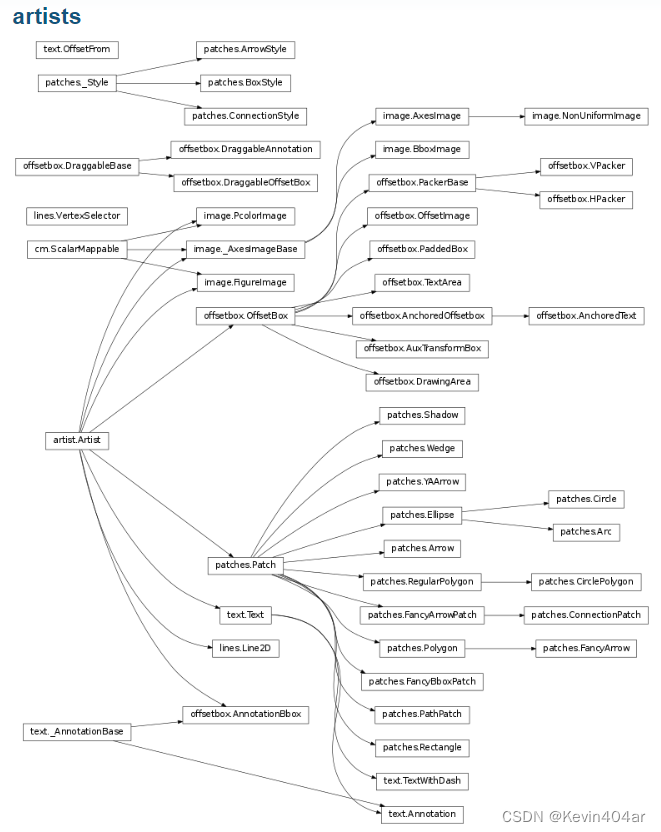
Figure is the largest artist, which includes all the elements of the entire image. The artists elements of each part of a Figure are shown in the figure below: The attributes of all element types in the figure can be used with ax.set_XXX(
) and ax .get_XXX() to set and get.

(one)
1. Element Artist
The base class of some drawing elements, including all the artists that can be seen in the figure. When a figure is rendered, all the artists are drawn on the canvas.
2.matplotlib.pyplot.figure(num, figsize, dpi, facecolor, edgecolor, linewidth, frameon)
Create an image and instantiate the Figure object, which is the top-level container of all drawing elements, which is equivalent to providing a canvas
parameter for the figure:
(1) num: image number or name
- If it is a number and there is a figure object corresponding to the id, activate the figure object for the id
- If it is a number and the figure object corresponding to the id does not exist, create it and return it
- If string, sets the window title to this string
- By default, a new figure object will be created, and at the same time increment the count value of the figure, which is stored in a number property of the figure object, starting from 1
(2) figsize: tuple, specify the width and height of the figure, in inches, the default is rc figure.figsize, initial (6.4,4.8)
(3) dpi: specify the resolution of the drawing object, that is, how many per inch Pixels, the default value is rc figure.dpi, the initial value is 72
1 inch equals 2.54cm, A4 paper is 21x30cm paper
(4) facecolor: background color, default is 'w'
(5) edgecolor: border color, default is 'w'
(6) linewidth: edge line width
(7) frameon: whether to display border, default is True
The image of the figure function has a "color" parameter, and the savefig function also has a "color parameter", but when storing the picture, only the color parameter of the savefig function is used, and the default is black and white.
#创建一个长为10,宽为6的画布
import matplotlib.pyplot as plt
fig=plt.figure(num='pic2-1.png',figsize = (10,6),dpi=90,facecolor = 'r',edgecolor = 'y')
#没有子图的空图形
(2) Add axes to the figure
1.函数matplotlib.pyplot.subplot(*args, **kwargs) / matplotlib.pyplot.subplot(nrows, ncols, index, **kwargs)
This method belongs to API Drawing
First create a canvas implicitly, and then add a subgraph on the canvas (if multiple subgraphs are required, it should be called repeatedly, or a for loop can be used), the subgraph is obtained by equally dividing the canvas
Subfigure: an Axes object, a rectangular area, this rectangle is defined based on the figure coordinate system.
Return value: an Axes object, indexed by the subgraph, in row-major order.
- Creating a subplot using the subplot() method will remove any pre-existing subplots that overlap it, rather than sharing borders.
- When occlusion occurs between the drawn subplots, the subplot method will draw the graphics whose code position is behind
Parameters:
(1) * args (position parameter): three integers or a three-digit number (automatically parsed into three integers), used to correspond to nrows, ncols, index respectively
(1.1) nrows: separated on the vertical axis of the canvas into Several subgraphs, the default is 1
(1.2) ncols: divided into several subgraphs on the horizontal axis of the canvas, the default is 1
(1.3) index: subgraph index
- If it is an integer, it indicates the number of images arranged from left to right and from top to bottom
- If it is a tuple (m, n), m and n are both integers, indicating the start position and end position, forming a rectangular area containing several subgraphs, m and n are at the diagonal positions of the rectangle
- Default is 1
举例:
plt.subplot(nrows=2, ncols=3, index=5)
=plt.subplot(2, 3, 5)
=plt.subplot(235)
(2) ** kwargs (optional): Some keyword arguments related to subgraph properties, this method also accepts keyword arguments that return the AXIS base class
This keyword parameter is similar to the keyword of the coordinate system axes subclass
(2.1) title
(2.2) xlabel, ylabel
(2.3) xlim, ylim
(2.4) frame_on
(2.5) xticks, yticks
(2.6) facecolor
(2.7) projection (keyword parameter): the projection type of the coordinate system
- Possible values are:
{None, 'aitoff', 'hammer', 'lambert', 'mollweide', 'polar', 'rectilinear', '3d', str} - polar: Draw a polar diagram
- 3d: Draw 3D graphs
- The default is None, which means Cartesian coordinate projection
- str is the name of the custom projection.
- Not only can you use the projections designed by the system, but you can also customize a projection transformation and use it, just register and call the custom projection name. str is the name of the custom projection.
(2.8) polar (keyword argument): Boolean indicating whether to enable the 'polar' projection type*
- polar=True <–> projection=‘polar’
- Default is False
import numpy as np
import matplotlib.pyplot as plt

# 设置数据
x = np.arange(0, 3, 0.1)
y1 = np.sin(np.pi*x)
y2 = np.cos(np.pi*x)

#创建图像
plt.figure(num='pic2-1.png',figsize = (10,6), dpi=90,facecolor = 'lightgrey', edgecolor = 'azure',linewidth=10)
# 绘制第一个子图
ax1=plt.subplot(211)
plt.plot(x, y1)
# 绘制第二个子图
ax2=plt.subplot(212)
plt.plot(x, y2)

#绘制
plt.show()

It seems that the subplot function and the show function generate a picture. The first run only has the format, and the second run only produces the picture; there is a subplot function but no show function, the first run has no output, and the second run only produces the picture.
2.函数matplotlib.pyplot.subplots(nrows, ncols, sharex, sharey, squeeze, subplot_kw, gridspec_kw=None, **fig_kw)
This method is object-oriented drawing
Create a canvas and a group of subfigures Return value: a tuple of figure and axes objects, the axes object is an array parameter
composed of several subfigures ax : (1) nrows: separate into several subfigures on the vertical axis of the canvas, The default is 1 (2) ncols: separate into several subgraphs on the horizontal axis of the canvas, the default is 1 (3) sharex / sharey: whether to share x or y axis, the default is False
- all / True: all subplots share axes
- none / False: each has its own axis
- row/col: share x, y axis by subplot row or column
(4) squeeze: When returning multiple subplots, whether axes should be compressed into a 1-dimensional array, the default is True
(5) subplot_kw: passed in the parameters in the add_subplot function, the default is None
() gridspec_kw: passed in the grid Parameters, the default is None
(6) ** fig_kw: other keywords when creating a figure, the specific explanation refers to the above
(6.1) num
(6.2) figsize
(6.3) dpi (6.4
) facecolor
(6.5) edgecolor
(6.6) linewidth
( 6.7) frameon
The parameters of the figure are added to the subplots function, there is no order requirement, no brackets are required, normal commas are enough
import numpy as np
import matplotlib.pyplot as plt

x = np.linspace(0, 2*np.pi, 400)
y = np.sin(x**2)

#创建图形,并创建一个子图
#面向对象语法
fig, ax = plt.subplots()
ax.plot(x, y)
plt.show()

import numpy as np
import matplotlib.pyplot as pl
# 设置数据
x = np.arange(0, 3, 0.1)
y1 = np.sin(np.pi*x)
y2 = np.cos(np.pi*x)
y3 = np.sin(2*np.pi*x)
y4 = np.cos(2*np.pi*x)
#创建figure
plt.figure(figsize = (10,6), facecolor = 'r', edgecolor = 'y')
#划分子图
fig,axes=plt.subplots(2,2)
ax1=axes[0,0]
ax2=axes[0,1]
ax3=axes[1,0]
ax4=axes[1,1]
# 绘制4个子图
ax1.plot(x, y1)
ax2.plot(x, y2)
ax3.plot(x, y3)
ax4.plot(x, y4)
plt.show()
Compare the two:
| subplot | subplots |
| import matplotlib.pyplot as plt | |
| fig = plt.figure() | fig,axes=plt.subplots(2,3) |
| ax1 = plt.subplot(231) | ax1=axes[0,0] |
| ax2 = plt.subplot(232) | ax2=axes[0,1] |
| ax3 = plt.subplot(233) | ax3=axes[0,2] |
| ax4 = plt.subplot(234) | ax4=axes[1,0] |
| ax5 = plt.subplot(235) | ax5=axes[1,1] |
| ax6 = plt.subplot(236) | ax6=axes[1,2] |

It seems that whether the subplots function has a show function or not, it will directly output the format and pictures
3. Method matplotlib.pyplot.figure().add_subplot(nrows, ncols, index, **kwargs)
This method is object-oriented drawing
Parameters:
(1) nrows: divide into several subgraphs on the vertical axis of the canvas, same as above
(2) ncols: divide into several subgraphs on the horizontal axis of the canvas, same as above
(3) index: subgraph index, same as above
(4)* * kwargs: Some keyword arguments related to subgraph properties, same as above
When there is occlusion between the drawn subplots, the subplot method will draw the graphics at the back of the code, and add_subplot will draw all the graphics, but only occlusion
4,方法matplotlib.pyplot.figure().add_axes(rect, projection, polar, sharex, sharey, **kwargs)
Parameters:
(1) rect (position parameter): a 4-element list of floating point numbers, [left, bottom, width, height]
which defines the rectangular sub-area to be added to the figure: the coordinates of the lower left corner (x, y) ,Width Height
The value of each element is the fractional ratio of the actual length to the corresponding length of the figure, not greater than 1; the width and height of the figure are taken as 1 unit
(2) projection (optional) (keyword parameter): the projection type of the coordinate system, as above
(3) polar (optional) (keyword parameter): indicates whether to enable the projection type of 'polar', as above
(4) sharex , sharey (optional) (keyword parameter): Whether to share x or y axis, same as above
5.函数matplotlib.pyplot.subplot2grid(shape, loc, rowspan, colspan, fig, **kwargs)
Parameters:
(1) shape: tuple, the shape of the grid division
(2) loc: tuple, the number of elements is consistent with shape, indicating the starting position of the subgraph division
(3) rowspan: how many rows the subgraph occupies, default is 1
(4) colspan: how many columns the subgraph occupies, the default is 1
(5) fig: the default is None
(6) **kwargs
import matplotlib.pyplot as plt
fig = plt.figure()
fig.suptitle('Figure')
axes1 = plt.subplot2grid((3,3), (0,0), colspan=3)
axes2 = plt.subplot2grid((3,3), (1,0), colspan=2)
axes3 = plt.subplot2grid((3,3), (1,2))
axes4 = plt.subplot2grid((3,3), (2,0))
axes5 = plt.subplot2grid((3,3), (2,1), colspan=2)
plt.show()
(3) Method of function figure
1.matplotlib.pyplot.figure().suptitle()
2.matplotlib.pyplot.figure().supxlabel()
3.matplotlib.pyplot.figure().supylabel()
(4) AxesSubplot method
1.
AxesSubplot.set_title(),AxesSubplot.set_xlabel(),AxesSubplot.set_ylabel(),AxesSubplot.set_xlim(),AxesSubplot.set_ylim(),AxesSubplot.remove(),AxesSubplot.set_facecolor,AxesSubplot.patch.set_alpha(),AxesSubplot.text,AxesSubplot.legend(),AxesSubplot.grid(),AxesSubplot.lines.set_label()
3. Types of painting
(1) Basics
1. Line graph matplotlib.pyplot.plot(*args,**kwargs,label) / AxesSubplot.plot()
For drawing, you can draw points and polylines.
Parameters:
(1) **args: allow multiple pairs of x, y and format_string to be passed in
plot(x1, y1, ‘str1’, x2, y2, ‘str2’)
(1.1) x (optional): X-axis data, which can be (tuple), [list], numpy.array, pandas.Series, default is range(len(y)) (1.2) y: Y-axis
data , can be (tuple), [list], numpy.array, pandas.Series
Can x, y be pd.DataFrame?
(1.3) format_string (optional): the format string of the control curve
(1.3.1) c: color, color, see "Color Table" at the bottom of the text for details
(1.3.2) ls: linestyle, line style
':': dotted line; '-.': dotted line; '–': dashed line; '-': solid line; '' and ' ': no line
(1.3.3) lw: linewidth, linewidth
(1.3.4) marker: marker
'.': point mark; ',': point mark; 'o': solid circle mark; 'v': inverted triangle mark; '^': upper triangle mark; '>': right triangle mark; '<': Left triangle mark; 'h': vertical hexagonal mark; 'H': horizontal hexagonal mark; '+': cross mark; '+': cross mark; '1': lower flower triangle mark; '2' : upper flower triangle mark; '3': left flower triangle mark; '4': right flower triangle mark; 's': solid square mark; 'p': solid five-point mark; '*': star mark; 'd ': thin diamond mark; 'D': diamond mark; '|': vertical line mark; '_': horizontal line mark
(1.3.5) markersize: marker size
(1.3.6) markerfacecolor: marker fill color
(1.3.7) markeredgewidth: marker edge width
(1.3.8) markeredgecolor: marker edge color
The above can use named parameters (color='r', linestyle='-', marker='o'), or in string form ('r'+'-'+'o') ('r-o' )
(1.3.9) alpha
(2) ** kwargs: allows multiple optional keyword parameters to be passed in
(3) label: label, there can only be one label in a plot, and the default is None
import matplotlib.pyplot as plt

#一个图片里绘制一个图像
a1=[3,4,5] # [列表]
a2=[2,3,2] # x,y元素个数N应相同

plt.plot(a1,a2)
plt.show()

import numpy as np
import pandas as pd
import matplotlib.pyplot as plt

#一个图片里绘制两个图像
x=(3,4,5) # (元组)
y1=np.array([3,4,3]) # np.array
y2=pd.Series([4,5,4]) # pd.Series

plt.plot(x,y1)
plt.plot(y2)  # x可省略,默认[0,1..,N-1]递增,N是y内的元素数
plt.show() # plt.show()前可加多个plt.plot(),画在同一张图上

import numpy as np
import pandas as pd
import matplotlib.pyplot as plt

#一个图片里绘制两个图像
plt.plot(x,y1,x,y2) # 此时x不可省略
plt.show()

import numpy as np
import matplotlib.pyplot as plt

#二维数组
b1=np.array([[0,1,2],
             [3,4,5],
             [6,7,8]])
b2=np.array([[2,3,5],
             [8,3,1],
             [4,5,9]])
#b1的第一列为[0,3,6],b2的第一列为[2,8,4],从而构成三个点一段折线,以此类推

plt.plot(b1,b2)
plt.show()

import numpy as np
import matplotlib.pyplot as plt

#格式控制字符串
b1=np.array([[0,1,2],
             [3,4,5],
             [6,7,8]])
b2=np.array([[1,3,4],
             [7,1,8],
             [9,7,6]])

plt.plot(b1,b2,"ob:") #"b"为蓝色, "o"为圆点, ":"为点线
plt.show()

import numpy as np
import pandas as pd
import matplotlib.pyplot as plt

#颜色与线型
color=['b','g','r','c','m','y','k','w']
linestyle=['-','--','-.',':']

##格式控制字符串
dic1=[[0,1,2],[3,4,5]]
x=pd.DataFrame(dic1)
dic2=[[2,3,2],[3,4,3],[4,5,4],[5,6,5]]
y=pd.DataFrame(dic2)

# 循环输出所有"颜色"与"线型"
for i in range(2):
    for j in range(4):
        plt.plot(x.loc[i],y.loc[j],color[i*4+j]+linestyle[j])
plt.show()

#如果只控制"颜色", 格式控制字符串还可以输入英文全称, 如"red"
#也可以是十六进制RGB字符串, 如"#FF0000"

import matplotlib.pyplot as plt

#关键字=参数
y=[2,3,2]
plt.plot(y,color="blue",linewidth=20,marker="o",markersize=50,
         markerfacecolor="red",markeredgewidth=6,markeredgecolor="grey")
plt.show()

2. Scatter plot matplotlib.pyplot.scatter(x, y, s, c, marker, cmap, norm, vmin, vmax, alpha, linewidths, edgecolors, **kwargs) / AxesSubplot.scatter()
Parameters:
(1) x, y: Indicates an array with a shape size of (n,), which is the data point for which we are about to draw a scatter diagram, input data. x-axis data and y-axis data
(2) s (optional): indicates the size of the scatter point, which is a scalar or an array with a shape size of (n,), the default is 20 (
3) c (optional): color, which represents a scatter color or a sequence of colors. But c should not be a single RGB number, nor should it be a sequence of RGBA, because it is inconvenient to distinguish. c can be an RGB or RGBA two-dimensional row array. The default is 'b', which means blue
(4) marker (optional): MarkerStyle, which means the scatter shape, the style of the marker, the default is 'o' (5)
cmap (optional): Colormap, scalar or the name of a colormap, cmap is only used when c is an array of floats. If it is not declared, it is image.cmap, and the default is None
cmap = plt.cm.Spectral
Give the point with label 1 a color, and give the point with label 0 another color
cmap=plt.get_cmap('rainbow'))
Set the color mapping
(6) norm: Normalize, the data brightness is between 0-1, and it is only used when c is an array of floating point numbers, the default is None (7
) vmin, vmax (optional): scalar, when norm exists is ignored. Used to normalize the brightness data, the default is None
(8) alpha (optional): scalar, between 0-1, the transparency of the scattered points, the default is None
(9) linewidths: the length of the marker point, The width of the scatter border, the default is None
(10) edgecolors: set the color of the scatter border, the default is None
3. Histogram matplotlib.pyplot.bar() / AxesSubplot.bar()
4. Horizontal histogram matplotlib.pyplot.barh() / AxesSubplot.barh()
4. Stem graph (match map) matplotlib.pyplot.stem(x, y, linefmt, markerfmt, basefmt,bottom, label, orientation) / AxesSubplot.stem()
Parameters:
(1) x (optional): array, the x-axis position of each match, the default is arange(len(y)) (
2) y: array, the y coordinate of the head of the match
(3) linefmt (optional Optional): string type, define the vertical line properties, including line color and line type, the default is None
(4) markerfmt (optional): string type, define the match head marker properties, including line color and line type
- Available colors: C0-C9, eight basic colors
- Optional linear: see above
- Default is 'C0o'
(5) basefmt (optional): string type, defines the baseline attribute, the default is 'C3-', in classic mode it is 'C2-'
(6) bottom (optional): floating point type, the y where the baseline is located Axis position, default is 0
(7) label (optional): string type, label, default is None
(8) orientation (optional): such as 'y'
2D plots seem to cause warnings using this parameter
5. Ladder chart (step chart) (segmented line chart) matplotlib.pyplot.step() / AxesSubplot.step()
6. Filling map matplotlib.pyplot.fill_between() / AxesSubplot.fill_between()
7. Stacked graph matplotlib.pyplot.stackplot() / AxesSubplot.stackplot()
8. Polar coordinates matplotlib.pyplot.polar() / AxesSubplot.polar()
(2) Drawing of arrays and fields
1. Display image matplotlib.pyplot.imshow(X,cmap,interpolation) / AxesSubplot.imshow()
Heatmap (heatmap) is a common method of data analysis. It shows the difference of data through color difference and brightness, which is easy to understand.
Parameters:
(1) x: image data
- (M, N): Image with scalar data, grayscale. Data visualization using colormaps.
- (M,N,3): Image (float or uint8) with RGB values.
- (M,N,4): Image (float or uint8) with RGBA values, i.e. including transparency.
- The first two dimensions (M, N) define the row and column images, that is, the height and width of the image
- RGB(A) values should be in the range [0,1] for floats, or [0,255] for integers. Values outside the range will be clipped to these bounds.
(2) cmap: Map scalar data to a colormap, the default is None
cmap='color'; cmap=plt.get_cmap('color')
(3) interpolation: the default is None
2.matplotlib.pyplot.pcolormesh() / AxesSubplot.pcolormesh()
3. Contour line (contour line) matplotlib.pyplot.contour(X, Y, Z, levels, cmap, **kwargs) / AxesSubplot.contour()
Parameters:
(1) X, Y (optional): array, coordinates of values in Z
- Both are two-dimensional and have the same shape as Z
- Both are one-dimensional, at this time len(X)==M is the number of columns in Z, len(Y)==N is the number of rows in Z
- The default is an integer index, that is, X = range(M), Y = range(N)
(2) Z: array-like(N,M), height values to draw contours
(3) levels (optional): int or array, determines the number and location of contours/regions
- If it is an integer n, use n data intervals to display n contour lines in the graph
- If it is an array [], the contour line is drawn at the specified elevation, and these values must be arranged in increasing order
- The default is to draw several curves Z=c, c is a random number
(4) cmap: the default is None
4. Fill contour matplotlib.pyplot.contourf(X, Y, Z, levels, cmap, **kwargs) \ AxesSubplot.contourf()
Basically the same as above
5. Barb plot matplotlib.pyplot.barbs() \ AxesSubplot.barbs()
6.箭图matplotlib.pyplot.quiver() \ AxesSubplot.quiver()
7. Streamline diagram matplotlib.pyplot.streamplot() \ AxesSubplot.streamplot()
8. Draw the correlation between X and Y matplotlib.pyplot.cohere() \ AxesSubplot.cohere()
9. Power spectral density map matplotlib.pyplot.psd() \ AxesSubplot.psd()
10. Spectrum matplotlib.pyplot.specgram() \ AxesSubplot.specgram()
(3) Statistical analysis and drawing
1. Histogram matplotlib.pyplot.hist() \ AxesSubplot.hist()
2. Box plot (box plot) matplotlib.pyplot.boxplot() \ AxesSubplot.boxplot()
3. Error bar graph matplotlib.pyplot.errorbar() \ AxesSubplot.errorbar()
4. Violin map matplotlib.pyplot.violinplot() \ AxesSubplot.violinplot()
5. Spike raster map matplotlib.pyplot.eventplot() \ AxesSubplot.eventplot()
6.2D histogram matplotlib.pyplot.hist2d() \ AxesSubplot.hist2d()
7.matplotlib.pyplot.hexbin() \ AxesSubplot.hexbin()
8. Pie chart matplotlib.pyplot.pie() \ AxesSubplot.pie()
(4) Unstructured coordinates
1.matplotlib.pyplot.tricontour() \ AxesSubplot.tricontour()
2.matplotlib.pyplot.tricontourf() \ AxesSubplot.tricontourf()
3.matplotlib.pyplot.tripcolor() \ AxesSubplot.tripcolor()
4.matplotlib.pyplot.triplot() \ AxesSubplot.triplot()
(5) 3D
1. AxesSubplot.plot(x, y, z)
2. AxesSubplot.scatter(x, y, z)
3. AxesSubplot.plot_surface(x, y, z, rstride, cstride, cmap)
Parameters:
(1) x, y, z:
(2) rstride: row, the stride of the specified row, the default is 1
(3) cstride: column, the stride of the specified column, the default is 1
(4) color: indicated It is a scatter color or color sequence, as above
(5) cmap: scalar or the name of a colormap, cmap is only used when c is an array of floating point numbers, as above
(6) alpha (optional): scalar, 0- Between 1, the transparency of scattered points, the default is None
4.
Triangular 3D surfaces,3D voxel / volumetric plot,3D wireframe plot
appendix
1. Color table
2. Marker
| symbol | mark | symbol | mark | symbol | mark | symbol | mark |
|---|---|---|---|---|---|---|---|
| . | point | , | pixel | o | solid circle | v | inverted triangle |
| ^ | regular triangle | < | left triangle | > | right triangle | 1 | lower flower triangle |
| 2 | upper flower triangle | 3 | left flower triangle | 4 | right flower triangle | 8 | regular octahedron |
| s | solid square | p | solid pentagon | P | solid cross | + | the cross |
| x | Forked | X | solid fork | d | skinny rhombus | D | diamond |
| h | vertical hexagon | H | horizontal hexagon | | | vertical line | _ | horizontal line |
| * | Pentagram |
The above is not finished and needs to be updated, it is only for personal study, the infringement contact is deleted, if there are any mistakes or deficiencies, please point out for improvement.