1. Introduction to machine learning
1. Development history of machine learning
Simply use a mind map to sort out the development process of machine learning:

In the past two decades, the ability of humans to collect , store , transmit , and process data has been rapidly improved. Every corner of human society has accumulated a large amount of data. There is an urgent need for machine algorithms that can effectively analyze and use data. Learning conforms to the needs of the great age, so this subject area has naturally made great developments and received widespread attention.
2. Machine learning task classification
Machine learning can be roughly divided into the following categories:
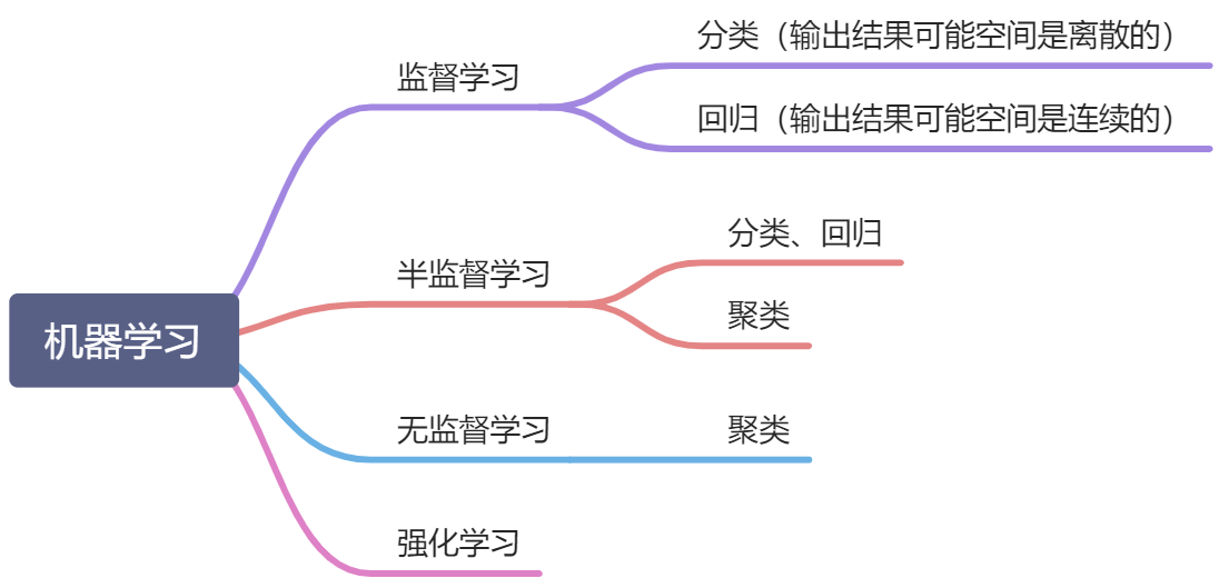
Focus on explaining the meaning of "supervision". Taking supervised learning as an example, the task of supervised learning is to try to learn a mathematical model so that the model can make a good prediction of its corresponding output for any given input. Supervision means that the output exists and is known (in the case of classification, the type is known, in the case of regression, the range is known). The purpose of semi-supervised clustering learning and unsupervised learning is to explore the internal relationships and structure in the data.
2. Demonstration of machine learning example code
1. Preparation
- Use anaconda to build a running environment
Reference tutorial:
Win10 uses Anaconda to build a Pandas+Numpy environment - Install related packages (here can also be written in requirements.txt for unified installation)
pip install numpy
pip install pandas
pip install sklearn
pip install matplotlib
pip install seaborn
- Introduce related packages into the code header
import numpy as np
import pandas as pd
import matplotlib.pyplot as plt
%matplotlib inline
plt.style.use("ggplot")
import seaborn as sns
from sklearn import datasets
2. Return
1) Overview of regression analysis
In statistics, regression analysis refers to a statistical analysis method that determines the quantitative relationship between two or more variables.
According to the type of relationship between the independent variable and the dependent variable, it can be divided into linear regression analysis and nonlinear regression analysis.
Among them, linear regression analysis can be divided into unary linear regression and multiple linear regression.
2) Return case
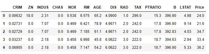
The Boston Housing Price Data Set contains information about housing prices in Boston, Massachusetts, US collected by the US Census Bureau. The data set is very small, with only 506 cases.
| variable name | Description |
|---|---|
| CRIM | Crime rate of urban population |
| ZN | Percentage of residential land with more than 25,000 square feet |
| INDUS | Proportion of urban non-retail business areas |
| CHAS | Charles River dummy variable (if the land is by the river=1; otherwise it is 0) |
| NOX | Nitric oxide concentration (per 10 million shares) |
| RM | Average number of rooms per resident |
| AGE | Percentage of owner-occupied units built before 1940 |
| DIS | Weighted distance to five Boston job centers |
| RAD | Accessibility index of radial highway |
| TAX | Full property tax rate per $10,000 |
| RTRATIO | Urban teacher-student ratio |
| B | 1000(Bk-0.63)^2 where Bk is the proportion of urban blacks |
| LSTAT | Percentage of lower-status people in the population |
| WITH V | (Target Variable/Category Attribute) The median of self-owned housing calculated at $1,000 |
View the data set:
v_housing = datasets.load_boston()
X = v_housing.data
y = v_housing.target
features = v_housing.feature_names
boston_data = pd.DataFrame(X,columns=features)
boston_data["Price"] = y
boston_data.head()
View feature types:
print(v_housing.feature_names)
['CRIM' 'ZN' 'INDUS' 'CHAS' 'NOX' 'RM' 'AGE' 'DIS' 'RAD' 'TAX' 'PTRATIO'
 'B' 'LSTAT']
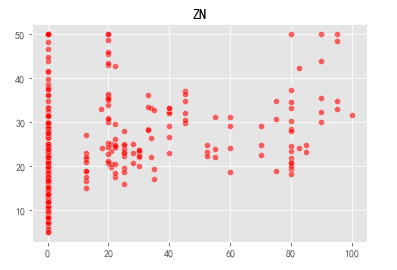
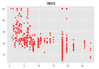
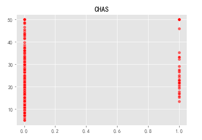
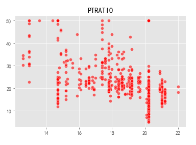
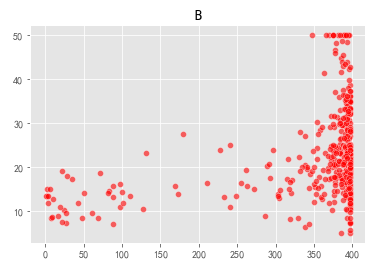
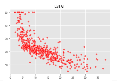
Visualize thirteen variables and prices in a scatter plot:
v_namedata = v_housing.feature_names
for i in range(len(v_housing.feature_names)):
    sns.scatterplot(x=X[:,i],y=y,color="r",alpha=0.6)
    plt.title(v_namedata[i])
    plt.show()
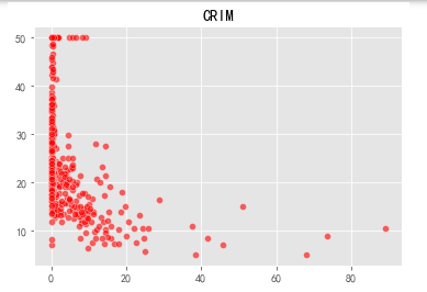

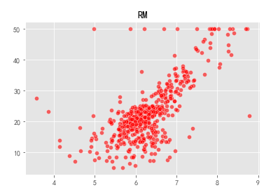
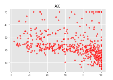
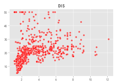
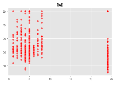
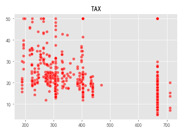
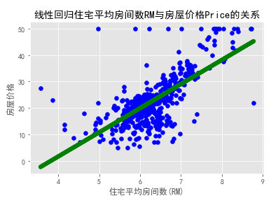
It can be seen that the average number of rooms (RM) and the price (Prine) of a house are closer to a positive linear correlation. Let us find the relevant coefficient weight w and offset b:
from sklearn.linear_model import LinearRegression
plt.rcParams['font.sans-serif'] = ['SimHei']
x = v_housing.data[:,5,np.newaxis]
y = v_housing.target
lm = LinearRegression()
lm.fit(x,y)
print('方程的确定性系数R的平方:',lm.score(x,y))
print('线性回归算法的权重w:',lm.coef_)
print('线性回归算法的偏移量b:',lm.intercept_)
plt.scatter(x,y,color='blue')
plt.plot(x,lm.predict(x),color='green',linewidth=6)
plt.xlabel('住宅平均房间数(RM)')
plt.ylabel(u'房屋价格')
plt.title('线性回归住宅平均房间数RM与房屋价格Price的关系')
plt.show()
方程的确定性系数R的平方: 0.48352545599133423
线性回归算法的权重w: [9.10210898]
线性回归算法的偏移量b: -34.670620776438554
3. Classification case
Kite (yuān) tail flower
Iris Data Set (Iris Plant Data Set) is a relatively long-standing data set. It first appeared in the 1936 paper "The use of multiple measurements in taxonomic problems" by the famous British statistician and biologist Ronald Fisher. It is used to introduce linear discriminant analysis.
In this data set, three different types of Iris plants are included: Iris Setosa, Iris Versicolour, and Iris Virginica. Each category collects 50 samples, so this data set contains a total of 150 samples, and each sample selects 4 representative features. They are:
- sepallength: the length of the sepal, in centimeters
- sepalwidth: the width of the sepal, in centimeters
- petallength: petal length, in centimeters
- petalwidth: petal width, in centimeters
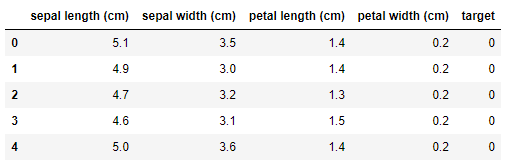
iris = datasets.load_iris()
X = iris.data
y = iris.target
features = iris.feature_names
iris_data = pd.DataFrame(X,columns=features)
iris_data['target'] = y
iris_data.head()
#自定义marker
marker = ['s','x','o']
#依次遍历三种不同的花
for index,c in enumerate(np.unique(y)):
    plt.scatter(x=iris_data.loc[y==c,"sepal length (cm)"],y=iris_data.loc[y==c,"sepal width (cm)"],alpha=0.8,label=c,marker=marker[c])
plt.xlabel("sepal length (cm)")
plt.ylabel("sepal width (cm)")
plt.legend()
plt.show()
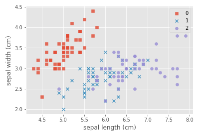
Explanation of plt.scatter parameters:
- x,y: two-dimensional data of scatter plot
- alpha: Transparency, the range is [0,1], from transparent to opaque
- label: represents the name of the point
- marker: MarkerStyle, default'o', the specific meaning is as follows:
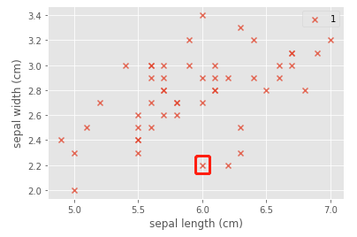
Now explore why there are purple squares, take (6.0,2.2) as an example:
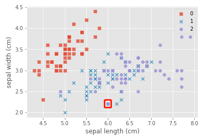
Dismantling analysis:
index = c = 1
plt.scatter(x=iris_data.loc[y==c,"sepal length (cm)"],y=iris_data.loc[y==c,"sepal width (cm)"],alpha=0.8,label=c,marker=marker[c])
plt.xlabel("sepal length (cm)")
plt.ylabel("sepal width (cm)")
plt.legend()
plt.show()
index = c = 2
plt.scatter(x=iris_data.loc[y==c,"sepal length (cm)"],y=iris_data.loc[y==c,"sepal width (cm)"],alpha=0.8,label=c,marker=marker[c])
plt.xlabel("sepal length (cm)")
plt.ylabel("sepal width (cm)")
plt.legend()
plt.show()
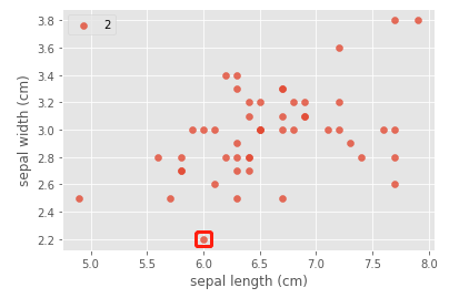
Draw a conclusion: when the x number and the circle overlap, it will become a square.
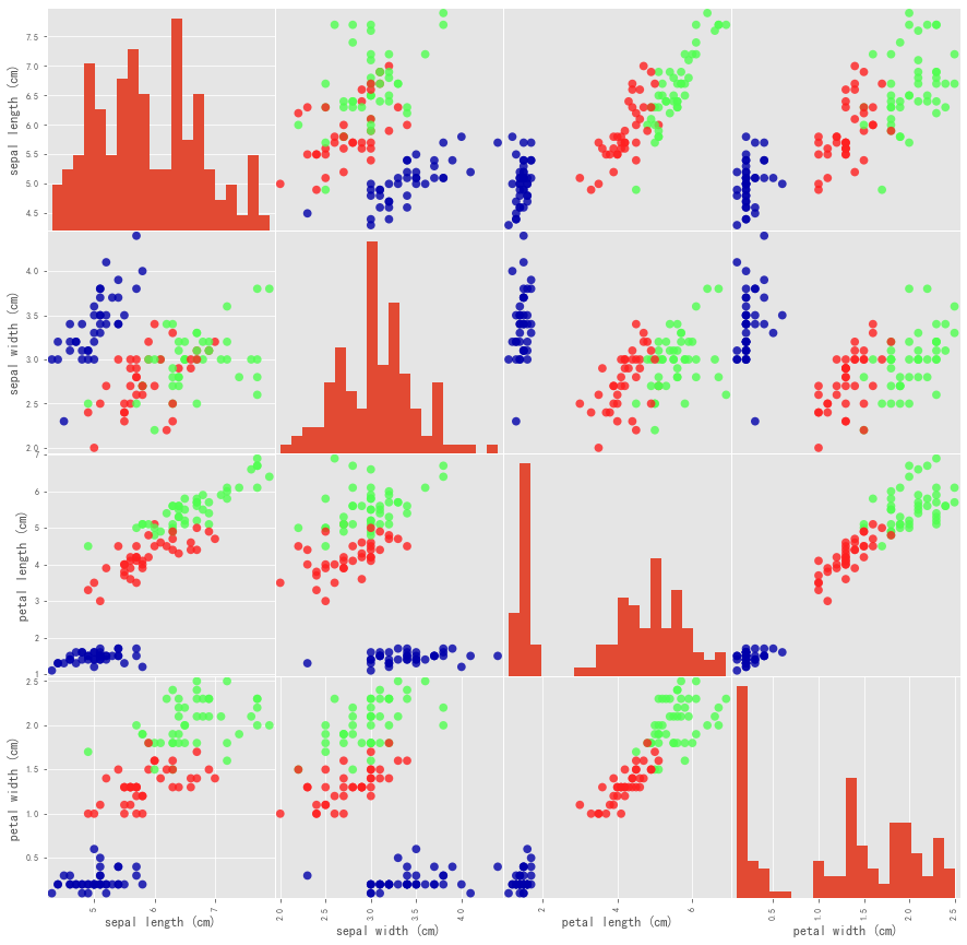
More specifically, we can use the pandas.plotting.scatter_matrix method to generate a matrix of pairwise scatter plots of all features:
from sklearn.model_selection import train_test_split
import mglearn
X_train,X_test,y_train,y_test = train_test_split(iris['data'],iris['target'],test_size=0.2,random_state=0)
iris_dataframe=pd.DataFrame(X_train,columns=iris.feature_names)
grr=pd.plotting.scatter_matrix(iris_dataframe,c=y_train,figsize=(15,15),marker='o',hist_kwds={

    'bins':20},s=60,alpha=.8,cmap=mglearn.cm3)
Next, let us use the Iris data set to build a predictive model:
X_train, X_test, y_train, y_test = train_test_split(
iris['data'], iris['target'], test_size=0.3,random_state=0)
knn = KNeighborsClassifier(n_neighbors=1)
knn.fit(X_train, y_train)
print("Test set score: {:.2f}".format(knn.score(X_test, y_test)))
result = knn.predict(X_new)
Test set score: 0.98
Test the flower data in the fifth row:
X_new = np.array([[5,3.6,1.4,0.2]])
result = knn.predict(X_new)
print('Prediction:{}'.format(result))
print('Predicted target name:{}'.format(iris_dataset['target_names'][result]))
Prediction:[0]
Predicted target name:['setosa']
4. Cases of unsupervised learning
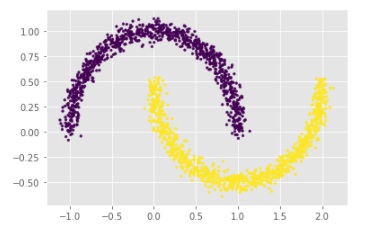
# 生成月牙型非凸集
x, y = datasets.make_moons(n_samples=2000, shuffle=True,
                  noise=0.05, random_state=None)
for index,c in enumerate(np.unique(y)):
    plt.scatter(x[y==c,0],x[y==c,1],s=7)
plt.show()

Among them, the function of the for loop is to draw the upper half circle first, and then the lower half circle. We can also use another method without using the loop:
plt.scatter(x[:,0],x[:,1],c=y,s=7)
plt.show()
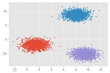
# 生成符合正态分布的聚类数据
x, y = datasets.make_blobs(n_samples=5000, n_features=2, centers=3)
for index,c in enumerate(np.unique(y)):
    plt.scatter(x[y==c, 0], x[y==c, 1],s=7)
plt.show()
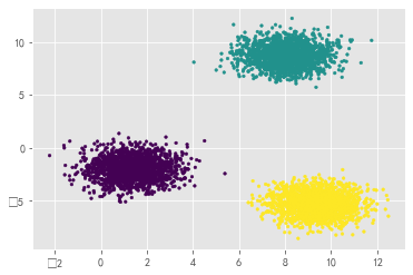
For this kind of clustered data, you can also skip the loop and draw directly:
plt.scatter(x[:, 0], x[:, 1],s=7,c=y)
plt.show()
Digression
Why do you feel that this jupyter notebook is selling cute to me? ? ?

references
[1] Zhou Zhihua, Machine Learning, Tsinghua University Press, 2016
[2] Li Hang, Statistical Learning Methods, Tsinghua University Press, 2012
[3] PYthon-detailed explanation of various parameters of plt.scatter
[4] Boston housing price prediction- Regression analysis case (dedicated to beginners)
[5] Introduction to machine learning: starting from Iris data classification