table of Contents
Front-end HTML/CSS (13)
background-origin, background positioning benchmark
Background cropping is used to control where the background extends, and background-originto control background-positionwhere to position relative to.
By default, the background-positionpositioning is relative to the outer boundary of the inner margin of the element.
padding-box,Defaults. The upper left corner of the background image is placed on the outer boundary of the inner margin (upper left corner).border-box, The upper left corner of the background image is placed on the outer border (upper left corner) of the frame.content-box, The upper left corner of the background image is placed on the outer boundary (upper left corner) of the content area.
background-clipAnd background-originthey are the same values. background-originUsed to define where to start and background-positionwhere to locate. background-clip, Used to define where the background extends when it is tiled.
background-position: top center; Make the large background picture as close to the center as possible to adapt it to the display of different resolution screens.
background-clip:
- background-clip: padding-box;
<!DOCTYPE html>
<html lang="en">
<head>
<meta name="keywords" content="zidingyi">
<meta name="description" content="zidingyi">
<meta charset="UTF-8">
<title></title>
<style>
div {
width: 400px;
height: 460px;
border: 10px dotted red;
padding: 10px;
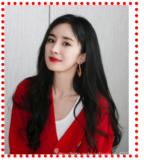
background-image: url(./img/杨幂.png);
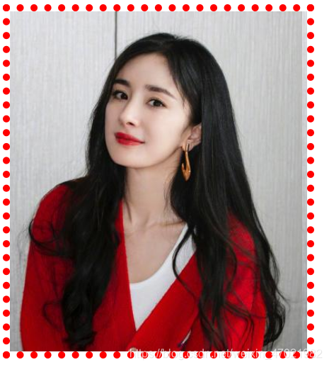
background-clip: content-box;
}
</style>
</head>
<body>
<div></div>
</body>
</html>
Display:
2. background-clip: border-box
Code:
<!DOCTYPE html>
<html lang="en">
<head>
<meta name="keywords" content="zidingyi">
<meta name="description" content="zidingyi">
<meta charset="UTF-8">
<title></title>
<style>
div {
width: 400px;
height: 460px;
border: 10px dotted red;
padding: 10px;
background-image: url(./img/杨幂.png);
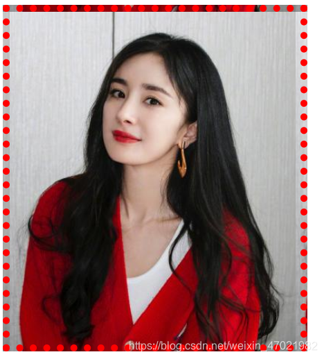
background-clip: border-box;
}
</style>
</head>
<body>
<div></div>
</body>
</html>
Display:
3. background-clip: content-box
Code:
<!DOCTYPE html>
<html lang="en">
<head>
<meta name="keywords" content="zidingyi">
<meta name="description" content="zidingyi">
<meta charset="UTF-8">
<title></title>
<style>
div {
width: 400px;
height: 460px;
border: 10px dotted red;
padding: 10px;
background-image: url(./img/杨幂.png);
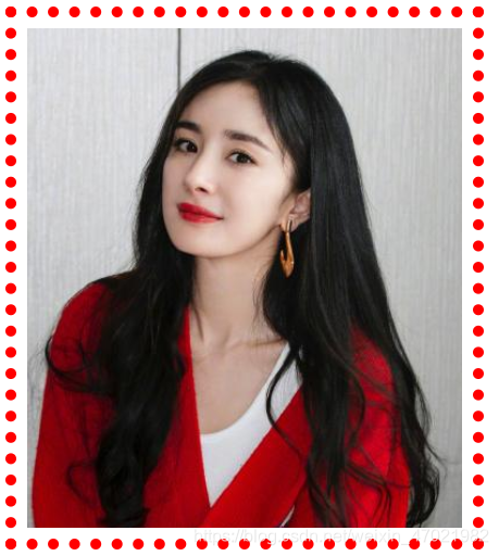
background-clip: content-box;
}
</style>
</head>
<body>
<div></div>
</body>
</html>
display:
background-size, adjust the size of the background image
Provide two values. The first is the horizontal size and the second is the vertical size.
background-size:
- px, pixels.
- em, the size of the text.
- %, calculated according to the width and height of the element (including the inner margin)
- cover, the proportional zoom completely covers the container, but the background image may exceed the container after the proportional zoom is completed.
- Contain, the background image is scaled to the width or height equal to the width or height of the container. The background image is always contained in the container (there will be no excess).
background-size:cover
Code:
<!DOCTYPE html>
<html lang="en">
<head>
<meta name="keywords" content="zidingyi">
<meta name="description" content="zidingyi">
<meta charset="UTF-8">
<title></title>
<style>
div {
width: 400px;
height: 460px;
border: 10px dotted red;
padding: 10px;
background-image: url(./img/杨幂.png);
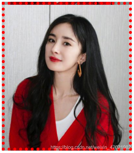
background-size: cover;
}
</style>
</head>
<body>
<div></div>
</body>
</html>
display:
background-size: contain;
Code:
<!DOCTYPE html>
<html lang="en">
    <head>
        <meta name="keywords" content="zidingyi">
        <meta name="description" content="zidingyi">
        <meta charset="UTF-8">
        <title></title>
        <style>
            div {


                width: 400px;
                height: 460px;
                border: 10px dotted red;
                padding: 10px;
                background-image: url(./img/杨幂.png);
                background-repeat: no-repeat;
                background-size: contain;
            }
        </style>
    </head>
    <body>
        <div></div>
    </body>
</html>
display:
Background adhesion (css2)
background-attachment:
-
scroll, the default value, the background image is fixed relative to the element itself, and does not scroll with its content.
Setting background-attachment: scroll on the body is an exception. The background will scroll as the content scrolls.
-
fixed, the background image is fixed relative to the viewport, which causes the page scrolling background to not scroll.
-
local, the background is fixed relative to the content of the element. If there is a scroll bar, the background will scroll as the content of the element scrolls.
[VNote](https://tamlok.github.io/vnote/) 是一个受Vim启发的更懂程序员和Markdown的一个笔记软件。
background-attachment: fixed; fixed relative to the viewport, the scroll bar of the browser will not move when scrolling, and the scroll bar of the content area will still not move when scrolling.
Troubleshooting: When writing a page, if the content of the following line is unsuccessful, you need to check whether the content of the above is exceeded, which causes the following code to be unsuccessful.
Shorthand attribute
format:background: image position/size repeat attachment origin clip color
note:
- Background can be set with multiple different backgrounds, and each background is separated by a comma.
- For multiple background pictures, put the first written on the top, and the last written on the bottom.
In background continuous writing, if two values are written continuously in position/size, the position cannot be changed, and there must be a slash in the middle (the slash cannot be omitted).
Filter
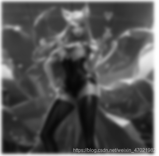
Filter: used to achieve various special effects of the image.
Format: filter: valueGenerally used on images.
-
blur(), Control the ambiguity. The default is 0, you can increase px to achieve blur. -
grayscale(), The gray of the control element, there is no change when it is 0, and it becomes a gray image when it is 1. -
opacity(), Transparency, 0 means completely transparent, 1 opaque. -
sepia(), Adjust the reddish brown of the element, there is no change at 0, the element becomes reddish at 1 hour. -
invert(), Reverse all colors of the element. There is no change at 0 and it is completely reversed at 1. (Display effect is like a negative of a photo)255 minus the values of r, g, and b.
-
brightness(), Adjust the brightness of the color on the element. When it is 0, it is pure black, and if it is greater than 1, it will be brighter than the original color. There is no change when it is 1. -
contrast(), Adjust the contrast of the colors on the element, the higher the contrast, the easier to distinguish the colors. The smaller the contrast, the closer the colors. When the value is 0, it becomes pure gray, when the value is 1, there is no change. When it is greater than 1, the color is more contrasted than the original element. -
filter:saturate(), Used to adjust the saturation of the element. The higher the saturation, the more vivid the color, and the lower the saturation, the darker the color. When the value is 0, there is no saturation, and the result is a gray image. No change when it is 1.
Note: The value of the filter can have multiple methods, and they are separated by spaces.
<!DOCTYPE html>
<html>
    <head>
        <meta charset="utf-8" />
        <style>
            img{


                filter:blur(5px) grayscale(1);
                /* filter:grayscale(0.5); */
                /* filter:opacity(0.1); */
                /* filter:sepia(1); */
                /* filter:invert(1); */
                /* filter:brightness(0); */
                /* filter:contrast(10); */
                /* filter:saturate(18) */;
            }
        </style>
    </head>
    <body>
        <img src="./img/big103015.png" />
    </body>
</html>
display:
opacity和rgba
opacity The attribute value is 0~1, 0 is completely transparent, and 1 is completely opaque.
filter: opacity, Used in the picture, because therefiltercan be multiple effects.opacityAttributes are generally used in animation to make the overall fade in and out.rgbaThe background is transparent, but the content inside is opaque. Often used as a mask layer.
Gradient
Gradient refers to the smooth transition from one color to another, which is an image. The biggest feature of the gradient is that there is no fixed size.
Gradient is divided into 线性渐变sum 径向渐变, linear gradient and radial gradient are divided into 循环渐变sum 不循环渐变.
Gradients are generally used in the background-image.
background-image
-
Linear gradient
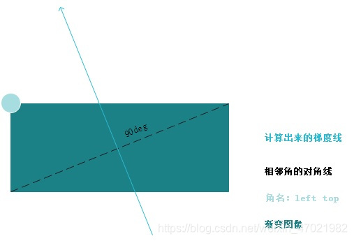
Linear gradient refers to the gradient obtained by filling along __a line__ (this line is a line passing through the center point of the element, usually called a gradient line).
linear-gradient:[方向/角度] color1 color2 .....-
Simple color values, you can use any type of color in any CSS, including rgba and transparent, and there can be two or more colors. If there are multiple colors, they are evenly distributed on the gradient line by default.
-
Angle
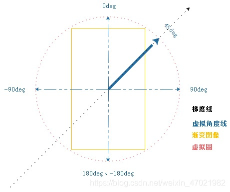
Assuming that the background image is矩形that the browser will virtualize a circle on the outside, since it is a prototype, there is an angle, clockwise is 0 180, counterclockwise is 0 -180.
-
-
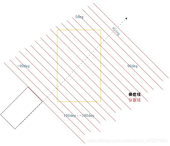
Distribution of the color of the gradient line
When assigning colors, the gradient line radiates a lot of virtual lines at 90 degrees to extend wirelessly.
4. Direction
-
to bottom The default value, the direction of the gradient line is downward.
-
to top, improvement
-
to left, to left
-
to right
-
to left top to left top
-
to left bottom to left bottom
-
to right top
-
to right bottom
-
Connect the angles on the two adjacent sides of the declared angle through the center point of the image.
-
The gradient line is perpendicular to the diagonal of the adjacent corner and points to the declared corner.
-
Default setting of color value
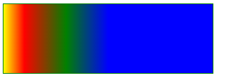
By default, if multiple colors are evenly distributed on the gradient line (the first color is at 0%, and the last color is at 100%)
background-image: linear-gradient(to right, yellow, blue, green);Yellow is at 0%, blue is at 50%, and green is at 100%.
background-image: linear-gradient(to right, red, yellow, blue, green);Red is at 0%, yellow is at 33.3%, blue is at 66.6%, and green is at 100%.
-
Specify the position of the color value.
You can specify the px or% unit, that is, insert a value (position value) after the specified color, so that the inserted colors are distributed unevenly on the gradient line.
background-image: linear-gradient(to right, yellow 0%, red 10%, green 30%, blue 50%);
Gradient line direction: from left to right.
If the arranged color does not reach the end of the gradient line, the last color will be extended.
Emergency stop effect, no gradual change.
-
Repeatable linear gradient
repeating-linear-gradient, The repetitive linear gradient continuously circulates the declared colors on the gradient line, and the length of the last color is used to define the overall length of the pattern to circulate after the length exceeds this length. -
Radial gradient
Extend the color around a center point to make a smooth transition.
radial-gradient:[大小][at point] color1 color2-
Simple colors
Any type of color can be used, including
transparenttwo or more colors. If there are multiple colors, they are equally distributed on the gradient line by default.By default, the radial gradient is displayed in the middle. The radial gradient is displayed as a circle in a square element, and the radial gradient is an ellipse in a rectangular element.
-
Gradient line
The gradient line extends from the center of the gradient to the right, and the other parts of the gradient are created based on this line.
-
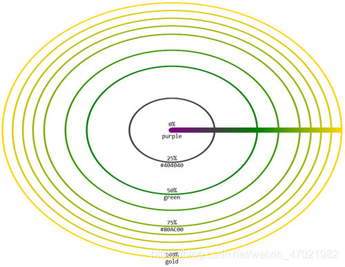
3. By default, if there are multiple colors, they are equally distributed on the gradient line by default (the color and the color are as smooth as possible). You can specify a position for the color value to make it unevenly distributed.
background-image: radial-gradient(yellow,red 20px,green 100%);, Place yellow at 0% of the gradient line, red at 20px of the gradient line (smooth transition between yellow and red), and green at 100% of the gradient line (smooth transition between red and green)
-
size
In the radial gradient, the size of the radial shape can be set.
Size: One value or two values.
If you have a value, you get a circular gradient, and its value is the radius.
With two values, the gradient of the ellipse is obtained, the first value is half the width, and the second value is half the height.
-
at point, the center of the radial gradient is at the center of the element by default, you can use at point to change it. The value of point and the value of background-position are the same.
Repeatable radial gradient
repeating-radial-gradient, After defining the size of the circle or ellipse, use the length to define the position of the color on the gradient line. After the end of the gradient line is exceeded, it can be looped.
<!DOCTYPE html>
<html>

<head>
    <meta charset="utf-8" />
    <style>
        div {


            width: 200px;
            height: 200px;
            background-image: repeating-radial-gradient(yellow, blue);
        }
    </style>
</head>

<body>
    <div></div>
</body>

</html>
Display: The
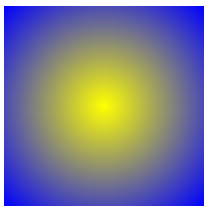
above code will not cycle the gradient, because the default value is used. The radial gradient starts to spread around the element at the center point. You must limit the size of the radial gradient. After this size is exceeded, it will start to repeat.