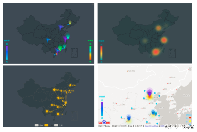
Recently, a small partner operated by a certain brand recently complained to me, and the leader asked him to make maps that are used to analyze and display business phenomena in news reports and business magazines, and to draw them in combination with data. He was very worried. ! In fact, such a form of using a map to reflect and analyze data is called a data map. In business data analysis, a large amount of data is related to geographic location. This kind of data is more intuitive and visualized by map analysis. In data visualization, map visualization is a relatively common type of graphics. As long as some high-level data processing tools are used, it can be easily completed.
Next, I will take Smartbi as an example to introduce you to the operation method of data map. Smartbi’s Echarts graph is a more flexible and intuitive way of data presentation. It is based on the user’s easier understanding of data and more scientific basis for decision-making. Demand, processing data under different business backgrounds can realize multi-angle and multi-level analysis of data. Next, I will teach you how to do it!
Prerequisites
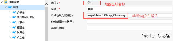
Before creating a map analysis, you must first create an HTML5 map file (*.svg format). For creating a map file, please refer to the HTML5 Map Editor Operation Manual. Follow the instructions for using the svg map file in smartbi, load the created svg map file into smartbi and configure the map area. as follows:

Before creating a map analysis, you need to ensure that the map codes of the three places are consistent: the area layer ID in the map svg file, the map code of the corresponding area in the map area setting, and the code data corresponding to the query in the map analysis.
1. The area layer ID in the map SVG file.
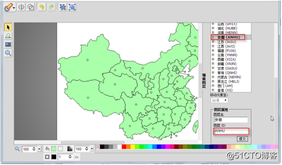
2. The map code of the corresponding area in the map area setting.
3. Map analysis of the coded data corresponding to the query.
Function entry
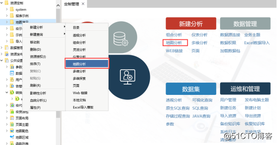
Map analysis function entrance: Click the shortcut "Map Analysis" of the "Customization Management" interface, or select "New Analysis -> Map Analysis" from the right-click menu on the resource customization directory tree. As shown below:
Actual operation
The process of using Smartbi to create a map analysis is shown in the figure below:
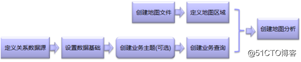
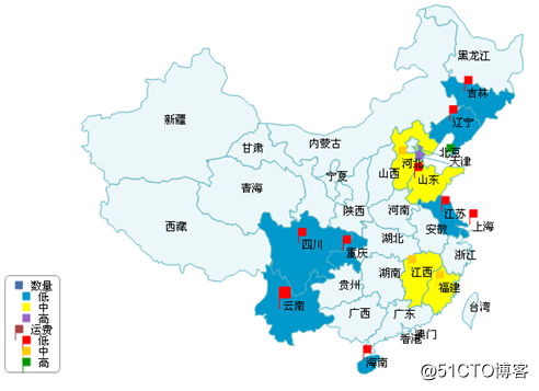
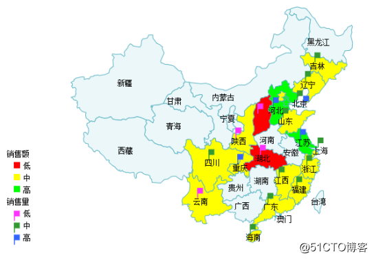
For defining relational data sources, please refer to Defining Relational Data Sources, for setting data foundations, please refer to Setting Data Foundations, and creating business topics, please refer to Creating Business Topics. Below we will create a map analysis named "Sales by Region_Map Analysis" to show the differences between "quantity" and "shipping" in the region, as shown in the following figure:
1. Map area coding
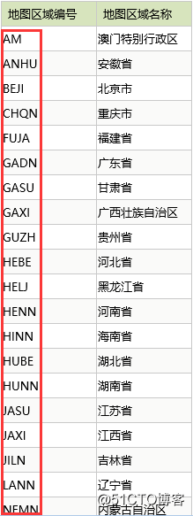
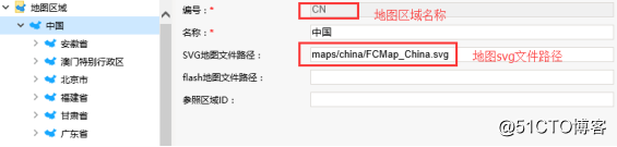
We first need to know the map area code to associate the queried data with the corresponding map area. We can view the built-in map area code by selecting "Customization Management -> Public Settings -> Map Area", as shown in the figure below. In fact, these information are in the "t_maparea" table of the system knowledge base, and the data can be directly exported. For a more detailed description of map area settings, please refer to Map Area Management.
2. Define the data set
Based on the "Order Subject" defined in Quickly Create Flexible Analysis> Define Business Subject, we create the visual query "Sales Query by Region" that the instrument analysis depends on. The specific operations are as follows:
In the "Customization Management" interface, click the shortcut to visualize the query, and the "Select Data Source" window will pop up.
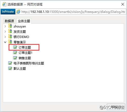
Respectively find the fields "Upper Region Number", "Sales Volume" and "Sales" under "Order Subject" by Ctrl key, and drag these fields to the "Field Area". As shown below:
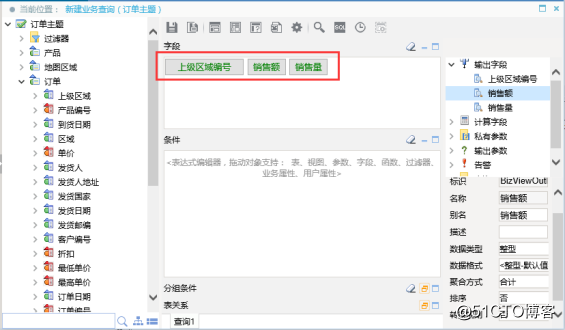
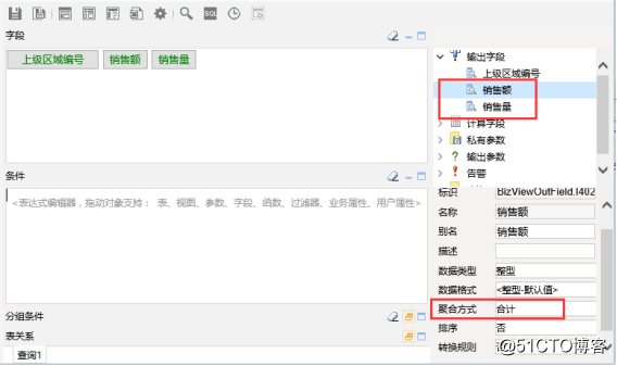
Select the output fields "Sales" and "Sales" in the work area, and set the aggregation mode to "Total" in the corresponding attribute area. As shown below:
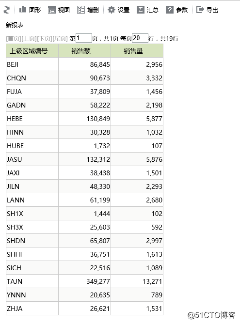
Click the Preview Data button on the visual query toolbar. You can preview the data in the pop-up dialog box.
Click the Save button on the toolbar of the visual query, and the "Save Visual Query" dialog box will pop up.
In the "Save Visual Query" dialog box, set the save location to "Resource Customization" and enter the name as "Sales Query by Region".
In the "Save Visual Query" dialog box, click the OK button to successfully save the visual query.
3. Define map analysis
After defining the visualization query, we next learn how to quickly define map analysis:
In the "Customization Management" interface, select the shortcut to create a new map analysis, and the "Select Business Query" dialog box will pop up.
In the "Select Business Query" dialog box, expand the resource tree, select Resource Customized Catalog> Sales Query by Region, and enter the "Graphic Settings" interface.
4. Make relevant settings in the "Graphics Settings" interface:
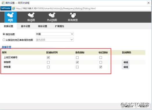
Set graphics options: select the specified map method, and select "China" in the drop-down options.
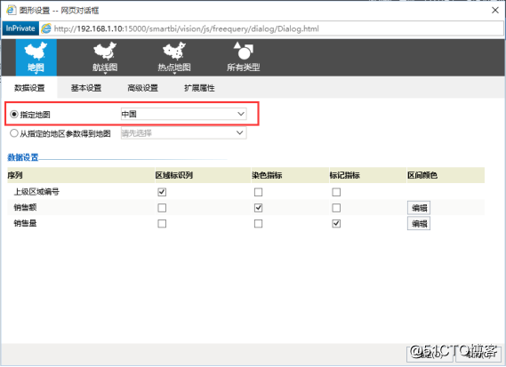
Select "Upper Area Number" as the area identification column. Select "Sales" as the dyeing index and "Sales" as the marking index.
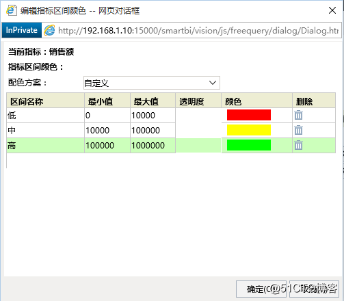
Click the edit button of the interval color corresponding to "Sales", and the "Edit indicator interval color" dialog box will pop up to set the indicator interval color, as shown in the figure below:
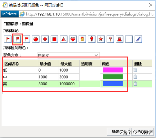
Click the edit button of the interval color corresponding to "Sales Volume", and the "Edit Indicator Interval Color" dialog box will pop up to set the indicator interval color, as shown in the figure below:
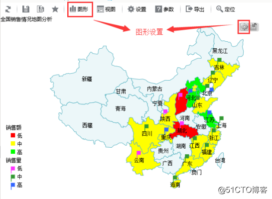
5. Click the OK button on the "Map Analysis Settings" interface to enter the "Map Analysis" display interface.
6. Save the analysis: Click the save button in the toolbar, and in the pop-up "Save Report" dialog box, select the path where the report needs to be saved, and save the current new map analysis.
7. Select the graphic setting button of map analysis to enter the "Map Analysis Settings" interface, allowing to modify the map analysis attribute settings. As shown below:
Nowadays, data is closely related to our daily life. From the initial computer to the current big data and artificial intelligence, data analysis has been continuously integrated into our lives. With the increasing number of dimensions of business analysis, the requirements for data analysis capabilities higher. But as long as you master the methods and tools, no matter what kind of data analysis, that's the same thing. Just like Smartbi’s ECharts graphics not only have rich visualization types, but also a variety of data formats that can be used directly without conversion. It can be displayed on the front end of tens of millions of data. It has multiple rendering schemes, not only can be used across platforms, but also can be set. Brilliant special effects.
Come follow me and teach you more about data analysis!