When disorganized data, after data cleaning, you get the data you want to use, but you can only see the data itself through the database, and you can’t see the rules. You can use BI data analysis tools to graphically display the data to make The data is displayed in front of users more visually, it is easier to see the pattern, draw conclusions, and can also monitor real-time data and refresh it in real time, such as the double eleven big screen and so on. Today, I will introduce Smartbi, a free-to-use BI data analysis tool.
Smartbi is an enterprise-level business intelligence application platform owned by Guangzhou Sematic Software Co., Ltd. After years of continuous development, its products are widely used in finance, large-scale manufacturing, government, telecommunications and other industries.
The SmartBI product currently includes three products, namely, an enterprise reporting platform, a self-service analysis platform, and a data mining platform. Among them, the enterprise report platform Insight is a tool software for designing enterprise WEB reports with the help of Excel plug-ins. The self-service analysis platform Eagle provides self-service data analysis tools for business personnel in the enterprise. The data mining platform Mining meets the predictive analysis needs of data scientists, business analysts, industry consultants and other functional personnel in the enterprise. It combines machine learning algorithms with BI to provide visualized construction of streaming modeling and drag-and-drop operations. Mold interface.
The nature of the data visualization work of the data department of an Internet company is similar to that of many Internet products, and is ultimately to generate user value through standardized products. A picture is worth a thousand words. I want data to have an impact, especially for managers and business background personnel with limited ability to read large-scale data. The right data visualization can produce a multiplier effect with half the effort. Before using Smartbi to make dashboards, data reports and reports were used to show the operating status of the equipment. Although the data is accurate, the readability is relatively poor, and the leader does not pay. Smartbi's spreadsheet is based on Excel to directly develop the dashboard. It is quick to get started and flexible in operation. Not only has the development efficiency improved, but it has also been recognized by the leaders. Choice is really more important than hard work.
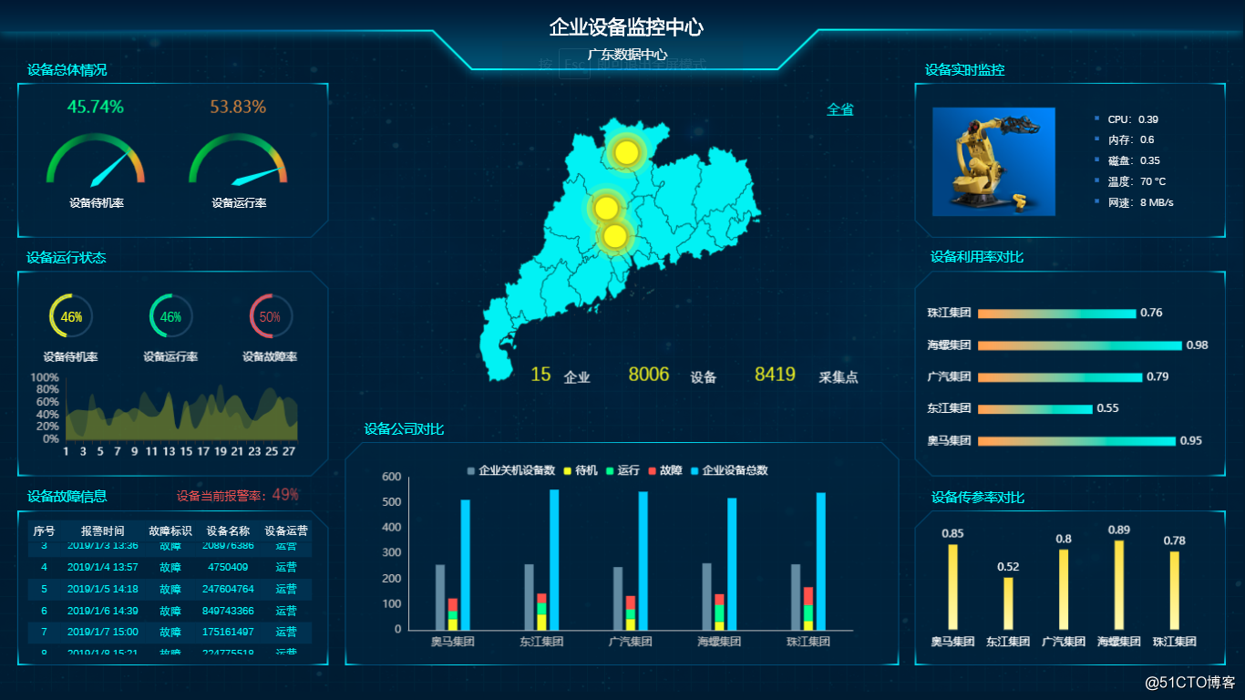
Figure: Analysis of Smartbi's equipment monitoring center
As data content becomes more and more complex, data visualization has gradually appeared in richer form carriers, such as information graphs, and dynamic multimedia data visualization based on HTML5 frameworks. However, the basic logic of data visualization has not changed, but more sophisticated technical methods have been adopted for a more diverse audience.
Smartbi is one of the top domestic BI software vendors, committed to providing customers with a one-stop business intelligence platform and BI solutions, based on a unified architecture to achieve data collection, query, reporting, self-service analysis, multi-dimensional analysis, mobile analysis, dashboard, Data mining and other auxiliary functions, and have special functions such as analysis reports and voice analysis combined with AI. With more than ten years of development history, it is the most comprehensive, mature and stable product among domestic BI software. It is widely used in the fields of finance, government, telecommunications, enterprises and institutions. Complete online documents and teaching videos, easy to operate.