1. Introduction
This experiment mainly introduces the theory of line chart and the realization of line chart based on Python.
1.1. The purpose of the experiment
Master the basic usage scenarios of the line chart, and use the pyecharts module of Python to realize the line chart.
1.2. Knowledge points
- Line chart theory
- Line chart implementation
2. Line chart theory
- Introduction to the line graph:
A line graph is also called a broken line graph. Values are marked as points, and these points are connected in a certain order by straight lines.
- scenes to be used:
The change of data in an ordered dependent variable is characterized by reflecting the trend of things changing with the sequence, and can clearly show the characteristics of increasing and decreasing trends, increasing and decelerating rates, increasing and decreasing laws, peaks and so on.
- Line graph advantages:
It can well show the trend of changes along a certain dimension; it can compare the trends of multiple sets of data in the same dimension; it is suitable for showing larger data sets.
- Disadvantages of line graph:
It is not suitable to show too many polylines on each picture.
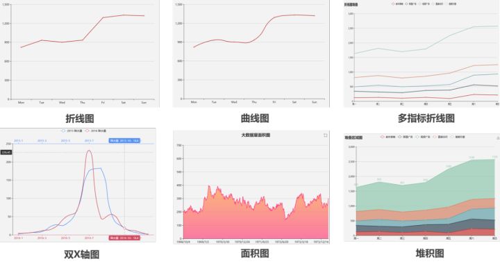
3. Line chart classification
4. Realization of line chart
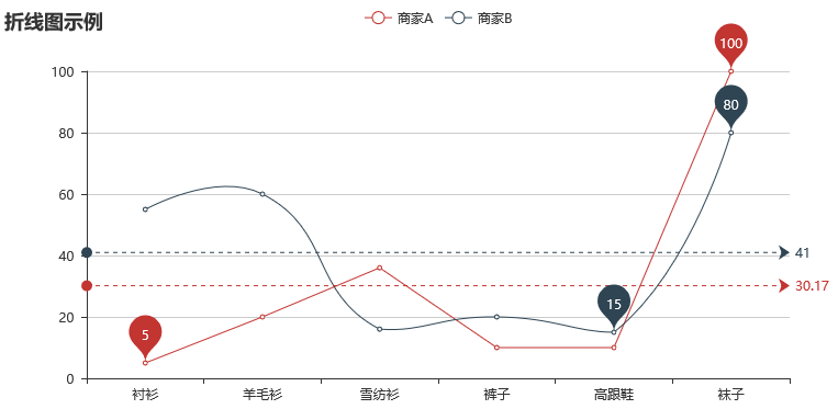
#Line graph from pyecharts import Line
attr =["shirt", "wool sweater", "chiffon shirt", "trousers", "high heels", "socks"]
v1 =[5, 20, 36, 10, 10 , 100]
v2 =[55, 60, 16, 20, 15, 80]
line =Line("Line chart example")#Initialize the chart, add the title
line.add("Business A", attr, v1, mark_point=[ "max",'min'], mark_line=["average"])#Add business data of A, and specify the maximum and minimum values to be identified by dots, and the average value is identified by lines
line.add("business B", attr, v2, is_smooth=True, mark_line=["average"],mark_point=["max",'min'])#Add B merchant data, and specify the maximum and minimum values to be identified by dots, the average value is identified by lines, set smoothing
#line. show_config()
line.render("line1.html")#Output graphics
line
Output result:
5. Area chart realization
#Area chart from pyecharts import Line
attr =["shirt", "wool sweater", "chiffon shirt", "trousers", "high heels", "socks"]
v1 =[5, 20, 36, 10, 10 , 100]
v2 =[55, 60, 16, 20, 15, 80]
line =Line("Line chart-area chart example")#Initialize the chart, add the title
line.add("Business A", attr, v1, is_fill=True, line_opacity=0.2, area_opacity=0.4, symbol=None)#Add business data of A, set fill, transparency
line.add("Business B", attr, v2, is_fill=True, area_color='#000', area_opacity=0.3, is_smooth=True)#Add B business data, set fill, transparency, color, smoothing
#line.show_config()
line.render("line2.html")#Output graphics
line
Output result:

For more content, please follow the official account of Haidata Lab.
Share this issue here, we will update the content every day , we will see you next issue, and look forward to your visit again. If you have any suggestions, such as the knowledge you want to know, the problems in the content, the materials you want, the content to be shared next time, and the problems encountered in learning, please leave a message below. Please pay attention if you like it.
