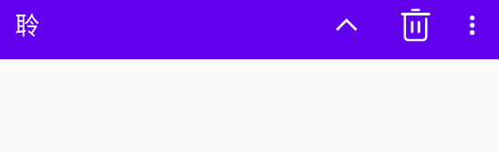
One: Replace ToolBar
1. ToolBar basic replacement
- First change the ActionBar in the theme to Light.NoActionBar
- Modify the main.xml file
1) Set the height of the ToolBar to the original ActionBar
2) Specify the background color
3) Since the light theme is set, the elements on the ToolBar will use a dark theme to distinguish the main body. The original white will turn black, which is more depressing , So specify a separate dark ToolBar, the words above will inherit the original Light white
4) Set the pop-up menu item to Light
    <androidx.appcompat.widget.Toolbar
        android:id="@+id/toolbar"
        android:layout_width="match_parent"
        android:layout_height="?attr/actionBarSize"
        android:background="?attr/colorPrimary"
        android:theme="@style/ThemeOverlay.AppCompat.Dark.ActionBar"
        app:popupTheme="@style/ThemeOverlay.AppCompat.Light"
    />
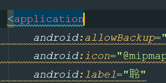
- Here we find the project name in the upper left corner, just go to the manifest file and modify the label
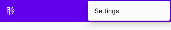
2. ToolBar combined with the introduction of the menu
- Create a menu folder under the res folder and create a menu resourse file of toolbar.xml
- Add the resource address of the app to the menu for easy compatibility. The item group
- showasAction
1) always: always displayed in the ToolBar
2) ifRoom: enough space in the toolbar is not enough in the menu
3) never: always displayed in the menu
ps: item in the toolbar only displays the icon, the action in the menu only displays text
<menu xmlns:android="http://schemas.android.com/apk/res/android"
      xmlns:app="http://schemas.android.com/apk/res-auto">
    <item
        android:id="@+id/backup"
        android:icon="@mipmap/arrow_up"
        android:title="BackUP"
        app:showAsAction="always"/>
    <item
            android:id="@+id/delete"
            android:icon="@mipmap/delete"
            android:title="Delete"
            app:showAsAction="ifRoom"/>
    <item
            android:id="@+id/setting"
            android:icon="@mipmap/setting"
            android:title="Settings"
            app:showAsAction="never"/>
</menu>
- Just copy the method and click method of creating the menu in MainActivity
    @Override
    public boolean onCreateOptionsMenu(Menu menu) {


        getMenuInflater().inflate(R.menu.toolbar,menu);
        return true;
    }

    @Override
    public boolean onOptionsItemSelected(@NonNull MenuItem item) {


        switch (item.getItemId()) {


            case R.id.backup:
                Toast.makeText(this,"BackUP",Toast.LENGTH_SHORT).show();
                break;
            case R.id.delete:
                Toast.makeText(this,"Delete",Toast.LENGTH_SHORT).show();
                break;
            case R.id.setting:
                Toast.makeText(this,"Setting",Toast.LENGTH_SHORT).show();
                break;

        }
        return true;
    }
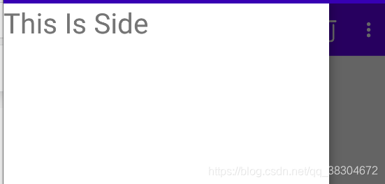
2. Pop up the sidebar
1. DrawerLayout
- With DrawerLayout provided by Google, solid sliding menu
这个布局可以放入两个直接子控件,第一个是主屏幕中的内容,第二个是滑动菜单中显示的内容 - Modify main.xml
第一个Fragment子控件 为主界面,第二个text
<androidx.drawerlayout.widget.DrawerLayout xmlns:android="http://schemas.android.com/apk/res/android"
    xmlns:app="http://schemas.android.com/apk/res-auto"
    xmlns:tools="http://schemas.android.com/tools"
    android:id="@+id/drawer_layout"
    android:layout_width="match_parent"
    android:layout_height="match_parent"
   >
    <FrameLayout
        android:layout_width="match_parent"
        android:layout_height="match_parent">


        <androidx.appcompat.widget.Toolbar
            android:id="@+id/toolbar"
            android:layout_width="match_parent"
            android:layout_height="?attr/actionBarSize"
            android:background="?attr/colorPrimary"
            android:theme="@style/ThemeOverlay.AppCompat.Dark.ActionBar"
            app:popupTheme="@style/ThemeOverlay.AppCompat.Light"/>
    </FrameLayout>
    <TextView
            android:layout_width="match_parent"
            android:layout_height="match_parent"
            android:layout_gravity="start"
            android:text="This Is Side"
            android:textSize="30sp"
            android:background="#FFF"/>
</androidx.drawerlayout.widget.DrawerLayout>
The second sub-layout Layout_gravity="start" must be specified. Start means that the pop-up menu is set according to the left and right of the system. It seems that you can also set left and so on. If you don't set it, only the second sub-item is displayed.
2. Add navigation buttons
- Get drawlay object in oncreate method
- Get the corresponding Actionbar instance (implemented by ToolBar) [ getSupportAsUpEnabled(true) ]
- Let the navigation button display [ actionBar.setDisplayHomeAsUpEnabled(true) ] set icon [ setHomeAsUpIndicator() ]
- Click the Toolba menu item to set and click, the id is always home, select the control switch and you can [ mDrawerLayout.openDrawer(GravityCompat.START) ]
- It's ugly to click on only one text. . . But it’s okay, the NavigationViw used next can solve this problem

Three.NavigationView
1. Guide package
- Design库
implementation ‘com.android.support:design:24.2.1’- Circular image open source project
implementation'de.hdodenhof:circleimageview:2.1.0'
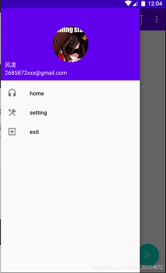
2. Two things need to be prepared before writing
-
menu is used to display specific menu items in NaviagtionView
1) After establishing nav_menu, specify the single-selection menu item<group android:checkableBehavior="single">
2) Then the item item -
headLayout is used to display the head layout, create a RelativeLayout, limit the height, and set the circular image to center
<RelativeLayout xmlns:android="http://schemas.android.com/apk/res/android"
              android:orientation="vertical"
              android:layout_width="match_parent"
              android:layout_height="180dp"
              android:padding="10dp"
              android:background="?attr/colorPrimary">
    <de.hdodenhof.circleimageview.CircleImageView
            android:id="@+id/icon_image"
            android:layout_width="70dp"
            android:layout_height="70dp"
            android:src="@mipmap/rolling"
            android:layout_centerInParent="true" />
    <TextView
            android:id="@+id/mail"
            android:layout_width="wrap_content"
            android:layout_height="wrap_content"
            android:layout_alignParentBottom="true"
            android:text="[email protected]"
            android:textColor="#FFF"
            android:textSize="14sp" />
    <TextView
            android:id="@+id/username"
            android:layout_width="wrap_content"
            android:layout_height="wrap_content"
            android:layout_above="@id/mail"
            android:text="风凌"
            android:textColor="#FFF"
            android:textSize="14sp" />
</RelativeLayout>
- Add two sub-layouts through the app method, change the text in the second title to NavigationView, and the app can be compatible with the introduction
  <com.google.android.material.navigation.NavigationView
            android:id="@+id/nav_view"
            android:layout_width="match_parent"
            android:layout_height="match_parent"
            android:layout_gravity="start"
            app:menu="@menu/nav_menu"
            app:headerLayout="@layout/nav_header"/>

4. Floating interactive buttons
一. FloatingActionButton
- A control provided in the Design Support library can easily achieve the effect of floating buttons.
- Add this button after ToolBar in the first main layout of DrawableLayout, with its own shadow effect, or it can be specified with app:elevation="8dp"
- MainActivity can set click listener
     <com.google.android.material.floatingactionbutton.FloatingActionButton
                android:id="@+id/fab"
                android:layout_width="wrap_content"
                android:layout_height="wrap_content"
                android:layout_gravity="bottom|end"
                android:layout_margin="16dp"
                android:src="@mipmap/play"/>
- Set the click event, just like a normal button, just set a click listener
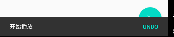
Two. Snackbar
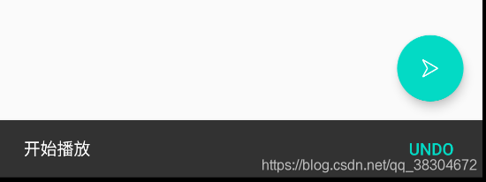
- A small selection box can pop up to remind Snackbar in the monitoring event
- The following is the sample code, a little doll, click the floating button, the Snack message pops up: start playing, click undo in the message, it shows cancel playback
- But at this time we found that the original floating button was blocked, emmm is a bit embarrassed, here you can use CoordinatorLayout [class enhanced FragmentLayout]
FloatingActionButton fab=(FloatingActionButton)findViewById(R.id.fab);
        fab.setOnClickListener(new View.OnClickListener() {


            @Override
            public void onClick(View view) {


                Snackbar.make(view, "开始播放", Snackbar.LENGTH_SHORT)
                        .setAction("Undo", new View.OnClickListener() {


                            @Override
                            public void onClick(View v) {


                                Toast.makeText(MainActivity.this, "取消播放",
                                        Toast.LENGTH_SHORT).show();
                            }
                        })
                        .show();
            }
        });
三.CoordinatorLayout
- CoordinatorLayout can listen to various events of all child controls [View passed in through child controls], and then help us to make the most reasonable response, we replace Fragment with this, and that’s it
- Since the second sub-layout of Drawable has little to do with CoordinatorLayout, the layout will still not move, so we can add it to the mobile solution.