Author: little brother Wu
Source: AI introductory learning (public account)
In python, there are 3 common data visualization libraries:
matplotlib: The most commonly used library, which can be regarded as a necessary skill library for visualization. It is relatively low-level, with many APIs, and it is not easy to learn.
seaborn: It is built on the basis of matplotlib, which can meet most of the visualization needs, and more special needs still need to learn matplotlib.
pyecharts: The above two libraries are static visualization libraries, and pyecharts has good web compatibility and can achieve visual dynamic effects. And the types are also relatively rich. For example, this picture is very powerful: the drawing artifact pyecharts-sunburst
Pandas: Today we are going to talk about the visualization of Pandas. Pandas is mainly used as a data analysis library. Although it is not as powerful as the above three libraries, it is more convenient. In the process of data analysis, it can be realized with just one line of code. And the graphics are also very beautiful.
See case
In pandas, there are 11 more common graph visualizations, and a few more advanced ones. Let’s see how to draw them one by one.
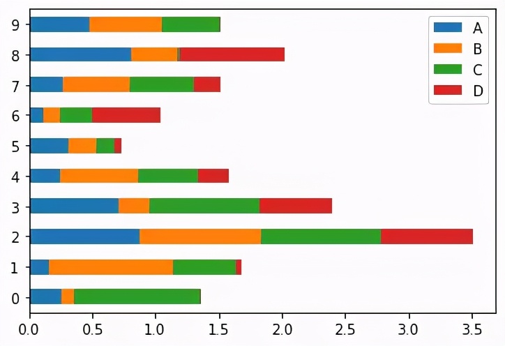
import pandas as pdimport numpy as npdf= pd.DataFrame(np.random.rand(10, 4), columns=['A','B','C','D'])01, histogram-vertical
df.plot.bar()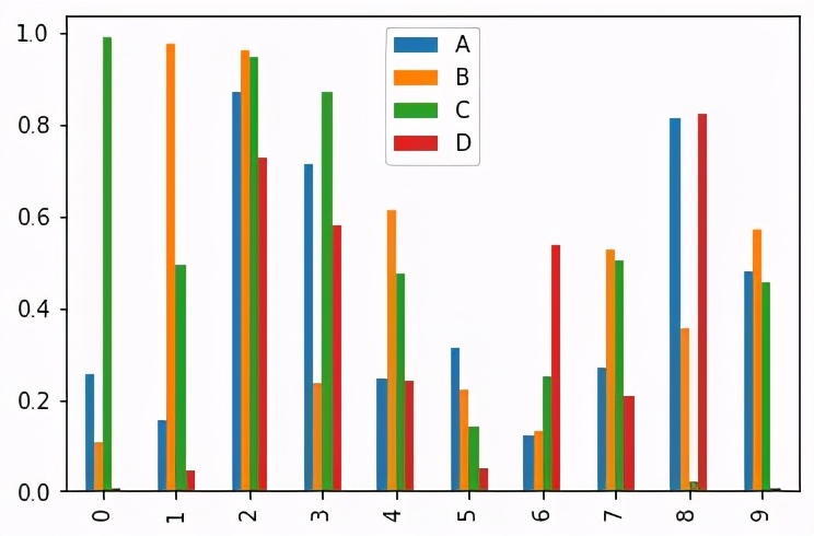
stacked=True, draw a stacked histogram
df.plot.bar(stacked=True)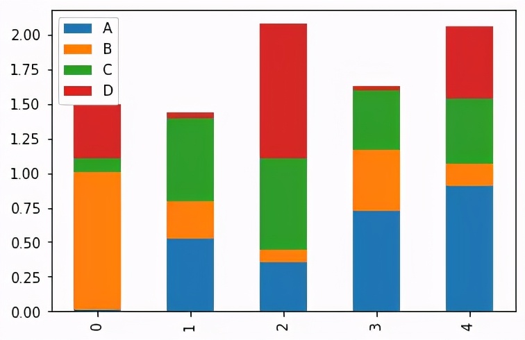
02, histogram-horizontal
df.plot.barh()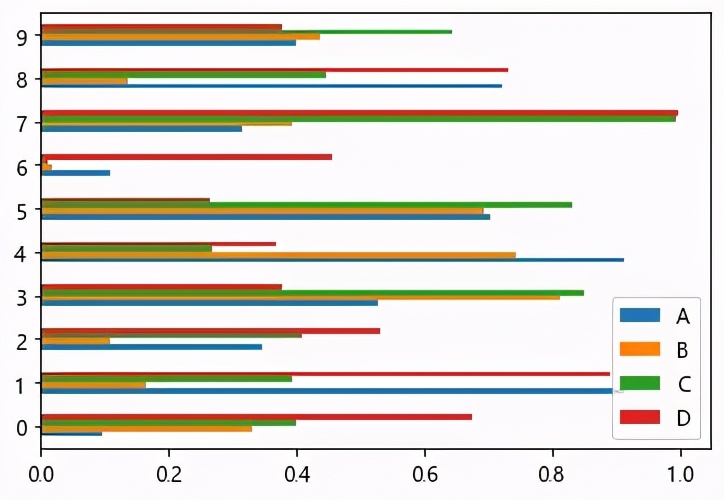
Similarly, stacked=True, draw a stacked histogram
df.plot.barh(stacked=True)
03, area chart
df.plot.area(alpha = 0.9)
df.plot.area(stacked=True,alpha = 0.9)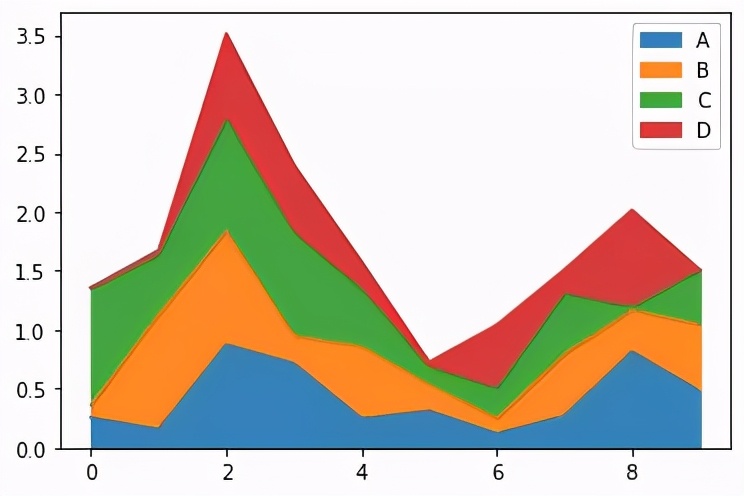
04, density map-kde
df.plot.kde()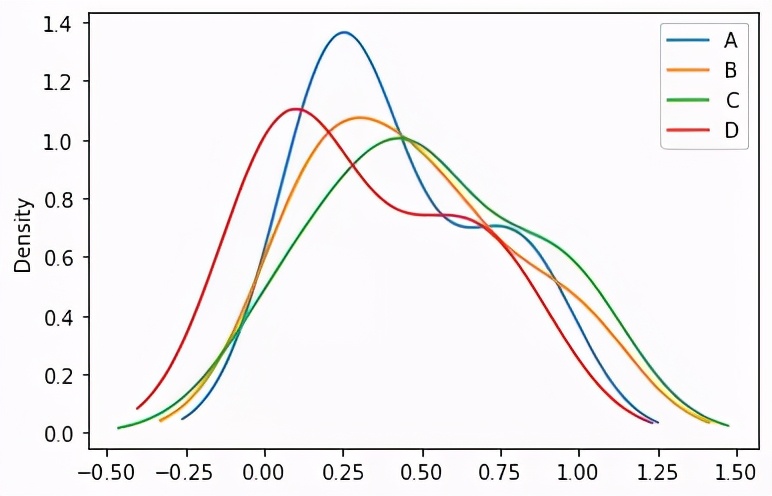
05, density map-density
df.plot.density()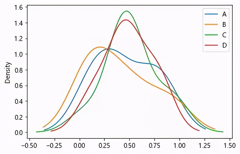
06, histogram
Change the data set
df = pd.DataFrame({'A': np.random.randn(1000) + 1,
                   'B': np.random.randn(1000),
                   'C': np.random.randn(1000) - 1},
                  columns=['A', 'B', 'C']) df.plot.hist(bins=200)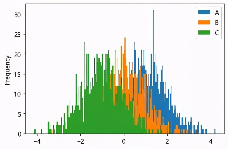
df.plot.hist(stacked=True, bins=20)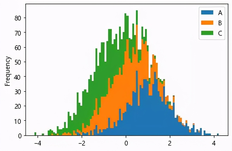
df= pd.DataFrame(np.random.rand(1000, 4), columns=['A','B','C','D'])df.diff().hist(color='k', alpha=0.7, bins=50)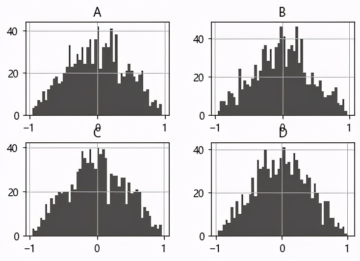
07, box map
df= pd.DataFrame(np.random.rand(100, 4), columns=['A','B','C','D'])df.plot.box()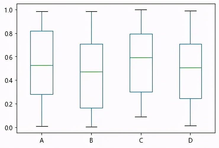
vert=False can also be changed to horizontal
df.plot.box(vert=False)
08, scatter plot
df.plot.scatter(x='A',y='B')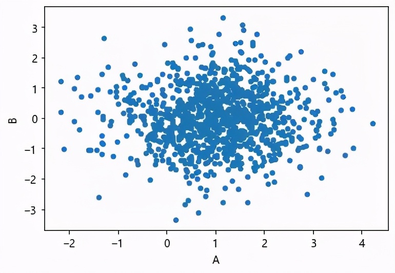
09, honeycomb diagram
df = pd.DataFrame(np.random.randn(1000, 2), columns=['a', 'b'])df['b'] = df['b'] + np.arange(1000)df.plot.hexbin(x='a', y='b', gridsize=25)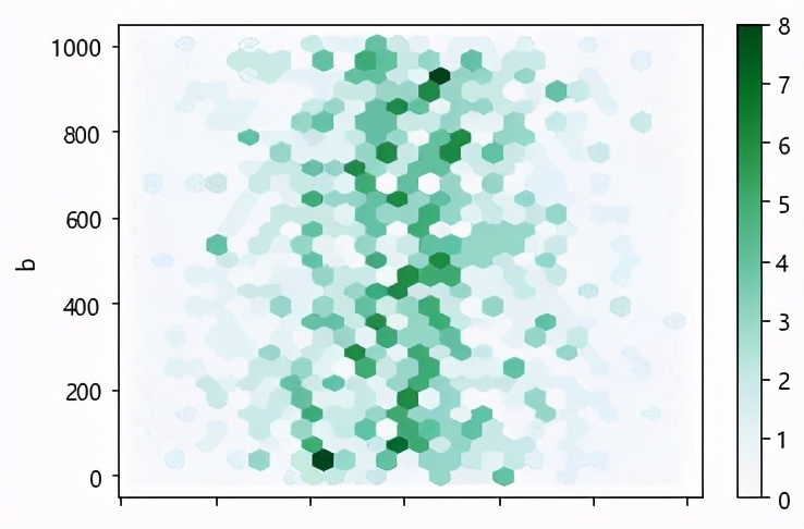
07, pie chart
series = pd.Series(3 * np.random.rand(4), index=['a', 'b', 'c', 'd'],
                   name='series')series.plot.pie(figsize=(6, 6))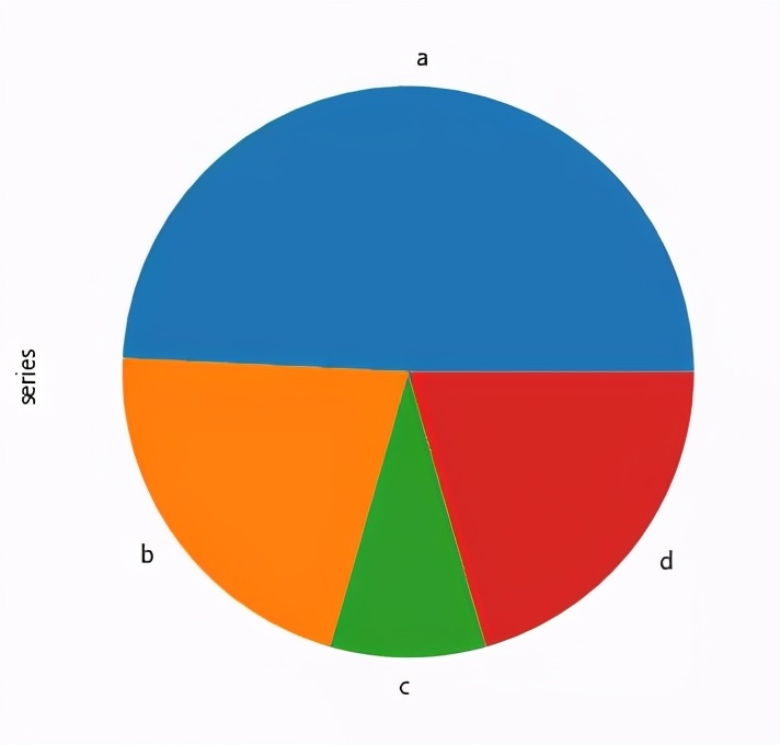
series.plot.pie(labels=['AA', 'BB', 'CC', 'DD'], colors=['r', 'g', 'b', 'c'],
                autopct='%.2f', fontsize=20, figsize=(6, 6))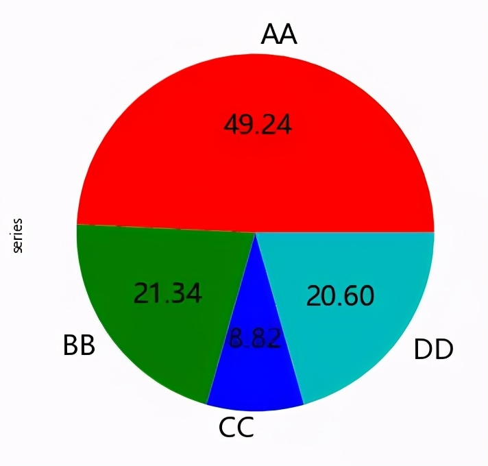
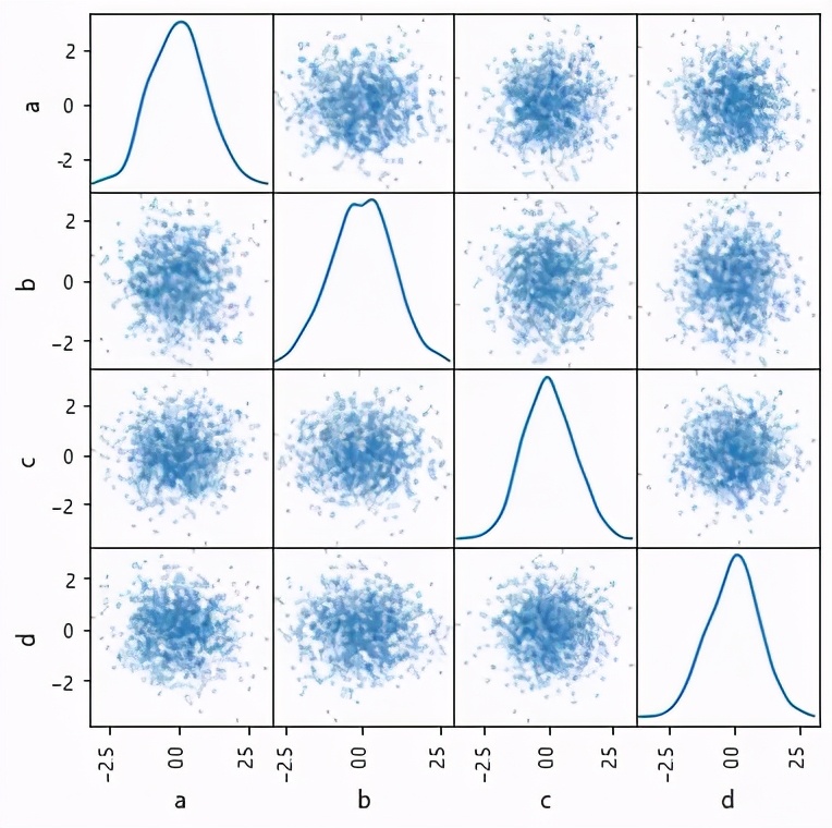
08, matrix scatter plot
from pandas.plotting import scatter_matrix
df = pd.DataFrame(np.random.randn(1000, 4), columns=['a', 'b', 'c', 'd'])
scatter_matrix(df, alpha=0.2, figsize=(6, 6), diagonal='kde')