Welcome to the "Good-looking blog post no one likes" series
The old rules, let’s first show you a wave of renderings. If you’re interested, continue to look at the following:
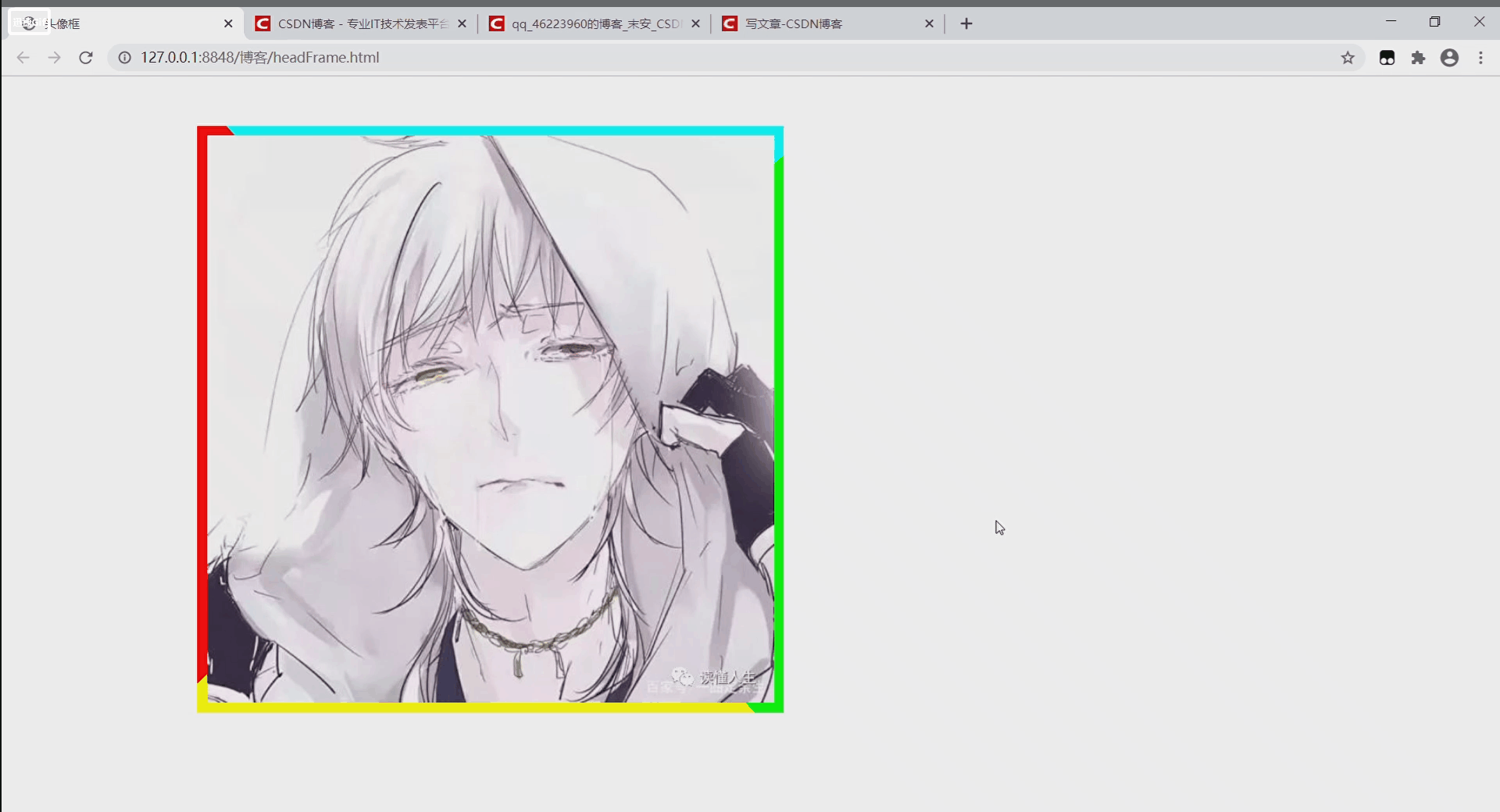
As shown in the picture above: the frame is rotating around the avatar, right, this is the flowing frame effect (in fact , the frame is not rotating, I want to lie to you,  )
)
I will remove the avatar for you to see: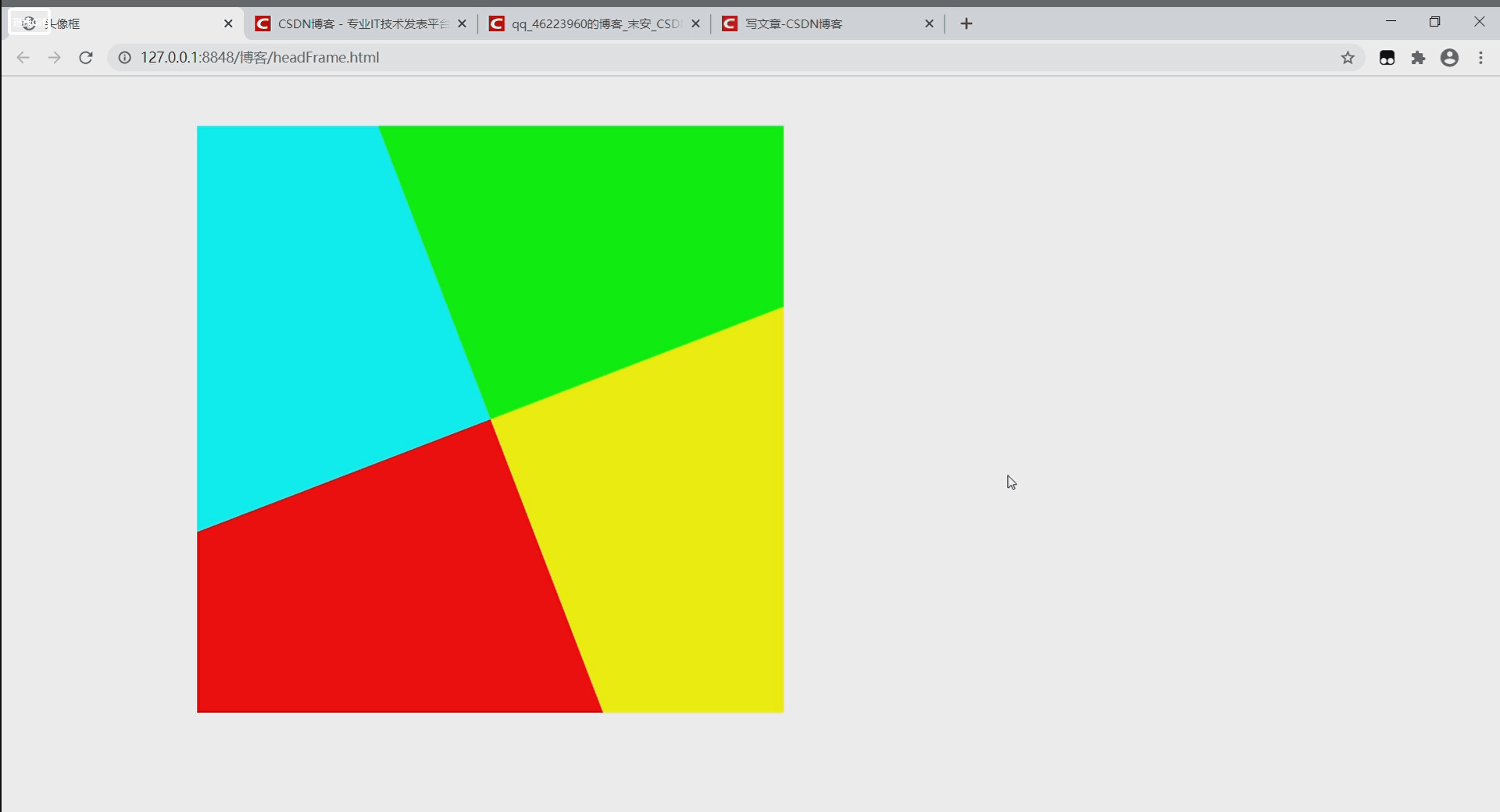
Nani! this one? ? ? what's happen
The principle will be clear at a glance-the effect is that a four-color square div is rotating, and the avatar is covered to make it look like the border is flowing. Wait, it's not right, your div rotates to rotate, why is the style wrong? In fact, there is a div at the bottom of the four-color div, which is used to fix the size of the four-color div, and the part that exceeds the bottom div is hidden. Oh, wow, so dead!
The source code is below:
<!DOCTYPE html>
<html>
	<head>
		<meta charset="utf-8">
		<title>头像框</title>
		<style>
			.headback{
				width: 600px;
				height: 600px;
				position: absolute;
				top: 50px;
				left: 200px;
				overflow: hidden;
			}
			.headborder{
				width: 0px;
				height: 0px;
				border-width: 500px;
				border-style: solid;
				border-top-color: #00FFFF;
				border-left-color: #FF0000;
				border-bottom-color: #FFFF00;
				border-right-color: #00ff00;
				position: relative;
				top: -200px;
				left: -200px;
				transition: all 2s linear;
				transform: rotateZ(0deg);
			}
			.headimg{
				width: 580px;
				height: 580px;
				position: absolute;
				top: 10px;
				left: 10px;
			}
		</style>
		<script>
			var headnum = 0 ;
			function head(){
				headnum+=180;
				document.getElementById("headborder").style.transform="rotateZ("+headnum+"deg)";
			}
			setInterval(head,2000);
		</script>
	</head>
	<body>
		<div class="headback">
			<div class="headborder" id="headborder"></div>
			<img src="img/null31f58c0111c7acd4.jpg" class="headimg">
		</div>
	</body>
</html>
That's it for this blog post. Thank you all for watching. It's not easy to make. Just like it and let's go.