table of Contents
1. Angle
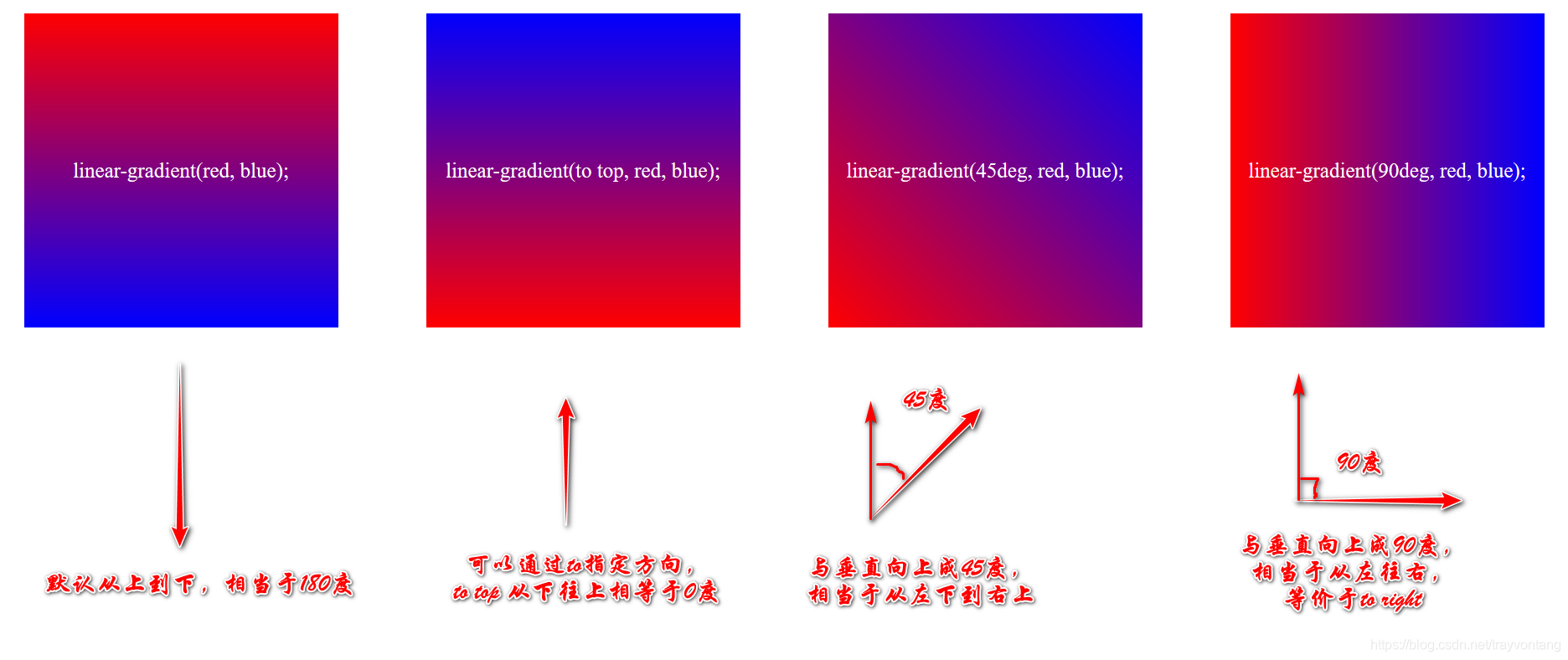 The vertical upward direction is 0 degrees, and the angle formed by the clockwise selection and the vertical upward direction is the angle.
Note that the standard syntax does not support starting directions, for example:
background: linear-gradient(top, red, blue);
If you want to use the starting angle, use the prefix for furniture:
background: -ms-linear-gradient(top, red, blue);
background: -webkit-linear-gradient(top, red, blue);
background: -o-linear-gradient(top, red, blue);
background: --moz-linear-gradient(top, red, blue);
So the gradient direction is from top to bottom, which is equivalent to:
background: linear-gradient(bottom, red, blue);
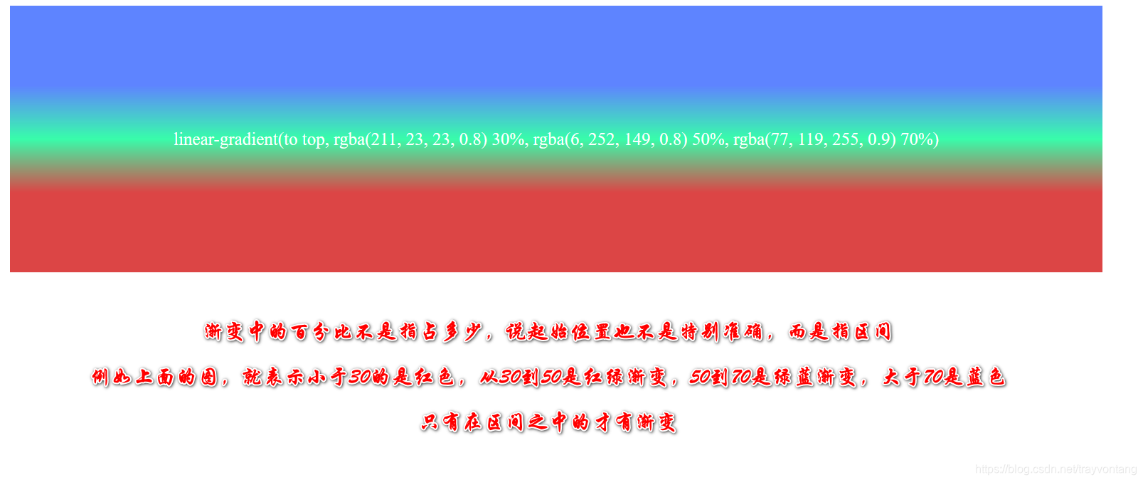
2. Percentage
Three, test code
<!DOCTYPE html>
<html lang="en">

<head>
    <meta charset="UTF-8">
    <meta name="viewport" content="width=device-width, initial-scale=1.0">
    <title>Document</title>
    <style>
        #container {


            display: flex;
            flex-direction: row;
            justify-content: center;
            margin: 0 auto;
            width: 100vw;
        }

        .item {


            width: 300px;
            height: 300px;
            line-height: 300px;
            margin: 10px auto;
            font-size: 20px;
            color: white;
            text-align: center;
        }

        .lg1 {


            background: linear-gradient(red, blue);
        }

        .lg2 {


            background: linear-gradient(to top, red, blue);
        }

        .lg3 {


            background: linear-gradient(45deg, red, blue);
        }

        .lg4 {


            background: linear-gradient(90deg, red, blue);
        }
    </style>
</head>

<body>
    <div id="container">
        <div class="item lg1">linear-gradient(red, blue);</div>
        <div class="item lg2">linear-gradient(to top, red, blue);</div>
        <div class="item lg3">linear-gradient(45deg, red, blue);</div>
        <div class="item lg4">linear-gradient(90deg, red, blue);</div>
    </div>
</body>
</html>