Directory Navigation
- Text wrap
- Shadow Settings
- Vertical center
- css triangle
A commonly used method style
1, text wrap
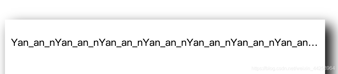
- Ordinary wrap hide omitted three dots
width: 480px;/* 限制宽度*/
overflow: hidden;/* 超出省略*/
white-space: nowrap;/* 强制不换行 */
text-overflow: ellipsis;/* 用三个省略号代替 */
FIG effect as
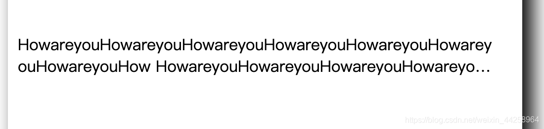
- Multi-line text hidden
/* 不建议设置高度*/
	width: 480px;/* 限制宽度*/
	display: -webkit-box !important;/* 设置专属的盒子类型*/
	overflow: hidden;/* 超出省略*/
	-webkit-line-clamp: 2;/* 行数设定*/
	-webkit-box-orient: vertical;/* 设置行的方向*/
FIG effect as
- If the failure to set English words proposes to add a property
word-break: break-all; /* 可以强行截断英文单词,达到词内换行效果。*/
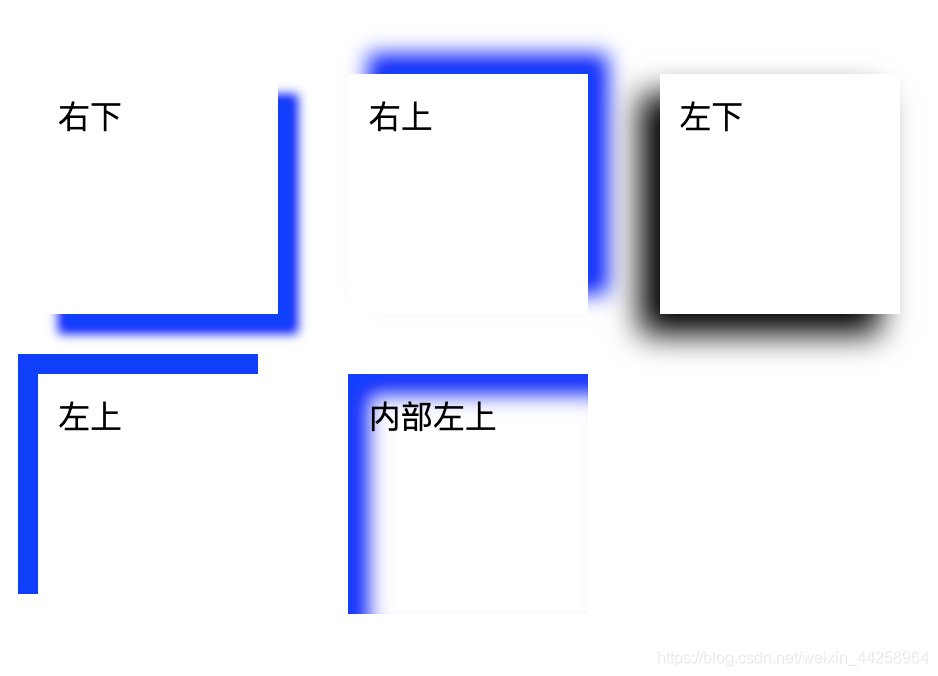
2, shadow settings
A shadow around the first outer length value (negative value -> left)
a second vertical value (negative value -> top)
third value fuzzy values (the greater the blur) is not very sharp negative default 0, like the border
fourth value shadow length and defaults to 0, positive shadow expanded, condensing the negative shadow (not used)
fifth value represents the color, and the associated default browser
about the vertical inner shadow contrast value
	.r_down {
		box-shadow: 10px 10px 5px blue;/* 右下 */
	}

	.r_up {
		box-shadow: 10px -10px 10px blue;/* 右上 */
	}

	.l_down {
		box-shadow: -10px 10px 15px;/* 浏览器默认颜色 */
	}

	.l_up {
		box-shadow: -10px -10px blue;/* 左上 */
	}

	.in_r_down {
		box-shadow: 10px 10px 10px inset blue;/* 左上 */
	}
Renderings
3, vertical centering
1, positioning mode
/*1)如果父级不设置定高top失效*/
width:500px;
height: 500px;
background-color: #123456;
position:absolute;
/*第1种方式*/
left:50%;
top:50%;
transform:translate(-50%,-50%);/*transform有时候会失效,可能是兼容问题使用margin方式也可以*/
/*margin:-250px 0 0 -250px;x、y方向上都减去一半*/
/*第2种方式*/
top:0;
left:0;
right: 0;
bottom: 0;
margin:auto;
2, flex layout setting
/*父级设置、高度必须*/
height:689px;
display:flex;
justify-content: center;
align-items: center;
3, calculated
/*上下居中用定值,左右居中用计算*/
margin:95px calc((100% - 500px)/2);
4, css triangle
By the border attribute set to the triangle
in two ways (the transparent, wherein the hidden three triangles)
 .sanjiao{
	width:0px;
	height:0px;
	border: 20px solid;
	border-color:transparent transparent transparent #ef4848;
}
Or directly transparent border triangle and then set a certain direction alone
.snajiao{
	width:0px;
	height:0px;
	border: 20px solid transparent;
	border-left:50px solid #ef4848;
}
Renderings:

Second, the problem often encountered
1, there is a gap between adjacent elements
- margin value and padding value is 0, but the two elements is connected between a slit.
The reason: display: After inline-block, line breaks between elements in question caused
Solution: Set a negative margin, or the wrap is removed.
Third, the summary
Constantly updated to add, there is a better solution please add a comment! !
