目次
この記事では主に、Pyecharts を使用して、散布図、円グラフ、ファネル チャートなどの一般的に使用されるビジュアル グラフィックを描画する方法を紹介します。具体的な描画方法については、以下を参照してください。
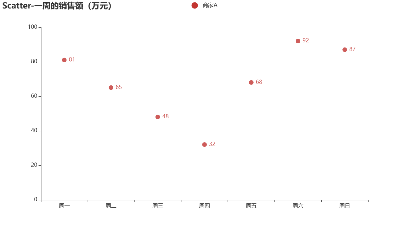
1.散布図を描く
pyecharts は、Scatter を使用して散布図を描画します。
from pyecharts import options as opts
from pyecharts.charts import Scatter
week = ["周一", "周二", "周三", "周四", "周五", "周六", "周日"]
c = Scatter()
c.add_xaxis(week)
c.add_yaxis("商家A", [81,65,48,32,68,92,87])
c.set_global_opts(title_opts=opts.TitleOpts(title="Scatter-一周的销售额(万元)"))
c.render_notebook()
結果グラフ:
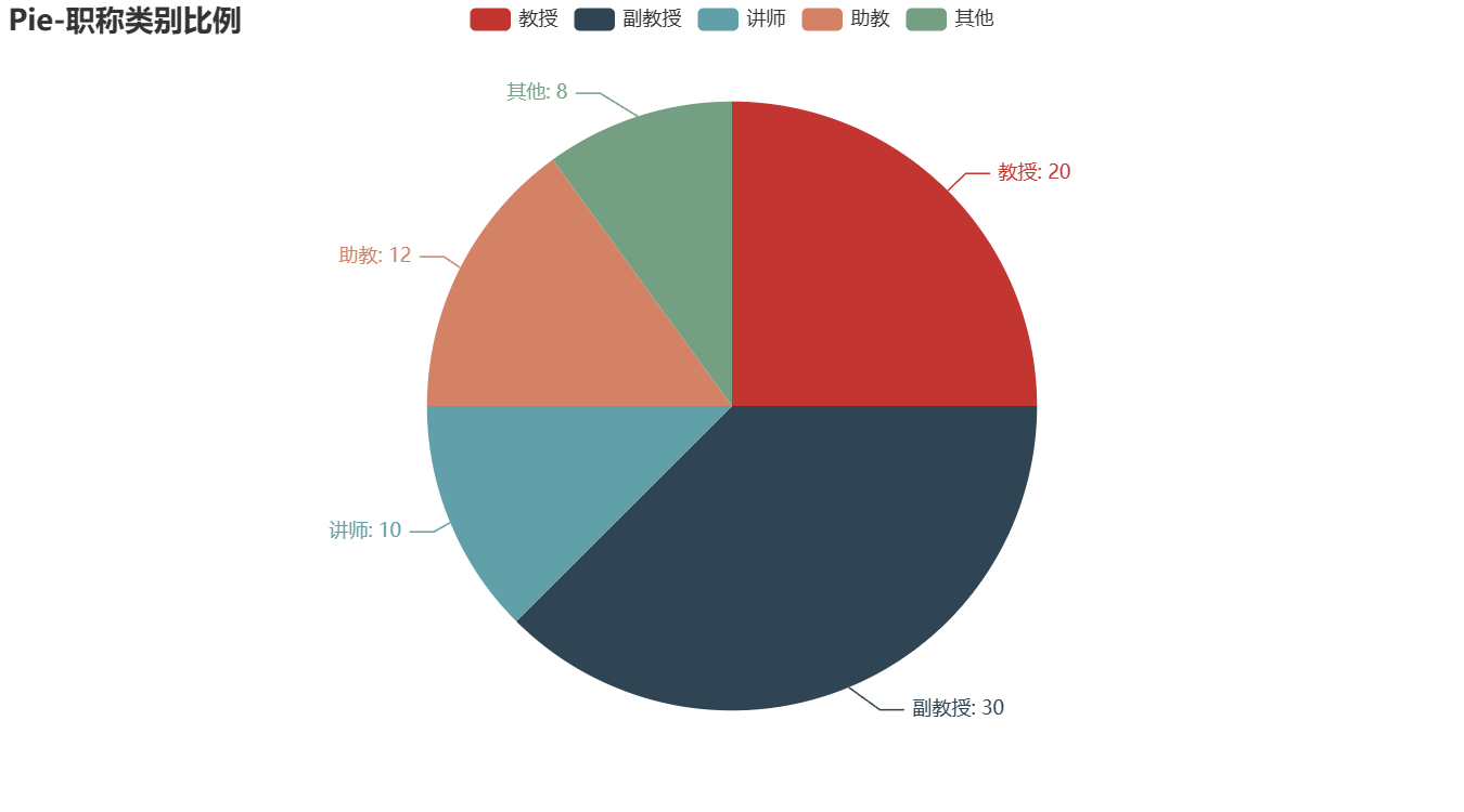
2.円グラフを描く
円グラフは、さまざまなカテゴリの割合を表すためによく使用されます。円グラフは Pie() メソッドを使用して描画できます。
2.1 実線の円グラフを描く
from pyecharts import options as opts
from pyecharts.charts import Page, Pie
L1=['教授','副教授','讲师','助教','其他']
num  = [20,30,10,12,8]
c = Pie()
c.add("", [list(z) for z in zip(L1,num)])
c.set_global_opts(title_opts=opts.TitleOpts(title="Pie-职称类别比例"))
c.set_series_opts(label_opts=opts.LabelOpts(formatter="{b}: {c}"))
c.render_notebook()
結果グラフ:
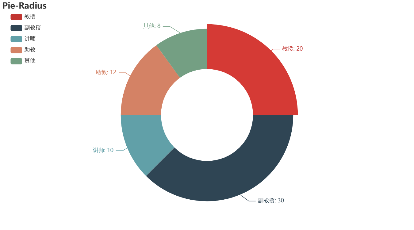
2.2 円グラフを描く
from pyecharts import options as opts
from pyecharts.charts import Page, Pie
wd = ['教授','副教授','讲师','助教','其他']
num = [20,30,10,12,8]
c = Pie()
c.add("",[list(z) for z in zip(wd, num)],radius = ["40%", "75%"])
# 圆环的粗细和大小
c.set_global_opts( title_opts=opts.TitleOpts(title="Pie-Radius"),legend_opts=opts.LegendOpts( orient="vertical", pos_top="5%", pos_left="2%" ))
c .set_series_opts(label_opts=opts.LabelOpts(formatter="{b}: {c}"))
c.render_notebook()
結果グラフ:
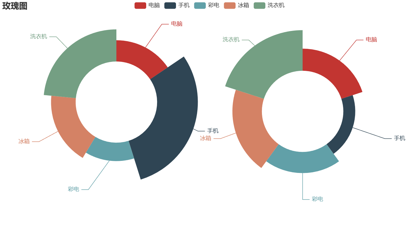
2.3 バラ図を描く
from pyecharts import options as opts
from pyecharts.charts import Page, Pie
data1 = [45,86,39,52,68]
data2 = [67,36,64,89,123]
labels = ['电脑','手机','彩电','冰箱','洗衣机']
c = Pie()
c.add("",[list(z) for z in zip(labels, data1)],radius=["35%", "70%"],center=[250,220],rosetype='radius')
c.add("",[list(z) for z in zip(labels, data2)],radius=["35%", "70%"],center=[650,240],rosetype='area')
c.set_global_opts(title_opts=opts.TitleOpts(title="玫瑰图"))
c.render_notebook()
結果グラフ:
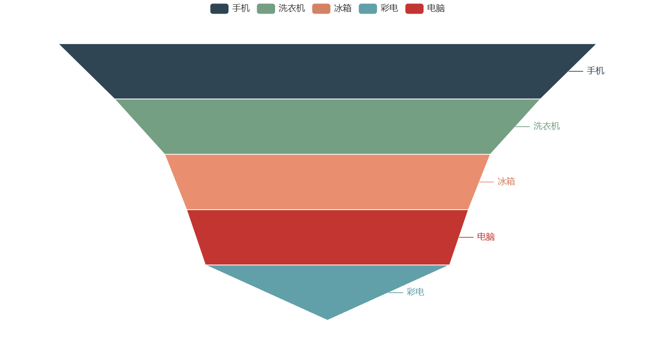
3.ファネルダイアグラムを描く
from pyecharts.charts import Funnel
from pyecharts import options as opts
%matplotlib inline
data = [45,86,39,52,68]
labels = ['电脑','手机','彩电','冰箱','洗衣机']
wf = Funnel()
wf.add('电器销量图',[list(z) for z in zip(labels, data)], is_selected= True)
wf.render_notebook()
結果グラフ:
4. ダッシュボードを描画する
from pyecharts import options as opts
from pyecharts.charts import Gauge
data = [("完成率", 60)]
gauge = (
    Gauge()
    .add(
        "仪表盘名称",
        data,
        title_label_opts=opts.LabelOpts(
            position="inside"  # 将指标名称放在仪表盘内部
        ),
        detail_label_opts=opts.GaugeDetailOpts(
            offset_center=[0, "40%"]  # 将数据值放在仪表盘上方
        ),
    )
    .set_global_opts(
        title_opts=opts.TitleOpts(title="仪表盘标题"),
        legend_opts=opts.LegendOpts(is_show=False),
    )
)
gauge.render_notebook()
結果グラフ:

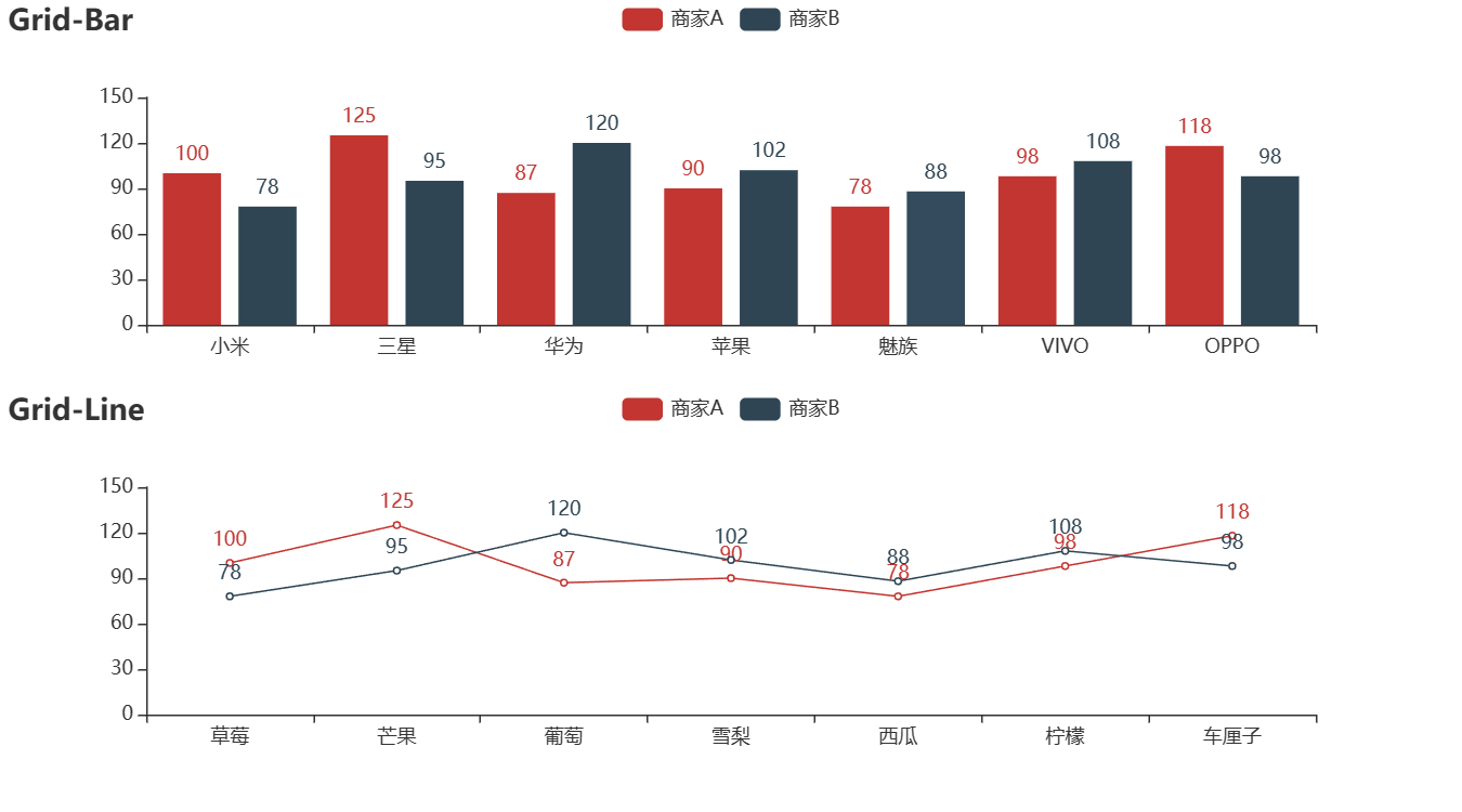
5. 組み合わせチャートを描く
from pyecharts import options as opts
from pyecharts.charts import Bar, Grid, Line,Scatter
A = ["小米", "三星", "华为", "苹果", "魅族", "VIVO", "OPPO"]
CA = [100,125,87,90,78,98,118]
B = ["草莓", "芒果", "葡萄", "雪梨", "西瓜", "柠檬", "车厘子"]
CB = [78,95,120,102,88,108,98]
bar = Bar()
bar.add_xaxis(A)
bar.add_yaxis("商家A",CA)
bar.add_yaxis("商家B", CB)
bar.set_global_opts(title_opts=opts.TitleOpts(title="Grid-Bar"))
bar.render_notebook()
line=Line()
line.add_xaxis(B)
line.add_yaxis("商家A", CA)
line.add_yaxis("商家B", CB)
line.set_global_opts(title_opts=opts.TitleOpts(title="Grid-Line", pos_top="48%"),
legend_opts=opts.LegendOpts(pos_top="48%"))
line.render_notebook()
grid = Grid()
grid.add(bar, grid_opts=opts.GridOpts(pos_bottom="60%"))
grid.add(line, grid_opts=opts.GridOpts(pos_top="60%"))
grid.render_notebook()
結果グラフ: