No passado, para obter o efeito de digitar em um computador, era necessário js+html. Hoje vou apresentar um novo método. Este artigo apresenta principalmente a pura html+cssrealização do efeito de digitação, que tem um certo valor de referência. Todos os códigos são fornecidos e podem ser usados diretamente.

1. Análise de princípios
A animação pode ser pensada em três níveis distintos:
- texto abaixo
- Um plano de fundo que bloqueia o texto no meio
- cursor superior
O texto é estático, enquanto o plano de fundo no meio e o cursor na camada superior são dinâmicos.
Inicialmente, o fundo bloqueia todo o texto e o cursor fica na extrema esquerda.
À medida que a animação avança, o fundo e o cursor se movem da esquerda para a direita no mesmo ritmo.
Quando a animação termina, o fundo não bloqueia mais o texto e o cursor pisca na extrema direita.
A única vantagem dessa implementação é que ela não requer js, mas a desvantagem é que ela só pode ser usada para uma linha de texto, e o texto de várias linhas teoricamente pode ser implementado, mas é mais problemático.
<!DOCTYPE html>
<html lang="en">
<head>
  <meta charset="UTF-8">
  <meta http-equiv="X-UA-Compatible" content="IE=edge">
  <meta name="viewport" content="width=device-width, initial-scale=1.0">
  <title>Typing effect without js</title>
  <style>
    :root {
      /* number of characters */
      --steps: 345;
      /* animation time */
      --duration: 2.5s;
      --fontSize: 50px;
      --cursorSize: 20px;
    }
    .text {
      color: #333;;
      position: relative;
      display: inline-block;
      font-family: 'Courier New', Courier, monospace;
      font-size: var(--fontSize);
      line-height: 1;
    }
    .text::after {
      content: '';
      width: var(--cursorSize);
      height: var(--fontSize);
      background-color: black;
      z-index: 2;
      position: absolute;
      animation: blink 1s var(--duration) step-end infinite,
      moveCursor var(--duration) steps(var(--steps)) forwards;
    }
    .text::before {
      content: '';
      width: 100%;
      height: var(--fontSize);
      z-index: 1;
      position: absolute;
      background: linear-gradient(#fff, #fff) no-repeat top right;
      animation: showText var(--duration) steps(var(--steps)) forwards;
    }
    /* Cursor blink animation */
    @keyframes blink {
      0% {
        background-color: black;
      }
      50% {
        background-color: transparent;
      }
      100% {
        background-color: black;
      }
    }
    /* Cursor movement animation */
    @keyframes moveCursor {
      0% {
        left: 0%;
      }
      100% {
        left: 100%;
      }
    }
    /* background moving animation */
    @keyframes showText {
      0% {
        background-size: 100% 100%;
      }
      100% {
        background-size: 0% 100%;
      }
    }
  </style>
</head>
<body>
<div class="text">hello,world!</div>
</body>
</htm>
Dois, javascript para obter o efeito de digitação 1
<!DOCTYPE html>
<html lang="en">
<head>
  <meta charset="UTF-8">
  <meta http-equiv="X-UA-Compatible" content="IE=edge">
  <meta name="viewport" content="width=device-width, initial-scale=1.0">
  <title>Typing effect with js</title>
</head>
<body>
<div style="font-size: 36px;" id="text">hello,world!</div>
<script>
  var str = 'In the past, to achieve an effect similar to typing on a computer,js+html was required. Today I will introduce a new method.';
  var i = 0;
  function typing(){
    var divTyping = document.getElementById('text');
    if (i <= str.length) {
      divTyping.innerHTML = str.slice(0, i++) + '_';
      setTimeout('typing()', 200);
    }
    else{
      divTyping.innerHTML = str;
    }
  }
  typing();
</script>
</body>
</html>
Três, javascript para obter o efeito de digitação 2

<!DOCTYPE html>
<html>
<head>
<meta http-equiv="Content-Type" content="text/html; charset=utf-8" />
<title>Typing effect with js</title>
<style>
.divcss5{word-wrap:break-word;font-size: 36px;}
</style>
</head>
<body>
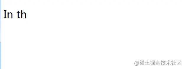
<div class="divcss5" id="aa">
In the past, to achieve an effect similar to typing on a computer, js+html was required. Today I will introduce a new method.This article mainly
</div>
<div style="display:none" id="w">
In the past, to achieve an effect similar to typing on a computer, js+html was required. Today I will introduce a new method.This article mainly introduces pure html+css to achieve typing effect, which has certain reference value, you can learn about it. Provide all the code, you can use it directly.
</div>
<script language="javascript">
var index=0;
var word=document.getElementById("w").innerHTML;
function type(){
document.getElementById("aa").innerText = word.substring(0,index++);
}
setInterval(type, 200);
</script>
</body>
</html>Finalmente, uma farra de front-end é dada a todos [Jiajun Yang: 581286372] para ajudar todos a aprender melhor!