インターネット上でカスタム タブバーの例を多数見つけました。その多くはコンポーネントを定義し、そのコンポーネントをタブバーを必要とするページの下部に配置します。これにより、ページが読み込まれるときにタブバーが再読み込みされます。ネットワークの遅延を引き起こし、ユーザーエクスペリエンスに影響を与えます。
公式ドキュメントに従ってタブバーをカスタマイズするのは実際には非常に簡単です。
タブバーをカスタマイズするための WeChat 公式ドキュメント。
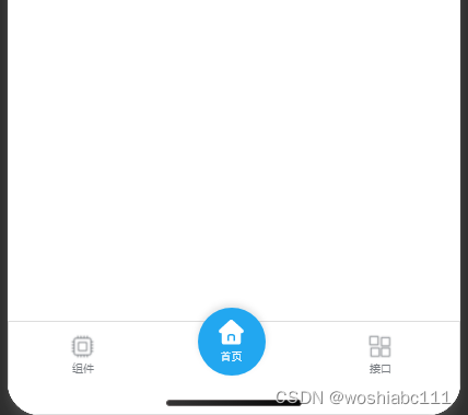
便宜上、簡単な例を作成しました。後で見る
1. プロジェクトのルート ディレクトリにカスタム タブ バー フォルダを作成します
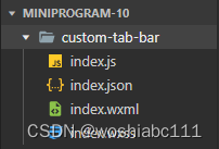
2.index.js ファイルでコンポーネントのコンテンツを定義します
Component({
  data: {
    selected: 0,
    color: "#7A7E83",
    selectedColor: "#3cc51f",
    list: [
        {
            "pagePath": "/pages/index/index",
            "iconPath": "/image/icon_API.png",
            "selectedIconPath": "/image/icon_API_HL.png",
            "text": "组件"
          },
          {
            "pagePath": "/pages/home/index",
            "iconPath": "/image/home_default.png",
            "selectedIconPath": "/image/home_select.png",
            "text": ""
          },
          {
            "pagePath": "/pages/logs/logs",
            "iconPath": "/image/icon_component.png",
            "selectedIconPath": "/image/icon_component_HL.png",
            "text": "接口"
          }
    ]
  },
  attached() {
  },
  methods: {
    switchTab(e) {
      const data = e.currentTarget.dataset;
      const url = data.path;
      wx.switchTab({url})
    }
  }
})
3.index.json でコンポーネントを定義する
{
  "component": true
}
4.index.wxmlページのコンテンツ
<view class="tab-bar">
  <block wx:for="{

     {list}}" wx:key="index">
    <view class="{

     {index==1?'grid-item2':'grid-item'}}"  data-path="{

     {item.pagePath}}" data-index="{

     {index}}" bindtap="switchTab">
      <view class="view-center">
        <image class="{

     {index==1?'img-size2':'img-size'}}"  src="{

     {selected === index ? item.selectedIconPath : item.iconPath}}"></image>
      </view>
      <view class="view-center">
        <text style="color: {
        {
        selected === index ? selectedColor : color}};font-size: 10px;">{

   {item.text}}</text>
      </view>
    </view>
  </block>
</view>
5.index.wxssページスタイル
.tab-bar {
  position: fixed;
  bottom: 0;
  left: 0;
  right: 0;
  height: 50px;
  background: white;
  display: flex;
  padding-bottom: env(safe-area-inset-bottom);
  border: 3rpx solid #DDDDDD;
}
.view-center{
    display: flex;
    justify-content: center;
    align-items: center;
}
.grid-item{
    width: 33%;
    height: 50px;
    margin-top: 10px;
}
.grid-item2{
    width: 33%;
    height: 50px;
    margin-top:-25px;
}
.img-size{
    width: 25px;
    height: 25px;
}
.img-size2{
    width: 80px;
    height: 80px;
}
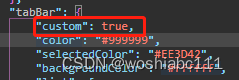
6.app.json の tabbar 属性に 1 つを追加します
7.タブバー ページの onLoad
    onLoad(options) {


    	//确保selected能够指定到对应的图标
        if (typeof this.getTabBar === 'function' &&
        this.getTabBar()) {


        this.getTabBar().setData({


          selected: 1
        })
        }
    },