API
| パラメータ | 説明する | タイプ | デフォルト | 通過しなければなりません |
|---|---|---|---|---|
| 幅 | テキストフィールドの幅 | 文字列 | 番号 | 「100%」 | 間違い |
| 許可クリア | クリアアイコンをクリックするとコンテンツを削除できます | ブール値 | 間違い | 間違い |
| autoSize | 適応コンテンツの高さ | ブール値 | {minRows?: 数値、maxRows?: 数値} | 間違い | 間違い |
| 無効 | 無効にするかどうか | ブール値 | 間違い | 間違い |
| 最大長 | 最大長さ | 番号 | 未定義 | 間違い |
| ショーカウント | 文字数を表示するかどうか | ブール値 | 間違い | 間違い |
| 値(v-モデル) | テキストフィールドの内容 | 弦 | 」 | 間違い |
イベント
| イベント名 | 説明する | パラメータ |
|---|---|---|
| 変化 | テキストフィールドの内容が変更されたときのコールバック | (e: イベント) => void |
| 入力 | Enterを押したときのコールバック | (e: イベント) => void |
効果は次のとおりです:オンライン プレビュー
テキストフィールドコンポーネント Textarea.vue を作成する
<script lang="ts">
/*
  一个根节点时,禁用组件根节点自动继承 attribute,必须使用这种写法!然后在要继承 attribute 的节点上绑定 v-bind="$attrs" 即可
  多个根节点时,只需在要继承 attribute 的节点上绑定 v-bind="$attrs" 即可
*/
export default {


  inheritAttrs: false
}
</script>
<script setup lang="ts">
import {

     ref, computed, watch, onMounted, nextTick } from 'vue'
interface Props {


  width?: string|number // 文本域宽度
  allowClear?: boolean // 可以点击清除图标删除内容
  autoSize?: boolean|{

    minRows?:number, maxRows?:number} // 自适应内容高度
  disabled?: boolean // 是否禁用
  maxlength?: number // 最大长度
  showCount?: boolean // 是否展示字数
  value?: string // 文本域内容(v-model)
  valueModifiers?: object // 用于访问组件的v-model上添加的修饰符
}
const props = withDefaults(defineProps<Props>(), {


  width: '100%',
  allowClear: false,
  autoSize: false,
  disabled: false,
  maxlength: undefined,
  showCount: false,
  value: '',
  valueModifiers: () => ({

    })
})
const areaWidth = computed(() => {


  if (typeof props.width === 'number') {


    return props.width + 'px'
  }
  return props.width
})
const autoSizeProperty = computed(() => {


  if (typeof props.autoSize === 'object') {


    const style: {

    'min-height'?: string, 'max-height'?: string, [propName: string]: any} = {


      resize: 'none'
    }
    if ('minRows' in props.autoSize) {


      style['min-height'] = (props.autoSize.minRows as number) * 22 + 10 + 'px'
    }
    if ('maxRows' in props.autoSize) {


      style['max-height'] = (props.autoSize.maxRows as number) * 22 + 10 + 'px'
    }
    return style
  }
  if (typeof props.autoSize === 'boolean') {


    if (props.autoSize) {


      return {


        'max-height': '9000000000000000px',
        resize: 'none'
      }
    }
    return {

    }
  }
})
const showCountNum = computed(() => {


  if (props.maxlength) {


    return props.value.length + ' / ' + props.maxlength
  }
  return props.value.length
})
watch(
  () => props.value,
  () => {


    if (JSON.stringify(autoSizeProperty.value) !== '{}') {


      areaHeight.value = 32
      nextTick(() => {


        getAreaHeight()
      })
    }
  }
)
const textarea = ref()
const areaHeight = ref(32)
onMounted(() => {


  getAreaHeight()
})
function getAreaHeight () {


  areaHeight.value = textarea.value.scrollHeight + 2
}
const emits = defineEmits(['update:value', 'change', 'enter'])
function onInput (e: any) {


  if (!('lazy' in props.valueModifiers)) {


    emits('update:value', e.target.value)
    emits('change', e)
  }
}
function onChange (e: any) {


  if ('lazy' in props.valueModifiers) {


    emits('update:value', e.target.value)
    emits('change', e)
  }
}
function onKeyboard (e: any) {


  if (e.key === 'Enter') {


    emits('enter', e)
  }
}
function onClear () {


  emits('update:value', '')
  textarea.value.focus()
}
</script>
<template>
  <div
    class="m-textarea"
    :class="{'show-count': showCount}"
    :style="`width: ${areaWidth};`"
    :data-count="showCountNum">
    <textarea
      ref="textarea"
      class="u-textarea"
      :class="{disabled: disabled}"
      :style="[`height: ${autoSize ? areaHeight : ''}px`, autoSizeProperty]"
      :value="value"
      :maxlength="maxlength"
      :disabled="disabled"
      @input="onInput"
      @change="onChange"
      @keydown="onKeyboard"
      v-bind="$attrs" />
    <span class="m-clear" v-if="!disabled&&allowClear&&value" @click="onClear">
      <svg focusable="false" class="u-clear" data-icon="close-circle" width="1em" height="1em" fill="currentColor" aria-hidden="true" viewBox="64 64 896 896"><path d="M512 64C264.6 64 64 264.6 64 512s200.6 448 448 448 448-200.6 448-448S759.4 64 512 64zm165.4 618.2l-66-.3L512 563.4l-99.3 118.4-66.1.3c-4.4 0-8-3.5-8-8 0-1.9.7-3.7 1.9-5.2l130.1-155L340.5 359a8.32 8.32 0 01-1.9-5.2c0-4.4 3.6-8 8-8l66.1.3L512 464.6l99.3-118.4 66-.3c4.4 0 8 3.5 8 8 0 1.9-.7 3.7-1.9 5.2L553.5 514l130 155c1.2 1.5 1.9 3.3 1.9 5.2 0 4.4-3.6 8-8 8z"></path></svg>
    </span>
  </div>
</template>
<style lang="less" scoped>
.m-textarea {


  position: relative;
  display: inline-block;
  .u-textarea {


    width: 100%;
    min-width: 0;
    min-height: 32px;
    max-width: 100%;
    height: auto;
    padding: 4px 11px;
    color: rgba(0, 0, 0, 0.88);
    font-size: 14px;
    line-height: 1.5714285714285714;
    list-style: none;
    transition: all 0.3s, height 0s;
    resize: vertical;
    position: relative;
    display: inline-block;
    vertical-align: bottom;
    text-overflow: ellipsis;
    background-color: #ffffff;
    border: 1px solid #d9d9d9;
    border-radius: 6px;
    outline: none;
    &:hover {


      border-color: #4096ff;
      border-inline-end-width: 1px;
      z-index: 1;
    }
    &:focus-within {


      border-color: #4096ff;
      box-shadow: 0 0 0 2px rgba(5, 145, 255, 0.1);
      border-inline-end-width: 1px;
      outline: 0;
    }
  }
  textarea:disabled {


    color: rgba(0, 0, 0, 0.25);
  }
  textarea::-webkit-input-placeholder {


    color: rgba(0, 0, 0, 0.25)
  }
  textarea:-moz-placeholder {


    color: rgba(0, 0, 0, 0.25)
  }
  textarea::-moz-placeholder {


    color: rgba(0, 0, 0, 0.25)
  }
  textarea:-ms-input-placeholder {


    color: rgba(0, 0, 0, 0.25)
  }
  .m-clear {


    position: absolute;
    inset-block-start: 8px;
    inset-inline-end: 8px;
    z-index: 1;
    display: inline-block;
    line-height: 0;
    .u-clear {


      display: inline-block;
      color: rgba(0, 0, 0, 0.25);
      font-size: 12px;
      line-height: 1;
      vertical-align: -1px;
      cursor: pointer;
      transition: color 0.3s;
      transition: fill 0.3s;
      &:hover {


        fill: rgba(0, 0, 0, 0.45);
      }
    }
  }
  .disabled {


    color: rgba(0, 0, 0, 0.25);
    background-color: rgba(0, 0, 0, 0.04);
    cursor: not-allowed;
    &:hover {


      border-color: #d9d9d9;
    }
    &:focus-within {


      border-color: #d9d9d9;
      box-shadow: none
    }
  }
}
.show-count {


  &::after {


    color: rgba(0, 0, 0, 0.45);
    white-space: nowrap;
    content: attr(data-count);
    pointer-events: none;
    float: right;
  }
}
</style>
ご利用ページ内でご紹介
これにより、 Vue3 の間隔 (Space)の使用が導入されます。
<script setup lang="ts">
import Textarea from './Textarea.vue'
import {
ref, watchEffect } from 'vue'
const value = ref('')
const lazyValue = ref('')
watchEffect(() => {
console.log('value:', value.value)
})
watchEffect(() => {
console.log('lazyValue:', lazyValue.value)
})
function onChange (e: Event) {
console.log('change e:', e)
}
function onEnter (e: KeyboardEvent) {
console.log('enter e:', e)
}
</script>
<template>
<div>
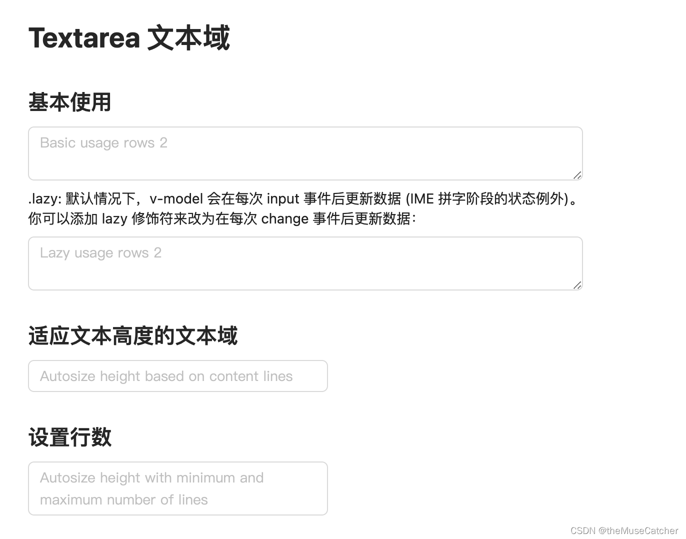
<h1>Textarea 文本域</h1>
<h2 class="mt30 mb10">基本使用</h2>
<Space direction="vertical">
<Textarea
v-model:value="value"
placeholder="Basic usage rows 2"
:rows="2"
@change="onChange"
@enter="onEnter" />
.lazy: 默认情况下,v-model 会在每次 input 事件后更新数据 (IME 拼字阶段的状态例外)。<br/>你可以添加 lazy 修饰符来改为在每次 change 事件后更新数据:
<Textarea
v-model:value.lazy="lazyValue"
placeholder="Lazy usage rows 2"
:rows="2"
@change="onChange" />
</Space>
<h2 class="mt30 mb10">适应文本高度的文本域</h2>
<Space direction="vertical" :width="300">
<Textarea
v-model:value="value"
placeholder="Autosize height based on content lines"
auto-size
/>
</Space>
<h2 class="mt30 mb10">设置行数</h2>
<Space direction="vertical" :width="300">
<Textarea
v-model:value="value"
placeholder="Autosize height with minimum and maximum number of lines"
:auto-size="{ minRows: 2, maxRows: 5 }"
/>
</Space>
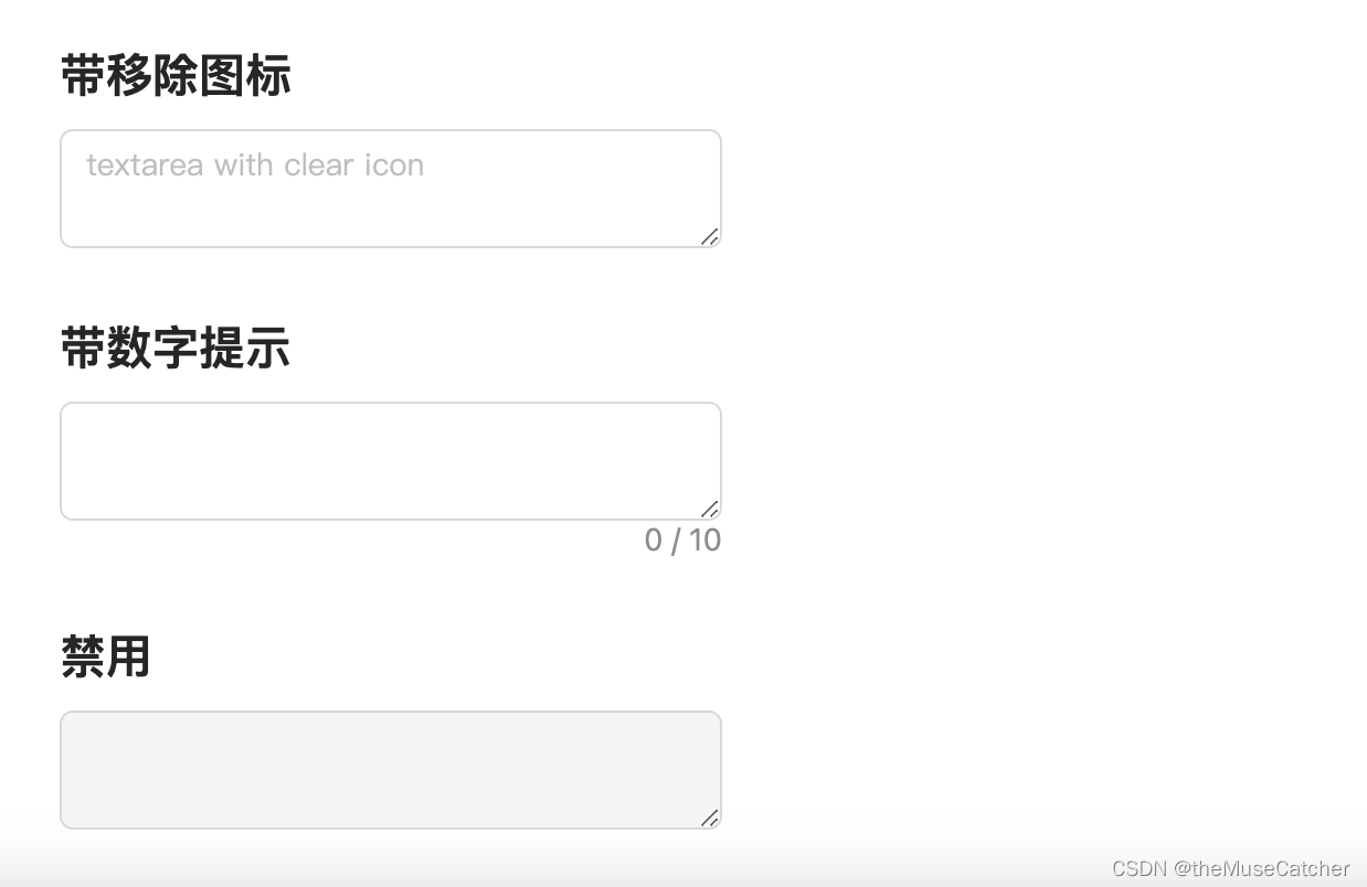
<h2 class="mt30 mb10">带移除图标</h2>
<Space direction="vertical" :width="300">
<Textarea v-model:value="value" placeholder="textarea with clear icon" allow-clear />
</Space>
<h2 class="mt30 mb10">带数字提示</h2>
<Space direction="vertical" :width="300">
<Textarea v-model:value="value" show-count :maxlength="10" />
</Space>
<h2 class="mt30 mb10">禁用</h2>
<Space direction="vertical" :width="300">
<Textarea v-model:value="value" disabled />
</Space>
</div>
</template>