1. 対象となる効果:
シンプルなウォーターフォール フローで効果が得られます。コードは以下にあり、コピー後直接実行できます。前提条件はuniappを使用することです。詳細な分析は以下にあります。
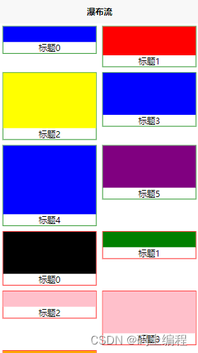
2. 原則:
2.1 CSSレベル
(1) .total クラスは滝の流れの左側の部分と滝の流れの右側の部分をラップするので、そのレイアウトは明らかに 1 行であり、フレックス レイアウトまたはフロートを使用できますが、私はフレックス レイアウトを選択します。ウォーターフォール フローの左側と右側の間にはギャップがありますが、これを justify-content: space-between; と flex-wrap: Wrap; で分離して、ウォーターフォール フローの左側と右側の要素をラップすることができます。 。
(2) 滝の左側のレイアウトは上下で、背景色の高さが親要素の90%を占め、幅が100%です
2.2jsレベル
(1)データが滝の左側にあるか右側にあるかを判断するにはどうすればよいですか? 私の側は、配列内の要素のインデックスに従って2の係数を取得することです。それが0に等しい場合は左側にあり、それ以外の場合は右側にあります。
(2)高低差をどう表現するか?データ内の高さによってスタイルを動的にバインドすることで実現され、背景色は同じです
3. ソースコード
<template>
	<view class="total">
		<view class="left" v-for="item,index in leftList" :key="index" :style="{height: item.height+'rpx'}">
			<!-- 图片 -->
			<view class="photo" :style="{ backgroundColor: item.background}">
			</view>
			<!-- 文字 -->
			<text>{

   {item.title+index}}</text>
		</view>
		<view class="right" v-for="item,index in rightList" :key="index" :style="{height: item.height+'rpx'}">
			<!-- 图片 -->
			<view class="photo" :style="{ backgroundColor: item.background}">
			</view>
			<!-- 文字 -->
			<text>{

   {item.title+index}}</text>
		</view>

	</view>
</template>

<script>
	export default {
		data() {
			return {
				list: [{
						title: '标题',
						height: 100,
						background: 'blue'
					}, {
						title: '标题',
						height: 200,
						background: 'black'
					}, {
						title: '标题',
						height: 150,
						background: 'red'
					}, {
						title: '标题',
						height: 100,
						background: 'green'
					}, {
						title: '标题',
						height: 250,
						background: 'yellow'
					}, {
						title: '标题',
						height: 100,
						background: 'pink'
					},
					{
						title: '标题',
						height: 200,
						background: 'blue'
					}, {
						title: '标题',
						height: 200,
						background: 'pink'
					}, {
						title: '标题',
						height: 300,
						background: 'blue'
					},
					{
						title: '标题',
						height: 300,
						background: 'orange'
					}, {
						title: '标题',
						height: 200,
						background: 'purple'
					}
				]
			}
		},
		computed: {
			leftList() {
				let temp = []
				this.list.forEach((item, index) => {
					if (index % 2 === 0) {
						temp.push(item)
					}
				})
				return temp;
			},
			rightList() {
				let temp = []
				this.list.forEach((item, index) => {
					if (index % 2 !== 0) {
						temp.push(item)
					}
				})
				return temp;
			}
		},
	}
</script>

<style lang="less">
	.total {
		margin: 10rpx auto;
		width: 730rpx;
		display: flex;
		flex-wrap: wrap;
		justify-content: space-between;


		.left,
		.right {
			margin-bottom: 20rpx;
			width: 350rpx;
			display: flex;
			flex-direction: column;
		}

		.left {
			border: 1px solid green;

			.photo {
				width: 100%;
				height: 90%;

			}

			text {
				text-align: center;
			}
		}

		.right {
			border: 1px solid red;

			.photo {
				width: 100%;
				height: 90%;
			}

			text {
				text-align: center;
			}
		}
	}
</style>