参照:https:
//www.cnblogs.com/xianyulaodi/p/5533185.html
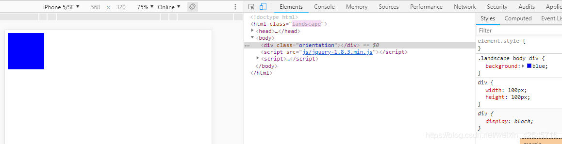
方法1:水平画面または垂直画面のhtmlに異なるクラス名を追加します。divの色(スタイル)を変更する
<!DOCTYPE html>
<html>
<head>
    <meta charset="utf-8" />
    <meta http-equiv="X-UA-Compatible" content="IE=edge">
    <title>Page Title</title>
    <meta name="viewport" content="width=device-width, initial-scale=1">
    <style>
    /**竖屏 body显示红色**/
    .portrait body div{
        background: red;
    }
    /**横屏 body显示蓝色**/
    .landscape body div{
    background: blue;
    }
    div{width: 100px;height: 100px;}
    </style>
</head>
<body>
    <div class="orientation"></div>
    <script src="js/jquery-1.8.3.min.js"></script>
    <script>
    (function(){
        var init = function(){
            var updateOrientation = function(){
                var orientation = window.orientation;
                switch(orientation){
                    case 90:
                    case -90:
                        orientation = 'landscape'; //这里是横屏
                        break;
                    default:
                        orientation = 'portrait';  //这里是竖屏
                        break;
                }

                //html根据不同的旋转状态,加上不同的class,横屏加上landscape,竖屏
                //加上portrait
                document.body.parentNode.setAttribute('class',orientation);
            };

            // 每次旋转,调用这个事件。
            window.addEventListener('orientationchange',updateOrientation,false);

            // 事件的初始化
            updateOrientation();
        };

        window.addEventListener('DOMContentLoaded',init,false);
    })();
    </script>
</body>
</html>

方法2:水平または垂直画面のhtmlに異なるクラス名を追加します。divの色(スタイル)を変更する[方法1との違い、cssの書き込み]
@media all and (orientation: portrait) {
   body div {background: red;}
}

@media all and (orientation: landscape) {
   body div {background: blue; }
}
div{width: 100px;height: 100px;}
方法3:互換性
一部のデバイスはorientationchangeイベントを提供しませんが、ウィンドウサイズ変更イベントをトリガーしません。メディアクエリがサポートされていない場合はどうすればよいですか?
サイズ変更イベントを使用して判断できます。innerWidthとinnerHeightを使用すると、画面サイズを取得できます。幅と高さの比較によると、幅は縦型スクリーンの高さよりも小さく、幅と高さは横型スクリーンです。
<!DOCTYPE html>
<html>
<head>
    <meta charset="utf-8" />
    <meta http-equiv="X-UA-Compatible" content="IE=edge">
    <title>Page Title</title>
    <meta name="viewport" content="width=device-width, initial-scale=1">
    <style>
    @media all and (orientation: portrait) {
        body div {background: red;}
    }

    @media all and (orientation: landscape) {
        body div {background: blue; }
    }
    div{width: 100px;height: 100px;}
    </style>
</head>
<body>
    <div class="orientation"></div>
    <script src="js/jquery-1.8.3.min.js"></script>
    <script>
    (function(){
        var updateOrientation = function(){
            var orientation = (window.innerWidth > window.innerHeight) ? 'landscape' : 'portrait';
            document.body.parentNode.setAttribute('class',orientation);
        };

        var init = function(){
            updateOrientation();
            //监听resize事件
            window.addEventListener('resize',updateOrientation,false);
        };

        window.addEventListener('DOMContentLoaded',init,false);
    })();
    </script>
</body>
</html>
方法4:2つの検出方法の組み合わせ、コードは次のとおりです。
(function(){
   var supportOrientation = (typeof window.orientation === 'number' &&
           typeof window.onorientationchange === 'object');

   var init = function(){
       var htmlNode = document.body.parentNode,
           orientation;
       var updateOrientation = function(){
           if(supportOrientation){
               orientation = window.orientation;
               switch(orientation){
                   case 90:
                   case -90:
                       orientation = 'landscape';
                       break;
                   default:
                       orientation = 'portrait';
                       break;
               }
           }else{
               orientation = (window.innerWidth > window.innerHeight) ? 'landscape' : 'portrait';
           }
           htmlNode.setAttribute('class',orientation);
       };

       if(supportOrientation){
           window.addEventListener('orientationchange',updateOrientation,false);
       }else{
           //监听resize事件
           window.addEventListener('resize',updateOrientation,false);
       }

       updateOrientation();
   };

   window.addEventListener('DOMContentLoaded',init,false);
})();
方法5:簡単な書き方
window.onorientationchange=function(){
     if(window.orientation==90||window.orientation==-90){
         alert('横屏了');
     }else{
         alert('没有横屏');
     }
 }