下面是代码,搞了好久,太难了,可能我太菜了...
<view class="container">
        <ec-canvas id="mychart-one" canvas-id="mychart-multi-one" ec="{

   { ec }}"></ec-canvas>
      </view>
.container {
width: 750rpx;
height: 500rpx;
padding: 0;
}
ec-canvas {
width: 100%;
height: 100%;
}import * as echarts from "../../ec-canvas/echarts"
function setOption(chart, xlist, ylist1, ylist2) {
var option = {
tooltip: {
trigger: 'axis',
},
grid: {
top:'0',
left: 'auto',
right: '8%',
bottom: '4%',
containLabel: true
},
xAxis: [
{
type: 'category',
offset: 5,
splitLine:{
show: true, //让网格显示
lineStyle: {//网格样式
color:['#e2e2e2'], //网格的颜色
width:1, //网格的宽度
type:'dotted' //网格是实实线,可以修改成虚线以及其他的类型
}
},
axisLine: { //坐标轴轴线设置
onZero: false,
show: true, //是否显示坐标轴轴线
lineStyle: { //坐标轴的线
color: '#f42f2f', //线的颜色
width: 4, //线的粗细程度 (用数字表示)
type: 'solid', //线的类型 (可选solid dotted dashed)
}
},
axisLabel: { //坐标轴刻度文字的设置
show: true, //是否显示
inside: false, //坐标轴刻度文字指向 (true表示向上 false表示向下)
margin: 4, //坐标轴刻度文字与轴线之间的距离
color: '#333333', //坐标轴刻度文字的颜色
fontSize:11, //坐标轴刻度文字的大小 (用数字表示)
fontWeight:'bolder', //坐标轴刻度文字的加粗程度 (可选bold bolder lighter normal)
fontFamily:'宋体', //坐标轴刻度文字的风格 (可选楷体 宋体 华文行楷等等)
padding: [6, 0, 0, 0] //坐标轴刻度文字的边距 (上右下左)
},
axisTick: {
length: 1,
lineStyle: {
type: 'dotted',
color: '#F42F2F',
width: 10,
cap: 'round',
padding: [6, 4, 0, 4] //坐标轴刻度文字的边距 (上右下左)
}
},
boundaryGap: false,
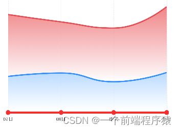
data: ['07日', '08日', '昨天', '今日',]
}
],
yAxis: [
{
type: 'value',
show:false
}
],
series: [
{
center: ['30%', '50%'],
name: '我',
type: 'line',
stack: 'Total',
areaStyle: {},
smooth:true,
symbol: "none",
emphasis: {
focus: 'series'
},
lineStyle:{
normal:{
color:'#3391ff',
width:3
}
},
areaStyle: {
normal: {
color: new echarts.graphic.LinearGradient(0, 0, 0, 1, [{
offset: 0, color: '#9ccbff' // 0% 处的颜色
}, {
offset: 1, color: '#fff' // 100% 处的颜色
}]
), //背景渐变色
}
},
data: [120, 132, 101, 134]
},
{
center: ['80%', '50%'],
name: '同行',
type: 'line',
stack: 'Total',
areaStyle: {},
smooth:true,
symbol: "none",
emphasis: {
focus: 'series'
},
lineStyle:{
normal:{
color:'#e64f54',
width:3
}
},
data: [220, 182, 191, 234],
areaStyle: {
normal: {
color: new echarts.graphic.LinearGradient(0, 0, 0, 1, [{
offset: 0, color: '#e95054' // 0% 处的颜色
}, {
offset: 1, color: '#fff' // 100% 处的颜色
}]
), //背景渐变色
}
},
},
]
};
chart.setOption(option);
}
Page({
/**
* 页面的初始数据
*/
data: {
ec: {
lazyLoad: true
},
xlist: [],
ylist:[],
ylist2:[],
list: ['全款', '待收货', '待发货', '已收货'],
activeIndex: 0
},
// tab切换
tabClick(val) {
this.setData({
activeIndex: val.currentTarget.dataset.index
})
},
getOneOption:function(){
this.setData({
xlist: ['周一', '周二', '周三', '周四', '周五', '周六', '周日'],
ylist: [120, 132, 101, 134, 90, 230, 210],
ylist2:[220, 182, 191, 234, 290, 330, 310]
})
this.init_one(this.data.xlist, this.data.ylist, this.data.ylist2)
},
init_one: function (xdata, ylist1, ylist2) { //初始化第一个图表
console.log(this.oneComponent)
this.oneComponent.init((canvas, width, height,dpr) => {
const chart = echarts.init(canvas, null, {
width: width,
height: height,
devicePixelRatio: dpr
});
setOption(chart, xdata, ylist1, ylist2) //赋值给echart图表
this.chart = chart;
return chart;
});
},
/**
* 生命周期函数--监听页面加载
*/
onLoad: function (options) {
this.oneComponent = this.selectComponent('#mychart-one');
this.getOneOption();
},
/**
* 生命周期函数--监听页面初次渲染完成
*/
onReady: function () {
},
})
推荐两个别人的文章,我觉得写的相当nice,也帮了我不少忙~~~~觉得可以的点个赞后期出页面
去掉echarts的折线小圆点:ECharts 去掉折线上面的小圆点_秋云ucharts折线图不显示圆点_大大大大大桃子的博客-CSDN博客echartsX轴的面积图遮住了X轴:
Echarts x轴设置上下偏移_echarts offset_huzhenv5的博客-CSDN博客
大家一起学习一起进步~~~