Abstract: The Windows Forms design program provides many controls, among which, the common control bar of the toolbox window contains more common controls. Classified according to functions, the controls used to display information include labels (Label) and hyperlink labels (LinkLabel). Label is used to display non-editable information, and LinkLabel not only displays non-editable information, but also provides the functions of executing files, URLs and email links, both of which are widely used. This article uses the Windows Forms design program of Visual Studio 2019, based on the C# programming language, from the common properties and events of controls, combined with specific examples, to introduce Label and LinkLabel respectively.
Table of contents
Label control
The Label control is used to display non-editable information, and supports functions such as setting display content, font size, font color, and background color, and the specific implementation is determined by its properties. Since the Label control does not support some additional interactions and has no special events, its events will not be described in detail.
Attributes
layout
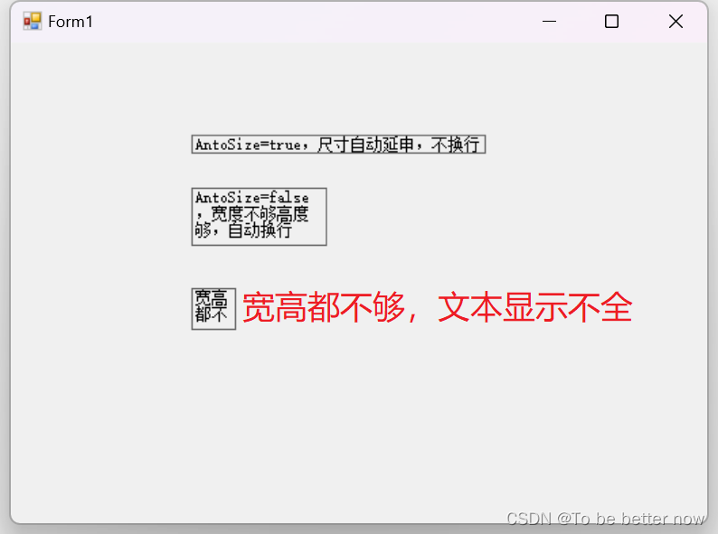
- AntoSize: bool type, indicating whether to enable automatic adjustment of the size according to the font size of the label content, initially true.
When the AntoSize property is true, its size (Size) cannot be set, and the Size property is automatically given according to the length of the label content (Text) and the font size (Font). To customize Size, you need to set the AntoSize property to false. After testing, when the AntoSize property is false, for the horizontally displayed text content, if the width (Width) is not enough but the height is enough (Height), the text content will wrap automatically; if the Width and Height are not enough, the text content will not be displayed completely. Therefore, when you find that the content of the label is not fully displayed during programming, consider whether the Size setting is large enough.
- Location: Point type, which defines the pixel coordinates of the upper left corner of the control relative to the upper left corner of its container, initially the pixel coordinates of the placed point.
- Size: Size type, which defines the pixel size of the control. The initial width is 41, and the height is 12, which is the size of the text "Label1" in Xiaowu Song.
design
- Name: string type, defining the member variable name used to identify the control in the code, initially Label1.
The Name attribute needs to be valid when the GenerateMember attribute is true. If the GenerateMember attribute is false, no member variable will be generated for the control. At this time, an error will be reported if the Name is entered in the code.
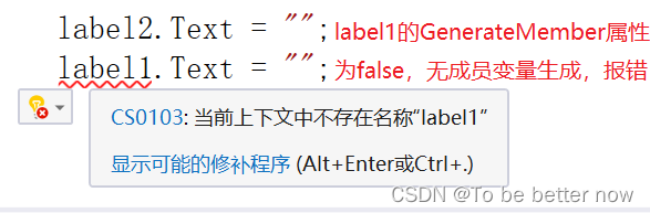
- GenerateMember: bool type, indicating whether to generate member variables for the control, initially true, as mentioned above.
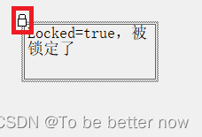
- Locked: bool type, indicating whether to move the control (Location) or adjust the size of the control (Size) by the mouse, initially false.
When the Locked property is true, selecting the control on the design interface will display a lock in the upper left corner, prompting that the control cannot be moved and resized by the mouse, but it can be operated by entering the Location coordinates or the Size value.

- Modifiers: Enumeration type, which defines the accessibility level of the control. The enumeration values are Private (accessible to the same class), Public (public access), Protected (accessible to the same class and derived classes), Internal (accessible to the same assembly), Protected Internal (accessible to the same assembly and derived assemblies), initially Private. (Note: If you want to access the control in other classes, you need to modify this property, this property cannot be modified by writing code
When you need to access the control in other classes, you should set Modifiers as an appropriate attribute. It is most convenient to use Public, and the access is unlimited. If you keep Modifiers as Private, an error will be reported when accessing the control in other classes.
Exterior
- BackColor: Color type, which defines the background color of the control, initially SystemColors.Control (system gray).
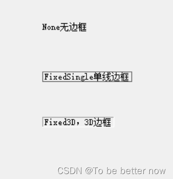
- BorderStyle: BorderStyle enumeration type, which defines the border of the label. The enumeration values include None (no border), FixedSingle (fixed single-line border), Fixed3D (fixed 3D border), and the initial value is None.
- BackgroundImage: Image type, which defines the background image of the control. It is initially empty, that is, a transparent background.
- BackgroundImageLayout: ImageLayout enumeration type, which defines the background image layout method of the control. The enumeration values include None (display on the left), Tile (repeated display), Center (centered display), Stretch (stretch to fill the display), Zoom (proportional Zoom display), the initial is Tile.
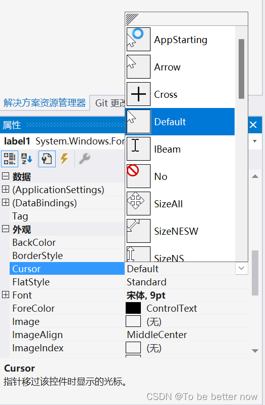
- Cursor: Cursor enumeration type, which defines the cursor displayed on the control when the mouse is moved, and is initially Default.
The drop-down box of the Cursor property displays the types of cursors corresponding to various enumeration values for developers to choose.
- Font: Font type, which defines the font and font size of the control text. The initial is Arial, 9pt (small five).
The Font property provides an interactive interface for developers to choose from, including multiple font selections, four font selections, multiple font size selections, strikethrough and underline selections, etc., similar to the interactive interface for setting fonts in Word.

- ForeColor: Color type, which defines the color of the control text, initially the system color SystemColors.ControlText (text black).
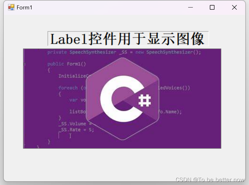
- Image: Image type, which defines the image displayed on the control, and is initially empty.
Although Label is a label control, it also provides an image display function, and sometimes it can be used as a PictureBox control.
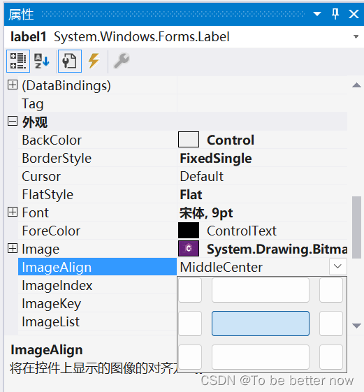
- ImageAlign: ContentAlignment enumeration type, defines the alignment of the control display image, initially MiddleCenter (horizontal, vertical center).
ImageAlign provides nine different positions: upper left, middle left, lower left, upper middle, middle middle, lower middle, upper right, middle right, and lower right. You can directly select the image in the drop-down box.
- Text: string type, which defines the text displayed by the control, initially "label1".
- TextAlign: ContentAlignment enumeration type, which defines the alignment of the text displayed by the control. The initial value is MiddleCenter (horizontal and vertical centering). The interaction mode of the drop-down bar is the same as that of the ImageAlign property, as shown in the figure above.
Behavior
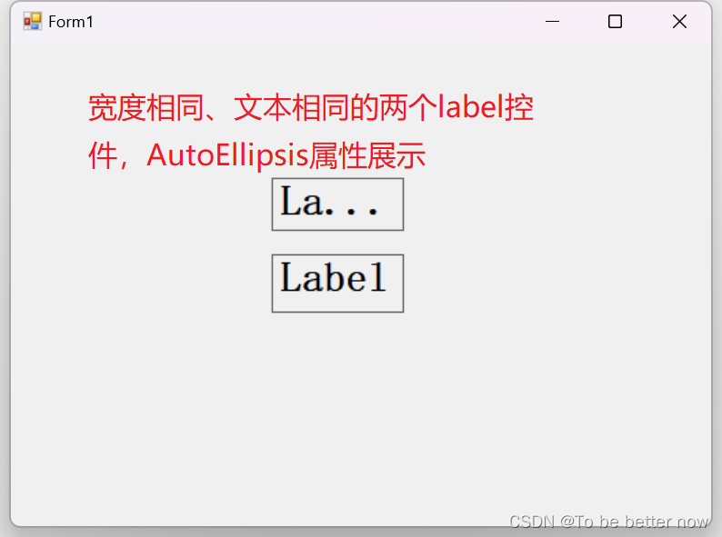
- AutoEllipsis: bool type, indicating whether to automatically process text beyond the overflow width, initially false.
The so-called automatic processing is actually to display the overflow text with an ellipsis.
- ContextMenuStrip: Define the shortcut menu displayed when the user right-clicks the control, initially empty. (Note: To create this menu, you need to write code to create or drag in the ContextMenuStrip control and then select it here, see my other article for details) Usage of ContextMenuStrip (right-click menu) in C#Windows Form Design _c# contextmenustrip usage_To be better now's blog-CSDN blog
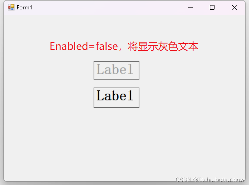
- Enabled: bool type, indicating whether to enable the control, initially true.
When the Enabled property of the label control is false, gray text will be displayed by default.
- Visible: bool type, indicating whether to display the control, initially true, and false to hide the control.
LinkLabel control
It is also an information display control, and the LinkLabel control additionally provides an external link interaction function for implementing hyperlinks. The specific implementation of the hyperlink depends on the LinkClicked event, just write the link address to go to in the event method body. The LinkLabel control is similar to the Label, and the same properties of the two will not be repeated here. This section mainly introduces the unique properties and events of the LinkLabel control.
Attributes
- ActiveLinkColor: Color type, which defines the color of the hyperlink displayed when the hyperlink control is clicked and the mouse is not released, initially it is Red (red).
- DisabledLinkColor: Color type, which defines the color when the hyperlink is disabled, initially RGB (133, 133, 133) (gray).
Note that this property is triggered when the hyperlink is disabled, not when the hyperlink control is disabled. If you set the Enabled property of the control to false in the property box, the default gray will be displayed directly, which has nothing to do with this property. To make this property work, the following code needs to be used, where 0 can be replaced with other index index.
linkLabel1.Links[0].Enabled = false;//linkLabel1控件的第一条超链接置为不可用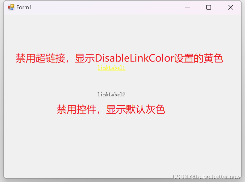
- LinkColor: Color type, which defines the default display color of hyperlinks, initially Blue (blue).
- LinkVisited: bool type, indicating whether the hyperlink is presented in the visited style, initially false.
- VisitedLinkColor: Color type, which defines the color displayed by the hyperlink when the LinkVisited property is true, initially RGB (128, 0, 128) (looks like a purple)
- LinkArea: LinkArea type, which defines the text range in the text of the hyperlink control that is regarded as a hyperlink. Initially, the text is fully covered.
The format of the LinkArea attribute is (x, y), x represents the starting index of the hyperlink text, y represents the number of characters of the hyperlink text, and the overall representation of the hyperlink text starts from the xth character, the number y characters end. When assigning it with code, you need to create a new one with the new operator.
linkLabel2.LinkArea = new LinkArea(0, 5);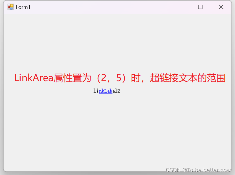
- LinkBehavior: LinkBehavior enumeration type, which defines the underline style of hyperlinks. The enumeration values include SystemDefault (system default), AlwaysUnderline (always underlined), HoverUnderline (underlined when the mouse hovers), and NeverUnderline (no underline), initially SystemDefault .
- Links (not in the control property box, but very important): LinkCollection type, which defines the collection of hyperlinks contained in the hyperlink control. The initial collection has only one element, that is, contains only one hyperlink.
The existence of the Links property means that a hyperlink control can contain multiple hyperlinks, and different character ranges can be used to represent different hyperlinks, and then adding it to the Links collection can realize multiple hyperlinks. Adding a hyperlink statement is as follows, The effect is as follows.
linkLabel2.Links.Add(7, 2);//linkLabel2添加超链接,文本范围为第七个字符往后两个字符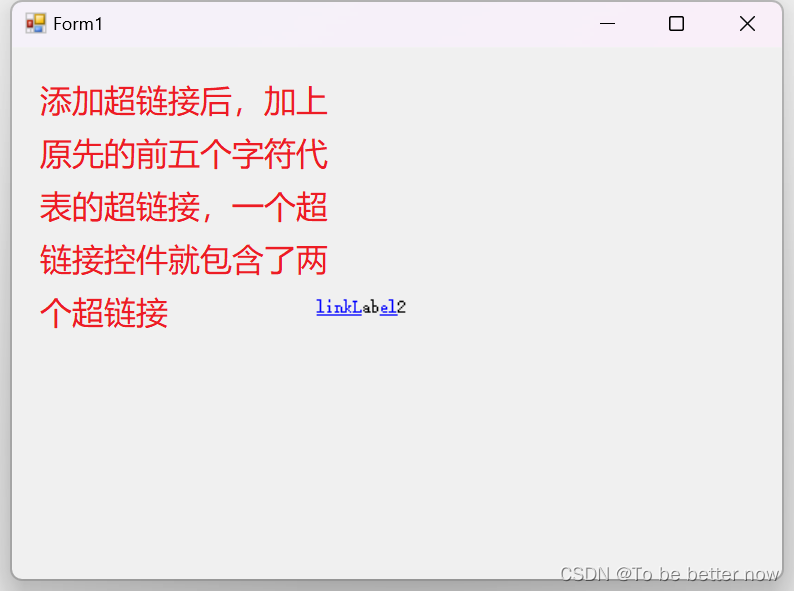
event
- LinkClicked(): Hyperlink click event, triggered when the hyperlink text is clicked, often used to link to executable files, URLs and emails.
Enter the following code into the LinkClicked event method body, link it to the CSDN official website home page, and test.
//超链接单击事件方法体
private void linkLabel2_LinkClicked(object sender, LinkLabelLinkClickedEventArgs e)
{
    System.Diagnostics.Process.Start("https://www.csdn.net/");//链接到CSDN网站
}
At this time, the two hyperlinks of linkLabel2 are linked to the homepage of CSDN official website. To make two hyperlinks link to different places, it is necessary to bind each hyperlink to the visited address. We rewrite the add method of the second hyperlink with the following code, bind it to the Baidu website, and then get the link address of the hyperlink click event method body and access it for testing.
linkLabel2.Links.Add(0, 5, @"https://www.csdn.net/");//linkLabel2添加超链接,链接地址为CSDN
linkLabel2.Links.Add(7, 2, @"https://www.baidu.com/");//linkLabel2添加超链接,链接地址为百度
//超链接单击事件方法体
private void linkLabel2_LinkClicked(object sender, LinkLabelLinkClickedEventArgs e)
{
if(!string.IsNullOrEmpty(e.Link.LinkData as string))//空字符串防护
{
System.Diagnostics.Process.Start(e.Link.LinkData as string);//链接到百度网站
}
}At this point, click the first hyperlink of linkLabel2 to link to the homepage of the CSDN official website, and click the second hyperlink to link to the Baidu website. To implement more hyperlinks pointing to different links, just add more according to this format. It is worth noting that when adding, it is necessary to ensure that the text ranges occupied by each hyperlink cannot overlap, otherwise an error will be reported.
summary
This article explains in detail two display information controls - Label and LinkLabel. Label provides a simple and powerful non-editable information display function, displaying text content, font size and shape, text location and layout, and even a guest PictureBox to display pictures. LinkLabel provides hyperlink functions for linkable objects including executable files, URLs and e-mails. It supports various states and colors to represent different states of hyperlinks. It supports one LinkLabel to contain multiple hyperlinks and link to different addresses respectively, which is flexible. And strong.
each message
The most difficult rule to follow in the world is speed. Speed comes from literacy, and literacy comes from the accumulation of details in daily life. This accumulation is a kind of kung fu .