【WeChat Mini Program—Animation Workshop】Introduction to Animation
antecedent
Pre-knowledge required:
- child selector
- basic layout
analyze
The tasks can be split up.
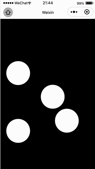
-
How to make the ball run?
Create an animation function through @keyframe, and then create an animation function through animation binding
The percentage of @keyframe represents the progress of the animation, 0% represents the starting point of the animation, and 100% represents the end point of the animation. If there are multiple identical positions, multiple time points can be merged and set.
-
How to control the direction of the animation?
Use the transform:translate function
transform:translate(a,b), which means that the element will be moved to a distance to the right of the starting point and b distance to the bottom. -
How to control the speed of the animation?
In the animation, we can set the period of the animation. If the period we give is shorter, it means that the animation will be completed faster, and vice versa.
animation: 6s; -
How to make the animation go on endlessly?
animation: infinite; -
How to make the ball run smoothly?
Add ease attribute to animation
-
How to draw a small ball?
First draw a square, and then set it like this
border-radius: 100%;
code file
- wxml
<view class="container">
  <view></view>
  <view></view>
  <view></view>
  <view></view>
</view>
- css
page{
  display:flex;
  justify-content: center;
  align-items: center;
  height: 100vh;
  background-color: black;
}

.container{
  position: relative;
  width: 200px;
  height: 200px;
}

.container view{
  position: absolute;
  width: 40%;
  height: 40%;
  border-radius: 100%;
  background-color:#ffffff;
  animation: loading 6s infinite ease;
}

.container :first-child{
  animation-delay: 1.5s;
}

.container :nth-child(1){
  animation-delay: 2.0s;
}

.container :nth-child(2){
  animation-delay: 3s;
}

.container :nth-child(3){
  animation-delay: 5s;
}

@keyframes loading{
  0%,100%{
    transform: translate(0,0);
  }
  20%{
    transform: translate(100px,100px)
  }
  40%{
    transform: translate(-100px,-100px);
  }
  60%{
    transform: translate(-100px,100px);
  }
  80%{
    transform: translate(100px,-100px);
  }
}