Nota: Mueva todos los datos de este artículo - datos de referencia
Directorio de artículos
1. Diagrama de apilamiento horizontal
Un gráfico apilado es en realidad una forma especial de un gráfico de columnas.
from matplotlib import pyplot as plt
plt.style.use('seaborn')
plt.figure(figsize=(15,9))
plt.rcParams.update({

    'font.family': "Microsoft YaHei"})
plt.title("中国票房2021TOP9")
plt.bar(cnbodfgbsort.index,cnbodfgbsort.PERSONS)
plt.bar(cnbodfgbsort.index,cnbodfgbsort.PRICE)
plt.bar(cnbodfgbsort.index,cnbodfgbsort.points)
plt.show()
Efecto gráfico apilado
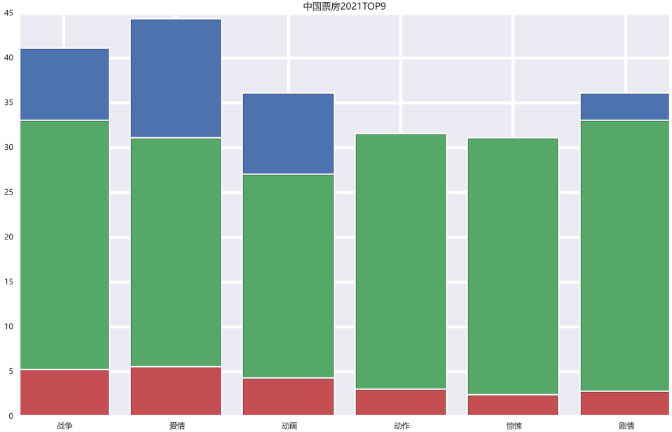
Se puede ver que algunos datos azules están bloqueados , si queremos mostrarlos todos podemos:
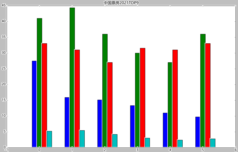
index_x=np.arange(len(cnbodfgbsort.index))
index_x
w=0.15
from matplotlib import pyplot as plt
plt.style.use('classic')
plt.figure(figsize=(15,9))
plt.rcParams.update({

    'font.family': "Microsoft YaHei"})
plt.title("中国票房2021TOP9")
plt.bar(index_x,cnbodfgbsort.PERSONS,width=w)
plt.bar(index_x+w,cnbodfgbsort.PRICE,width=w)
plt.bar(index_x+2*w,cnbodfgbsort.points,width=w)
plt.show()
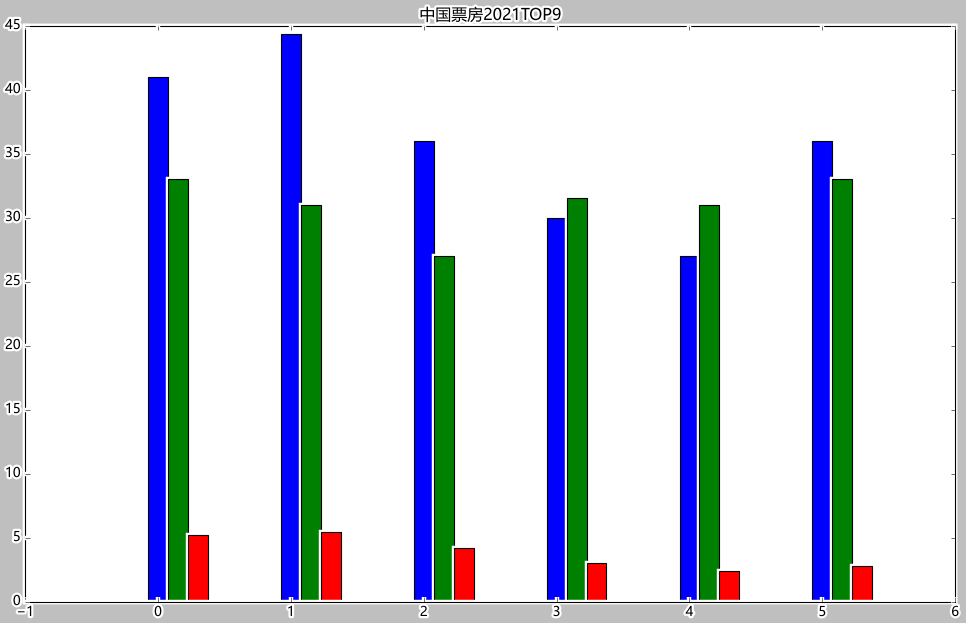
Se puede ver que los números de BO y PRECIO y PERSONAS en la fuente de datos de Excel son muy diferentes. Si se usa un gráfico apilado, BO cubrirá todo lo demás y no podrá mostrar buenos resultados:

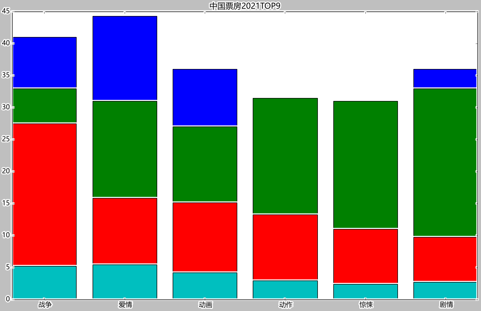
debido a que los datos son muy diferentes, podemos directamente Sea BO dividido por 1000 :
from matplotlib import pyplot as plt
plt.style.use('classic')
plt.figure(figsize=(15,9))
plt.rcParams.update({

    'font.family': "Microsoft YaHei"})
plt.title("中国票房2021TOP9")
plt.bar(cnbodfgbsort.index,cnbodfgbsort.PERSONS)
plt.bar(cnbodfgbsort.index,cnbodfgbsort.PRICE)
plt.bar(cnbodfgbsort.index,cnbodfgbsort.BO/1000)
plt.bar(cnbodfgbsort.index,cnbodfgbsort.points)
plt.show()
from matplotlib import pyplot as plt
plt.style.use('classic')
plt.figure(figsize=(15,9))
plt.rcParams.update({

    'font.family': "Microsoft YaHei"})
plt.title("中国票房2021TOP9")
plt.bar(index_x-w,cnbodfgbsort.BO/1000,width=w)   # 直接让BO除以1000
plt.bar(index_x,cnbodfgbsort.PERSONS,width=w)
plt.bar(index_x+w,cnbodfgbsort.PRICE,width=w)
plt.bar(index_x+2*w,cnbodfgbsort.points,width=w)
plt.show()
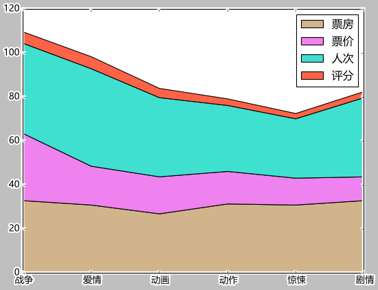
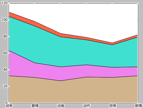
En segundo lugar, el diagrama de apilamiento ondulado
labels=['战争','爱情','动画','动作','惊悚','剧情']
colors=['tan','violet','turquoise','tomato','teal','steelblue']
plt.stackplot(cnbodfgbsort.index,cnbodfgbsort.PRICE,cnbodfgbsort.PERSONS,cnbodfgbsort.points,labels=labels,colors=colors)

labels=['战争','爱情','动画','动作','惊悚','剧情']
colors=['tan','violet','turquoise','tomato','teal','steelblue']
plt.stackplot(cnbodfgbsort.index,cnbodfgbsort.PRICE,cnbodfgbsort.BO/900,cnbodfgbsort.PERSONS,cnbodfgbsort.points,labels=labels,colors=colors)
3. Agregue etiquetas de datos
plt.legend()
labels=['票房','票价','人次','评分']
colors=['tan','violet','turquoise','tomato','teal','steelblue']
plt.stackplot(cnbodfgbsort.index,cnbodfgbsort.PRICE,cnbodfgbsort.BO/900,cnbodfgbsort.PERSONS,cnbodfgbsort.points,labels=labels,colors=colors)
plt.legend()