Referencia:
https://www.cnblogs.com/xianyulaodi/p/5533185.html
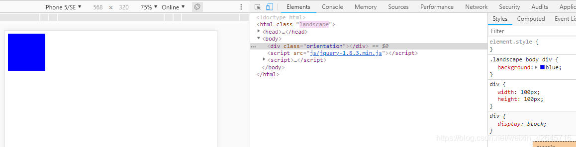
Método 1: agregue diferentes nombres de clase a html en pantalla horizontal o vertical. Modificar el color (estilo) del div
<!DOCTYPE html>
<html>
<head>
    <meta charset="utf-8" />
    <meta http-equiv="X-UA-Compatible" content="IE=edge">
    <title>Page Title</title>
    <meta name="viewport" content="width=device-width, initial-scale=1">
    <style>
    /**竖屏 body显示红色**/
    .portrait body div{
        background: red;
    }
    /**横屏 body显示蓝色**/
    .landscape body div{
    background: blue;
    }
    div{width: 100px;height: 100px;}
    </style>
</head>
<body>
    <div class="orientation"></div>
    <script src="js/jquery-1.8.3.min.js"></script>
    <script>
    (function(){
        var init = function(){
            var updateOrientation = function(){
                var orientation = window.orientation;
                switch(orientation){
                    case 90:
                    case -90:
                        orientation = 'landscape'; //这里是横屏
                        break;
                    default:
                        orientation = 'portrait';  //这里是竖屏
                        break;
                }

                //html根据不同的旋转状态,加上不同的class,横屏加上landscape,竖屏
                //加上portrait
                document.body.parentNode.setAttribute('class',orientation);
            };

            // 每次旋转,调用这个事件。
            window.addEventListener('orientationchange',updateOrientation,false);

            // 事件的初始化
            updateOrientation();
        };

        window.addEventListener('DOMContentLoaded',init,false);
    })();
    </script>
</body>
</html>

Método 2: agregue diferentes nombres de clase a html en pantalla horizontal o vertical. Modificar el color (estilo) del div [Diferencia del método 1, escritura css]
@media all and (orientation: portrait) {
   body div {background: red;}
}

@media all and (orientation: landscape) {
   body div {background: blue; }
}
div{width: 100px;height: 100px;}
Método 3: compatibilidad
Algunos dispositivos no proporcionan un evento de cambio de orientación, pero no activan el evento de cambio de tamaño de la ventana. ¿Qué debemos hacer si las consultas de medios no son compatibles?
Puede utilizar el evento de cambio de tamaño para juzgar. Con innerWidth e innerHeight, puede recuperar el tamaño de la pantalla. De acuerdo con la comparación de ancho y alto, el ancho es menor que el alto de la pantalla vertical, y el ancho y alto son la pantalla horizontal.
<!DOCTYPE html>
<html>
<head>
    <meta charset="utf-8" />
    <meta http-equiv="X-UA-Compatible" content="IE=edge">
    <title>Page Title</title>
    <meta name="viewport" content="width=device-width, initial-scale=1">
    <style>
    @media all and (orientation: portrait) {
        body div {background: red;}
    }

    @media all and (orientation: landscape) {
        body div {background: blue; }
    }
    div{width: 100px;height: 100px;}
    </style>
</head>
<body>
    <div class="orientation"></div>
    <script src="js/jquery-1.8.3.min.js"></script>
    <script>
    (function(){
        var updateOrientation = function(){
            var orientation = (window.innerWidth > window.innerHeight) ? 'landscape' : 'portrait';
            document.body.parentNode.setAttribute('class',orientation);
        };

        var init = function(){
            updateOrientation();
            //监听resize事件
            window.addEventListener('resize',updateOrientation,false);
        };

        window.addEventListener('DOMContentLoaded',init,false);
    })();
    </script>
</body>
</html>
Método 4: combinación de los dos métodos de detección, el código es el siguiente:
(function(){
   var supportOrientation = (typeof window.orientation === 'number' &&
           typeof window.onorientationchange === 'object');

   var init = function(){
       var htmlNode = document.body.parentNode,
           orientation;
       var updateOrientation = function(){
           if(supportOrientation){
               orientation = window.orientation;
               switch(orientation){
                   case 90:
                   case -90:
                       orientation = 'landscape';
                       break;
                   default:
                       orientation = 'portrait';
                       break;
               }
           }else{
               orientation = (window.innerWidth > window.innerHeight) ? 'landscape' : 'portrait';
           }
           htmlNode.setAttribute('class',orientation);
       };

       if(supportOrientation){
           window.addEventListener('orientationchange',updateOrientation,false);
       }else{
           //监听resize事件
           window.addEventListener('resize',updateOrientation,false);
       }

       updateOrientation();
   };

   window.addEventListener('DOMContentLoaded',init,false);
})();
Método cinco: escritura simple
window.onorientationchange=function(){
     if(window.orientation==90||window.orientation==-90){
         alert('横屏了');
     }else{
         alert('没有横屏');
     }
 }