From the beginning of this talk, we will begin officially components. If you participated in the Form Designer, you will certainly understand what a component. Element All components have been carefully designed, so it is very beautiful.
Element 03 ~ Element 10 focuses Basic components, namely,
Layout Layout
Container layout container
Color Color
Typography Font
Border Border
Icon Icon
Button Button
Link text link
Today we'll Layout layout.
Layout, it is a piece of content over specific to a distributed fashion. For example, my blog is 25% + 50% + 25% to the layout. Use Element, you can easily to web pages and even multi-row single row of parallel layout, while the layout of multi-page, to apply to the corporate website.
First, we will be what is the foundation layout. Basic layout is the basis for creating a grid layout with a single columns. By el-rowand el-colassemblies, and through el-colthe component spanwe can freely combine layout properties.
Note that, with all the components of the Element are made el- beginning. This is also the reason and the Foundation can coexist.
First of all for everyone to see the effect of the general layout:
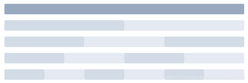
Each color can represent its content.
Code:
<el-row>
  <el-col :span="24"><div class="grid-content bg-purple-dark"></div></el-col>
</el-row>
<el-row>
  <el-col :span="12"><div class="grid-content bg-purple"></div></el-col>
  <el-col :span="12"><div class="grid-content bg-purple-light"></div></el-col>
</el-row>
<el-row>
  <el-col :span="8"><div class="grid-content bg-purple"></div></el-col>
  <el-col :span="8"><div class="grid-content bg-purple-light"></div></el-col>
  <el-col :span="8"><div class="grid-content bg-purple"></div></el-col>
</el-row>
<el-row>
  <el-col :span="6"><div class="grid-content bg-purple"></div></el-col>
  <el-col :span="6"><div class="grid-content bg-purple-light"></div></el-col>
  <el-col :span="6"><div class="grid-content bg-purple"></div></el-col>
  <el-col :span="6"><div class="grid-content bg-purple-light"></div></el-col>
</el-row>
<el-row>
  <el-col :span="4"><div class="grid-content bg-purple"></div></el-col>
  <el-col :span="4"><div class="grid-content bg-purple-light"></div></el-col>
  <el-col :span="4"><div class="grid-content bg-purple"></div></el-col>
  <el-col :span="4"><div class="grid-content bg-purple-light"></div></el-col>
  <el-col :span="4"><div class="grid-content bg-purple"></div></el-col>
  <el-col :span="4"><div class="grid-content bg-purple-light"></div></el-col>
</el-row>

<style>
  .el-row {
    margin-bottom: 20px;
    &:last-child {
      margin-bottom: 0;
    }
  }
  .el-col {
    border-radius: 4px;
  }
  .bg-purple-dark {
    background: #99a9bf;
  }
  .bg-purple {
    background: #d3dce6;
  }
  .bg-purple-light {
    background: #e5e9f2;
  }
  .grid-content {
    border-radius: 4px;
    min-height: 36px;
  }
  .row-bg {
    padding: 10px 0;
    background-color: #f9fafc;
  }
</style>
Tip: The color here is to use CSS results achieved.
How to achieve it in the interval columns inside? Do not worry, come at once. 
Is not the effect you want? el-rowComponent provides gutterproperty to specify the interval between each column, the default interval is 0.
<el-row :gutter="20">
  <el-col :span="6"><div class="grid-content bg-purple"></div></el-col>
  <el-col :span="6"><div class="grid-content bg-purple"></div></el-col>
  <el-col :span="6"><div class="grid-content bg-purple"></div></el-col>
  <el-col :span="6"><div class="grid-content bg-purple"></div></el-col>
</el-row>

<style>
  .el-row {
    margin-bottom: 20px;
    &:last-child {
      margin-bottom: 0;
    }
  }
  .el-col {
    border-radius: 4px;
  }
  .bg-purple-dark {
    background: #99a9bf;
  }
  .bg-purple {
    background: #d3dce6;
  }
  .bg-purple-light {
    background: #e5e9f2;
  }
  .grid-content {
    border-radius: 4px;
    min-height: 36px;
  }
  .row-bg {
    padding: 10px 0;
    background-color: #f9fafc;
  }
</style>
How, the way out of it!
If you want multiple layouts, (mixed layout), like this: 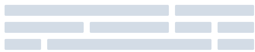
simple fact, the official explanation is: by base ({{1}} {{ 24}} \ \ frac) \ columns arbitrarily extended mixing combined to form more complex layouts. Through the development of el-colcomponents offsetyou can specify the number of columns columns offset property.
Code:
<el-row :gutter="20">
  <el-col :span="16"><div class="grid-content bg-purple"></div></el-col>
  <el-col :span="8"><div class="grid-content bg-purple"></div></el-col>
</el-row>
<el-row :gutter="20">
  <el-col :span="8"><div class="grid-content bg-purple"></div></el-col>
  <el-col :span="8"><div class="grid-content bg-purple"></div></el-col>
  <el-col :span="4"><div class="grid-content bg-purple"></div></el-col>
  <el-col :span="4"><div class="grid-content bg-purple"></div></el-col>
</el-row>
<el-row :gutter="20">
  <el-col :span="4"><div class="grid-content bg-purple"></div></el-col>
  <el-col :span="16"><div class="grid-content bg-purple"></div></el-col>
  <el-col :span="4"><div class="grid-content bg-purple"></div></el-col>
</el-row>

<style>
  .el-row {
    margin-bottom: 20px;
    &:last-child {
      margin-bottom: 0;
    }
  }
  .el-col {
    border-radius: 4px;
  }
  .bg-purple-dark {
    background: #99a9bf;
  }
  .bg-purple {
    background: #d3dce6;
  }
  .bg-purple-light {
    background: #e5e9f2;
  }
  .grid-content {
    border-radius: 4px;
    min-height: 36px;
  }
  .row-bg {
    padding: 10px 0;
    background-color: #f9fafc;
  }
</style>
To move the position of a point? Very simple, offset it.
<el-row :gutter="20">
  <el-col :span="6"><div class="grid-content bg-purple"></div></el-col>
  <el-col :span="6" :offset="6"><div class="grid-content bg-purple"></div></el-col>
</el-row>
<el-row :gutter="20">
  <el-col :span="6" :offset="6"><div class="grid-content bg-purple"></div></el-col>
  <el-col :span="6" :offset="6"><div class="grid-content bg-purple"></div></el-col>
</el-row>
<el-row :gutter="20">
  <el-col :span="12" :offset="6"><div class="grid-content bg-purple"></div></el-col>
</el-row>

<style>
  .el-row {
    margin-bottom: 20px;
    &:last-child {
      margin-bottom: 0;
    }
  }
  .el-col {
    border-radius: 4px;
  }
  .bg-purple-dark {
    background: #99a9bf;
  }
  .bg-purple {
    background: #d3dce6;
  }
  .bg-purple-light {
    background: #e5e9f2;
  }
  .grid-content {
    border-radius: 4px;
    min-height: 36px;
  }
  .row-bg {
    padding: 10px 0;
    background-color: #f9fafc;
  }
</style>
Through flexto flexible alignment of columns layout.
Alignment:
The type attribute assigned 'flex', to enable flexthe layout, and by a justifyspecified start attribute, center, end, space-between , space-around value which is defined typesetting child elements.
<el-row type="flex" class="row-bg">
  <el-col :span="6"><div class="grid-content bg-purple"></div></el-col>
  <el-col :span="6"><div class="grid-content bg-purple-light"></div></el-col>
  <el-col :span="6"><div class="grid-content bg-purple"></div></el-col>
</el-row>
<el-row type="flex" class="row-bg" justify="center">
  <el-col :span="6"><div class="grid-content bg-purple"></div></el-col>
  <el-col :span="6"><div class="grid-content bg-purple-light"></div></el-col>
  <el-col :span="6"><div class="grid-content bg-purple"></div></el-col>
</el-row>
<el-row type="flex" class="row-bg" justify="end">
  <el-col :span="6"><div class="grid-content bg-purple"></div></el-col>
  <el-col :span="6"><div class="grid-content bg-purple-light"></div></el-col>
  <el-col :span="6"><div class="grid-content bg-purple"></div></el-col>
</el-row>
<el-row type="flex" class="row-bg" justify="space-between">
  <el-col :span="6"><div class="grid-content bg-purple"></div></el-col>
  <el-col :span="6"><div class="grid-content bg-purple-light"></div></el-col>
  <el-col :span="6"><div class="grid-content bg-purple"></div></el-col>
</el-row>
<el-row type="flex" class="row-bg" justify="space-around">
  <el-col :span="6"><div class="grid-content bg-purple"></div></el-col>
  <el-col :span="6"><div class="grid-content bg-purple-light"></div></el-col>
  <el-col :span="6"><div class="grid-content bg-purple"></div></el-col>
</el-row>

<style>
  .el-row {
    margin-bottom: 20px;
    &:last-child {
      margin-bottom: 0;
    }
  }
  .el-col {
    border-radius: 4px;
  }
  .bg-purple-dark {
    background: #99a9bf;
  }
  .bg-purple {
    background: #d3dce6;
  }
  .bg-purple-light {
    background: #e5e9f2;
  }
  .grid-content {
    border-radius: 4px;
    min-height: 36px;
  }
  .row-bg {
    padding: 10px 0;
    background-color: #f9fafc;
  }
</style>
Responsive reference BootStrap, in response to a preset size 5: xs, sm, md, lgandxl
<el-row :gutter="10">
  <el-col :xs="8" :sm="6" :md="4" :lg="3" :xl="1"><div class="grid-content bg-purple"></div></el-col>
  <el-col :xs="4" :sm="6" :md="8" :lg="9" :xl="11"><div class="grid-content bg-purple-light"></div></el-col>
  <el-col :xs="4" :sm="6" :md="8" :lg="9" :xl="11"><div class="grid-content bg-purple"></div></el-col>
  <el-col :xs="8" :sm="6" :md="4" :lg="3" :xl="1"><div class="grid-content bg-purple-light"></div></el-col>
</el-row>

<style>
  .el-col {
    border-radius: 4px;
  }
  .bg-purple-dark {
    background: #99a9bf;
  }
  .bg-purple {
    background: #d3dce6;
  }
  .bg-purple-light {
    background: #e5e9f2;
  }
  .grid-content {
    border-radius: 4px;
    min-height: 36px;
  }
</style>
Furthermore, based on break point behind class : Element offers a range of extra class name, used to hide elements under certain conditions. The class name can be added to the DOM element or any custom components. If necessary, introducing yourself the following documents:
import 'element-ui/lib/theme-chalk/display.css';It contains class names and their meanings are as follows:
hidden-xs-only - when the viewport hidden when the size of xs
hidden-sm-only - when the viewport size sm hidden when the
hidden-sm-and-down - when the viewport and hidden when the following dimensions sm
hidden-sm- and-up - when the viewport hidden when sm and larger
hidden-md-only - when the viewport size md hidden in the
hidden-md-and-down - when the viewport hidden when md and smaller
hidden-md- and-up - when the viewport hidden when md and larger
hidden-lg-only - when the viewport size lg hidden in the
hidden-lg-and-down - when the viewport hidden when lg and smaller
hidden-lg- and-up - when the viewport hidden when lg and larger
viewport size when hidden when xl - hidden-xl-only
el-rowList of elements:
| parameter | Explanation | Types of | Optional value | Defaults |
|---|---|---|---|---|
| gutter | Grid space | number | - | 0 |
| type | Layout mode, optional flex, effective modern browser | String | — | — |
| justify | The horizontal arrangement of the layout flex | string | start/end/center/space-around/space-between | start |
| align | Vertical arrangement of the layout flex | string | top/middle/bottom | top |
| tag | Custom label elements | string | * | div |
el-colList of elements
| parameter | Explanation | Types of | Optional value | Defaults |
|---|---|---|---|---|
| span | Number of columns in the grid occupied | number | — | 24 |
| offset | The number of cells in spacing grids left | number | — | 0 |
| push | Raster move right number of cells | number | — | 0 |
| pull | The number of mobile grid to the left grid | number | — | 0 |
| xs | <768px | Number of grids or grid responsive property of the object | number / object (e.g.: {span: 4, offset: 4}) | — |
| sm | ≥768px | Number of grids or grid responsive property of the object | number / object (e.g.: {span: 4, offset: 4}) | — |
| md | ≥992px | Number of grids or grid responsive property of the object | number / object (e.g.: {span: 4, offset: 4}) | — |
| lg | ≥1200px | Number of grids or grid responsive property of the object | number / object (e.g.: {span: 4, offset: 4}) | — |
| xl | ≥1920px | Number of grids or grid responsive property of the object | number / object (e.g.: {span: 4, offset: 4}) | — |
| tag | Custom label elements | string | * | div |
Table, carrying the source code from the official documentation: https://element.eleme.cn/#/zh-CN/component/layout