Previous: multi-column histogram https://blog.csdn.net/zjw_python/article/details/98205614
Next: horizontal bar graph https://blog.csdn.net/zjw_python/article/details/98209333
Initialization code structure and canvas Chart object description, please see https://blog.csdn.net/zjw_python/article/details/98182540
This figure complete source code Address: https://github.com/zjw666/D3_demo/tree/master/src/barChart/stackedBarChart
1 diagram effect
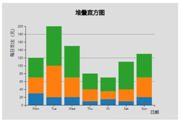
2 Data
date,food,transportation,education
Mon,30,40,50
Tue,20,80,100
Wed,20,50,80
Thu,10,30,40
Fri,15,20,35
Sat,10,30,70
Sun,20,50,60
3 Key Code
Import Data
d3.csv('./data.csv', function(d){
    return {
        date: d.date,
        food: +d.food,
        transportation: +d.transportation,
        education: +d.education
    };
}).then(function(data){
.....
Configure some parameters styles
/* ----------------------------配置参数------------------------  */
const config = {
        barPadding: 0.15,
        margins: {top: 80, left: 80, bottom: 50, right: 80},
        textColor: 'black',
        gridColor: 'gray',
        tickShowGrid: [60, 120, 180],
        title: '堆叠直方图',
        hoverColor: 'white',
        animateDuration: 1000
    }
Scaling function and layout definitions using stacked column d3.stacklayout, the layout calculation which automatically returns to the upper and lower boundaries of each block yvalue
/* ----------------------------尺度转换------------------------  */
    chart.scaleX = d3.scaleBand()
                    .domain(data.map((d) => d.date))
                    .range([0, chart.getBodyWidth()])
                    .padding(config.barPadding);

    chart.scaleY = d3.scaleLinear()
                    .domain([0, d3.max(data.map((d) => d.food + d.transportation + d.education))])
                    .range([chart.getBodyHeight(), 0])

    chart.stack = d3.stack()
                    .keys(['food', 'transportation', 'education'])
                    .order(d3.stackOrderAscending)
                    .offset(d3.stackOffsetNone);
Rendering cylindrical, after stackthe function processing, it can be returned in accordance with the layout information, and determining coordinates of the rectangle height
/* ----------------------------渲染柱形------------------------  */
    chart.renderBars = function(){

        let groups = chart.body().selectAll('.g')
                        .data(chart.stack(data));

        let bars = groups.enter()
                    .append('g')
                  .merge(groups)
                    .attr('class', (d) => 'g ' + d.key)
                    .attr('fill', (d,i) => chart._colors(i))
                    .selectAll('.bar')
                    .data((d)=>{
                        return d.map((item) => {
                            item.index = d.index;
                            item.name = d.key;
                            return item;
                        });
                    });

            groups.exit()
                    .remove();

            bars.enter()
                    .append('rect')
                    .attr('class', 'bar')
                .merge(bars)
                    .attr('x', (d) => chart.scaleX(d.data.date))
                    .attr('y', (d) => chart.scaleY(d[0]))
                    .attr('width', chart.scaleX.bandwidth())
                    .attr('height', 0)
                    .transition().duration(config.animateDuration)
                    .attr('height', (d) => chart.scaleY(d[0]) - chart.scaleY(d[1]))
                    .attr('y', (d) => chart.scaleY(d[1]));

            bars.exit()
                    .remove();
    }
Thereafter, the rendering axes, text labels, grid lines, which is similar to the base bar graph, almost no change
/* ----------------------------渲染坐标轴------------------------  */
    chart.renderX = function(){
        chart.svg().insert('g','.body')
                .attr('transform', 'translate(' + chart.bodyX() + ',' + (chart.bodyY() + chart.getBodyHeight()) + ')')
                .attr('class', 'xAxis')
                .call(d3.axisBottom(chart.scaleX));
    }

    chart.renderY = function(){
        chart.svg().insert('g','.body')
                .attr('transform', 'translate(' + chart.bodyX() + ',' + chart.bodyY() + ')')
                .attr('class', 'yAxis')
                .call(d3.axisLeft(chart.scaleY));
    }

    chart.renderAxis = function(){
        chart.renderX();
        chart.renderY();
    }

    /* ----------------------------渲染文本标签------------------------  */
    chart.renderText = function(){
        d3.select('.xAxis').append('text')
                            .attr('class', 'axisText')
                            .attr('x', chart.getBodyWidth())
                            .attr('y', 0)
                            .attr('fill', config.textColor)
                            .attr('dy', 30)
                            .text('日期');

        d3.select('.yAxis').append('text')
                            .attr('class', 'axisText')
                            .attr('x', 0)
                            .attr('y', 0)
                            .attr('fill', config.textColor)
                            .attr('transform', 'rotate(-90)')
                            .attr('dy', -40)
                            .attr('text-anchor','end')
                            .text('每日支出(元)');
    }

    /* ----------------------------渲染网格线------------------------  */
    chart.renderGrid = function(){
        d3.selectAll('.yAxis .tick')
            .each(function(d, i){
                if (config.tickShowGrid.indexOf(d) > -1){
                    d3.select(this).append('line')
                        .attr('class','grid')
                        .attr('stroke', config.gridColor)
                        .attr('x1', 0)
                        .attr('y1', 0)
                        .attr('x2', chart.getBodyWidth())
                        .attr('y2', 0);
                }
            });
    }
Finally bind mouse interaction events
/* ----------------------------绑定鼠标交互事件------------------------  */
    chart.addMouseOn = function(){
        //防抖函数
        function debounce(fn, time){
            let timeId = null;
            return function(){
                const context = this;
                const event = d3.event;
                timeId && clearTimeout(timeId)
                timeId = setTimeout(function(){
                    d3.event = event;
                    fn.apply(context, arguments);
                }, time);
            }
        }

        d3.selectAll('.bar')
            .on('mouseover', function(d){
                const e = d3.event;
                const position = d3.mouse(chart.svg().node());

                d3.select(e.target)
                    .attr('fill', config.hoverColor);

                chart.svg()
                    .append('text')
                    .classed('tip', true)
                    .attr('x', position[0]+5)
                    .attr('y', position[1])
                    .attr('fill', config.textColor)
                    .text( d.name + ':' + d.data.food + '元');
            })
            .on('mouseleave', function(d){
                const e = d3.event;

                d3.select(e.target)
                    .attr('fill', chart._colors(d.index));

                d3.select('.tip').remove();
            })
            .on('mousemove', debounce(function(){
                    const position = d3.mouse(chart.svg().node());
                    d3.select('.tip')
                    .attr('x', position[0]+5)
                    .attr('y', position[1]-5);
                }, 6)
            );
    }
