The new crown epidemic borrow part of the data
in Wuhan and Huangshi life for over ten years, there are a lot of relatives there too, hope Wuhan Come on! ! Yellowstone Come on! !
Installation command:pip install pyecharts
Introduction of the Treasury, to prepare data
from pyecharts.charts import Bar
from pyecharts.charts import Line
# 日期作为x轴/横轴
x_date = [
'2020-02-09', '2020-02-10', '2020-02-11', '2020-02-12', '2020-02-13',
'2020-02-14', '2020-02-15', '2020-02-16', '2020-02-17', '2020-02-18'
]
# 各城市确诊病例数作为y轴数据
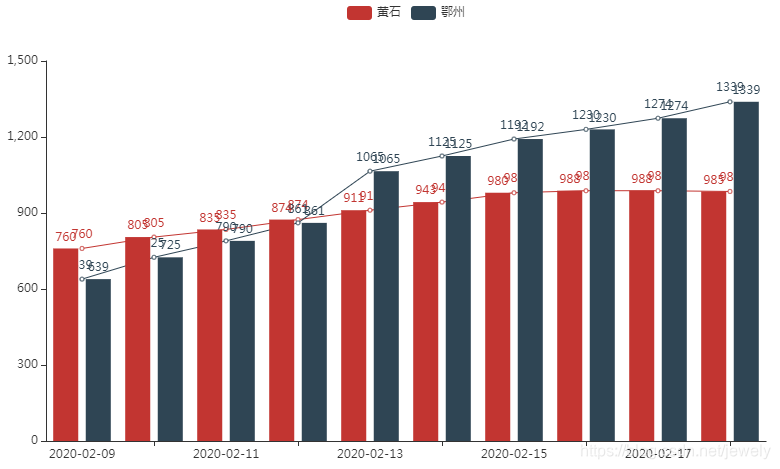
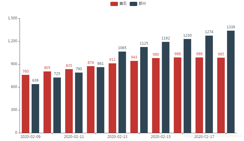
y_huangshi = [760, 805, 835, 874, 911, 943, 980, 988, 988, 985] # 黄石
y_ezhou = [639, 725, 790, 861, 1065, 1125, 1192, 1230, 1274, 1339] # 鄂州
Column Chart
- Single-column data display
bar=Bar()

bar.add_xaxis(x_date) # 添加x轴数据

bar.add_yaxis('黄石',y_huangshi) # 添加y轴数据

bar.render_notebook() # 显示图表
Note: Because it is run in the notebook, so you use .render_notebook()to display the chart, there are other ways such as .render(‘xxx.html’)a chart saved as a html file.

- Simultaneously display multiple columns of data
# 同时显示多列数据
bar.add_yaxis('鄂州',y_ezhou) # 再添加一条y轴数据

bar.render_notebook() # 显示图表
line chart
And bar graph charts the same Cartesian coordinate system, thus adding data in substantially the same
line=Line()

line.add_xaxis(x_date) # 添加x轴数据

line.add_yaxis('黄石',y_huangshi) # 添加y轴数据

line.add_yaxis('鄂州',y_ezhou) # 继续向y轴添加一列数据

line.render_notebook() # 显示图表
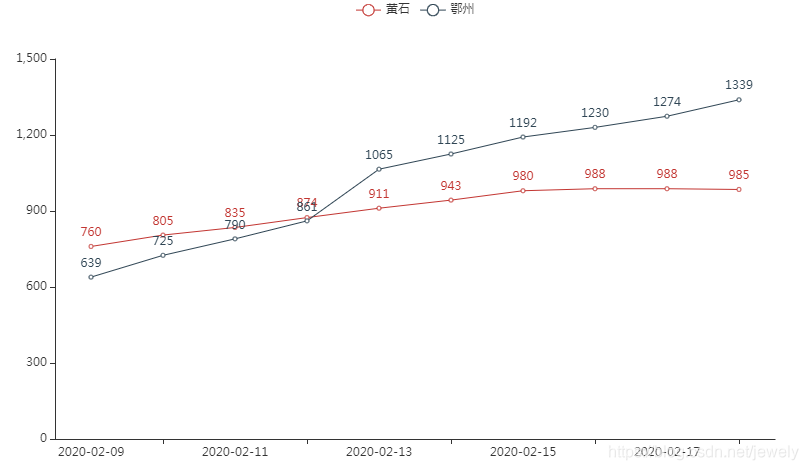
Only to find that the number of confirmed Yellowstone declined, come on! !
FIG stacking a plurality
The different types of charts superposed in a chart
A.overlap(B): Chart B superimposed into the graph A,
# 将折线图叠加到柱形图中
bar.overlap(line)

bar.render_notebook()