The basic problem description
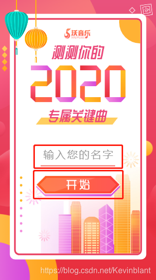
H5 This page contains an input box and a button, the entire page is full screen (positioning layout has been used to do a full-screen adaptation), height 100vh.
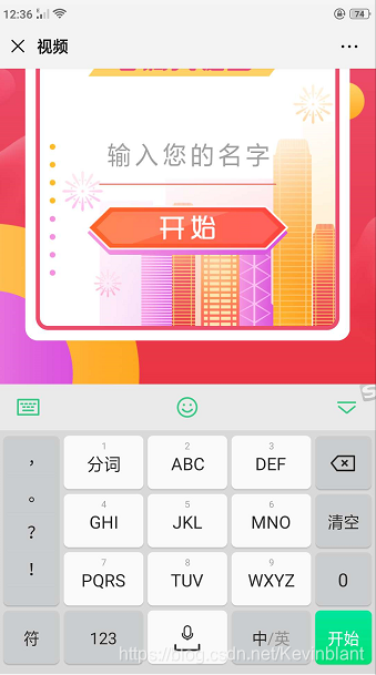
When you click the input box, the soft keyboard will pop up the phone, iphone browser layout or the original normal, but in android, it appears like this:
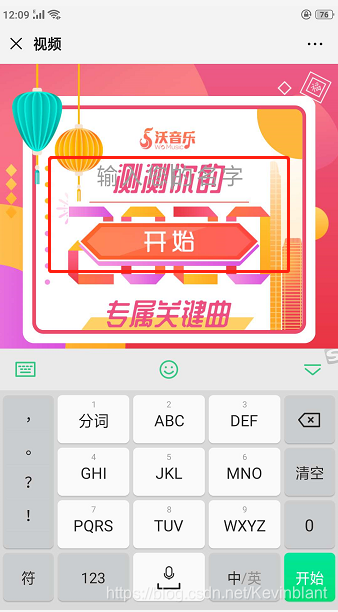
you can see, the keyboard pops up, highly visible area of the page is compressed, so that the whole page layout has changed.
- At first my basic style:
/* 外层容器 */
.keyword-container{
  background: linear-gradient(#ea537e, #e82e3b);
  position: absolute;
  top: 0;
  left: 0;
  right: 0;
  bottom: 0;
  overflow: hidden;
 }
Analyze and solve
Since it is the height of the container is compressed, so we'll give a fixed height of the container, but to consider different models of screen height is not the same, so it is necessary to use js dynamic to get the screen height, and then to the container, the idea is this.
mounted () {
    this.containerHeight = window.innerHeight  // 获取浏览器可用区域高度
},
Binding to the outermost container
<div class="keyword-container" :style="{ height: containerHeight + 'px'}">
CSS needs a little change
/* 外层容器 */
.keyword-container{
  background: linear-gradient(#ea537e, #e82e3b);
  position: absolute;
  left: 0;
  right: 0;
  bottom: 0;
  overflow: hidden;
 }
Removing the top is because when the soft keyboard to ensure that bounce, is located on the lower part of the page soft keyboard (soft keyboard image is from the top), so that the text box of the visible region ^_^.
- After solving the effect of: