1 Introduction
In mobile development, it is sometimes necessary to set a width and height equal div, and in order to make a certain percentage of the screen width and height and can be adapted to the width and height of the screen more, then it is required. Here css will provide a solution for some back-end developers need to write cumbersome js.
2. implementation code
html:
<!DOCTYPE html>
<html>

<head>
    <title>test</title>
</head>

<body>
    <div class="wrapper">
        <div class="box"></div>
    </div>
</body>
</html>
css:
<style>
    .wrapper {
        position: relative;
        height: 0;
        padding-top: 80%;
    }

    .box {
        position: absolute;
        width: 80%;
        height: 100%;
        left: 10%;
        top: 0;
        border: 1px solid #ccc;
    }
</style>
effect:
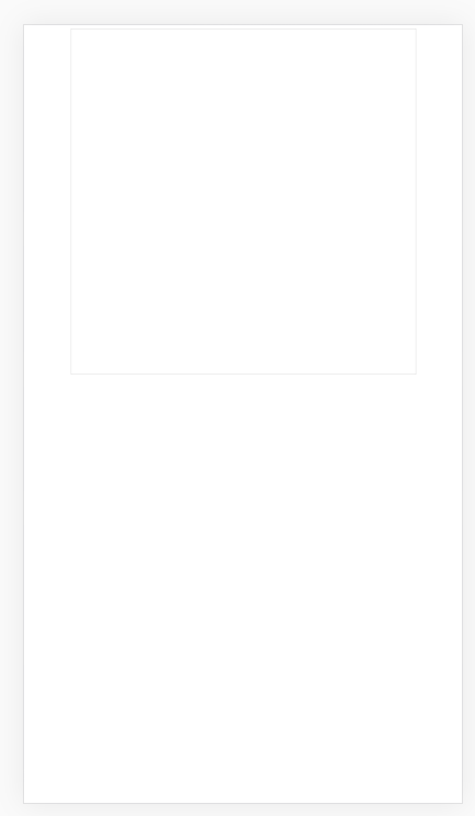
So we get a square fit the screen width, in practical applications, we can also give this box set as well as a variety of other border-radius property, get a more cool effect. Now we have to analyze why this css will achieve this effect, it helps us to understand how it works to be more handy to modify it.
A wrapper disposed height: 0; padding-top: 80%; wapper will occupy an aspect ratio of 10: 8 area. With such an area is not suddenly feeling a little inspiration. Yes, we give it a sub-element width and then take a percentage, it will be the width and height of the same. There is also a note of the internal warpper is actually no height, so this sub-element must use the position: absolute, wrapper also need to add position: relative.
As a front-end side dish, I quickly trying to learn it, fitting.