Use tools: vscode, ps cs6, iconfont icon ( https://www.iconfont.cn/ ), convert ico icon ( http://www.bitbug.net/ )
It involves language: HTML, CSS
Renderings: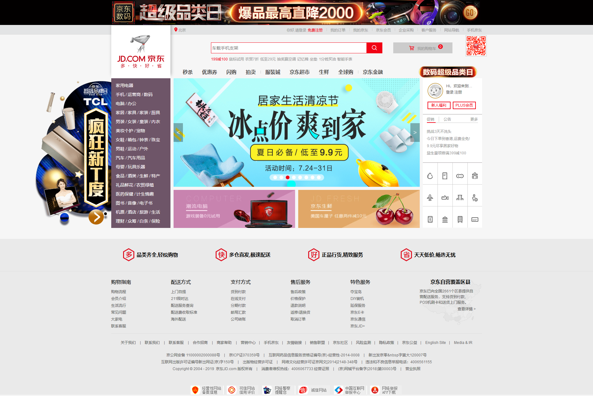
step:
(1) the new images, css, fonts, js to store the file corresponding to the code
(2) will cover picture on the images folder
(3) The normalize.css in css folder
There are several normalize.css the following purposes:
- Protection of useful browser's default style but not completely get rid of them
- Generalized style: provide most HTML elements
- Fix a bug in the browser itself and ensure the consistency of each browser
- CSS optimization Availability: with some tips
- Interpreted code: with notes and detailed documentation
(4) New home page index.html
(5) introduced iconfont pictures, generate iconfont.css
(5) New base.css, to complete the home base of the style
(6) New index.css, complete the core of home style
The complete code will be stored in https://github.com/Linqueme
Completion point
(1) determine the version of the heart
I.e. determine an approximate range of the main content of the page, it generates a common class base.css ease of reference
The case version of the heart:
Specific code: generating a width 1190px, centered public classes
.w{
width: 1190px;
margin: 0 auto;
}
(2) cancel the default style
Property will only use the default style, for example, ul, li comes margins when specific instructions. Will have an impact on the process of writing, the correct approach is to remove the default style
Not recommended
*{
padding:0;
margin:0;
}
Because of the priority selector minimum weight (0,0,1), it can easily be covered without effect.
Recommend specific instructions in the base.css
The case involved as
ul,h1,input,p,button,h5,dt,dd,dl,span
{
padding: 0;
margin: 0;
}
input,button{
/* 取消默认边框 */
border: 0;
/* 取消轮廓边框*/
outline: none;
}
ul{
list-style: none;
}
/* 取消下划线 和基本样式*/
a{
text-decoration: none;
color: #999;
font-size: 12px;
}
(3)图片的基线对齐方式
img{
/* display: block; */
/* 图片会基线对齐,会存在小间隙,方法一,display:block 但有可能会掉下来*/
vertical-align: top;
/* 方法二,改变基线对齐方式,解决图片底侧有空白间隙问题 ,不能和display: block同在,因为是行内块元素*/
}
(4)文字的居中对齐
text-align:center;//水平居中
line-height:xxpx;//垂直居中,XX为对应的高度
(5)块级元素的居中对齐
采用定位的方法来避免计算和为防以后数据改变后要查询计算
父元素{
position:relative(主要)/absolute;
}
居中元素(子元素){
//垂直居中
position:absolute;
top:50%;//为父高度
transform: translateY(-50%);//为自身高度
//水平居中
margin:0 auto;
}
(6)装饰用的 | 写法
1<span>|</span>
将其视为字体进行样式修改
2<div></div>
生成具体的类来实现
div{
height:10px;
width:1px;
background:#ccc;//因为本身里面没有字体元素,所以color无效
}
3设置为边框一侧(常用于多li处)
li{
border-right:1px solid #ccc;
}
(7)混乱布局
在XX范围内里面布局不是常规形式,一般用定位来布局
(8)阴影样式
在logo处有向上的阴影
box-shadow: 2px -10px 10px rgba(0, 0, 0, .3);//水平偏移,垂直偏移,阴影模糊程度,背景色
向上为-px,正常向下为+px
(9)关于a的大小和排列问题
在案例中a作为链接是以不同的形式伴随出现,如li,img,div等
因为a为行内元素,width和height不起作用。
所以关于a的大小修改方法为
1 display:block;
将a变成块级元素,因为会变成块级元素,所以多个a不会像以前一样水平排列,而会独占一行垂直排列
2 dissplay:inline-block;
将a变成行内块元素,同时具有行内和块级元素特性,即是可以对大小进行改变又能在同一行显示
(10)提升引擎搜索优化
例:在logo的链接处本身为一图片,但为提高搜索引擎权重,使logo包在<h1>内
<div class="logo">
<h1>
<!-- 提高权重,有利于搜索引擎优化 -->
<a href="#"></a>
</h1>
</div>
(11)版心内三列水平布局
1:
div1,div2,div3{
float:left;
}
然后用padding或margin来使它们之间产生空隙。但之间距离要精确计算,避免超过父宽度后面盒子被挤下去。或者最后盒子右边留有空隙,使父盒子看起来变短
2:
div1,div2{
float:left;
}
div3{
float:right;
}
使一二盒子向左浮动,三盒子向右浮动,只需计算第一条空隙,免除上面的烦恼。
(12)盒子内二列水平布局
1:使2个子盒子分别向左,向右浮动
2:使2个子盒子向左浮动,计算他们之间空隙
3:特殊情况特殊方法
在案例登录处:

左边图片,右边文字
/* 京东写法 *不左右浮动,只给文字盒子,图片采用定位*/
<div class="login-t">
Hi,欢迎来到京东! <br/>
<!-- 有省略·效果 -->
<a href="#">登录</a>
<a href="#">注册</a>
<a href="#" class="user-info"><img src="images/images/no_login.jpg" alt="" ></a>
</div>
生成一个盒子刚好包裹文字
//文字部分,这里作为父盒子让图片定位
.login-t{
width: 95px;
height: 60px;
line-height: 20px;
font-size: 12px;
white-space: nowrap;
/* 强制一行显示 */
overflow: hidden;
/* 超出隐藏 */
text-overflow: ellipsis;
/* 省略号 */
color: #666;
padding-left: 60px;
/* 这里把文字挤过来 */
position: relative;
}
//图片部分
.user-info{
position: absolute;
width: 50px;
height: 50px;
left: 0;
top: 0;
/* 如果在父使用border-radius,而在子有显示的话,外加overflow:hidden */
}
(13)文字超出省略且具有省略号
white-space: nowrap;
/* 强制一行显示 */
overflow: hidden;
/* 超出隐藏 */
text-overflow: ellipsis;
/* 省略号 */
(14)精灵图
多个图标集合在一张图,提高搜索效率
//第一个图标
.expand a{
display: block;
margin: 0 auto;
margin-top: 30px;
width: 24px;
height: 24px;
}
//后续图标
.expand .a2{
background-position: -44px 0;
}
//只需改变精灵图里面的定位位置即可
(15)不在版心内的不固定位置,随页面移动一起移动
在本案例中为左侧广告栏随三列的第一列一起移动
在第一列内新建div来容纳广告栏图片,然后对齐采用定位方式
(16)图片出现的动画效果
在本案例中有移动到广告栏后其右侧出现图片
可以采用图片display:none;然后广告栏hover后图片display:block;
但该效果在一瞬间完成,不是很美观
使用css3的动画效果来改变
.ad:hover .ad-r{
width: 990px;//图片最终宽度
}
.ad-r{
position: absolute;
top: 0;
left: 250px;
z-index: 2;//防止被盖住
width: 0;
height: 480px;//为防止其按比例大小出现而不是从左到右出现,先设置好高端
/* 这个图片做动画,所以给它过渡效果 */
transition: all 0.8s;
}
(17)清除浮动带来的影响
1 子盒子浮动
父盒子{
overflow:hidden;
}
2 新建伪类元素
xx:after{
clear:both;
}
3 一般父盒子不给高度,让里面的子盒子撑开,所以不清楚浮动会有影响,
清除浮动是为了解决子有浮动而父没有高度造成的变异,给父亲高度即可不用清除浮动。
父盒子{
height:xx;
}
(18)转义字符的fontweight好像无效(待确定)
(19)加了绝对定位,浮动,固定定位的行内元素,直接给高度,不用转换
(20)盒子宽度计算
width为内容宽度,不是实际宽度
box-sizing:border-box;
使width:变成实际宽度包含padding,concent,border,不用担心给了padding,border撑开盒子宽度
(21)去掉最右边li右边边框
1 设置好ul宽度,使li排列异常隐藏
ul{
overflow:hidden;
}
2 倍数li去边框
expand li:nth-of-type(4n){
border-right: 0;
}
(23)ico图标获得方法
在对应官网网址后加上favicon.icon
对图片进行转换。
注意该图片后缀为ico是正确的,且要将它放在根目录而不是images文件夹内
记得在index.html中进行引用
(24)iconfont图标获得方法
选择需要的图标进行下载
将iconfont.css放入css文件夹内,下载包其余文件放在fonts文件夹内
记得index.css内进行引用
其中除此方法外还有在线引用官网链接不用卸载,但是需要在服务器上进行,
在本地进行引用只会出现小方块。
有错误欢迎指出