Layout Holy Grail (Holy Grail Layout) refers to the most common site layout. Page from top to bottom, is divided into three parts: header (header), trunk (body), the tail (footer). In which the torso and horizontally divided into three columns, from left to right: navigation, main bar, sidebar.

1 <body>
2   <header>...</header>
3   <div class="body">
4       <main class="content">...</main>
5       <nav class="nav">...</nav>
6       <aside class="ads">...</aside>
7   </div>
8   <footer>...</footer>
9 </body>
The Holy Grail layout can also be made of the following layout:
1. The fixed-width layout: a fixed set of page width, typically px as a unit of length, is common in the PC side web, not suitable for multi-terminal (mobile terminal) used.
Advantages: better adapt to all devices on the market today: we know the current mainstream market focus on the following resolution
In a fixed layout, the width of the page must be specified as a pixel value.
For example Phoenix, his width is 1000px, my computer's resolution: 1080 * 1920, so there will be blank portion around.
Now the major sites page width is generally 1000px, so can adapt more equipment.
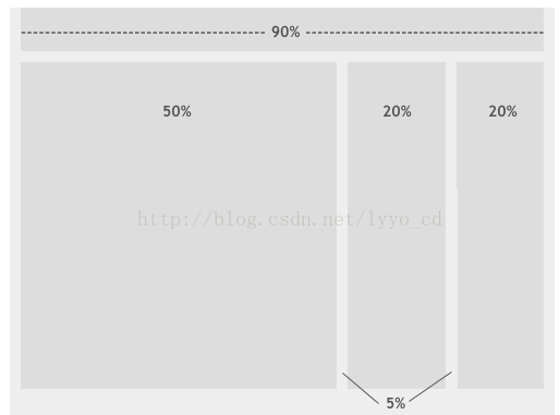
2. Fluid layout: to set a relative width of the page, typically as a percentage of units of length.
Pros: With the change of the page, the page will follow the changes in accordance with the ratio, but this will make the contents page of deformation.
Flow layout is different from the basic layout is that of the fixed-width side per unit size different sites. Using a fixed-width layout pixel, but the percentage of flow layout is used, the page provides a good plasticity and flowability. In other words, by setting the percentage, we do not need to consider the size of the equipment or the size of the screen width, you can find a viable solution for each case, should be the size of your design will accommodate all equipment sizes. Flow layout is closely related to media queries and optimization technology style.
3. responsive layout (also known as elastic layout): By detecting equipment information, decided to page layout, ie if the user uses different devices to access the same page, there might not see the same content, in general, is testing equipment width of the screen to achieve.
Use viewport meta tag on the mobile browser control layout
<meta name="viewport" content="width=device-width,initial-scale=1,maximum-scale=1" />
4. The layout grid (grid layout): the length of the page width into equal artificial, then places these as the unit of measure equal length typesetting layout, typically using as a percentage of the length into units of equal length .
Note: Several more layout not independent, the actual development process is often used in combination with each other
Flow fixed-layout and layout differences Design: