Android style shape tag
introduction
In Android development, we often use pictures to show related effects. Today I will introduce in detail the use of Shape to develop simple UI under Android. On the one hand, these are the basis of Android development. On the other hand, knowledge in this area can reduce the use of pictures and reduce the size of the App to a certain extent. Next, I will introduce the relevant knowledge of Shape in detail.
Note: XML files defined with shape are generally stored in the drawable directory. If the project does not have this directory, create a new one instead of placing it in a directory such as drawable-hdpi.
Types of shapes supported by Shape
rectangle : rectangle, the default shape, you can draw right rectangles, rounded rectangles, arcs, etc.
oval : oval, which is more commonly used to draw a perfect circle
line : Line shape, you can draw solid lines and dotted lines
ring : Ring shape, you can draw a circular progress bar
Now I will start to introduce them one by one.
1、rectangle
This type should be the most commonly used type. It can be used to complete the background of some controls and layouts.
Let’s take a look at the detailed introduction:
solid : Set the color of the shape fill, there is only one attribute android:color
-
- android:color fill color
-
padding : Set the inner spacing between the content and the shape boundary. You can set the left, right, up and down distances respectively.
- android:left left inner spacing
- android:rightright inner spacing
- android:top inner spacing
- android:bottom inner spacing
-
gradient : Set the gradient color of the shape, which can be a linear gradient, a radial gradient, or a scanning gradient.
- android:type gradient type
- linear linear gradient, the default gradient type
- radial gradient. When setting this item, android:gradientRadius must also be set.
- sweep gradient
- android:startColorThe color where the gradient starts
- android:endColor gradient end color
- android:centerColor The color in the middle of the gradient
- android:angle gradient angle, valid only for linear gradient, must be a multiple of 45, 0 means from left to right, 90 means from bottom to top
- android:centerX The relative
- android:centerY The relative
- android:gradientRadius The radius of the gradient, only used when the gradient type is radial
- android:useLevel can be used in LevelListDrawable if true
- android:type gradient type
-
corners : Set rounded corners, only applicable to rectangle type. You can set rounded corners with different radii for the four corners respectively. When the set rounded corner radius is very large, such as 200dp, it can become an arc edge.
- android:radius fillet radius, will be overridden by each specific fillet attribute below
- android:topLeftRadiusThe radius of the upper left corner
- android:topRightRadiusThe radius of the upper right corner
- android:bottomLeftRadiusThe radius of the lower left corner
- android:bottomRightRadiusThe radius of the lower right corner
-
stroke : Set the stroke, which can be drawn as a solid line or a dotted line.
- android:color stroke color
- android:widthThe width of the stroke
- android:dashWidth sets the length of the horizontal line when dotted
- android:dashGap sets the distance between horizontal lines when dashed
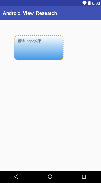
Let's look at an example below:
<!-- android:shape指定形状类型,默认为rectangle -->
<shape xmlns:android="http://schemas.android.com/apk/res/android"
    android:shape="rectangle">
    <!-- solid指定形状的填充色,只有android:color一个属性 -->
    <solid android:color="#4097e6" />
    <!-- padding设置内容区域离边界的间距 -->
    <padding
        android:bottom="15dp"
        android:left="15dp"
        android:right="15dp"
        android:top="15dp" />

    <!--渐变设置-->
    <gradient
        android:endColor="#4097e6"
        android:startColor="#FFFFFF"
        android:angle="270"
        android:type="linear" />

    <!-- corners设置圆角,只适用于rectangle
         数值较大时,就变成了弧边形状例如>=200时
     -->
    <corners android:radius="15dp" />
    <!-- stroke设置描边 -->
    <stroke
        android:width="2dp"
        android:color="#ff8900"
        android:dashGap="4dp"
        android:dashWidth="4dp" />
</shape>
The renderings are as follows:
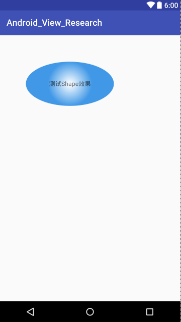
2、oval
Oval is used to draw ellipses, but in practical applications, it is more often used to draw perfect circles, such as message prompts, circular buttons, etc. The following pictures are some examples:
size : Set the default size of the shape, you can set the width and height
-
- android:width width
- android:height height
If you use something like TextView to set an ellipse, the size will default to the width and height of the View.
Let’s look at an example:
<!--椭圆-->
<shape xmlns:android="http://schemas.android.com/apk/res/android"
    android:shape="oval">

    <!--设置图形的尺寸
        不过默认获取的还是View的宽度和高度-->
    <size android:width="60dp"
        android:height="60dp" />

    <solid android:color="#4097e6" />

    <!--渐变效果
        注意此处使用了gradientRadius这个属性值
        只有type="radial"时才有效
    -->
    <gradient
        android:endColor="#4097e6"
        android:startColor="#FFFFFF"
        android:gradientRadius="50dp"
        android:type="radial"/>

</shape>
The renderings are as follows:
3、line
Through Shape we can also set dividing lines. But generally when I use lines, I view them directly. By setting stroke we can set the line style (color, dashed or solid line, etc.). Examples are as follows:
<shape xmlns:android="http://schemas.android.com/apk/res/android"
    android:shape="line">
    <!-- 实际显示的线 -->
    <stroke
        android:width="1dp"
        android:color="#2F90BD"
        android:dashGap="2dp"
        android:dashWidth="4dp" />
    <!-- 形状的高度 -->
    <size android:height="4dp" />
</shape>
Note: When drawing lines, there are several characteristics that you must know:
- Can only draw horizontal lines, not vertical lines;
- The height of the line is set through the android:width attribute of stroke;
- The android:height attribute of size defines the height of the entire shape area;
- The height of size must be greater than the width of stroke, otherwise, the line cannot be displayed;
- The line is centered within the entire shape area;
- There will be blank space on the left and right sides of the line. The thicker the line, the larger the blank space;
- The view that references the dotted line needs to add the attribute android:layerType and set the value to "software", otherwise the dotted line will not be displayed.
4、ring
First of all, some attributes of the shape root element are only applicable to the ring type. Let’s take a look at these attributes first:
- android:innerRadiusThe radius of the inner ring
- android:innerRadiusRatio floating point type, representing the radius of the inner ring in terms of the width ratio of the ring. The default is 3, which means the radius of the inner ring is the width of the ring divided by 3. This value will be overwritten by android:innerRadius
- android:thickness ring thickness
- android:thicknessRatio floating point type, the thickness of the ring is expressed as the ratio of the width of the ring. The default is 9, which means the thickness of the ring is the width of the ring divided by 9. This value will be overwritten by android:thickness
- android:useLevel is generally false, otherwise the ring may not be displayed. It is only set to true when used as a LevelListDrawable.
Let's look at an example below:
<!--圆环-->
<shape xmlns:android="http://schemas.android.com/apk/res/android"
    android:shape="ring"
    android:innerRadius="100dp"
    android:thickness="20dp"
    android:useLevel="false">

    <!--填充色-->
    <solid android:color="#4097e6" />

    <!--渐变色-->
    <gradient
        android:endColor="#4097e6"
        android:startColor="#FFFFFF"
        android:type="sweep" />

    <!--描边会让内圆和外圆都有边框-->
    <stroke
        android:width="1dp"
        android:color="#ff8900" />

</shape>
The renderings are as follows:

What are the benefits of using Drawable?
- It is very convenient to get a rectangle, circle, ellipse, and ring, and it is easy to maintain and modify
- It is very convenient to realize rounded corners and gradients (linear gradient, radial gradient, scanning gradient)
- Replace the picture as the background of the View and reduce the size of the apk (the most obvious and effective step to reduce the size of the apk is to remove the picture)
- Large pictures consume memory. Use Drawable to save memory. Android itself has done a good job in optimizing Drawable (memory optimization needs to be considered).
Under what circumstances should you choose to use Drawable instead of using a picture, or vice versa?
- In theory, use Drawable wherever you can use it.
- If the geometry that can be defined through the shape tag can meet the needs, there is no need to use pictures to represent it.
- Gradient type backgrounds should also be implemented using shape as much as possible.
- Irregular and complex graphics can still only use pictures, such as an icon representing a mobile phone or a person's avatar.
- Some special lifting effects require the use of .9.png images (make them as small as possible, the smaller they are, the more memory they save)
How many types of Drawables can the shape tag define?
shape can define four types of geometries, specified by the android:shape attribute
line --> line
rectangle --> rectangle (rounded rectangle)
oval --> ellipse, circle
ring --> ring
shape can define border attributes
With border, no border, dotted border, solid border
Shape can achieve rectangular rounded corners effect
You can specify one corner or multiple corners to set the rounded corner effect.
Specify the fillet radius to set the size of the fillet
shape can implement three gradients, implemented by the sub-label gradient
linear --> Linear gradient (three gradients: horizontal, vertical, and diagonal)
sweep --> sweep gradient (only supports clockwise direction, in fact, the color is the same as counterclockwise)
radial --> Radial gradient (gradient outward from the specified center point, specify the radius)
The xml implementation only supports three colors, startColor, CenterColor, endColor
For more detailed introduction about shape, please go to Android GradientDrawable (shape tag definition) static use and dynamic use (rounded corners, gradient implementation)
Many Drawables can be defined by the above combination, which are introduced :
Line (solid line + dashed line)

Solid line: line_solid.xml
<?xml version="1.0" encoding="utf-8"?>
<!-- 实线 -->
<shape xmlns:android="http://schemas.android.com/apk/res/android"
    android:shape="line"
    android:useLevel="true">

<stroke
    android:width="2dp"
    android:color="#ffff0000" />

</shape>
Dashed line: line_dashed.xml
<?xml version="1.0" encoding="utf-8"?>
<!--虚线
    设置类型会line
    需要关闭硬件加速虚线才能绘制出来,布局文件中使用的时候需要设置android:layerType="software"
    android:width 线宽,布局文件中的View的高度需要比这个值大才可以绘制出来
    android:dashWidth 每段破折线的长度
    android:dashGap="5dp"每段破折线之间的间隔-->
<shape xmlns:android="http://schemas.android.com/apk/res/android"
    android:shape="line"
    android:useLevel="true">

    <stroke
        android:width="2dp"
        android:dashGap="5dp"
        android:dashWidth="10dp"
        android:color="#ffff0000" />

</shape>
Rectangle (border + padding)
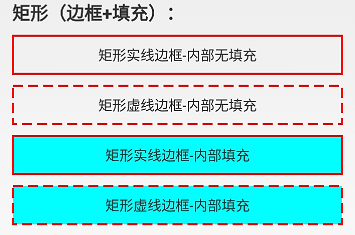
There is no padding inside the rectangular solid border: rect_solid_border.xml
<?xml version="1.0" encoding="utf-8"?>
<!-- 实线边框 -->
<shape xmlns:android="http://schemas.android.com/apk/res/android"
    android:shape="rectangle"
    android:useLevel="true">

    <stroke
        android:width="2dp"
        android:color="#ffff0000" />

</shape>
There is no padding inside the rectangular dashed border: rect_dashed_border.xml
<?xml version="1.0" encoding="utf-8"?>
<!-- 虚线边框 -->
<shape xmlns:android="http://schemas.android.com/apk/res/android"
    android:shape="rectangle"
    android:useLevel="true">

    <stroke
        android:width="2dp"
        android:color="#ffff0000"
        android:dashGap="5dp"
        android:dashWidth="10dp" />

</shape>
Rectangular solid border-inner fill: rect_solid_border_and_fill.xml
<?xml version="1.0" encoding="utf-8"?>
<!-- 实线边框+内部填充 -->
<shape xmlns:android="http://schemas.android.com/apk/res/android"
    android:shape="rectangle"
    android:useLevel="true">

    <stroke
        android:width="2dp"
        android:color="#ffff0000" />

    <solid android:color="#ff00ffff" />

</shape>
Rectangular dashed border-inner fill: rect_dashed_border_and_fill.xml
<?xml version="1.0" encoding="utf-8"?>
<!-- 虚线边框+内部填充 -->
<shape xmlns:android="http://schemas.android.com/apk/res/android"
    android:shape="rectangle"
    android:useLevel="true">

    <stroke
        android:width="2dp"
        android:color="#ffff0000"
        android:dashGap="5dp"
        android:dashWidth="10dp" />

    <solid android:color="#ff00ffff" />
</shape>
Rounded Rectangle

Rounded rectangle - border only: rect_rounded_border.xml
<?xml version="1.0" encoding="utf-8"?>
<!-- 矩形边框圆角 -->
<shape xmlns:android="http://schemas.android.com/apk/res/android"
    android:shape="rectangle"
    android:useLevel="true">

    <size android:height="100dp"
        android:width="100dp"/>

    <stroke
        android:width="2dp"
        android:color="#ffff0000" />

    <corners android:bottomLeftRadius="2dp"
        android:bottomRightRadius="2dp"
        android:topLeftRadius="2dp"
        android:topRightRadius="2dp" />

</shape>
Rounded rectangle - inner fill only: rect_rounded_fill.xml
<?xml version="1.0" encoding="utf-8"?>
<!-- 圆角矩形 -->
<shape xmlns:android="http://schemas.android.com/apk/res/android"
    android:shape="rectangle"
    android:useLevel="true">

    <size android:height="100dp"
        android:width="100dp"/>

    <solid android:color="#8000ff00" />

    <corners android:bottomLeftRadius="2dp"
        android:bottomRightRadius="2dp"
        android:topLeftRadius="2dp"
        android:topRightRadius="2dp" />

</shape>
Rounded rectangle - border and fill:rect_rounded_border_and_fill.xml
<?xml version="1.0" encoding="utf-8"?>
<!-- 矩形边框+填充 圆角 -->
<shape xmlns:android="http://schemas.android.com/apk/res/android"
    android:shape="rectangle"
    android:useLevel="true">

    <size android:height="100dp"
        android:width="100dp"/>

    <stroke
        android:width="2dp"
        android:color="#ffff0000" />

    <solid android:color="#8000ff00" />

    <corners android:bottomLeftRadius="2dp"
        android:bottomRightRadius="2dp"
        android:topLeftRadius="2dp"
        android:topRightRadius="2dp" />

</shape>
Rounded rectangle - the left rounded corner is a semi-circle: rect_rounded_left_arc.xml
<?xml version="1.0" encoding="utf-8"?>
<!-- 矩形圆角+左右两边为一个圆弧 -->
<shape xmlns:android="http://schemas.android.com/apk/res/android"
    android:shape="rectangle"
    android:useLevel="true">

    <size
        android:width="50dp"
        android:height="10dp" />

    <solid android:color="#8000ff00" />

    <!-- 圆角半径是高度的一般就是一个圆弧了 -->
    <corners
        android:bottomLeftRadius="20dp"
        android:topLeftRadius="20dp" />

</shape>
Rounded rectangle - both left and right sides are semicircular arcs: rect_rounded_left_right_arc.xml
<?xml version="1.0" encoding="utf-8"?>
<!-- 矩形圆角+左右两边为一个圆弧 -->
<shape xmlns:android="http://schemas.android.com/apk/res/android"
    android:shape="rectangle"
    android:useLevel="true">

    <size
        android:width="50dp"
        android:height="10dp" />

    <solid android:color="#8000ff00" />

    <!-- 圆角半径是高度的一般就是一个圆弧了 -->
    <corners android:radius="20dp" />

</shape>
Rounded rectangle - semi-circular arcs on both left and right sides - with border: rect_rounded_left_right_arc_border.xml
<?xml version="1.0" encoding="utf-8"?>
<!-- 矩形圆角+左右两边为一个圆弧 -->
<shape xmlns:android="http://schemas.android.com/apk/res/android"
    android:shape="rectangle"
    android:useLevel="true">

    <size
        android:width="50dp"
        android:height="10dp" />

    <stroke android:color="#ffff0000"
        android:width="2dp"/>

    <solid android:color="#8000ff00" />

    <!-- 圆角半径是高度的一般就是一个圆弧了 -->
    <corners android:radius="20dp" />

</shape>
Rounded rectangle-circle: rect_rounded_arc.xml
<?xml version="1.0" encoding="utf-8"?>
<!-- 矩形圆角+圆出一个圆弧 -->
<shape xmlns:android="http://schemas.android.com/apk/res/android"
    android:shape="rectangle"
    android:useLevel="true">

    <size android:height="10dp"
        android:width="10dp"/>

    <solid android:color="#8000ff00" />

    <corners android:radius="20dp" />

</shape>
Rounded rectangle - semi-circular arcs on the top and bottom sides: rect_rounded_top_bottom_arc.xml
<?xml version="1.0" encoding="utf-8"?>
<!-- 矩形圆角+左右两边为一个圆弧 -->
<shape xmlns:android="http://schemas.android.com/apk/res/android"
    android:shape="rectangle"
    android:useLevel="true">

    <size
        android:width="10dp"
        android:height="60dp" />

    <solid android:color="#8000ff00" />

    <!-- 圆角半径是高度的一般就是一个圆弧了 -->
    <corners android:radius="10dp" />

</shape>
Gradient effect (take rectangle as an example)

Vertical linear gradient: rect_gradient_linear_vertical.xml
<?xml version="1.0" encoding="utf-8"?>
<!-- 矩形内部填充-线性垂直渐变 -->
<shape xmlns:android="http://schemas.android.com/apk/res/android"
    android:shape="rectangle"
    android:useLevel="true">

    <size
        android:width="@dimen/shape_size"
        android:height="@dimen/shape_size" />

    <stroke
        android:width="1px"
        android:color="#ffff00ff" />

    <!-- 调整angle实现水平渐变,垂直渐变或者对角渐变 -->
    <gradient
        android:angle="-45"
        android:centerX="0.5"
        android:centerY="0.4"
        android:centerColor="#8000ff00"
        android:endColor="#1000ff00"
        android:startColor="#ff00ff00"
        android:type="linear" />
</shape>
Horizontal linear gradient:rect_gradient_linear_horizon.xml
<?xml version="1.0" encoding="utf-8"?>
<!-- 矩形内部填充-线性水平渐变 -->
<shape xmlns:android="http://schemas.android.com/apk/res/android"
    android:shape="rectangle"
    android:useLevel="true">

    <size
        android:width="@dimen/shape_size"
        android:height="@dimen/shape_size" />

    <stroke
        android:width="1px"
        android:color="#ffff00ff" />

    <!-- 调整angle实现水平渐变,垂直渐变或者对角渐变 -->
    <gradient
        android:angle="0"
        android:centerX="0.5"
        android:centerY="0.5"
        android:centerColor="#8000ff00"
        android:endColor="#ff00ff00"
        android:startColor="#1000ff00"
        android:type="linear" />
</shape>
Diagonal linear gradient: rect_gradient_linear_diagonal.xml
<?xml version="1.0" encoding="utf-8"?>
<!-- 矩形内部填充-线性对角线渐变 -->
<shape xmlns:android="http://schemas.android.com/apk/res/android"
    android:shape="rectangle"
    android:useLevel="true">

    <size
        android:width="@dimen/shape_size"
        android:height="@dimen/shape_size" />

    <stroke
        android:width="1px"
        android:color="#ffff00ff" />

    <!-- 调整angle实现水平渐变,垂直渐变或者对角渐变 -->
    <gradient
        android:angle="45"
        android:centerX="0.5"
        android:centerY="0.5"
        android:centerColor="#8000ff00"
        android:endColor="#1000ff00"
        android:startColor="#ff00ff00"
        android:type="linear" />
</shape>
Radial gradient: rect_gradient_radial.xml
<?xml version="1.0" encoding="utf-8"?>
<!-- 矩形内部填充-径向渐变,一般不用在rect上,用到圆或者椭圆上 -->
<shape xmlns:android="http://schemas.android.com/apk/res/android"
    android:shape="rectangle"
    android:useLevel="true">

    <size
        android:width="@dimen/shape_size"
        android:height="@dimen/shape_size" />

    <stroke
        android:width="1px"
        android:color="#ffff00ff" />

    <!-- 径向渐变angle无效 -->
    <gradient
        android:angle="0"
        android:centerX="0.5"
        android:centerY="0.5"
        android:startColor="#0000ff00"
        android:endColor="#ff00ff00"
        android:gradientRadius="40dp"
        android:type="radial" />
</shape>
Sweep gradient: rect_gradient_sweep.xml
<?xml version="1.0" encoding="utf-8"?>
<!-- 矩形内部填充-扫描渐变 -->
<shape xmlns:android="http://schemas.android.com/apk/res/android"
    android:shape="rectangle"
    android:useLevel="true">
    <!--如果布局中没有设置View的大小,会size设置的大小为默认值-->
    <size
        android:width="20dp"
        android:height="20dp" />

    <stroke
        android:width="1px"
        android:color="#ffff00ff" />

    <!--调整angle不能实现角度变化
        centerX,centerY是中心点的位置,这里用的是百分比值(0-1)
        在rect中gradientRadius无效-->
    <gradient
        android:angle="0"
        android:centerX="0.5"
        android:centerY="0.5"
        android:startColor="#ff00ff00"
        android:gradientRadius="20dp"
        android:type="sweep" />
</shape>
Circle (border+fill+gradient)

Circle-border: circle_border.xml
<?xml version="1.0" encoding="utf-8"?>
<!-- 圆形边框 -->
<shape xmlns:android="http://schemas.android.com/apk/res/android"
    android:shape="oval"
    android:useLevel="true">

    <size
        android:width="80dp"
        android:height="80dp" />

    <stroke
        android:width="2dp"
        android:color="#ffff0000" />

</shape>
Circle-Fill: circle_fill.xml
<?xml version="1.0" encoding="utf-8"?>
<!-- 圆形边框 + 填充 -->
<shape xmlns:android="http://schemas.android.com/apk/res/android"
    android:shape="oval"
    android:useLevel="true">

    <size
        android:width="80dp"
        android:height="80dp" />

    <solid android:color="#800000ff" />

</shape>
Circle-border fill: circle_border_and_fill.xml
<?xml version="1.0" encoding="utf-8"?>
<!-- 圆形边框 + 填充 -->
<shape xmlns:android="http://schemas.android.com/apk/res/android"
    android:shape="oval"
    android:useLevel="true">

    <size
        android:width="80dp"
        android:height="80dp" />

    <stroke
        android:width="2dp"
        android:color="#ffff0000" />

    <solid android:color="#800000ff" />

</shape>
Linear gradient: circle_gradient_linear.xml
<?xml version="1.0" encoding="utf-8"?>
<!-- 圆形内部填充-线性渐变 -->
<shape xmlns:android="http://schemas.android.com/apk/res/android"
    android:shape="oval"
    android:useLevel="true">

    <size
        android:width="@dimen/shape_size"
        android:height="@dimen/shape_size" />

    <!-- angle调整渐变角度,只能是45的倍数,centerX, centerY是百分百(0-1) -->
    <gradient
        android:angle="-90"
        android:centerX="0.5"
        android:centerY="0.8"
        android:centerColor="#80ff0000"
        android:endColor="#ffff0000"
        android:startColor="#00ff0000"
        android:type="linear" />

</shape>
Radial gradient: circle_gradient_radial.xml
<?xml version="1.0" encoding="utf-8"?>
<!-- 圆形内部填充-径向渐变 -->
<shape xmlns:android="http://schemas.android.com/apk/res/android"
    android:shape="oval"
    android:useLevel="true">

    <size
        android:width="40dp"
        android:height="40dp" />

    <!-- centerX, centerY是百分百(0-1) -->
    <gradient
        android:centerX="0.5"
        android:centerY="0.5"
        android:startColor="#ffff0000"
        android:centerColor="#80ff0000"
        android:endColor="#10ff0000"
        android:gradientRadius="30dp"
        android:type="radial" />

</shape>
Sweep gradient: circle_gradient_sweep.xml
<?xml version="1.0" encoding="utf-8"?>
<!-- 圆形内部填充-扫描渐变 -->
<shape xmlns:android="http://schemas.android.com/apk/res/android"
    android:shape="oval"
    android:useLevel="true">

    <size
        android:width="@dimen/shape_size"
        android:height="@dimen/shape_size" />

    <!-- sweep类型angle,gradientRadius无效,centerX, centerY是百分百(0-1) -->
    <gradient
        android:centerX="0.5"
        android:centerY="0.6"
        android:startColor="#ffff0000"
        android:centerColor="#80ff0000"
        android:endColor="#20ff0000"
        android:gradientRadius="20dp"
        android:type="sweep" />

</shape>
Ellipse (border+fill+gradient)

Border: oval_border.xml
<?xml version="1.0" encoding="utf-8"?>
<!-- 椭圆边框 -->
<shape xmlns:android="http://schemas.android.com/apk/res/android"
    android:shape="oval"
    android:useLevel="true">

    <stroke
        android:width="2dp"
        android:color="#ffff0000" />

</shape>
Fill: oval_fill.xml
<?xml version="1.0" encoding="utf-8"?>
<!-- 椭圆填充-->
<shape xmlns:android="http://schemas.android.com/apk/res/android"
    android:shape="oval"
    android:useLevel="true">

    <solid android:color="#800000ff" />

</shape>
Border + fill: oval_border_and_fill.xml
<?xml version="1.0" encoding="utf-8"?>
<!-- 椭圆边框 + 填充-->
<shape xmlns:android="http://schemas.android.com/apk/res/android"
    android:shape="oval"
    android:useLevel="true">

    <stroke
        android:width="2dp"
        android:color="#ffff0000" />

    <solid android:color="#800000ff" />

</shape>
Linear gradient: oval_gradient_linear.xml
<?xml version="1.0" encoding="utf-8"?>
<!-- 椭圆内部填充-线性渐变 -->
<shape xmlns:android="http://schemas.android.com/apk/res/android"
    android:shape="oval"
    android:useLevel="true" >

    <size
        android:width="80dp"
        android:height="60dp" />

    <gradient
        android:angle="45"
        android:centerX="0.5"
        android:centerY="0.7"
        android:centerColor="#80ff0000"
        android:endColor="#ffff0000"
        android:startColor="#00ff0000"
        android:type="linear" />

</shape>
Radial gradient: oval_gradient_radial.xml
<?xml version="1.0" encoding="utf-8"?>
<!-- 椭圆内部填充-径向渐变 -->
<shape xmlns:android="http://schemas.android.com/apk/res/android"
    android:shape="oval"
    android:useLevel="true" >

    <size
        android:width="80dp"
        android:height="60dp" />

    <gradient
        android:centerX="0.5"
        android:centerY="0.5"
        android:centerColor="#80ff0000"
        android:endColor="#00ff0000"
        android:startColor="#ffff0000"
        android:gradientRadius="40dp"
        android:type="radial" />

</shape>
Sweep gradient: oval_gradient_sweep.xml
<?xml version="1.0" encoding="utf-8"?>
<!-- 椭圆内部填充-扫描渐变 -->
<shape xmlns:android="http://schemas.android.com/apk/res/android"
    android:shape="oval"
    android:useLevel="true" >

    <size
        android:width="80dp"
        android:height="60dp" />

    <gradient
        android:centerX="0.5"
        android:centerY="0.5"
        android:centerColor="#80ff0000"
        android:endColor="#ffff0000"
        android:startColor="#00ff0000"
        android:type="sweep" />

</shape>
Ring (border+fill+gradient)

Ring filling: ring_fill.xml
<?xml version="1.0" encoding="utf-8"?><!-- 圆环 -->
<shape xmlns:android="http://schemas.android.com/apk/res/android"
    android:innerRadiusRatio="4"
    android:shape="ring"
    android:thicknessRatio="4"
    android:useLevel="false">
    <!--android:useLevel="false"必须是false-->
    <size
        android:width="80dp"
        android:height="80dp" />

    <solid android:color="#80ff0000" />

</shape>
Ring border:ring_border.xml
<?xml version="1.0" encoding="utf-8"?>
<!-- 圆环-仅有边框 -->
<shape xmlns:android="http://schemas.android.com/apk/res/android"
    android:innerRadius="20dp"
    android:shape="ring"
    android:thickness="16dp"
    android:useLevel="false">
    <!--android:useLevel="false"必须是false-->

    <size
        android:width="80dp"
        android:height="80dp" />

    <stroke
        android:width="2dp"
        android:color="#ffff00ff" />
</shape>
Border + fill: ring_border_and_fill.xml
<?xml version="1.0" encoding="utf-8"?>
<!-- 圆环 -->
<shape xmlns:android="http://schemas.android.com/apk/res/android"
    android:innerRadius="20dp"
    android:shape="ring"
    android:thickness="16dp"
    android:useLevel="false">
    <!--android:useLevel="false"必须是false-->

    <size
        android:width="80dp"
        android:height="80dp" />

    <solid android:color="#80ff0000" />

    <stroke
        android:width="2dp"
        android:color="#ffff00ff" />
</shape>
Linear gradient: ring_gradient_linear.xml
<?xml version="1.0" encoding="utf-8"?>
<!-- 圆环-线性渐变 -->
<shape xmlns:android="http://schemas.android.com/apk/res/android"
    android:shape="ring"
    android:innerRadius="10dp"
    android:thickness="30dp"
    android:useLevel="false">
    <!--android:useLevel="false"必须是false-->

    <size
        android:width="80dp"
        android:height="80dp" />

    <gradient
        android:angle="45"
        android:centerColor="#80ff0000"
        android:endColor="#ffff0000"
        android:startColor="#00ff0000"
        android:type="linear" />

</shape>
Radial gradient: ring_gradient_radial.xml
<?xml version="1.0" encoding="utf-8"?>
<!-- 圆环-径向渐变渐变 -->
<shape xmlns:android="http://schemas.android.com/apk/res/android"
    android:shape="ring"
    android:innerRadius="10dp"
    android:thickness="30dp"
    android:useLevel="false">
    <!--android:useLevel="false"必须是false-->

    <size
        android:width="80dp"
        android:height="80dp" />

    <!--设置径向渐变半径,渐变从圆心开始-->
    <gradient
        android:centerX="0.5"
        android:centerY="0.5"
        android:centerColor="#80ff0000"
        android:endColor="#00ff0000"
        android:startColor="#ffff0000"
        android:gradientRadius="40dp"
        android:type="radial" />

</shape>
Sweep gradient: ring_gradient_sweep.xml
<?xml version="1.0" encoding="utf-8"?>
<!-- 圆环-线性渐变 -->
<shape xmlns:android="http://schemas.android.com/apk/res/android"
    android:shape="ring"
    android:innerRadius="10dp"
    android:thickness="30dp"
    android:useLevel="false">
    <!--android:useLevel="false"必须是false-->

    <size
        android:width="80dp"
        android:height="80dp" />

    <!--扫描渐变shape不能设置角度-->
    <gradient
        android:centerColor="#80ff0000"
        android:endColor="#ffff0000"
        android:startColor="#00ff0000"
        android:type="sweep" />

</shape>
Original address: A brief discussion on shape in Android style development : https://www.cnblogs.com/dreamGong/p/6170770.html
Detailed explanation on the use of Android XML shape tags : https://www.cnblogs.com/popfisher/p/6238119.html