Preface
As an important field of current artificial intelligence algorithms, reinforcement learning algorithms perform very well. However, the results of reinforcement learning algorithms are notoriously unstable: the search space of hyperparameters is often very large, and the algorithm is sensitive to different hyperparameters. , and even if there is only a difference in the random number seeds, the results of the algorithm may have considerable deviations. Therefore, today's mainstream papers will report the average performance of reinforcement learning algorithms under multiple random number seeds. In order to display the performance and randomness of the algorithm in the same picture at the same time, papers generally use line charts with shaded areas to report changes in indicators such as reward during the training process. However, in different articles, the drawing methods and the meaning of the shaded parts are different to a certain extent, and many articles do not explain in the text what the shaded parts mean. Currently, no relevant analysis and introduction can be found online. . This article attempts to start from a specific case to clarify the specific meaning of the shaded line graph that often appears in reinforcement learning papers, and how to use Python code to draw these images.
1. Experimental result diagrams in classic papers
First, let’s introduce the common drawing methods of line charts in deep reinforcement learning papers:
Only report the average of multiple experiments, or only perform one experiment
Use averages and error bars to show the stability of the algorithm under different random number seeds >
The polyline uses the median, and the shaded part uses the quantile
The polyline uses the mean, and the shaded part uses the standard deviation
The polyline uses the mean , the shaded part uses the standard error
, the polyline uses the mean, the shaded part uses the confidence interval
…
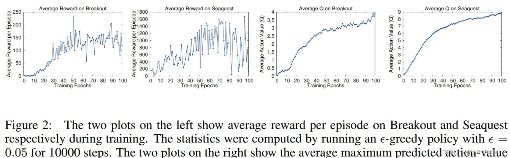
In early deep reinforcement learning papers, different methods were used to draw line charts. For example, in the paper DQN, the pioneering work of deep reinforcement learning, the error caused by random number seeds was not plotted, but only the experimental results were reported:
In early deep reinforcement learning papers, different methods were used to draw line charts. For example, in the paper DQN, the pioneering work of deep reinforcement learning, the error caused by random number seeds was not plotted, but only the experimental results were reported:
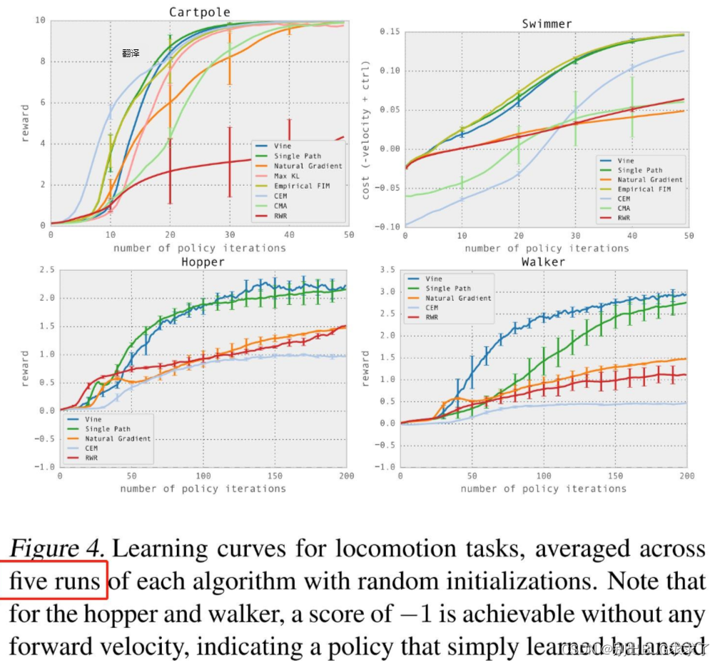
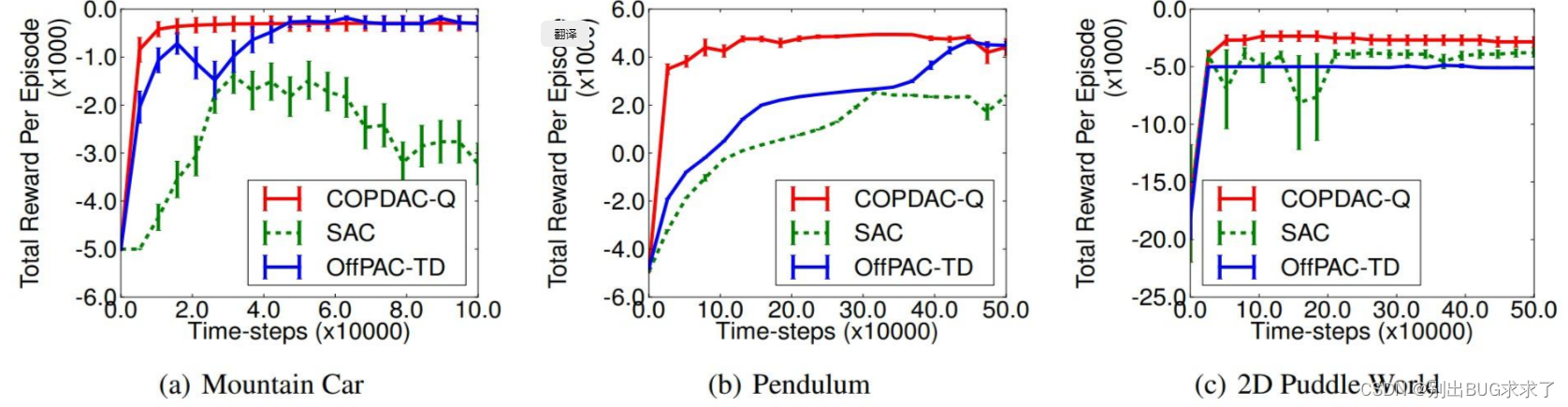
Later articles tried to use the form of error bars to report experimental results, such as the experimental parts of the classic algorithms DPG and TRPO:
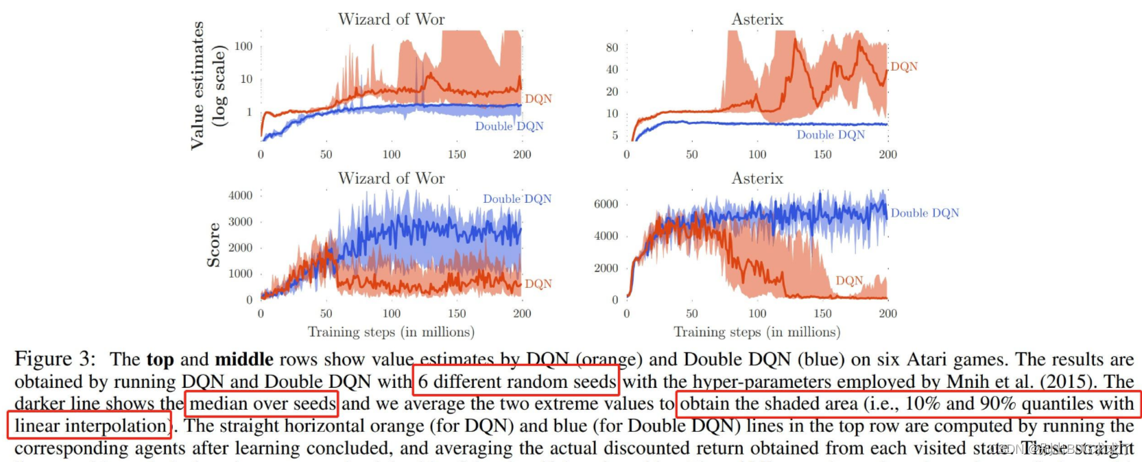
There are also some algorithms, such as the Double DQN paper, which use line charts with shaded areas to show their experimental results. This article explains in detail the meaning of the shaded parts of their figure: the dark line is the median of the scores in 6 random experiments, and the shade represents the minimum and maximum values of the experimental results* *, the quantiles are at the 10% and 90% positions** respectively. This drawing method is quite different from other papers. One feature of this drawing is that the error distances above and below the curve may be unequal, because the score is the median, not the maximum and minimum values. average.
Then we look at a more classic drawing method. This is an article that benchmarks the reinforcement learning algorithm of continuous control space. It also proposes an open source framework called RLLab. In the legend of this article, it is clearly stated that the meaning of their images is mean and standard deviation. The dark polyline represents the average of five different random experiments, and the upper and lower shaded parts represent the positive and negative standard deviations respectively. This means that the average polyline always bisects the entire shaded area vertically.
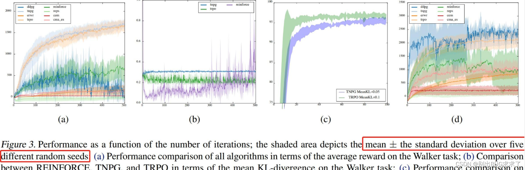
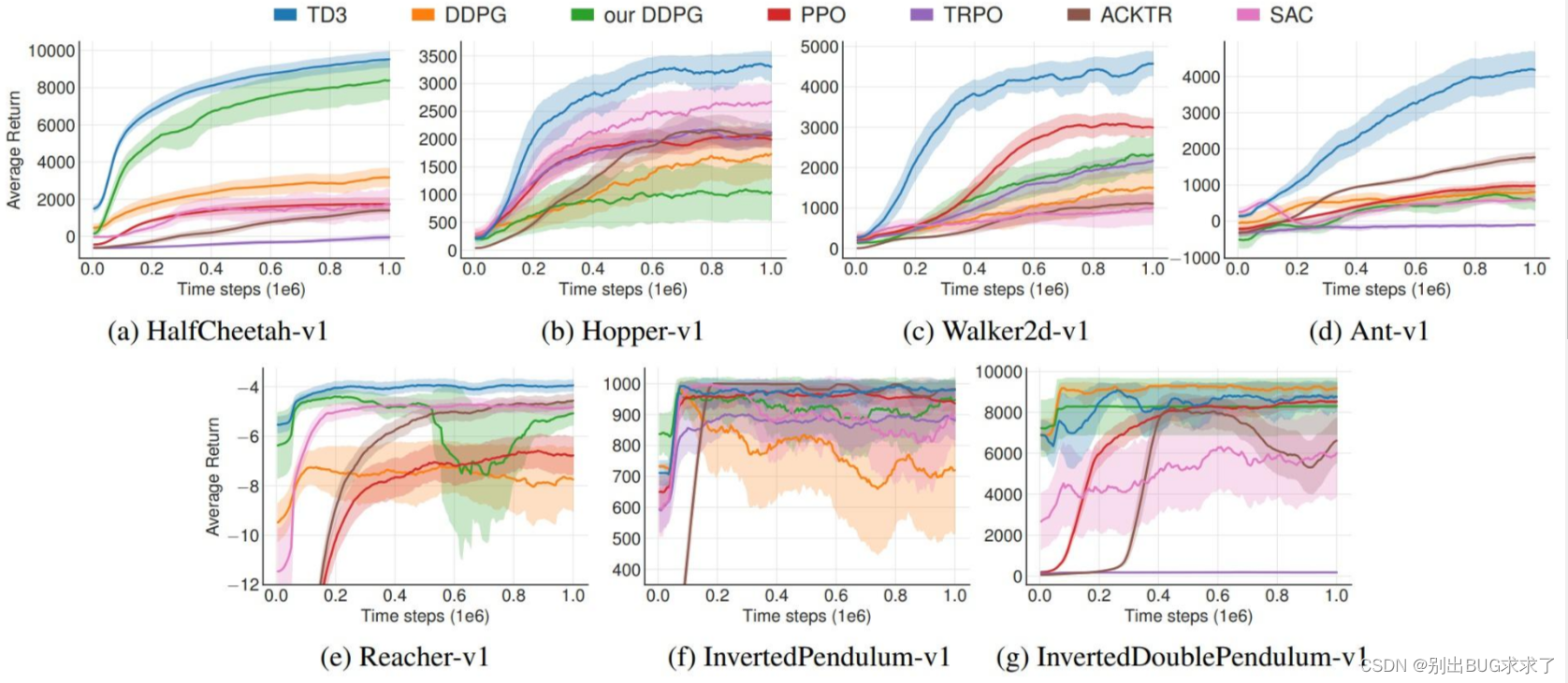
There are also some drawing methods. For example, in the TD3 paper, the shaded area represents half of the standard deviation, and they used 10 random number seeds to conduct the experiment. Since the shaded parts used in the two articles have different meanings, it is not possible to directly compare the algorithms on both sides through the graph to see which one is more stable.
There are also some drawing methods. For example, the shaded part means the standard error (standard error) or the 95% confidence interval (confidence interval). Specific examples will not be shown here.
But compared to the example just given, most articles do not explain the meaning of the shaded parts at all, making the meaning of the picture unclear. However, it may be because the shaded part only reflects the stability of the algorithm rather than the absolute index, so it is not emphasized as a key point in the reinforcement learning paper. But this also leads to the fact that when beginners write reinforcement learning papers, they often have headaches with this kind of line chart with unclear meaning and uncertain standards, and they are not clear about the calculation methods of standard deviation, standard error, and confidence interval. This makes it difficult to get started. Generally speaking, the current mainstream papers are still based on shaded line charts, so the article will introduce the basic knowledge of statistics one by one and explain how to use Python code to draw shaded line charts.
2. Standard deviation, standard error, confidence interval
In order to draw a line chart, we first need to know how to calculate the standard deviation, standard error and confidence interval in the experimental results. These three are different concepts, but are often drawn in the same way, which often leads to confusion. The article will introduce these three concepts next. Interested readers can read the following article in depth: David L Streiner. Maintaining Standards: Differences between the Standard Deviation and Standard Error, and When to Use Each. 1996.
- Standard Deviation
Standard deviation (or standard deviation) describes the degree of dispersion of a set of data. It is the arithmetic square root of the variance and is also the most commonly used statistic in probability statistics. one. For a set of discrete data with a mean of and a number of data, the formula for the population standard deviation is:
If the population follows a certain distribution, the standard deviation of the population can only be estimated from the sample standard deviation through sampling. If samples are sampled from the distribution, and the mean of these samples is , then the sample standard deviation is:
The sample standard deviation calculated at this time is an unbiased estimate of the population standard deviation.
- Standard Error
The standard error is the quotient of the standard deviation and the arithmetic square root of the sample size. Its calculation formula is:
The standard deviation is a statistic belonging to the population and describes the dispersion of the data as a whole, while the standard error describes the fluctuation of the data mean during the sampling process. As the number of samples increases, the standard error will become smaller and smaller, eventually approaching 0. In experiments with a limited number of samples, the standard error can be a good way to measure the accuracy of the mean, which is a different concept from the standard deviation.
- Confidence Interval Confidence Inverval
The meaning of confidence interval is two different concepts from "what probability is the sample falling within a certain range" in the distribution! Assuming that the height of all middle school students obeys the normal distribution: , we obtained the mean and standard deviation of the sample through sampling. Consider the following two statements:
There is a 95% probability that the mean height of all middle school students is within a certain range;
There is a 95% probability that the height range of middle school students is within a certain range.
It is easy to confuse these two concepts, especially when the population itself obeys a normal distribution.
The value of the confidence interval is related to the statistical test method used (such as U test, also called z test, and t test);
What is the probability of the sample falling into a certain Within a range, it is related to the overall distribution form (such as normal distribution, chi-square distribution, etc.).
Generally speaking, when the sample size is large (such as ), we can use the U test (also called the z test) to test our estimated values. The distribution used in the test at this time is a normal distribution, with a mean of , and a standard deviation of . It can be known by querying the normal distribution table that the true mean of the sample has a 95% probability of falling within . When the sample size is small, t-test is generally used for statistical testing. The distribution form of the t test is similar to the normal distribution, but the specific distribution shape is related to the number of samples (degrees of freedom).
All in all, the 90% or 95% confidence interval represented by the shaded part in the paper is the interval calculated based on the standard error. When the number of random experiments increases, the shaded part will become smaller.
- What image should be used?
Because many papers do not explain the meaning of their shaded parts, it is difficult to say what the shaded parts represent in the current mainstream painting methods. It is even possible that many authors do not understand the relationship between standard deviation, standard error, and confidence intervals.
Fortunately, OpenAI has open sourced a set of code for drawing shaded line charts, which is integrated in the openai/baselines warehouse. This set of codes provides two drawing methods, using standard deviation and standard error as the shaded parts respectively, controlled by the parameters shaded_err and shaded_std. I believe that the current mainstream reinforcement learning papers also refer to the implementation of this set of codes. Next, we will take the code in baselines as an example to explain in detail how to draw the shaded line chart in the paper.
3. Learn drawing from baselines
- The solution given by baselines
The code in baselines lacks documentation. The only documentation is to teach you how to draw pictures in Colab. Generally speaking, the experimental result curve of reinforcement learning is not flat, and there are a lot of noise interference factors. If it is drawn exactly as it is, the effect will probably be as shown in the figure below:
Original experimental data
In order to make the experimental results look better, the image needs to be smoothed. The simplest method is to take an average value together with the data near the data point, which can greatly increase the readability of the curve.
Smoothed curve
This simple smoothing method gives the same weight to each value in the neighborhood of the data point. However, the training process should be sequential and should be based on the current Moment-to-moment data is given greater weight. In addition, in reinforcement learning experiments, we often conduct multiple experiments in the same setting using different random number seeds. The horizontal axes (timesteps) of these experiments may not be aligned. For example, the horizontal axis of the first set of experiments is [ 0, 1001, 2002, 3003], the horizontal axis of the second set of experiments is [500, 1501, 2503]. This misalignment will result in the inability to calculate the standard deviation of all experiments at a certain time, resulting in the inability to draw the hatched polyline picture.
In order to solve the above two problems, the baseline provides a data processing method based on exponential moving average (EMA) and resample, using exponential moving average to achieve a more scientific smoothing method, and using re-sampling. Sampling aligns the horizontal axes of different experiments.
- Exponential Moving Average
The exponential moving average (EMA) is a very commonly used smoothing method. It is not only used for line charts, but can even be used to update model parameters. It is widely used in the financial field and deep learning. The commonly used Tensorboard has a built-in exponential moving average function for automatically smoothing curves.
The calculation formula of EMA is as follows:
Where is the moving average at time, is the real value at time, and is the weight factor. The above formula is a recursive formula. If the above formula is converted into a form related only to , then:
There are obviously problems with this method, for example, when , , only when becomes larger, the moving average will be close to the true value. In order to solve this problem, a bias correction term is introduced, and the modified exponential moving average formula is:
When is large and small, due to , the coefficient will become very small, close to 0, so that it cannot have an impact on . Regarding how large is considered to have no impact, we generally define it as the threshold of the effective weight item.
In the code of baselines, the variable decay_steps is used to represent the range of effective weight items, and its relationship with the coefficient beta is beta = np.exp(-1 / decay_steps). For example, if decay_steps = 5, then only values within 5 moments from the current moment will be regarded as valid values, and values beyond 5 moments will be regarded as invalid values. At this time, .
- Resampling
In baselines, resampling is implemented based on exponential moving average. The code first reads the data of all experiments, extracts the maximum and minimum values of the horizontal axis in the data, and sets them as high and low respectively. Then, the code divides the interval between high and low into n-1 uniform intervals. This interval is defined as . Counting the beginning and end, there are a total of n time points that can be sampled. We refer to these time points as
The problem with resampling is how to calculate the value of each set of experimental data at time? If this set of experimental data happens to have a value at , just assign it directly. If this set of experimental data has no value at , but has a value at some point in between, how should we estimate the value at ?
baselines gives the following solution:
This formula actually follows the idea of exponential moving average. In the recursive formula of the exponential moving average we just discussed, is discrete, and is only related to and . So, can the value of be a decimal? Of course you can, and the same conclusion applies. Here, the value of is calculated using the point between using the idea of exponential moving average. If there are no points in this interval, then when using exponential moving average, the value of time can only be predicted based entirely on the points before time.
- The process of baseline drawing code
Read the data and obtain the experimental curves under different random number seeds. The horizontal axis is the time slice and the vertical axis is the measurement index (such as reward); < /span> Calculate the mean, standard deviation and standard error of the data at each time point at n uniform time points. Depending on the setting, determines whether to draw standard deviation shading or standard error shading. Drawing shading can be achieved using matplotlib's fill_between() function. Take the average of the results of the two exponential moving averages in the forward and reverse directions and use it as the value for drawing the current experimental curve. Take a negative value on the horizontal axis of the original data and repeat steps 2~3. Because the exponential moving average can only use the data on one side (that is, before the current moment) for moving average, but we hope that the data after the current moment can also be used for the moving average. This step is called symmetric_ema in the code. Right The data at these n uniform time points are subjected to exponential moving average respectively to obtain a smoothed curve;
Resample each set of data using the method introduced above, and map all values to n uniform time points between low and high;
Summarize
This article introduces in detail the meaning and drawing method of shaded line charts in deep reinforcement learning. I hope that after reading the introduction of the article, you can write your own code for drawing a shaded line chart. If there are any errors or omissions, please feel free to point them out in the comment area.