1. TextInput description
The TextInput component is used to enter a single line of text and respond to input events. TextInput is also widely used, such as applying login account and password, sending messages, etc. Like the Text component, the TextInput component also supports text style settings. The following example code implements a simple input box:
@Entry
@Component
struct Index {
  @State message: string = 'Hello 334 World'

  build() {
    Row() {
      Column() {
        TextInput()
          .fontColor(Color.Blue)
          .fontSize(20)
          .fontStyle(FontStyle.Italic)
          .fontWeight(FontWeight.Bold)
          .fontFamily('Arial')
      }
      .width('100%')
    }
    .height('100%')
  }
}
Rendering:

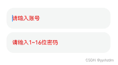
2. Set input prompt text
When you usually use the input box, there will often be some prompt text. For example, when logging in to an account, there will be a text prompt such as "Please enter your account number." When the user enters the content, the prompt text will disappear. This prompt function uses placeholderAttributes can be easily implemented. You can also use placeholderColor and placeholderFont to set the color and style of the prompt text respectively. The sample code is as follows:
@Entry
@Component
struct Index {
  @State message: string = 'Hello 334 World'

  build() {
    Row() {
      Column() {
        TextInput({placeholder:"请输入账号"})
          .fontColor(Color.Blue)
          .height(60)
          .width(300)
          .fontSize(20)
          .fontStyle(FontStyle.Italic)
          .fontWeight(FontWeight.Medium)
          .fontFamily('Arial')
          .placeholderColor(Color.Red)

        Blank(10)

        TextInput({ placeholder: "请输入1~16位密码" })
          .fontColor(Color.Blue)
          .fontSize(20)
          .height(60)
          .width(300)
          .fontStyle(FontStyle.Italic)
          .fontWeight(FontWeight.Medium)
          .fontFamily('Arial')
          .placeholderColor(Color.Red)
      }
      .width('100%')
    }
    .height('100%')
  }
}
The renderings are as follows:
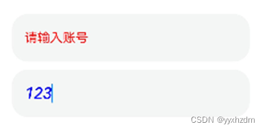
3. Set input type
You can usetypeattribute to set the input box type. For example, in the password input box, when entering a password, for the sake of user password security, the content will be displayed as "...". For this kind of Scenario, this can be achieved by setting the type attribute to InputType.Password. The sample code is as follows:
@Entry
@Component
struct Index {
  @State message: string = 'Hello 334 World'

  build() {
    Row() {
      Column() {
        TextInput({placeholder:"请输入账号"})
          .fontColor(Color.Blue)
          .height(60)
          .width(300)
          .fontSize(20)
          .fontStyle(FontStyle.Italic)
          .fontWeight(FontWeight.Medium)
          .fontFamily('Arial')
          .placeholderColor(Color.Red)

        Blank(10)

        TextInput({ placeholder: "请输入1~16位密码" })
          .type(InputType.Password)
          .fontColor(Color.Blue)
          .fontSize(20)
          .height(60)
          .width(300)
          .fontStyle(FontStyle.Italic)
          .fontWeight(FontWeight.Medium)
          .fontFamily('Arial')
          .placeholderColor(Color.Red)
      }
      .width('100%')
    }
    .height('100%')
  }
}
Rendering:
The parameter type of type is InputType, which includes the following input types:

- Normal: Basic input mode. Supports numbers, letters, underscores, spaces, special characters, etc.

Password: Password input mode

Email:e-mail location shipping pattern

Number: Pure numerical input mode

4. Set the cursor position
You can use TextInputController to dynamically set the light position. The following sample code uses the caretPosition method of TextInputController, Move the cursor after the second character.
Code:
@Entry
@Component
struct Index {
  controller: TextInputController = new TextInputController();

  build() {
    Row() {
      Column() {
        TextInput({ controller: this.controller })
          .width(300)
          .height(40)
        Blank(10)
        Button('设置光标位置')
          .onClick(() => {
            this.controller.caretPosition(2)
          })

      }
      .width('100%')
    }
    .height('100%')
  }
}
Rendering - before clicking the button:

Rendering - after clicking the button:

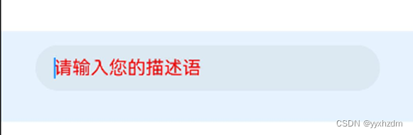
5. Get the input text
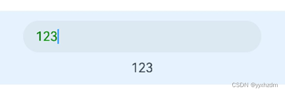
We can set the onChange event for TextInput to trigger a callback when the input text changes. The value in the example code below is to obtain the text information entered by the user in real time.
@Entry
@Component
struct Index {
  @State input_text: string = "";

  build() {
    Row() {
      Column() {
        TextInput({placeholder:"请输入您的描述语"})
          .placeholderColor(Color.Red)
          .fontColor(Color.Green)
          .width(300)
          .height(40)
          .onChange((value: string) => {
            this.input_text = value;
            console.log("onEditChange value = " + this.input_text);
          })
          .onEditChange((isEditing: boolean) => {
            console.log("onEditChange isEditing = " + isEditing);
          })
        Blank(10)
       Text(this.input_text)

      }
      .width('100%')
      .alignItems(HorizontalAlign.Center)
      .padding(12)
      .backgroundColor(0xE6F2FD)
    }
    .height('100%')
  }
}
Rendering:
log:
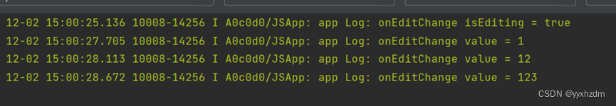
It can be seen that when the input box is clicked, the isEditing callback of the onEditChange method returns true, indicating that the input box is being edited. The following is the real-time input content corresponding to input 123.