Recently, XGboost supports quantile regression. I took a look and made a small code example. After all, there are still not many ways to combine this novel machine learning with traditional statistics in the academic market. To be considered innovative, find a good data set to publish a paper on.
Code
Import package
import numpy as np
import pandas as pd
import matplotlib.pyplot as plt
import seaborn as sns
from sklearn.linear_model import LinearRegression
from sklearn.model_selection import train_test_split
from sklearn.metrics import mean_squared_error,r2_score
import xgboost as xgb
import lightgbm as lgb
import statsmodels.api as sm
from statsmodels.regression.quantile_regression import QuantReg
Both xgboost and lightgbm need to be installed. They are not the same library as the machine learning method of the sklearn library. How to install it? See my xgb article in the "Practical Machine Learning" column.
Quantile regression on simulated data
First create a simulation data set
def f(x: np.ndarray) -> np.ndarray:
    return x * np.sin(x)

rng = np.random.RandomState(2023)
X = np.atleast_2d(rng.uniform(0, 10.0, size=1000)).T
expected_y = f(X).ravel()
sigma = 0.5 + X.ravel() / 10.0
noise = rng.lognormal(sigma=sigma) - np.exp(sigma**2.0 / 2.0)
y = expected_y + noise

print(X.shape,y.shape)
Then draw a picture to see:
plt.figure(figsize=(6,2),dpi=100)
plt.scatter(X,y,s=1)
plt.show()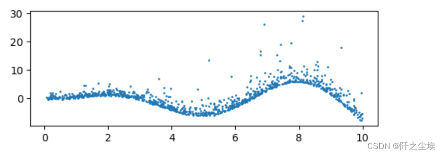
#Divide training set and test set
X_train, X_test, y_train, y_test = train_test_split(X, y, random_state=rng)
print(f"Training data shape: {X_train.shape}, Testing data shape: {X_test.shape}")
Three models are used here for fitting and prediction comparison, namely linear quantile regression, XGB combined with quantiles, and LightGBM combined with quantiles:
alphas = np.arange(5, 100, 5) / 100.0
print(alphas)
mse_qr, mse_xgb, mse_lgb = [], [], []
r2_qr, r2_xgb, r2_lgb = [], [], []
qr_pred,xgb_pred,lgb_pred={},{},{}

# Train and evaluate
for alpha in alphas:
    # Quantile Regression
    model_qr = QuantReg(y_train, sm.add_constant(X_train)).fit(q=alpha)
    model_pred=model_qr.predict(sm.add_constant(X_test))
    mse_qr.append(mean_squared_error(y_test,model_pred ))
    r2_qr.append(r2_score(y_test,model_pred))

    # XGBoost
    model_xgb = xgb.train({"objective": "reg:quantileerror", 'quantile_alpha': alpha},
                          xgb.QuantileDMatrix(X_train, y_train), num_boost_round=100)
    model_pred=model_xgb.predict(xgb.DMatrix(X_test))
    mse_xgb.append(mean_squared_error(y_test,model_pred ))
    r2_xgb.append(r2_score(y_test,model_pred))

    # LightGBM
    model_lgb = lgb.train({'objective': 'quantile', 'alpha': alpha,'force_col_wise': True,},
                          lgb.Dataset(X_train, y_train), num_boost_round=100)

    model_pred=model_lgb.predict(X_test)
    mse_lgb.append(mean_squared_error(y_test,model_pred))
    r2_lgb.append(r2_score(y_test,model_pred))

    if alpha in [0.1,0.5,0.9]:
        qr_pred[alpha]=model_qr.predict(sm.add_constant(X_test))
        xgb_pred[alpha]=model_xgb.predict(xgb.DMatrix(X_test))
        lgb_pred[alpha]=model_lgb.predict(X_test)
Record when the quantiles are 0.1, 0.5, and 0.9 for easy drawing and viewing.
Then draw a comparison of the errors and goodness of fit of the three models at different quantiles:
plt.figure(figsize=(7, 5),dpi=128)
plt.subplot(211)
plt.plot(alphas, mse_qr, label='Quantile Regression')
plt.plot(alphas, mse_xgb, label='XGBoost')
plt.plot(alphas, mse_lgb, label='LightGBM')
plt.legend()
plt.xlabel('Quantile')
plt.ylabel('MSE')
plt.title('MSE across different quantiles')

plt.subplot(212)
plt.plot(alphas, r2_qr, label='Quantile Regression')
plt.plot(alphas, r2_xgb, label='XGBoost')
plt.plot(alphas, r2_lgb, label='LightGBM')
plt.legend()
plt.xlabel('Quantile')
plt.ylabel('$R^2$')
plt.title('$R^2$ across different quantiles')
plt.tight_layout()
plt.show()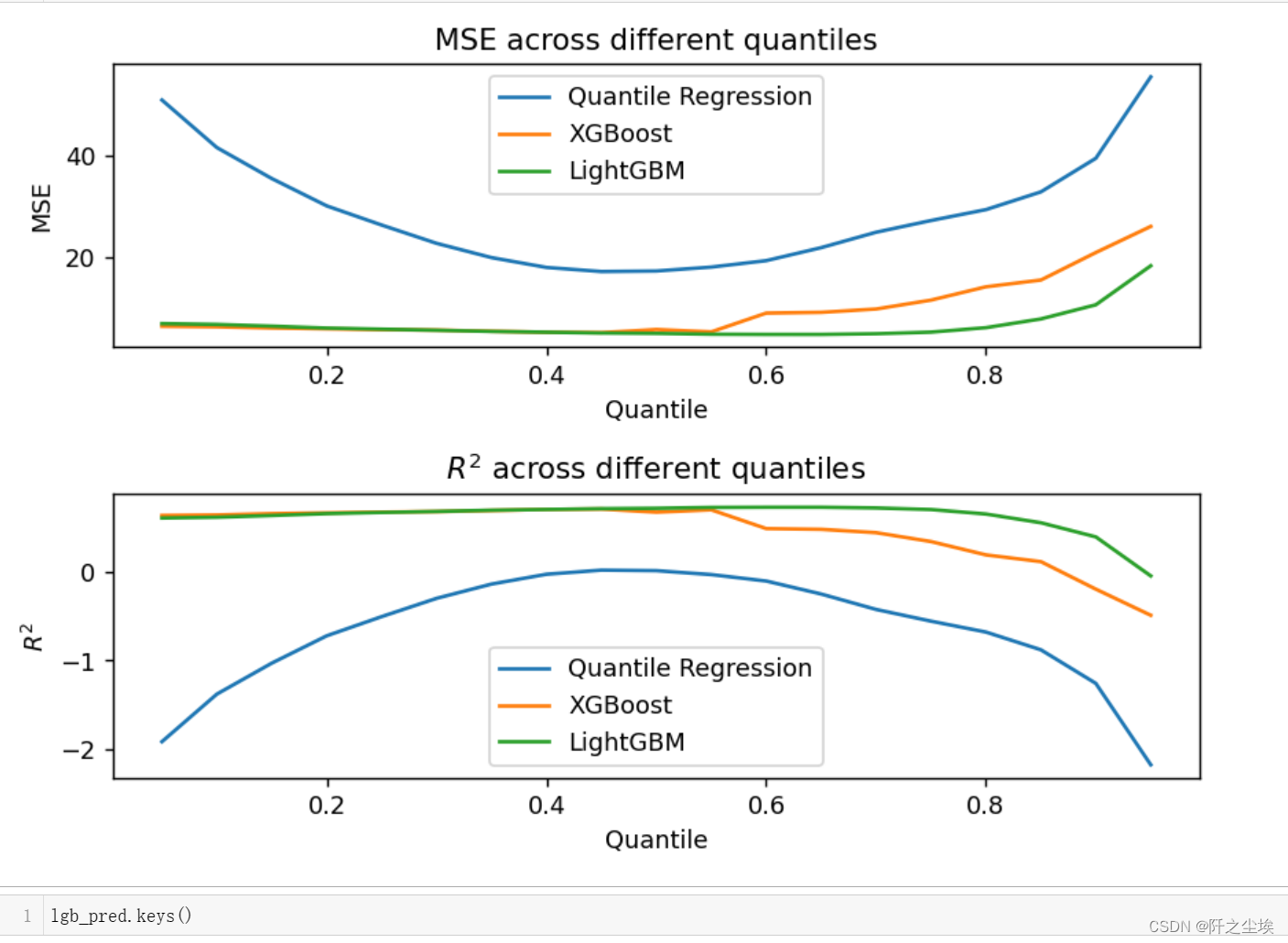
It can be seen that at the quantile point of 0.5, the model errors are relatively small. Because this data set does not have many outliers. Then the model performance is, LGBM>XGB>Linear QR. Of course, a linear model cannot fit a nonlinear functional relationship here.
Draw the fitting graph:
name=['QR','XGB-QR','LGB-QR']
plt.figure(figsize=(7, 6),dpi=128)
for k,model in enumerate([qr_pred,xgb_pred,lgb_pred]):
    n=int(str('31')+str(k+1))
    plt.subplot(n)
    plt.scatter(X_test,y_test,c='k',s=2)
    for i,alpha in enumerate([0.1,0.5,0.9]):
        sort_order = np.argsort(X_test, axis=0).ravel()
        X_test_sorted = np.array(X_test)[sort_order]
        #print(np.array(model[alpha]))
        predictions_sorted = np.array(model[alpha])[sort_order]
        plt.plot(X_test_sorted,predictions_sorted,label=fr"$\tau$={alpha}",lw=0.8)
    plt.legend()
    plt.title(f'{name[k]}')
plt.tight_layout()
plt.show()
You can see the obvious interval characteristics of quantile regression.
There are also advantages of non-parametric nonlinear methods, and XGB and LGBM obviously fit better.
Boston Dataset
The above is artificial data. The following is a real data set for comparison. Let’s use the most commonly used Boston housing price data set for regression:
data_url = "http://lib.stat.cmu.edu/datasets/boston"
raw_df = pd.read_csv(data_url, sep="\s+", skiprows=22, header=None)
data = np.hstack([raw_df.values[::2, :], raw_df.values[1::2, :2]])
target = raw_df.values[1::2, 2]
column_names = ['CRIM','ZN','INDUS','CHAS','NOX','RM','AGE','DIS','RAD','TAX','PTRATIO',  'B','LSTAT', 'MEDV']
boston=pd.DataFrame(np.hstack([data,target.reshape(-1,1)]),columns= column_names)
Take out X and y and divide the test set and training set
X = boston.iloc[:,:-1]
y = boston.iloc[:,-1]
X_train, X_test, y_train, y_test = train_test_split(X, y, test_size=0.2, random_state=42)
Fit predictions, compare
alphas = np.arange(0.1, 1, 0.1)
mse_qr, mse_xgb, mse_lgb = [], [], []
r2_qr, r2_xgb, r2_lgb = [], [], []
qr_pred,xgb_pred,lgb_pred={},{},{}
# Train and evaluate
for alpha in alphas:
    # Quantile Regression
    model_qr = QuantReg(y_train, sm.add_constant(X_train)).fit(q=alpha)
    model_pred=model_qr.predict(sm.add_constant(X_test))
    mse_qr.append(mean_squared_error(y_test,model_pred ))
    r2_qr.append(r2_score(y_test,model_pred))

    # XGBoost
    model_xgb = xgb.train({"objective": "reg:quantileerror", 'quantile_alpha': alpha},
                          xgb.QuantileDMatrix(X_train, y_train), num_boost_round=100)
    model_pred=model_xgb.predict(xgb.DMatrix(X_test))
    mse_xgb.append(mean_squared_error(y_test,model_pred ))
    r2_xgb.append(r2_score(y_test,model_pred))

    # LightGBM
    model_lgb = lgb.train({'objective': 'quantile', 'alpha': alpha,'force_col_wise': True,},
                          lgb.Dataset(X_train, y_train), num_boost_round=100)

    model_pred=model_lgb.predict(X_test)
    mse_lgb.append(mean_squared_error(y_test,model_pred))
    r2_lgb.append(r2_score(y_test,model_pred))

    if alpha in [0.1,0.5,0.9]:
        qr_pred[alpha]=model_qr.predict(sm.add_constant(X_test))
        xgb_pred[alpha]=model_xgb.predict(xgb.DMatrix(X_test))
        lgb_pred[alpha]=model_lgb.predict(X_test)
Draw a graph to view the errors and goodness of fit of different models at different quantiles:
plt.figure(figsize=(8, 5),dpi=128)
plt.subplot(211)
plt.plot(alphas, mse_qr, label='Quantile Regression')
plt.plot(alphas, mse_xgb, label='XGBoost')
plt.plot(alphas, mse_lgb, label='LightGBM')
plt.legend()
plt.xlabel('Quantile')
plt.ylabel('MSE')
plt.title('MSE across different quantiles')

plt.subplot(212)
plt.plot(alphas, r2_qr, label='Quantile Regression')
plt.plot(alphas, r2_xgb, label='XGBoost')
plt.plot(alphas, r2_lgb, label='LightGBM')
plt.legend()
plt.xlabel('Quantile')
plt.ylabel('$R^2$')
plt.title('$R^2$ across different quantiles')
plt.tight_layout()
plt.show()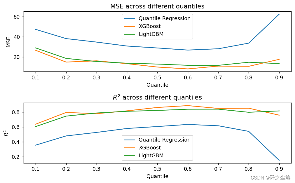
It can be seen that at the quantile point of 0.6, the performance of the three attached models is relatively good. Looking at the model performance, XGB>LGBM>QR, the two machine learning models are more powerful.
Comparison between quantile loss function and sum of squares loss function
Above we get that when the quantile point is 0.6, the model performs well. So how does the effect of the quantile model compare with the ordinary MSE loss function? Let’s continue to compare:
# 定义alpha值
alpha = 0.5

# 分位数回归模型
model_qr = sm.regression.quantile_regression.QuantReg(y_train, sm.add_constant(X_train)).fit(q=alpha)
qr_pred = model_qr.predict(sm.add_constant(X_test))

# XGBoost分位数回归
model_xgb = xgb.train({"objective": "reg:quantileerror", 'quantile_alpha': alpha},
                      xgb.DMatrix(X_train, label=y_train), num_boost_round=100)
xgb_q_pred = model_xgb.predict(xgb.DMatrix(X_test))

# LightGBM分位数回归
model_lgb = lgb.train({'objective': 'quantile', 'alpha': alpha,'force_col_wise': True},
                      lgb.Dataset(X_train, label=y_train), num_boost_round=100)
lgb_q_pred = model_lgb.predict(X_test)

# 普通的最小二乘法线性回归
model_lr = LinearRegression()
model_lr.fit(X_train, y_train)
lr_pred = model_lr.predict(X_test)

# 普通的XGBoost
model_xgb_reg = xgb.train({"objective": "reg:squarederror"}, xgb.DMatrix(X_train, label=y_train), num_boost_round=100)
xgb_pred = model_xgb_reg.predict(xgb.DMatrix(X_test))

# 普通的LightGBM
model_lgb_reg = lgb.train({'objective': 'regression', 'force_col_wise': True}, lgb.Dataset(X_train, label=y_train), num_boost_round=100)
lgb_pred = model_lgb_reg.predict(X_test)
The above are six models, respectively XGB, LGBM and linear quantile regression based on quantile regression. There are also three ordinary XGB, LGBM and least squares linear regression based on the most common MSE loss function.
# Calculate MSE and R^2 of 6 models
models = ['QR', 'XGB Quantile', 'LightGBM Quantile', 'Linear Reg', 'XGBoost', 'LightGBM']
preds = [qr_pred, xgb_q_pred, lgb_q_pred, lr_pred, xgb_pred, lgb_pred]
mse_scores = [mean_squared_error(y_test, pred) for pred in preds]
r2_scores = [r2_score(y_test, pred) for pred in preds]
Draw a bar chart to view:
colors = sns.color_palette("muted", len(models))
fig, axs = plt.subplots(2, 1, figsize=(9,7))
axs[0].bar(models, mse_scores, color=colors)
axs[0].set_title('MSE Comparison')
axs[0].set_ylabel('MSE')
axs[1].bar(models, r2_scores, color=colors)
axs[1].set_title(r'$R^{2}$ Comparison')
axs[1].set_ylabel(r'$R^{2}$')
plt.tight_layout()
plt.show()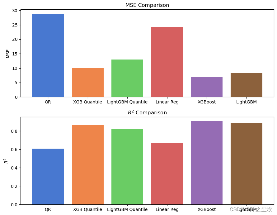
You can see that from the model effect, XGboost is better than the linear model due to Lightgbm. However, the effect of quantile regression is not as good as that of MSE loss, which means that in terms of performance on this data set, the ordinary model using the most classic MSE loss will have better results. . .
It is indeed the case that many academic innovations and improvements are not necessarily better than the most classic and common methods.
If it is data with a lot of outliers and heteroscedasticity, it may be better to use quantile as the loss function.